Jacob Wise’s five key considerations for designing your own letterforms
Following on from Jacob’s session as part of our New World: Creating for Tomorrow series with Today at Apple, the designer shares a snippet of his tips and tricks when designing type.
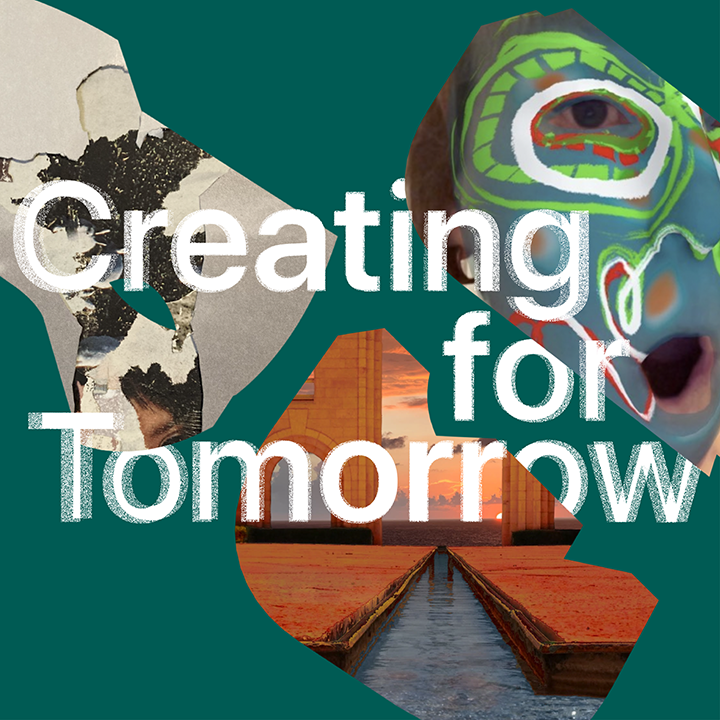
New World: Creating for Tomorrow is a programme of free, hands-on virtual sessions hosted by Today at Apple and It’s Nice That from 1 – 29 March. Building on our New World partnership in 2021, we’ll be hosting a series of Virtual Studio sessions with artists and designers who use creativity to present their ideals for the future.
As part of our ongoing programme with Today at Apple, New World: Creating for Tomorrow, It’s Nice That had the honour of hosting a virtual session with Jacob Wise. One of the most respected voices in graphic and type design, Jacob’s session saw the Rotterdam-based designer teach attendees how to design type to express their respective creative futures while designing type using Procreate on iPad.
Taking learnings from his career so far – which has seen him work with the likes of Collins, Klunk Records and the Utah Jazz – the designer also shared a step-by-step guide to drawing type, aided by insight from his type and media master’s studies, which Jacob is currently completing at the Royal Academy of Arts in The Hague.
Although our Creating for Tomorrow sessions are not available to rewatch after the live event, we’re pleased to be able to share a snippet of Jacob’s advice via five key considerations to take into account when designing your very own letterforms. Within the session the designer showcased the capabilities of typography to hold new meanings when driven by the thoughtful personality of its creator. We hope the below tips and tricks will guide you in exploring the detail-oriented craft that is hand drawn type design.
(Copyright © Jacob Wise, 2022)
Angle
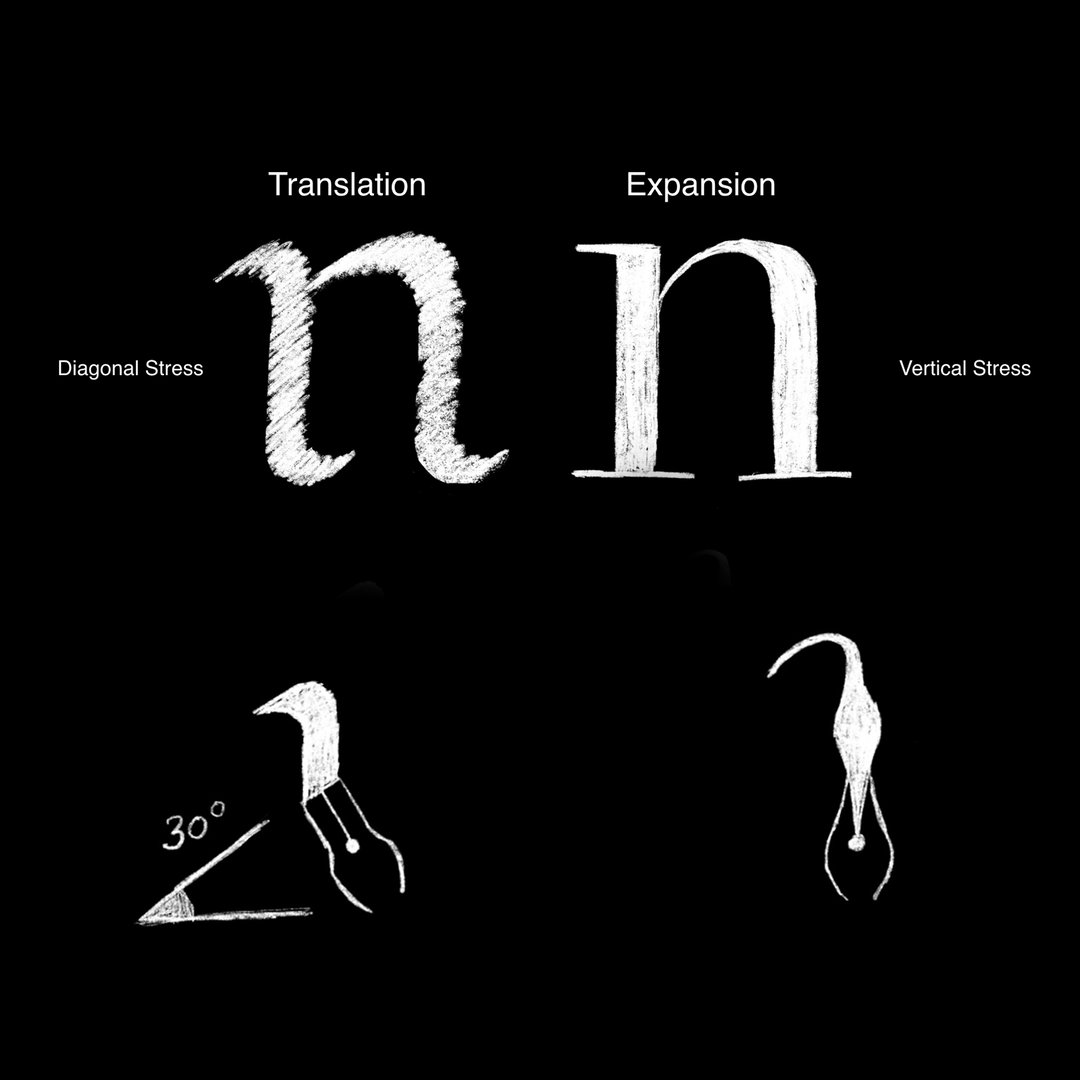
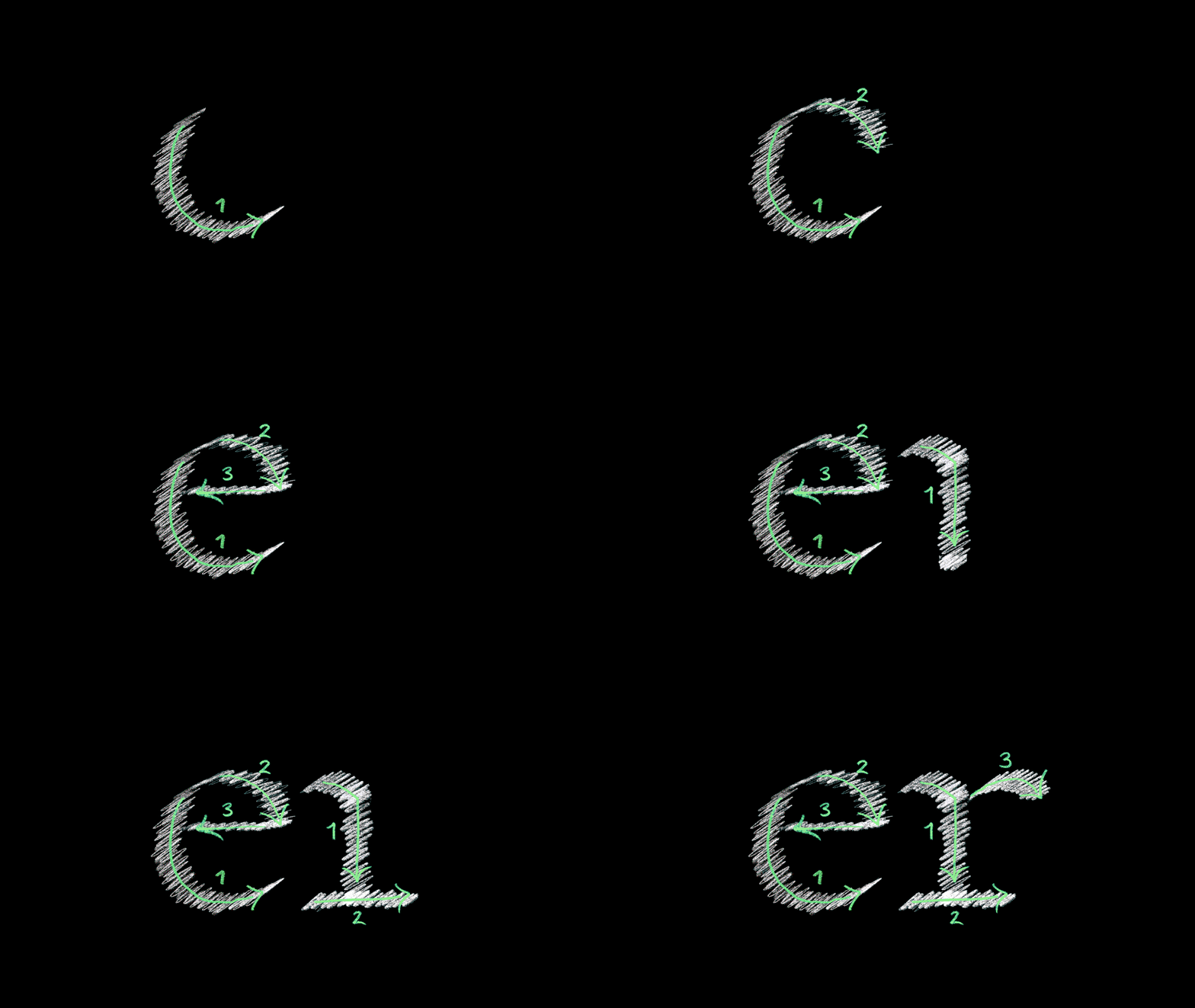
Before putting pen to paper, Jacob first advised considering the angle of your pen or tool from which your letterform is going to be created. Considering how a letter is constructed using a number of strokes, in general it’s advised to “practice some form of calligraphy to develop an understanding of this,” he told the audience.
Drawing his own letterform with this in mind, Jacob showed the audience how the direction of drawing the beginning of a lowercase “e” can aid your approach for both its top and bottom curves. This can also drive the design of the next letter you might draw too, by following your already created directional line.
(Copyright © Jacob Wise, 2022)
Spacing
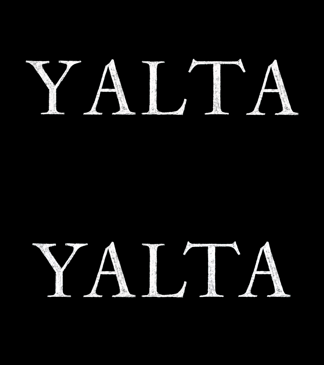
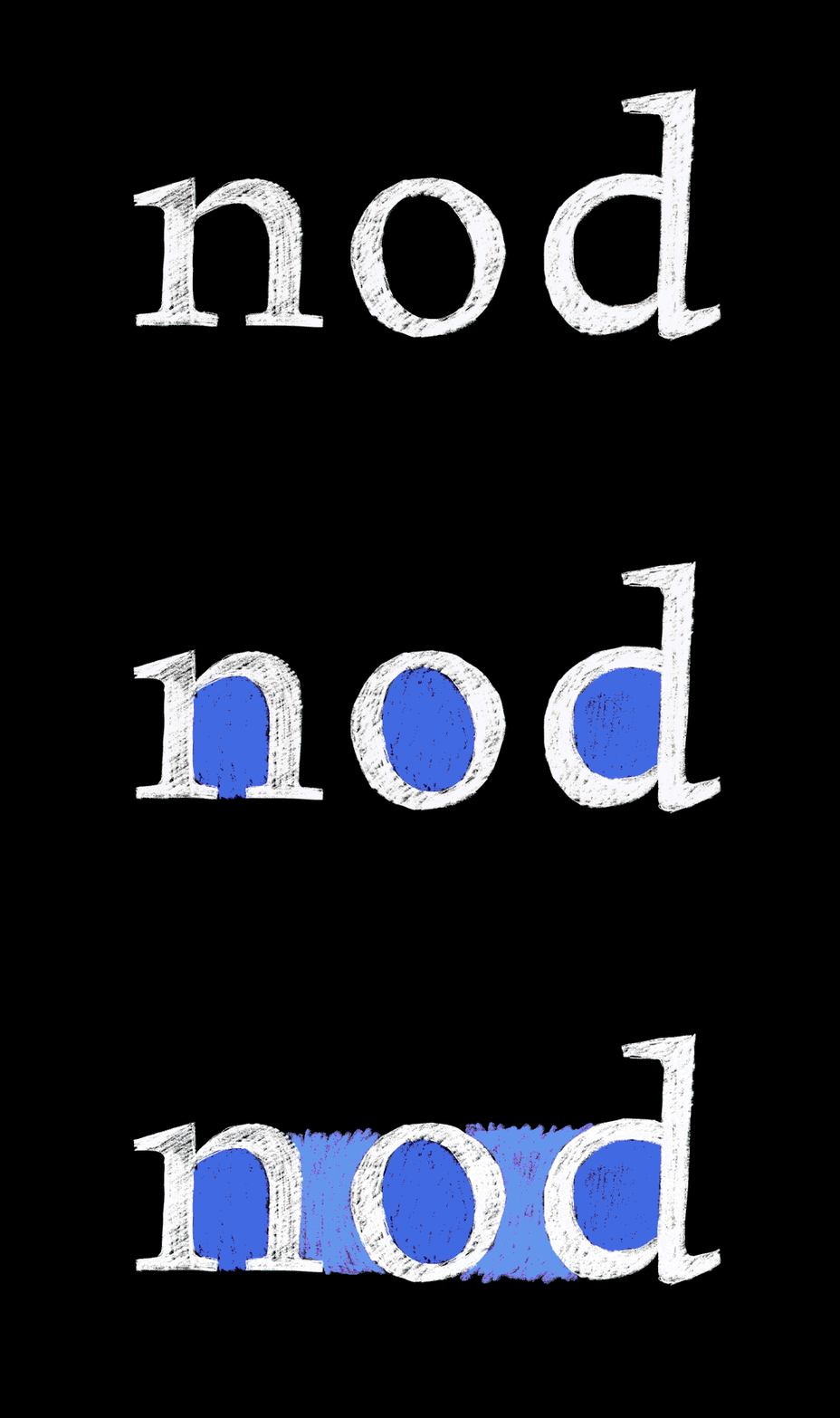
Once you’ve drawn the letterforms of your chosen word, the designer next advises considering the spacing of your word when balancing various letterforms together – especially when they are drawn by hand. A crucial step towards type functioning with balance, Jacob explained that “well balanced type should give an even distribution of dark value, or what we call ‘colour’.”
Encouraging the audience to squint to judge the distribution of “colour”, the designer also highlighted how, while it’s helpful to consider negative space as the interior of letterforms, we mustn’t forget about the space between each letterform when considering spacing. “There should be an equilibrium of both negative and positive mass.”
(Copyright © Jacob Wise, 2022)
Proportion
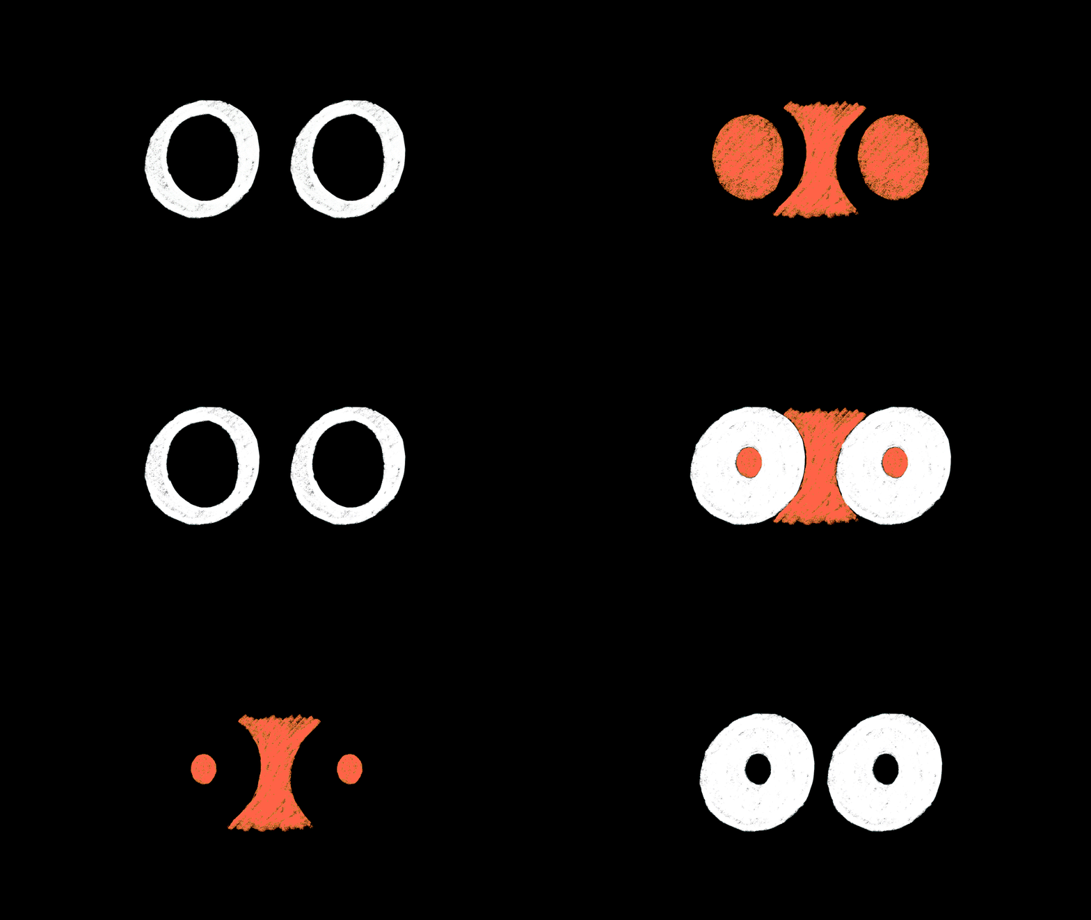
While spacing is important to how the reader views your letterforms, proportion is equally so, in helping your type design to look natural; especially as “our eyes are accustomed to particular proportions of letterforms” Jacob pointed out.
To aid this process, the designer explained how the inside of a letter, known as “counters”, should each “exert a similar optical mass to be in balance… and so too should the spacing between letters be in proportion to this.”
(Copyright © Jacob Wise, 2022)
Weight
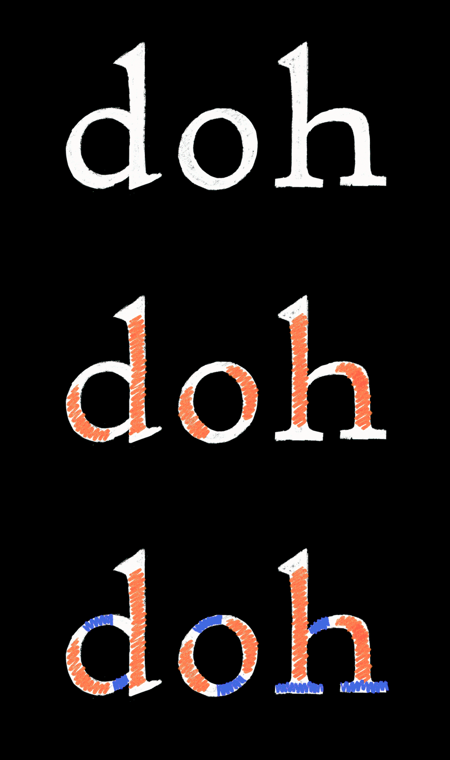
Then, weight comes into play. Able to affect spacing quite dramatically, Jacob took the audience through how, if you’ve taken the steps to balance your “counter” space, and assessed the “colour” between letterforms, there should be an “optically similar value”. Yet, if you then begin to increase the actual weight of your letterform without changing its spacing, the form will begin to look a little off.
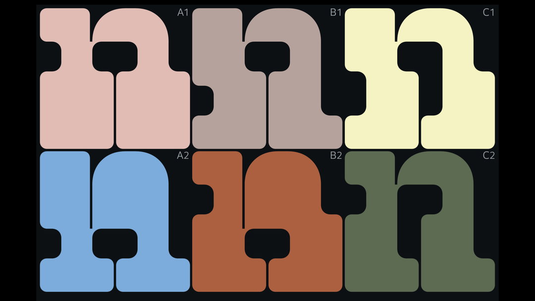
The reasoning for this is you are adjusting the original counter space to become smaller, and therefore it’s time to consider your spacing again to maintain balance. In this instance, altering negative space often “appears to force the letters further apart than they actually are”. Isolating negative space and removing your letterforms can help in surveying this imbalance, guiding you to then tighten the spacing as you see fit. “In short,” Jacob advised, “the heavier the weight, the tighter the spacing, the light the weight, the looser spacing,” especially if you’re aiming to create legible text at a small size.
(Copyright © Jacob Wise, 2022)
Distribution
On the topic of weight, distribution is also key to tightening the final step of your letterforms. At this stage, Jacob advised considering how “anything in the vertical direction tends to have optically equal values” and therefore, “the thicks should be equal”. This very same vein of thinking should additionally be applied to thins (the detail added towards the edges of letterforms) especially when creating serif letterforms.
Although these are each advisable steps for taking your first steps into type design, each of these elements should be a consideration taken into account at every stage. Designing type, as Jacob told our attendees, is a craft of spinning many plates at the same time.
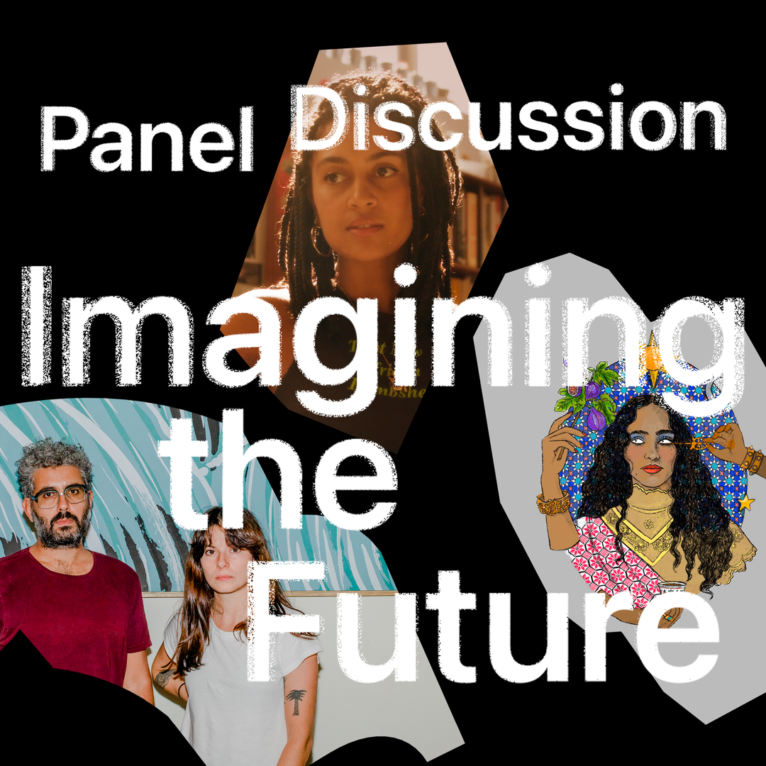
You can also take a look at the creations of our event attendees in this feature, where we celebrate the work made in each of our New World: Creating for Tomorrow sessions. Our final event, held this Tuesday 29 March, will be an open panel discussion with previous Today at Apple guests Moniker and Studio Dumbar, discussing the skills and digital processes that will shape tomorrow, which you can sign up to directly here.
New World: Building Tomorrow
Studio Dumbar and Moniker explore how tech will influence our creative futures in our final New World session on 29th March.
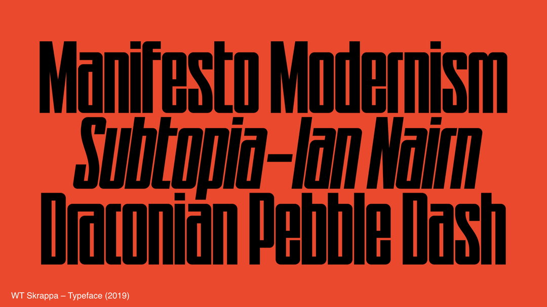
Gallery(Copyright © Jacob Wise, 2022)
In partnership with

Free sessions in-store and online that inspire hands-on creativity in photography, art, design, coding, music and more. Brought to you by Apple.
Share Article
Further Info
About the Author
—
This article was written by the It’s Nice That team. To find our editors and writers, please head over to our Contact page.