




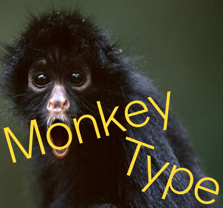
Meet Monkey Type, an international collective bananas about fonts
Typography design is regarded as one of the most serious tasks a graphic designer can embark on. Incredibly difficult to get right and an aspect of design literally everyone has an opinion on, it isn’t often people have a bit of a laugh with the sacred territory of fonts. However, international type design collective Monkey Type is approaching the medium with a refreshing silliness, and a bit of mystery too…Despite emailing with the collective back and forth we still only know its imaginary figure head, Curious George.
Made up of a group of unknown designers who work at various agencies across the US and Europe, Monkey Type has both the professional backing and humour to make terrific typography. Living “on a steady diet of bananas to fuel our bezier curves,” the collective began in 2015, “as kind of a joke,” it explains. After spending “too much time on Skype critiquing each others typefaces rather than focusing on our respective studio’s design work,” Monkey Type was formed as a space to “explore and develop our type design craft and simultaneously make fun of ourselves, our work and the stuffy type design industry.” Skype, as the members favoured method of communication is also what inspired the collective’s name, honouring the dancing Monkey emoji. "There is no better representation of excitement in emoji form,” it says. “If Skype didn’t own the rights to that animation we would certainly love to have it as our logo!”
As Monkey Type has its feet in both in the commercial and independent realm of graphic design, there is no doubting that they understand and appreciate the amount of work typography takes and it’s the members’ working life which allows them to pick up on some of this industry’s laughable qualities: “Spending day after day magnifying old type specimens and researching the unsung heroes of design can quickly make you pedantic,” the collective explains. “However for us, while we are as nerdy as they come, we are very comfortable knowing that three years fine tuning a lowercase ’s’ is completely ridiculous.”
As a result, Monkey Type put typefaces out into the world (via their Instagram signing off every post with a “ohhhohhh ahahha ohhohhhhoh ahha ahahah ahh!!!”) at a work in progress stage. “Luckily we all have the extreme luxury of working in studios that provide consistent income and there is no pressure for Monkey Type to become commercially focused,” it explains. “This allows us to pursue aesthetic concepts that we find interesting personally, rather than worry what will be marketable. However, we do licence our typefaces occasionally on a per case basis. Since we see our typefaces as perpetual works in progress we let designers know that what they receive is ‘beta’ and will probably evolve and be refined years beyond their purchasing point.” The aesthetic tendencies of Monkey Type also differ from its contemporaries. Where others switch up the colour palette and specimens of separate designs, this collective stick to an apt and punny combination of yellow and brown.
With no concrete plans for the future other than “to keep improving as designers and maybe shift one of our typefaces out of ‘beta’ phase to completely finished,” you can count on Monkey Type to give you a “constant stream of ball busting, pranks, harsh critiques, bananas and gratuitous usage of the dancing monkey Skype emoji,” Curious George tells It’s Nice That. “And hopefully we’ll never forget how extremely privileged we are that we can spend hours designing type. It’s absolutely ridiculous in the grand scheme of things, but we sure do love it!”

Monkey Type: Albert Display
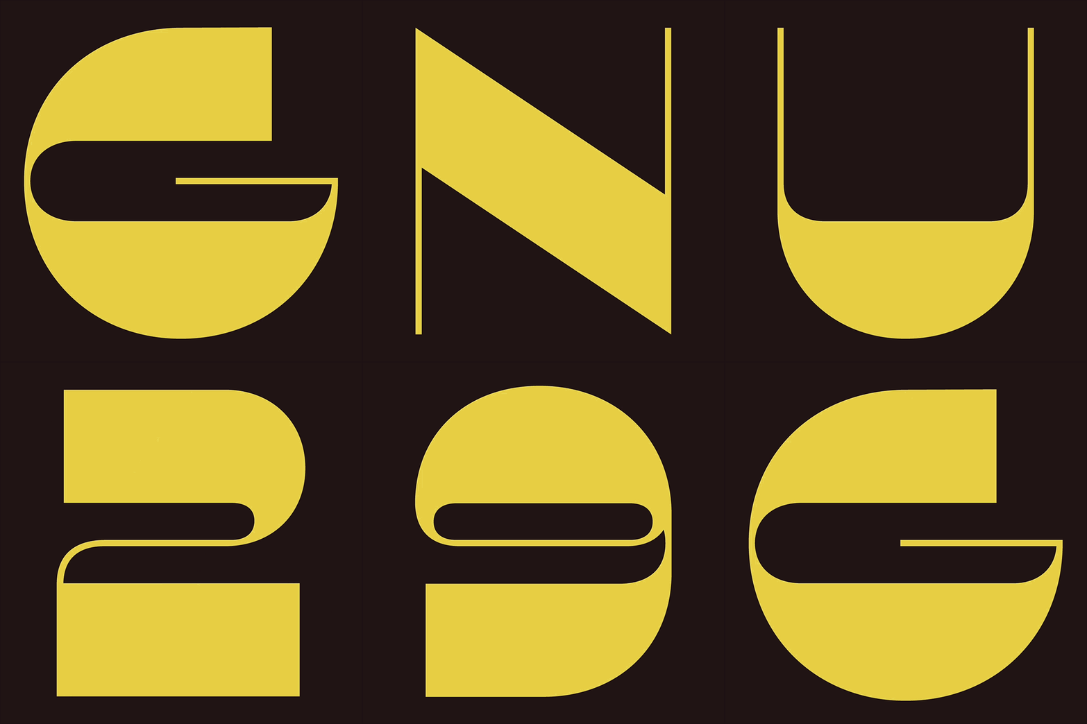
Monkey Type: Albert Display
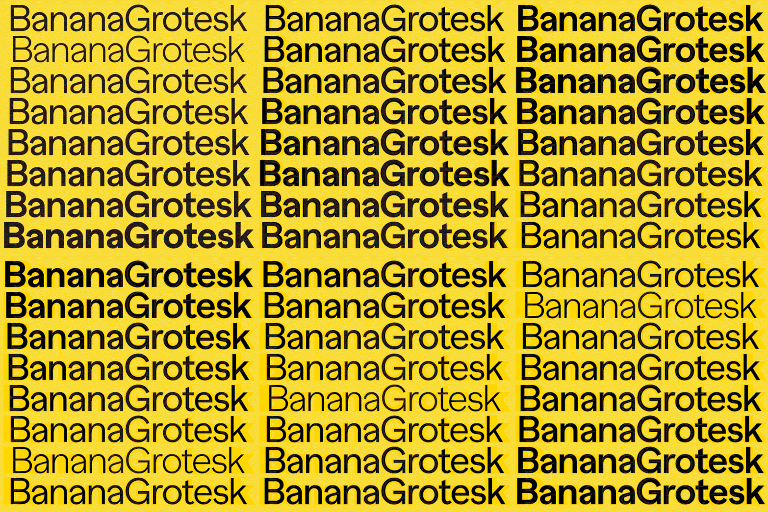
Monkey Type: Banana Grotesk
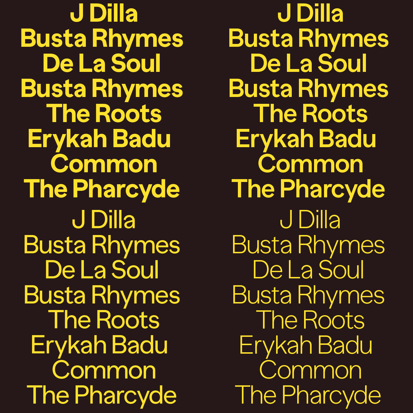
Monkey Type: Banana Grotesk
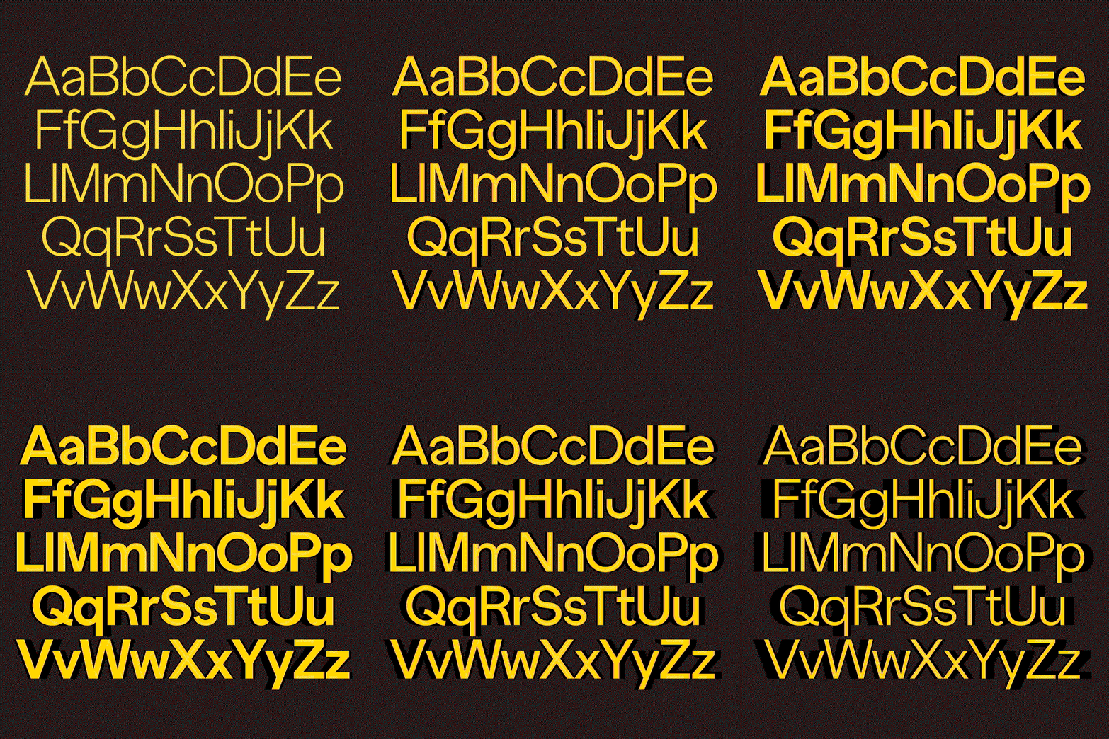
Monkey Type: Banana Grotesk
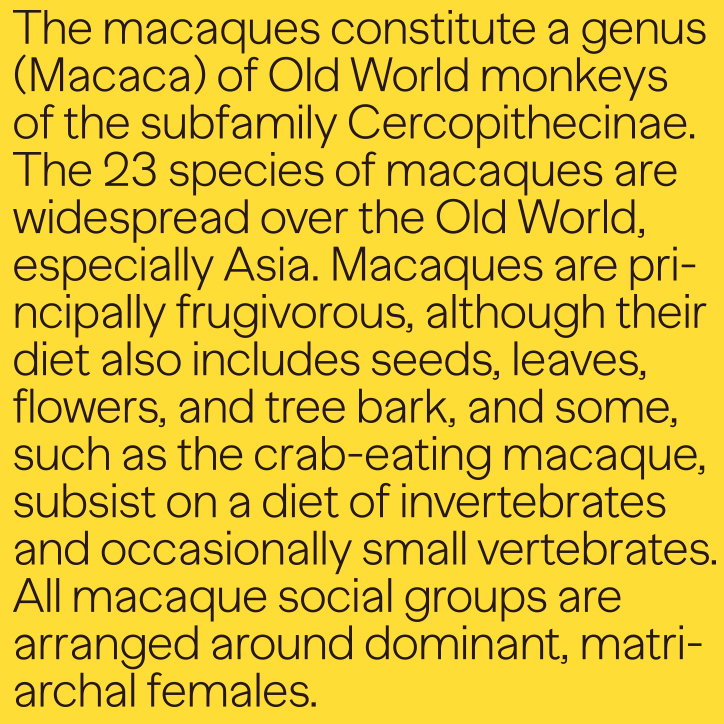
Monkey Type: Banana Grotesk
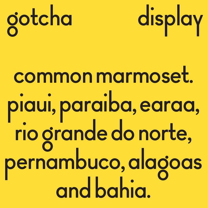
Monkey Type: Gotcha
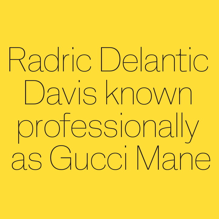
Monkey Type: Macaque
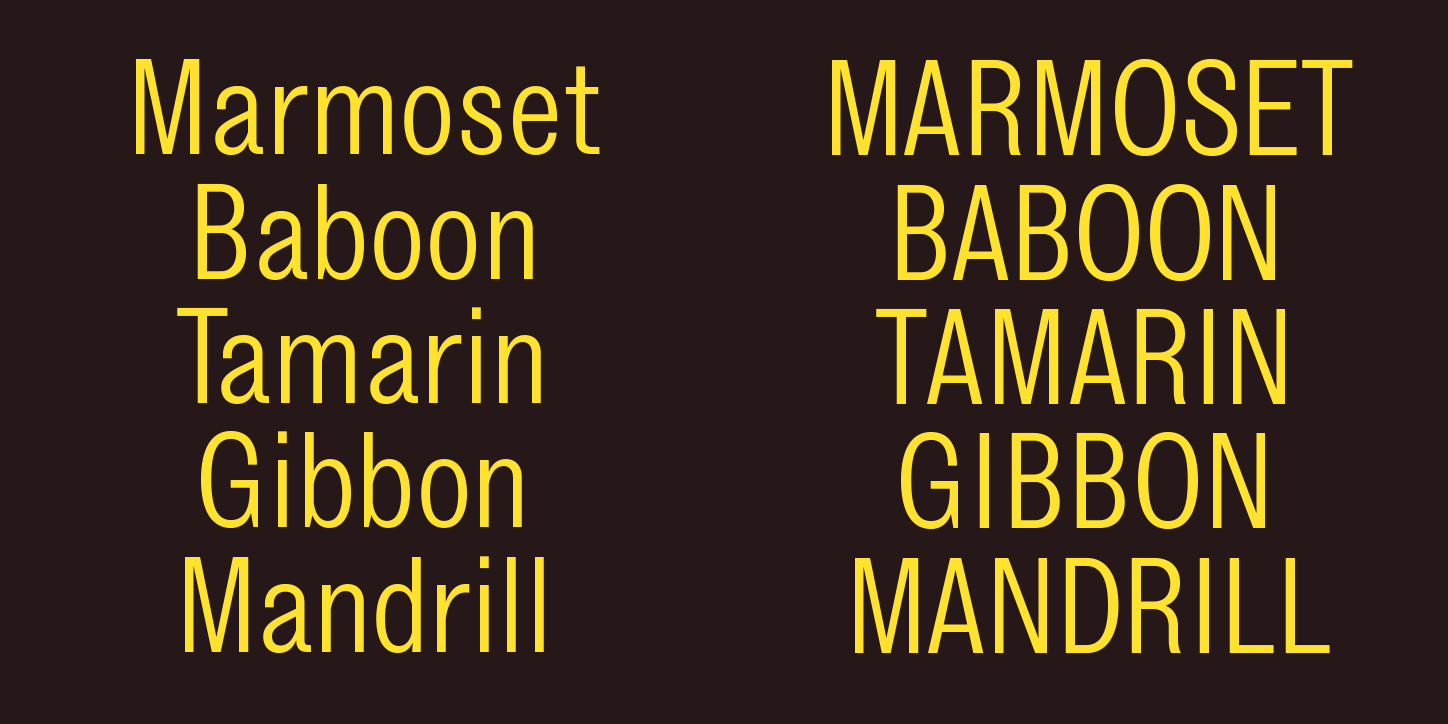
Monkey Type: Mandrill
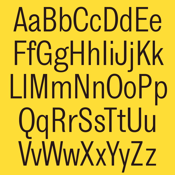
Monkey Type: Mandrill
Share Article
Further Info
About the Author
—
Lucy (she/her) was part of the It’s Nice That team from 2016–2025, first joining as a staff writer after graduating from Chelsea College of Art with a degree in Graphic Design Communication, eventually becoming a senior editor on our editorial team, and most recently at Insights, a research-driven department with It’s Nice That.



