One of the first things you notice when looking across Ming Hsun Yu’s work is colour; a great example being an identity for the 24th Biennale of Sydney (created while part of the Wkshps team, under the creative direction of Chris Wu). Here, the New York City-based designer used gradients and endless circular devices – circles as borders, typography and animations – to respond to the theme Ten Thousand Suns, which acknowledges the “multiplicity of perspectives, cosmologies and ways of life that have always woven together the world under the sun”. Perhaps the most memorable part of the visual identity though, even more than this circular device, was the searing colour, a theme which crops up often throughout Ming’s practice.
Outside of their design work, they work with colour markers, charcoal and oil paint in their art practice. In these works, Ming uses: “vivid colours [to] convey the intense emotions of living with severe eczema and East-Asian queerness,” they say. Their paintings and drawings often combine elements of graphic design, showing how the two practices overlap for Ming – it’s perhaps no surprise that graphic-driven names like Bruce Nauman, Elizabeth Murray and Bráulio Amado are major influences.
Meanwhile, Ming’s graphic design portfolio is just as broad. They create everything from visual identities, motion graphics, websites, publications to posters and other printed matter. “I explore human experience, metaphors and questions through graphic methods,” they say, “seeking possibilities within structures, fluidity between dualities, and constant joy.” Another stand-out recent project is the design for Gold Art Prize 2023 Catalogue (also created while at Wkshps), which combines multiple visual elements, from the old (Kintsugi aesthetics) to the new (pixels), to create wonderful contradictions.
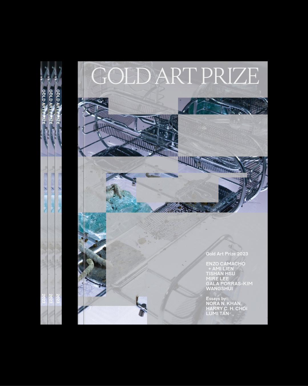
Gold Art Prize 2023 Catalogue (Copyright © Gold Art Prize. Designed by Wkshps / Ming Hsun Yu, 2023)
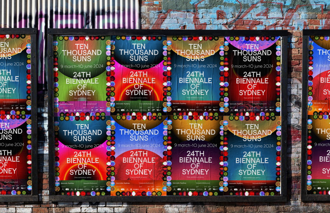
A concept rendering for Ten Thousand Suns, 24th Biennale of Sydney (Copyright © 24th Biennale of Sydney. Designed by Wkshps / Ming Hsun Yu, 2024)
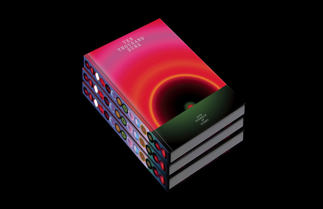
Catalogue for Ten Thousand Suns, 24th Biennale of Sydney (Copyright © 24th Biennale of Sydney. Designed by Wkshps / Ming Hsun Yu, 2024)
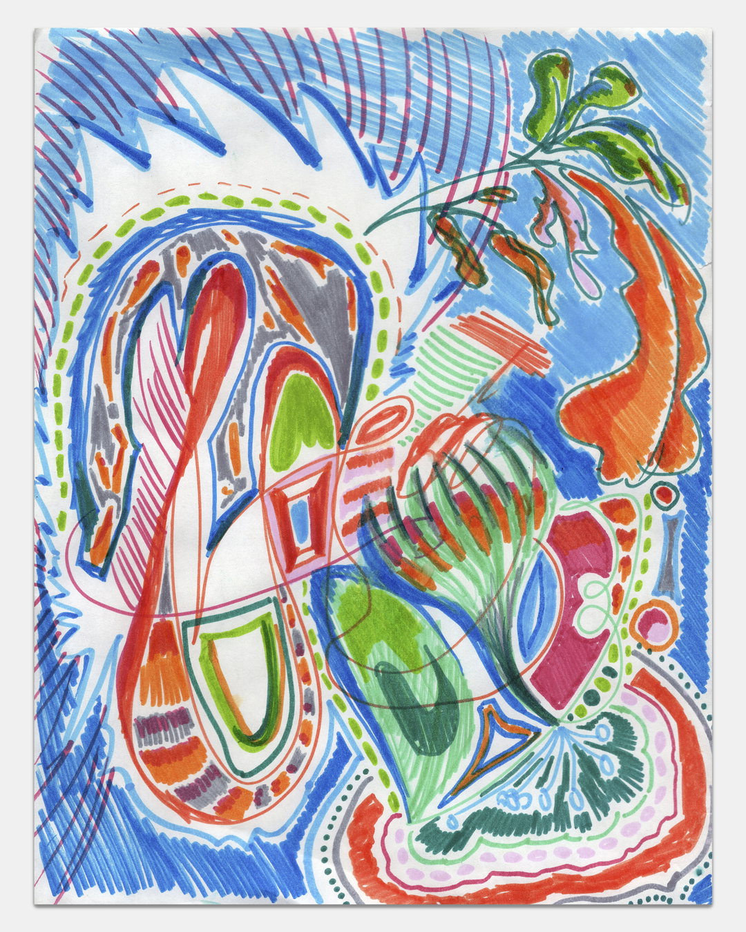
Ming Hsun Yu: Why Not? (Copyright © Ming Hsun Yu, 2022)
Ming Hsun Yu: Echo? (Copyright © Ming Hsun Yu, 2023)
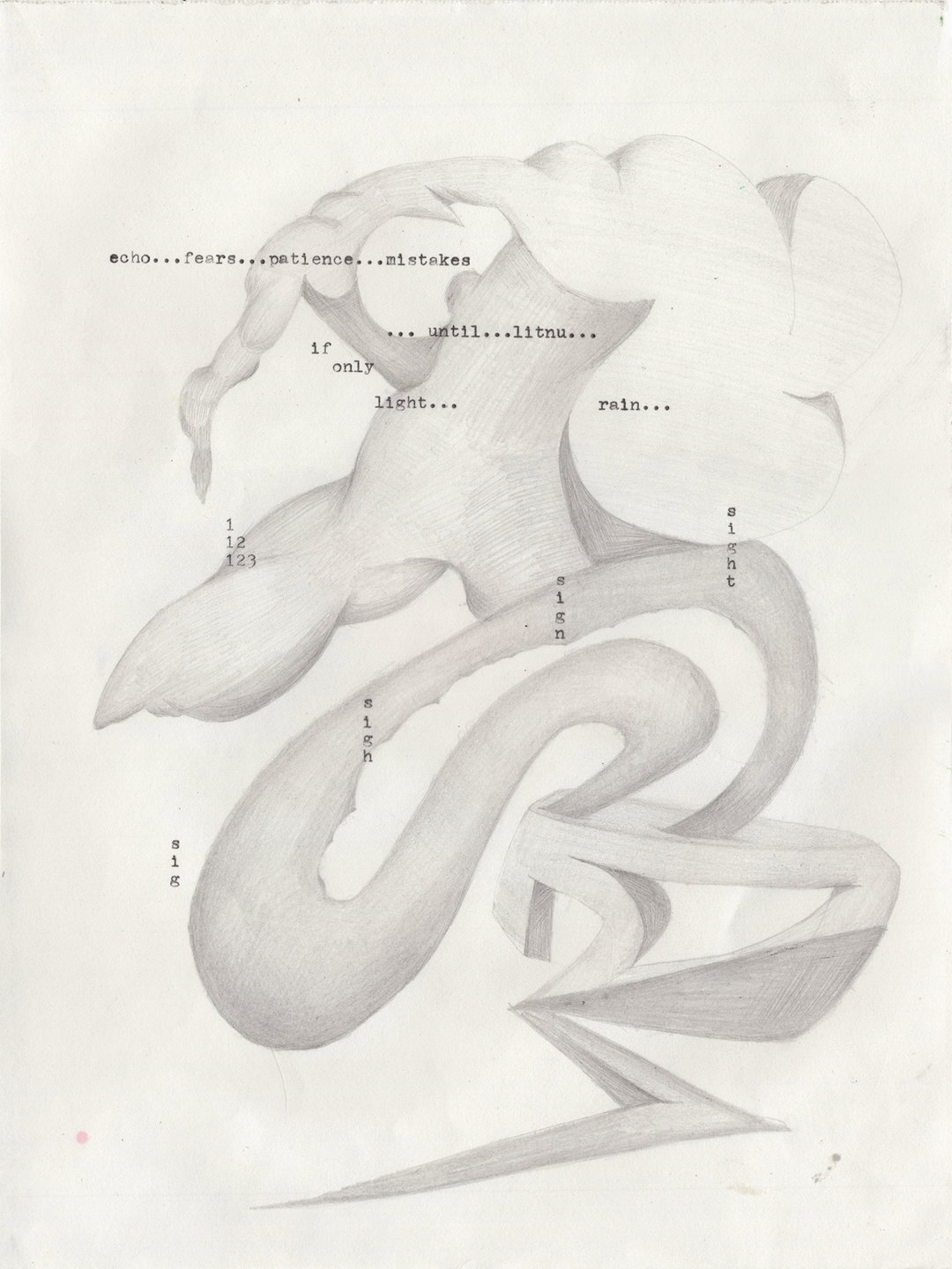
Ming Hsun Yu: Echo? (Copyright © Ming Hsun Yu, 2023)
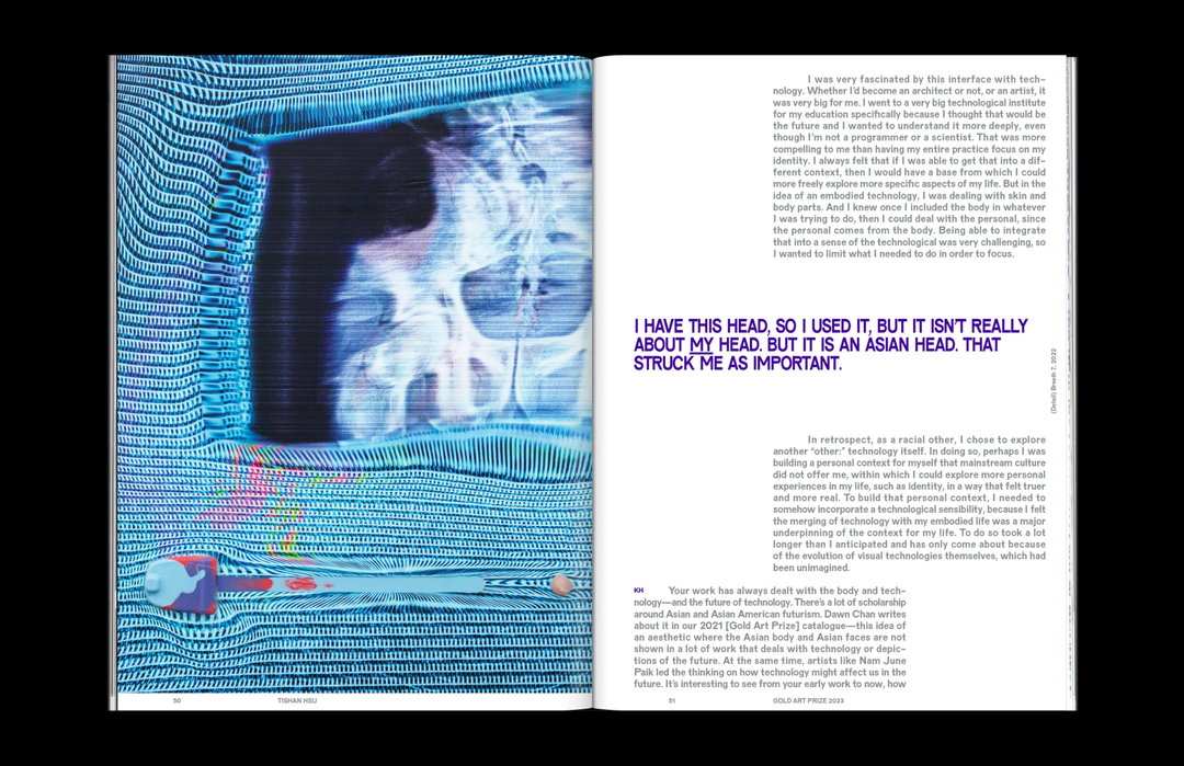
Gold Art Prize 2023 Catalogue (Copyright © Gold Art Prize. Designed by Wkshps / Ming Hsun Yu, 2023)
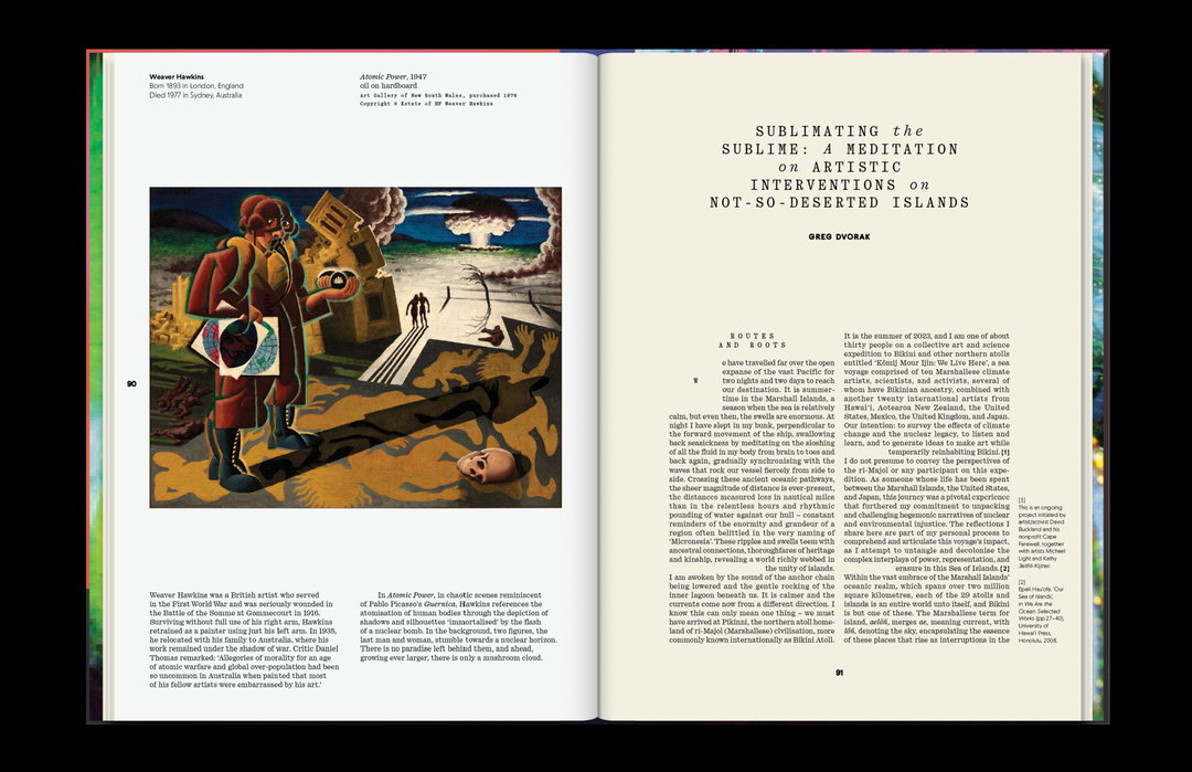
Gold Art Prize 2023 Catalogue (Copyright © Gold Art Prize. Designed by Wkshps / Ming Hsun Yu, 2023)
Gold Art Prize 2023 Catalogue (Copyright © Gold Art Prize. Designed by Wkshps / Ming Hsun Yu, 2023)
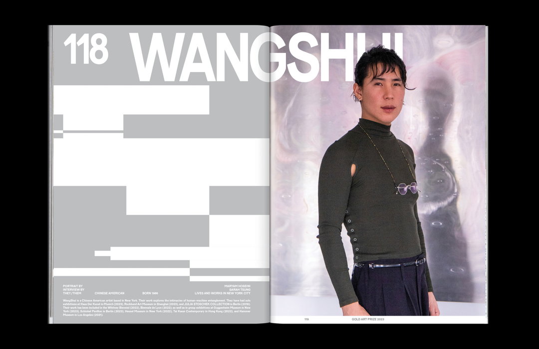
Gold Art Prize 2023 Catalogue (Copyright © Gold Art Prize. Designed by Wkshps / Ming Hsun Yu, 2023)
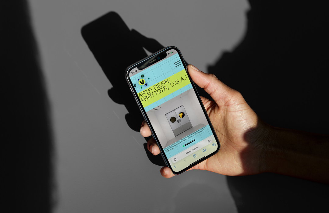
The Vega Foundation: website design by Wkshps, visual identity by M/M Paris (Copyright © The Vega Foundation, 2024)
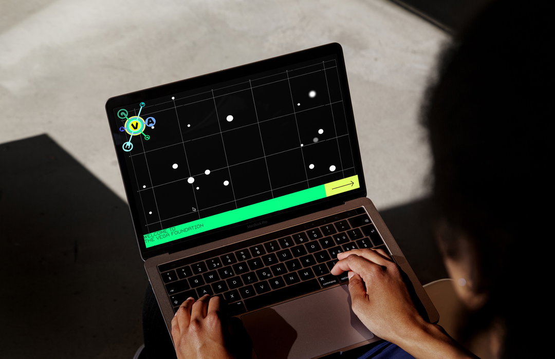
The Vega Foundation: website design by Wkshps, visual identity by M/M Paris (Copyright © The Vega Foundation, 2024)
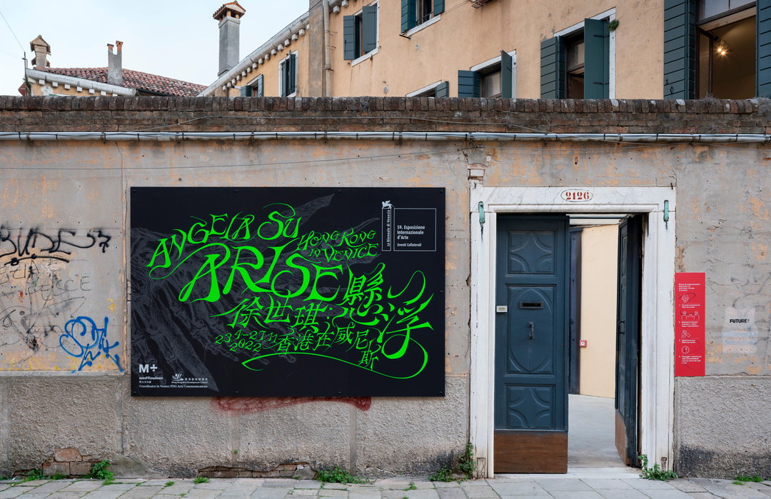
Visual identity for Angela Su: Arise, Hong Kong in Venice, 2022. Designed by Wkshps / Ming Hsun Yu. (Copyright @M+, Hong Kong) Photo by t-space studio, courtesy of M+, Hong Kong.
Hero Header
Copyright © Ming Hsun Yu
Share Article
Further Info
About the Author
—
Liz (she/they) is the senior editor at Insights, a research-driven department within It’s Nice That. They previously ran the news section of the website. Get in contact with them for potential Insights collaborations or to discuss Insights’ public-facing reports.