




Say hello to our 15th and final Grad of 2014! Graphic designer Michael Crook
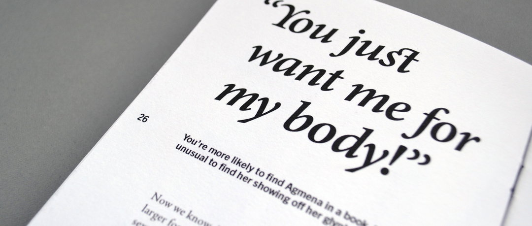
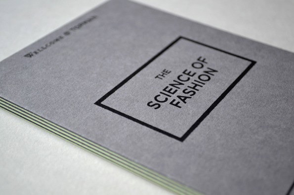
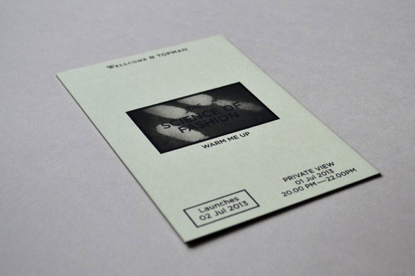
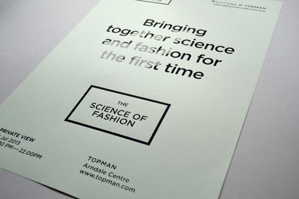
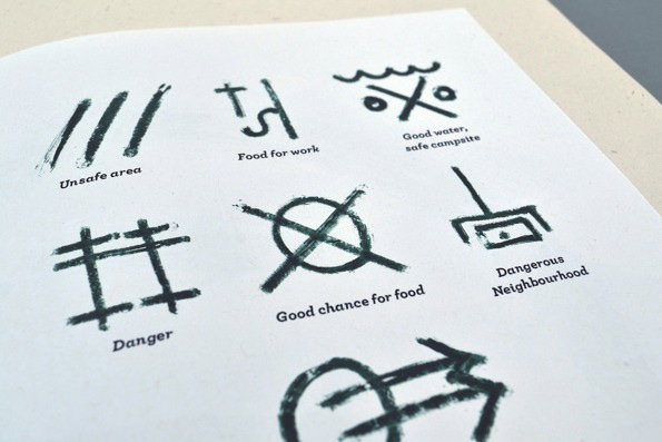
Graphic designer and Manchester School of Art student Michael Crook is the 15th and final of our Graduates of 2014, securing a spot up there with the best of ’em with his incredibly sharp and effortless-looking design. The projects he won us over with include an identity for an event called The Science of Fashion in which he used thermochronic ink to create a disappearing design, a book about American hobo culture and the secret written languages nomads use to communicate with one another, and an original take on book cover design, in which he made Ray Bradbury’s Fahrenheit 451 look like a book of matches ready for the striking. Read on to find out about his favourite project to date, and the perfume-soaked tab he’s hoping never to encounter again. Well done Michael!
Michael Crook: The Science of Fashion
Michael Crook: The Science of Fashion
Michael Crook: The Science of Fashion
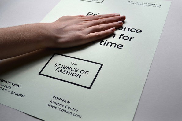
Michael Crook: The Science of Fashion
Why or who or what made you go to art school?
After choosing to study Biology, Chemistry and Graphic Design at A level, I soon came to realise that pursuing a career in the sciences was definitely not for me… Art school was the logical next step.
Tell us about your best project
My favourite project would probably be Vagrant, a publication I made about the American hobo. As part of my research, I found that transient workers once used their own visual language to communicate with one another. I would say it’s a shame that the culture is dying out, but it’s probably not such a bad thing when you think about it.
Tell us about your worst
My least favourite project was a university project we were given this year. We were handed a small tab of paper which had been soaked in cheap perfume, and then asked to “respond” to it. Here’s to hoping that I won’t be getting a brief like that again anytime soon.
If you could show one person your portfolio, who would it be and why?
The person who lands me a design job in a studio that inspires me.
What was the best moment of your three years at uni (extra curricular included)?
University is packed full of amazing experiences, it would be very difficult to pick just one. I’d have to say that today would be a pretty good contender though; finding out you have been chosen as one of this year’s It’s Nice That Graduates’, and that you will be graduating with a First Class Hons is a pretty good feeling!
A lot is changing – would you recommend art school to someone who is considering going?
Definitely. It’s a great time to explore and develop your own personal practice – the freedom you will experience at art school is invaluable. I wouldn’t like to be the one paying £9k a year though!
Finally, if your dreams come true, where will you be in a year’s time?
I’m in the process of moving down to London at the moment, if all goes well, in a year’s time I will be getting paid for doing what I love. I hope to have seen much more of the world, and maybe one day my work will help me
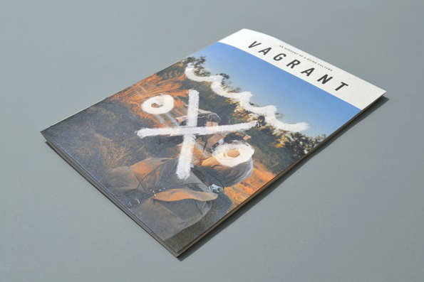
Michael Crook: Vagrant
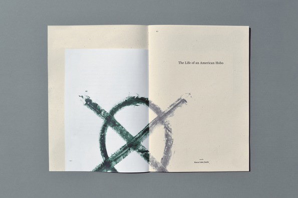
Michael Crook: Vagrant
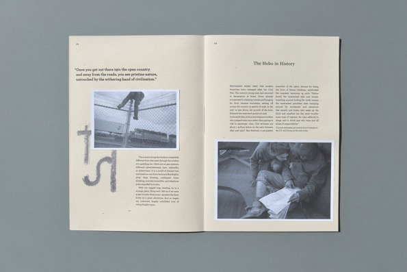
Michael Crook: Vagrant
Michael Crook: Vagrant

Michael Crook: Petrichor
Michael Crook: Konzept Gestaltung
Michael Crook: Konzept Gestaltung
Michael Crook: Konzept Gestaltung
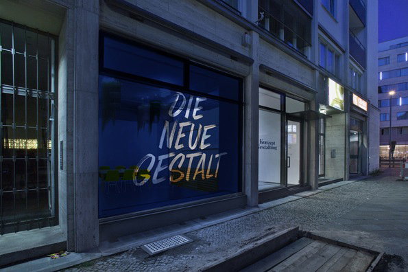
Michael Crook: Konzept Gestaltung
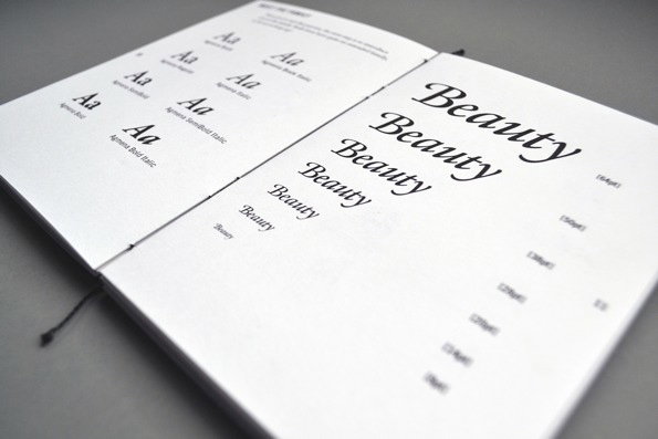
Michael Crook: ISTD
Michael Crook: ISTD
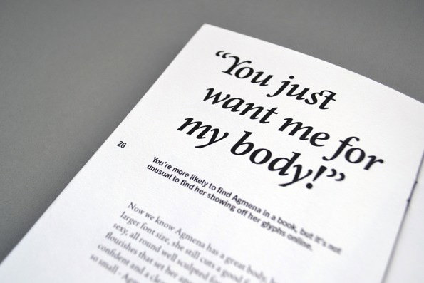
Michael Crook: ISTD
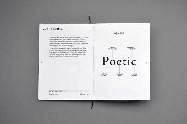
Michael Crook: ISTD
Supported by Represent
We are very pleased that The It’s Nice That Graduates 2014 will once again be supported by Represent Recruitment. The graphic design recruitment specialists have developed a peerless reputation working with designers of all levels and matching them up with the right positions in some of the top agencies around. Represent’s support has helped us grow the Graduate scheme over recent years and we are thrilled they have partnered with us again in 2014.
Share Article
Further Info
About the Author
—
Maisie joined It’s Nice That fresh out of university in the summer of 2013 as an intern before joining full time as an Assistant Editor. Maisie left It’s Nice That in July 2015.


