




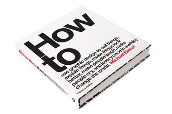
A look at Michael Bierut's defining designs as new book announced
Michael Bierut is a designer, Pentagram partner, writer, lecturer and self-confessed nerd. Taking the stage at the Design Indaba festival in Cape Town yesterday, he announced his new book, pithily titled How to: Use graphic design to sell things, explain things, make things look better, and (every once in a while) change the world. Published by Thames & Hudson it won’t come out until later in the year, but we felt it was a good excuse to look at some of Michael’s most interesting work from across the years.
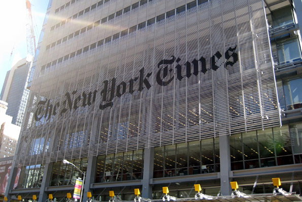
Michael Bierut: New York Times frontage
Like his friend and mentor Massimo Vignelli, Michael has excelled in designing for some of New York’s most venerable institutions (including Grand Central Station and the New York Jets). They don’t come much more venerable than The Times for whom Michael worked on graphics across the building. On one end of the spectrum is the huge The New York Times signage on the front of the offices which is designed to look solid but allows those inside to see out. At the other, Michael and his team rebranded all the meeting room signs using images sourced from the Times archive.
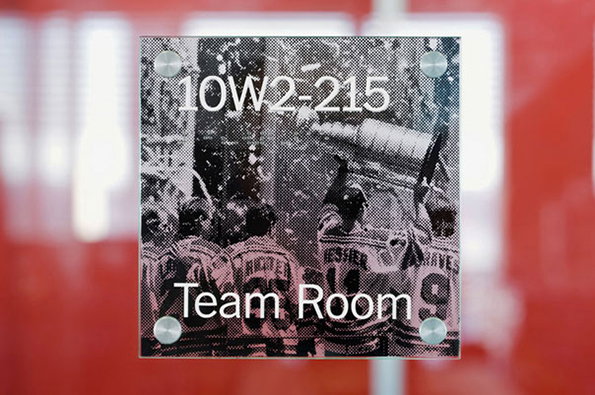
Michael Bierut: Internal New York Times signage
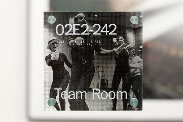
Michael Bierut: Internal New York Times signage
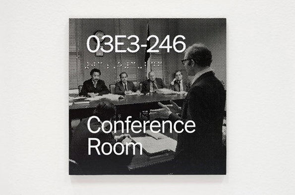
Michael Bierut: Internal New York Times signage
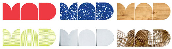
Michael Bierut: Museum of Arts and Design MAD typefaces
Michael is one of the very best at putting into words both the joys and challenges graphic designers face. He talks about the identity for MAD with characteristic self-deprecation, and happily showed the Indaba crowd some, er, less successful early iterations. In the end the solution was all built around a simple block typeface which could be rolled out across various collateral and change according to context, while retaining its innate communicative sense.

Michael Bierut: Museum of Arts and Design MAD blocks
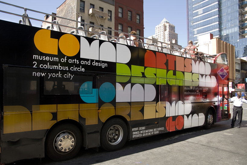
Michael Bierut: Museum of Arts and Design bus signage
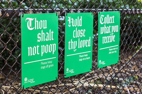
Michael Bierut: Cathedral Church of St John the Divine signage
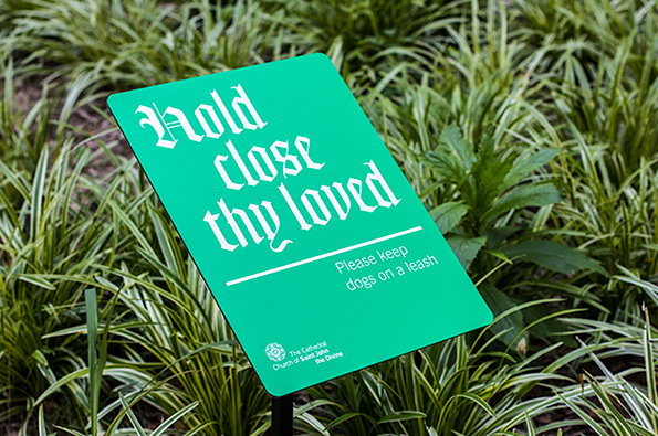
Michael Bierut: Cathedral Church of St John the Divine signage
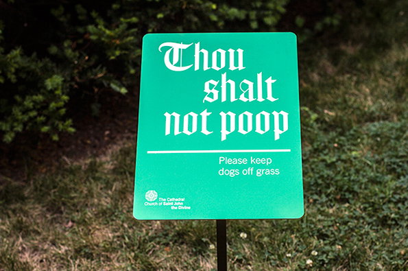
Michael Bierut: Cathedral Church of St John the Divine signage
Church signage may not sound like the sexiest design commission going, but Michael’s work for the Cathedral Church of St John The Divine bucked the trend. He led an extensive branding project for the church across both print and digital platforms with an identifier which referenced the cathedral’s stained glass windows and a new version of Frederic Goudy‘s black-letter text from 1928, which he had based on Gutenberg’s 42-line Bible. These signs were produced for the annual St Francis Day blessing of the animals, encouraging god-fearing dog-lovers to keep their pets under control.
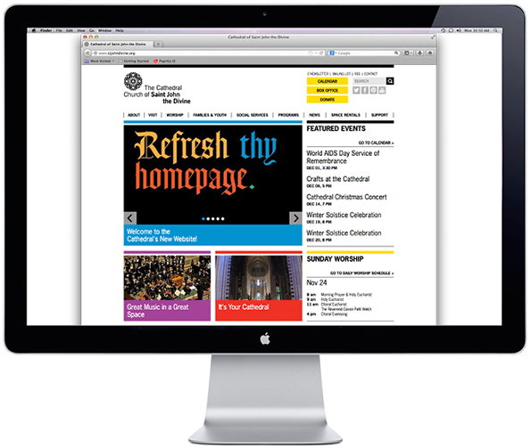
Michael Bierut: Cathedral Church of St John the Divine website
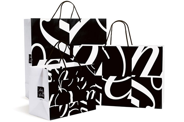
Michael Bierut: Saks Fifth Avenue bags
From one revered place of New York worship to another, Michael’s work for Saks Fifth Avenue was centred on a redrawing of the cursive logo with type designer Joe Finocchiaro and then splitting it into 64 tiles. By shuffling and rotating the tiles there were millions of combinations the designers could then draw on, and each individual image retained both aesthetic interest and communicative cohesion.

Michael Bierut: Saks Fifth Avenue logo study

Michael Bierut: Saks Fifth Avenue logo study
As well as being one of the world’s leading designers, Michael writes brilliantly about graphic design. Graphic Design Criticism As Spectator Sport is a lucid demolition of the feeding frenzies we see play out whenever a new logo seems to be launched.
“The basic starting point of Graphic Design Criticism as a Spectator Sport is ‘I could have done better.’ And of course you could! But simply having the idea is not enough. Crafting a beautiful solution is not enough. Doing a dramatic presentation is not enough. Convincing all your peers is not enough. Even if you’ve done all that, you still have to go through the hard work of selling it to the client. And like any business situation of any complexity whatsoever, that process may be smothered in politics, handicapped with exigencies, and beset with factors that have nothing to do with design excellence. You know, real life… Maybe it’s time to stop shouting from the sidelines and actually get back on the field.”
Share Article
Further Info
About the Author
—
Rob Alderson is a freelance writer, editor and strategist. He was previously editor-in-chief of It’s Nice That and WePresent, and editor of Design Week. He publishes the newsletter Undo, which tries to make sense of how AI is changing design work, the design process and the design industry.



