Launch Recite Me assistive technology
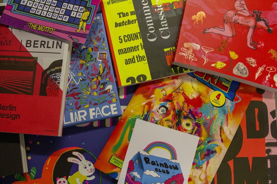
A collection of colourful books and prints are scattered across a surface. Legible titles include “Berlin”, “Liar Face” and “Rainbow Club”.

An alternate look at LA, a feud about ice cream and a hoodie to draw on: Here’s March’s Things

Many of this month’s entries provide respite from the real world, and let’s be honest, we need it!

—
Date
5 March 2020

Share

Spring is on its way! That momentous time where the birds sing, the trees blossom, and everything seems perfect (in cartoon depictions anyway) officially arrives on 20 March 20. To see us through until then we have copious amounts of reading to do. From graphic novels to historical accounts of West Berlin design, all the boxes have been ticked. Thanks to you we are well on our way to becoming polymaths, or at least to being able to answer more than one question on University Challenge.

If you would like to help our quest for knowledge and contribute to next month’s Things, please send your designs to this address.
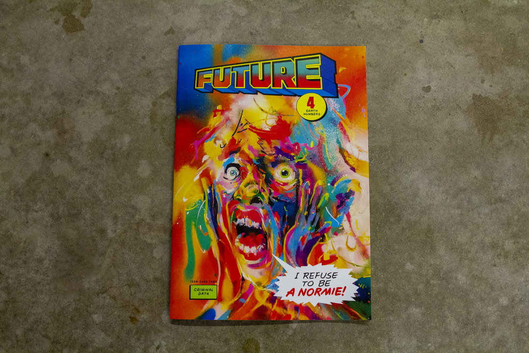
The cover of a magazine titled “Future” features a colourful, distorted illustration of a screaming face. A yellow circle in the top right corner contains the number “4” and the words “Earth Numbers”. In the bottom right, a speech bubble reads “I refuse to be a normie!”.
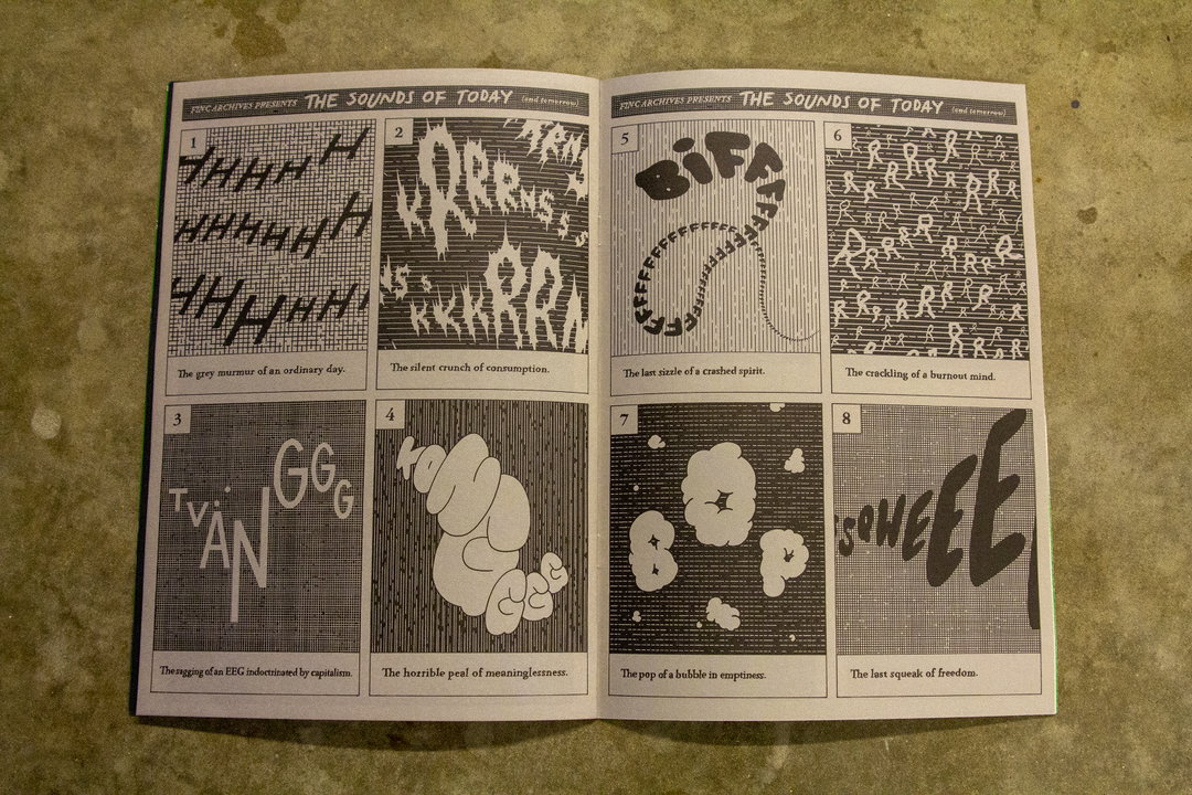
An open zine titled “The Sounds of Today (and tomorrow)” features eight numbered panels of black and white abstract illustrations. Each panel pairs a visual representation of a sound with a caption, such as “The grey murmur of an ordinary day” and “The last squeak of freedom.”
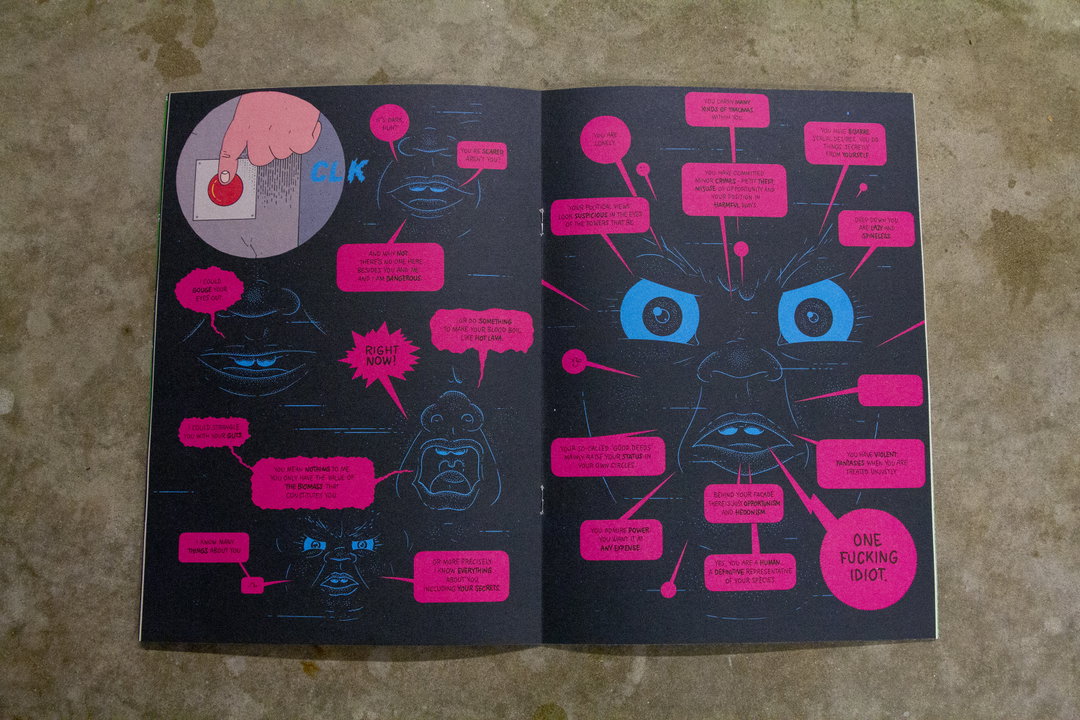
An illustration across two pages featuring a dark, surreal figure with glowing blue eyes and mouth. The figure is surrounded by numerous pink speech bubbles containing critical text, including the phrase “ONE FUCKING IDIOT.” In the top left, a hand presses a red button.

Future #4: Tommi Musturi

Issue number four of Future zine continues the dystopian focus from previous issues, pondering what life could be like in years to come. It answers some of the hard-hitting issues, like what will be going on inside plastic bags in thousands of years time, and the unexpected chain of events that follow a man throwing an apple out of the window.
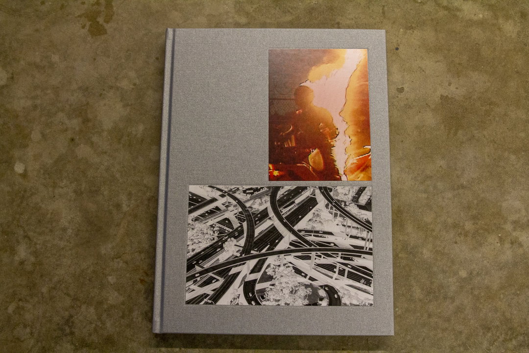
A grey cloth-bound book lies flat on a concrete floor. The cover features two images: a warm-toned, abstract portrait at the top and a black and white photograph of intersecting railway tracks below.
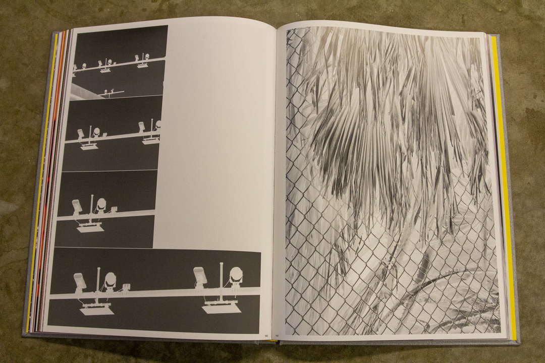
An open book shows two black and white photographs. The left page features a vertical series of four frames showing security cameras on a ledge, while the right page shows palm fronds behind a chain-link fence.
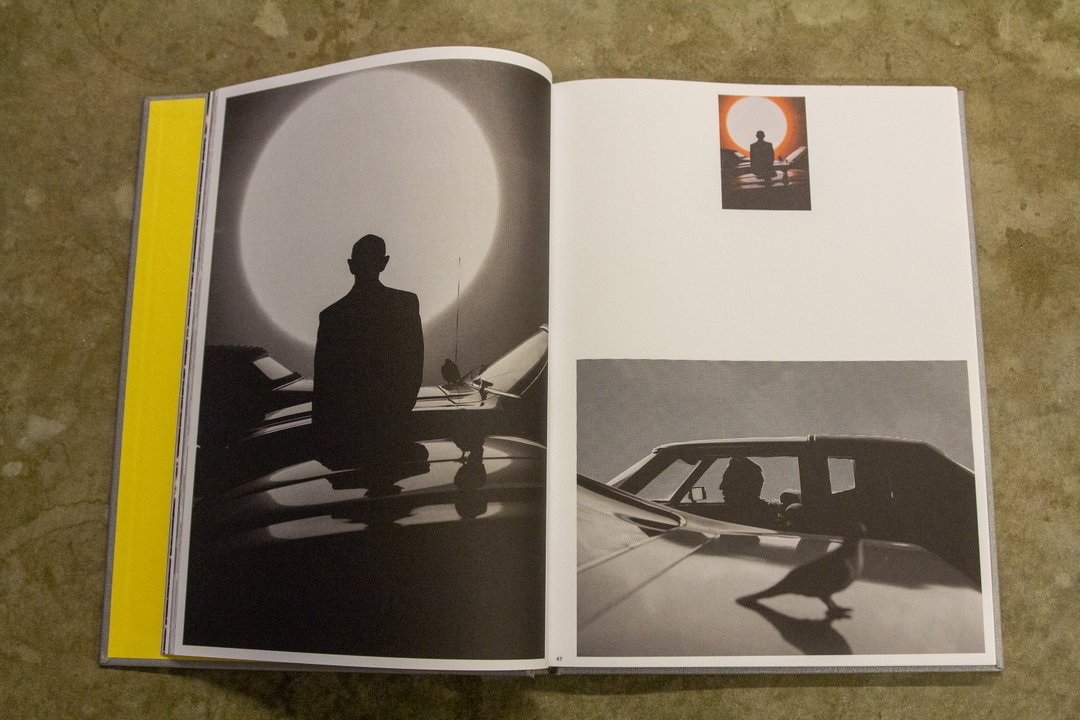
An open book displays three photographs of a person in silhouette. On the left, the figure stands before a massive, glowing white circle. On the right, a smaller image shows the person against a red sun, while a larger photo shows them inside a car with a pigeon perched on the bonnet.

David Black: The Days Change at Night

David Black’s latest book tells a story of Los Angeles, but not the usual one of glitz and glamour. A follow up to Cerro Gordo, it looks at the many contradictions present in LA from the viewpoint of a passenger in a fast-moving car. Literature has informed the book heavily, with a Bret Easton Ellis quote in the synopsis and Ray Bradbury cited as an inspiration.
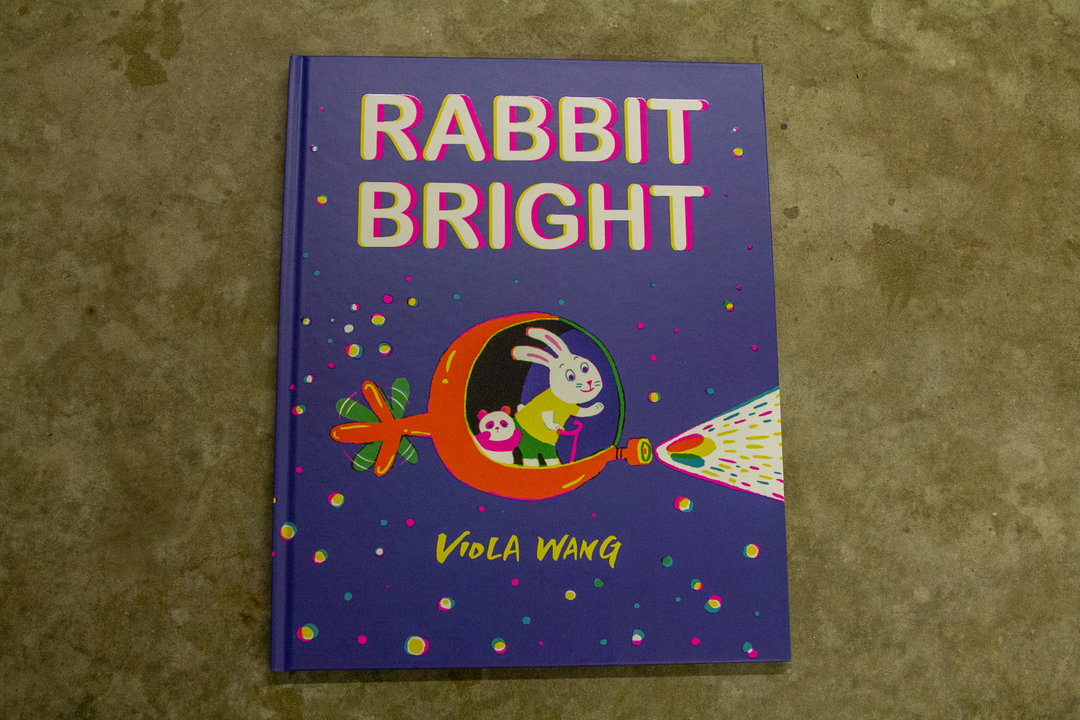
The cover of a children’s book titled “Rabbit Bright” by Viola Wang. An illustration shows a white rabbit and a small panda inside a red, key-shaped spaceship that beams a rainbow of light.
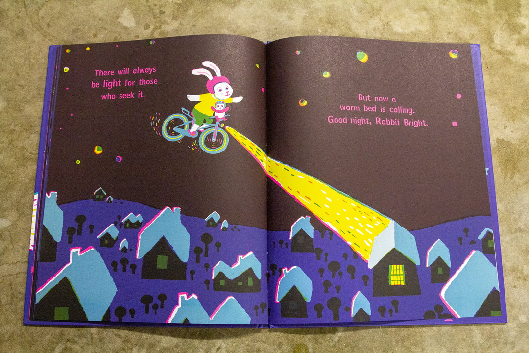
An illustration from a children's book shows a rabbit on a bicycle, trailing a beam of yellow light. The light shines down onto a small house in a purple village of stylised buildings. Text on the left reads “There will always be light for those who seek it.” On the right, it reads “But now a warm bed is calling. Good night, Rabbit Bright.”
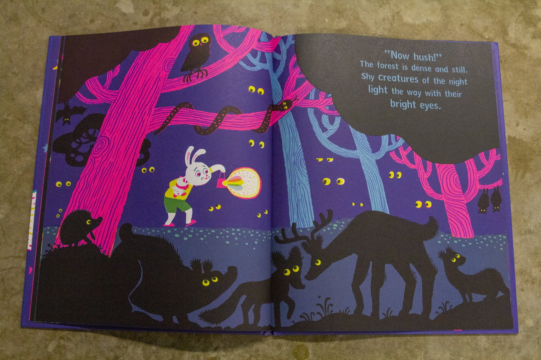
An illustration from a children's book showing a small white rabbit holding a glowing lantern in a dark purple forest. Silhouetted animals with bright yellow eyes watch from the shadows. The facing page contains the text: “Now hush!” The forest is dense and still. Shy Creatures of the night light the way with their bright eyes.

Viola Wang: Rabbit Bright

Fluorescent colours feature heavily across this children’s book that tells a brave tale. Written and illustrated by London-based Viola Wang, the book utilises rhyme to tell the story of a rabbit that must find light in dark places. The way things seem to be going, it’s probably a life lesson we could all use right now!
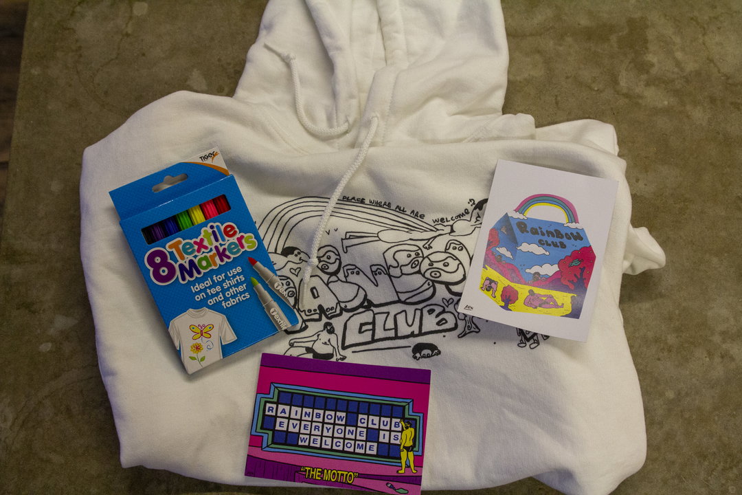
A white hoodie is laid flat with a pack of “Textile Markers” and two cards resting on top. The hoodie features a black line illustration of a crowd of figures and the word “CLUB”. One card shows a colourful cake under a rainbow, while the other reads “RAINBOW CLUB EVERYONE IS WELCOME”.
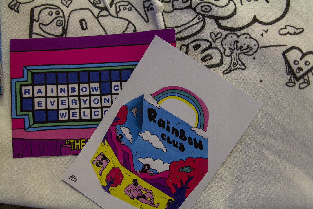
An illustration of a small, 3D pop-up card featuring a colourful landscape with the words “Rainbow Club” under a rainbow. Beside it lies a purple card with a digital display reading “Rainbow Club Everyone Welcome”.
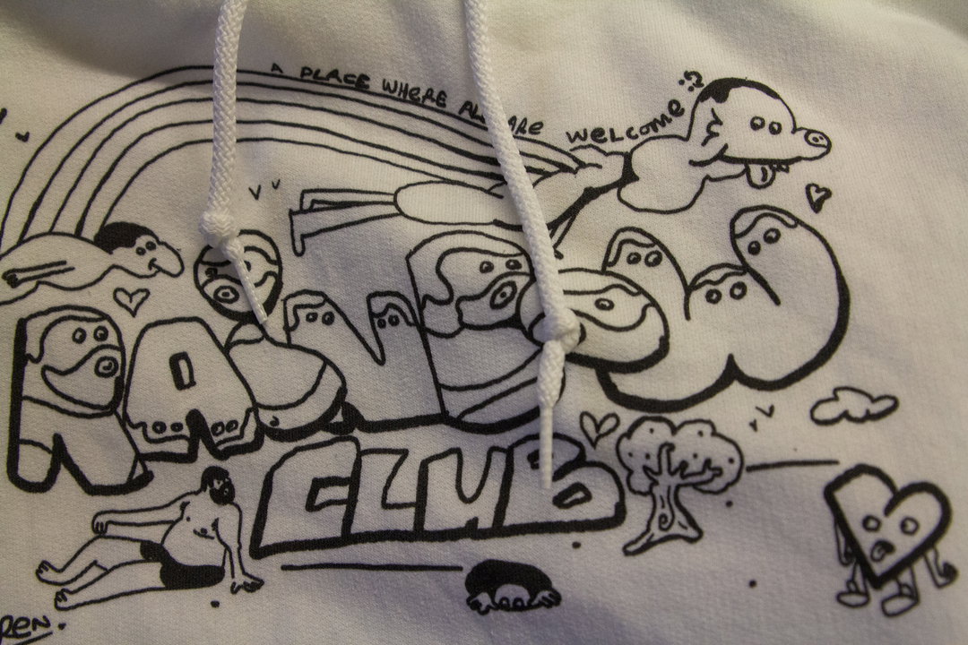
A black and white illustration on a white hoodie features bubbly, character-like letters that spell “RAW CLUB”. Above the text, a curved line reads “A PLACE WHERE ALL ARE WELCOME”.

Ren and Everpress: Rainbow Club

Artist Ren has taken it upon himself to create Rainbow Club, an inclusive fictional club that encourages freedom of expression. He represents this across multiple media, including a hoodie in a recent partnership with Everpress. Continuing with the values of Rainbow Club it comes with textile markers to personalise it ourselves, and will be keeping us warm in style this Spring.
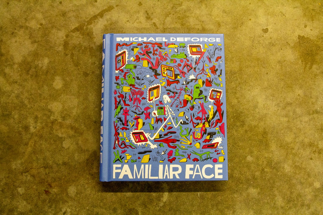
A blue book cover titled “Familiar Face” by Michael Deforge. The cover is filled with a dense, colourful illustration of abstract figures and shapes.
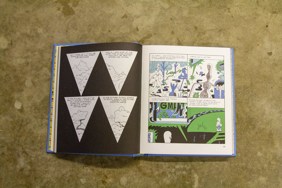
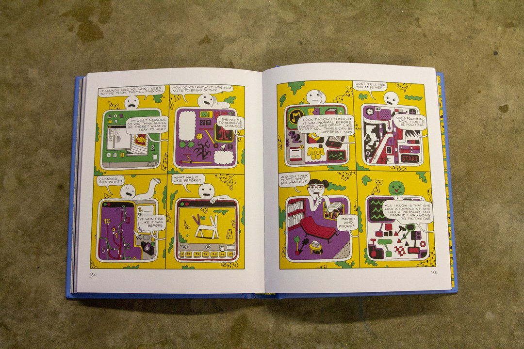
An open comic book showing two pages of a colourful graphic novel. The panels feature stylised figures in a bright yellow and purple setting, with dialogue bubbles and digital screens.
An open book shows a comic with surreal illustrations and text. The left page features white triangles on a black background, while the right page contains panels with abstract figures and a green creature.

Michael Deforge: Familiar Face

“In a thoroughly modernised, constantly updating society, where can true connection be found?”

That is the question asked in the blurb of this graphic novel by Canadian illustrator Michael Deforge, and it is one that the book’s story attempts to help you answer. Set in a dystopian future where everything has been optimised, it is an allegorical tale about the risks of living in an overly digital society.
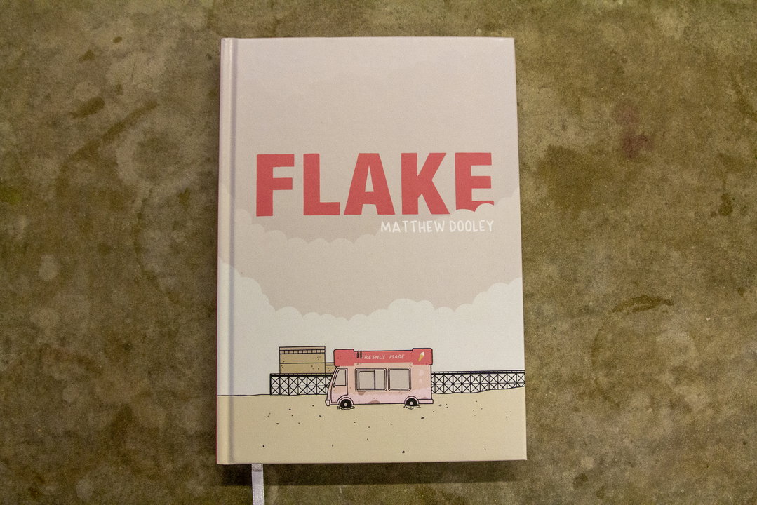
The cover of a book titled “Flake” by Matthew Dooley. An illustration at the bottom shows a small pink ice cream van parked in a desert landscape.
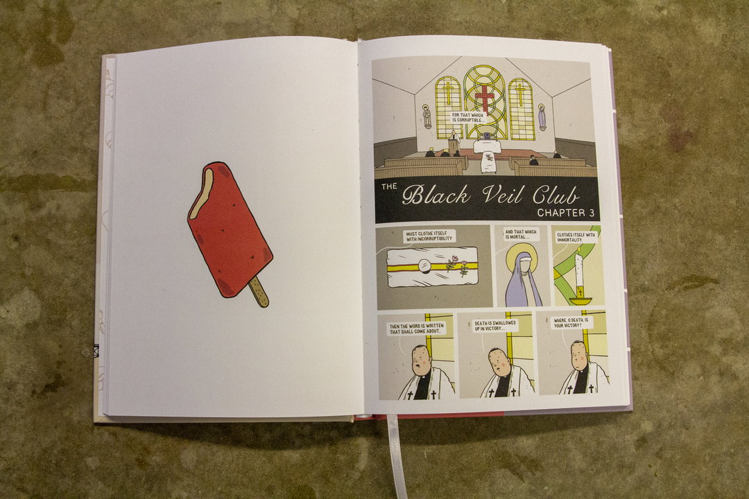
An open book shows a comic strip on the right page and a single illustration of a red popsicle on the left. The comic, titled “The Black Veil Club Chapter 3”, features a series of panels depicting a religious setting with a figure in a black robe.
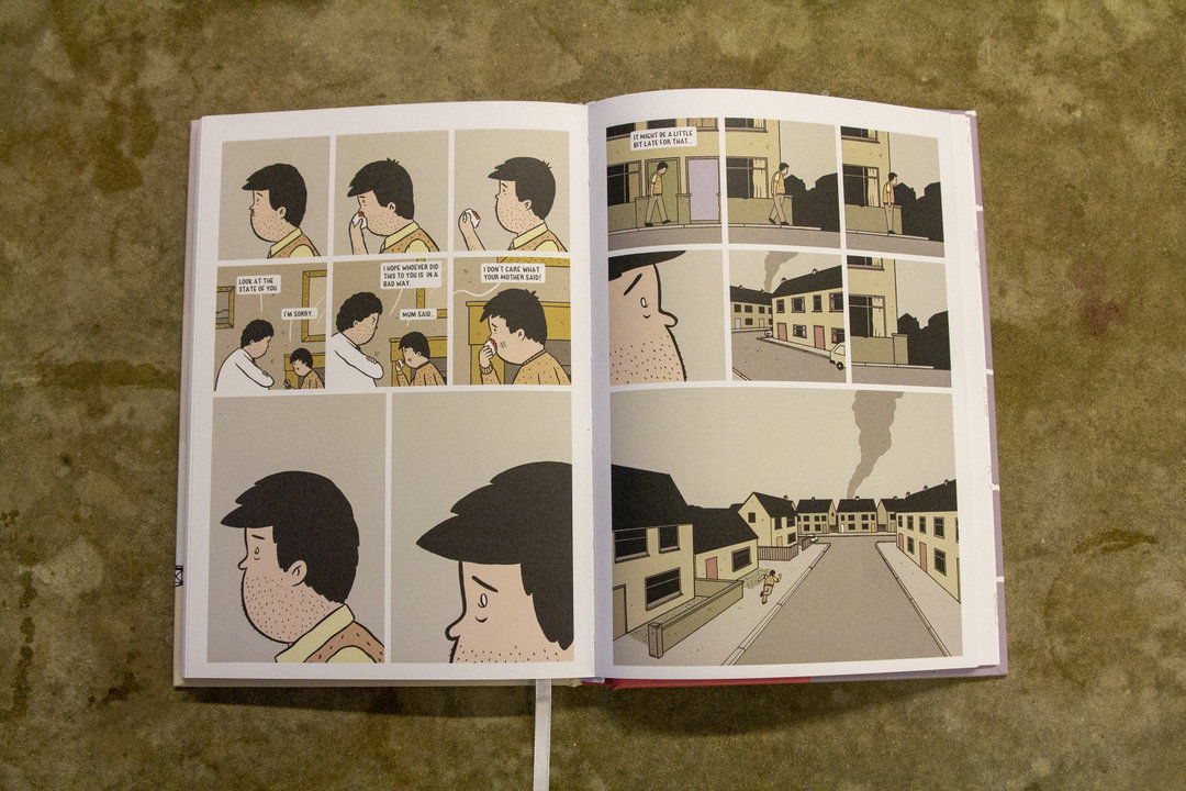
An open graphic novel showing a series of comic panels. The story follows a person in a yellow shirt having a conversation, with scenes of a quiet residential street and a plume of smoke rising in the distance.

Matthew Dooley: Flake

Ice Cream Wars was a notorious drug-related feud in Glasgow that saw rival gangs sell their goods out of Ice Cream Vans. Apart from involving ice cream vans, Flake has absolutely nothing to do with that…

Instead, this graphic novel tells the story of two (actual) ice cream sellers that are sworn enemies, innocent Howard and his nemesis Tony Augustus. Who comes out on top in this “story of fate, friendship and fighting back?”

You’ll have to read to find out!
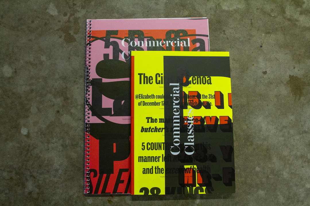
Two spiral-bound books lay on a concrete floor. The top book features a yellow and black cover with the words “Commercial Classics” printed vertically.
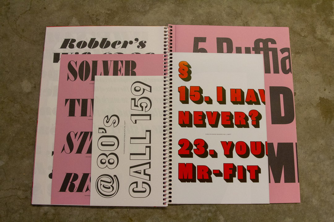
A spiral-bound book of typographic samples with pink and white pages. Bold, oversized text in various styles and colours includes the phrases “CALL 159”, “I HAVE NEVER?” and “YOU MR-FIT”.
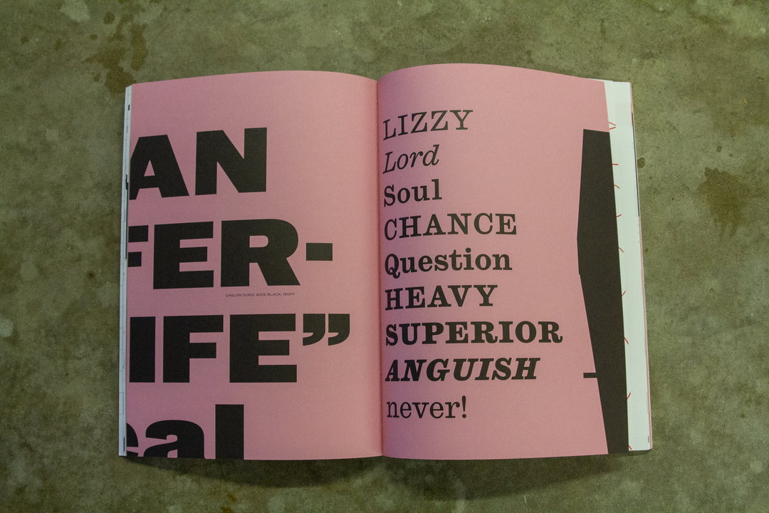
An open book with pink pages and bold black typography. The left page features large, cropped text reading “AN FER- IFE””, while the right page lists words including “LIZZY”, “Soul”, “CHANCE” and “ANGUISH”.

Commercial Classics

Filled to the brim with a number of fonts from the Commercial Classics bank, these two publications are bursting with typefaces of all shapes and sizes. From Isambard to Brunel (yes they are separate), it includes many of the fonts created by owners Paul Barnes and Christian Schwartz, as well as a range of staff and collaborators.
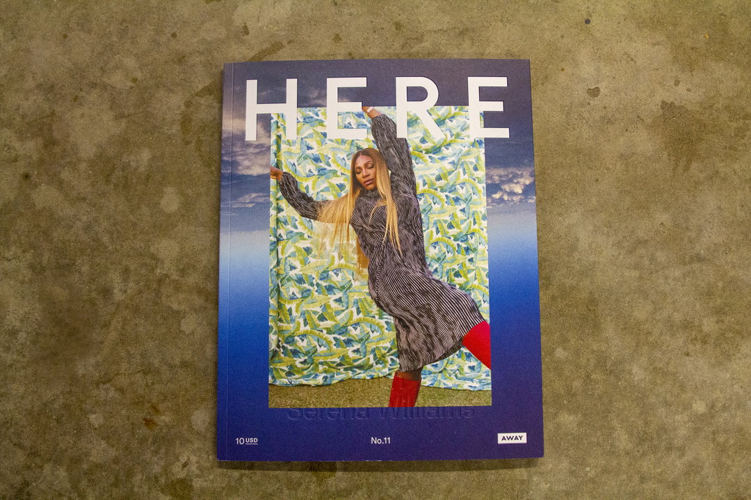
The cover of a magazine titled “HERE” features Serena Williams standing in front of a patterned blue and green fabric. She wears a striped dress and bright red boots.
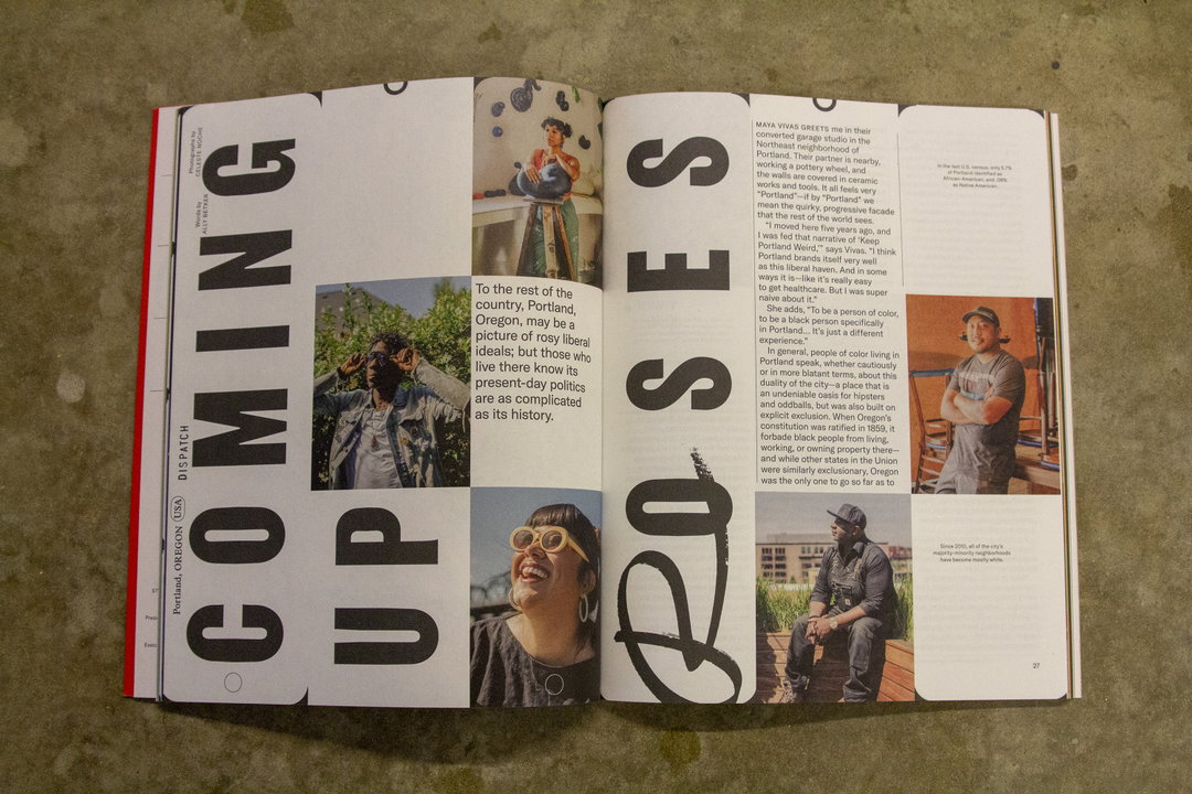
An open magazine spread featuring a bold typographic layout. Large, black vertical text reads “COMING UP ROSES”, framing a series of photographs of a person in a studio and a city street.
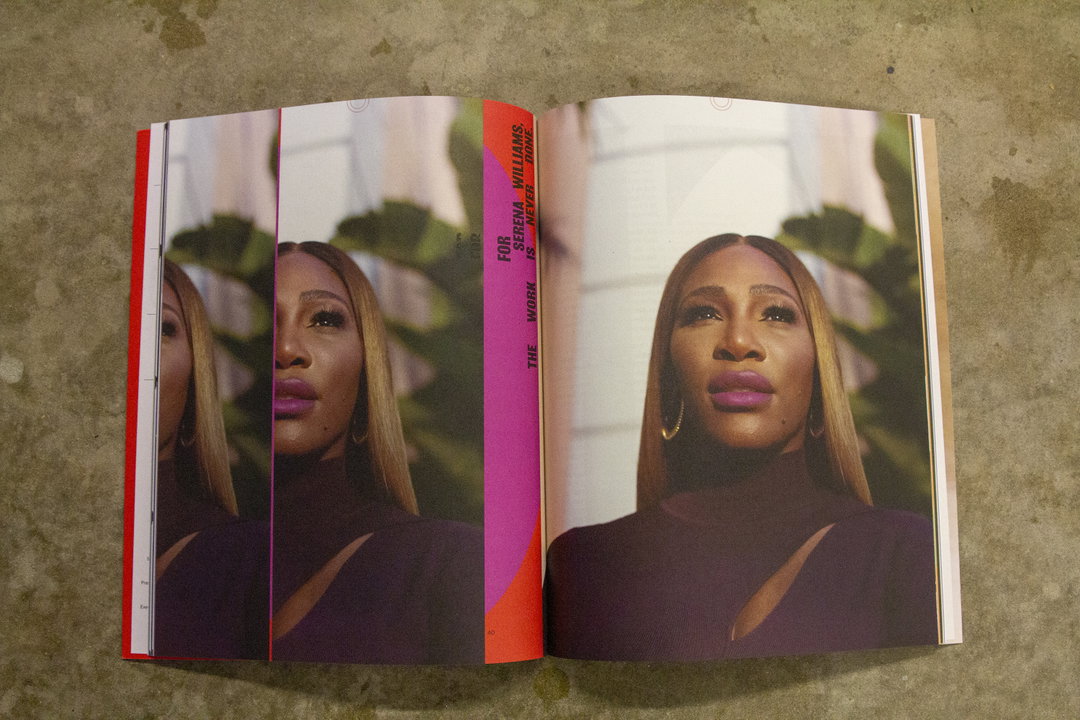
An open magazine shows a portrait of Serena Williams across a double page spread. A pink vertical strip in the centre reads “FOR THE WORK SERENA WILLIAMS IS NEVER DONE.”

Here Magazine

Issue 11 of travel magazine Here takes you on a whirlwind trip across the globe. Delving into creativity in Belfast, feminist bookshops in London, minority-owned businesses in Portland and the music scene in Cape Town. The cover features Serena Williams, and includes an extensive shoot and interview with the international tennis star.
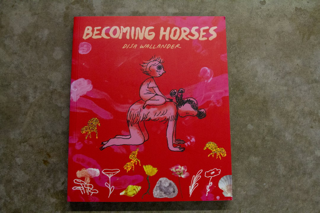
The cover of a book titled “Becoming Horses” by Disa Wallander. An illustration on a red background shows a small figure sitting on the back of a pink, four-legged creature, surrounded by gold glittery animals and simple floral drawings.
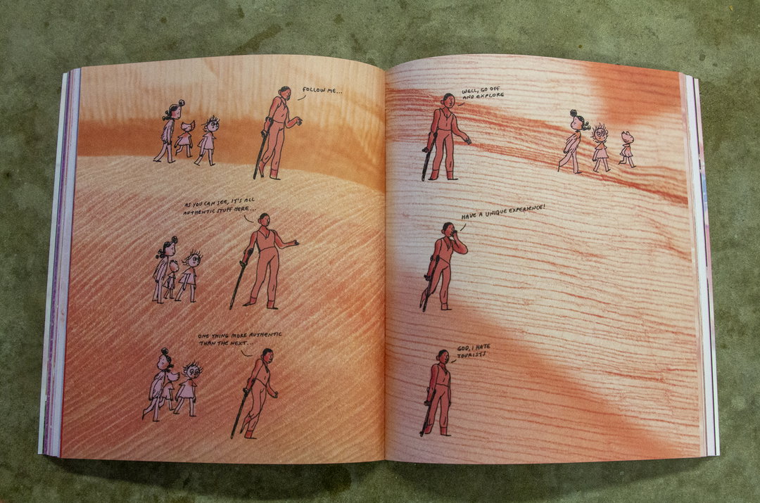
An illustration across two open book pages shows a sequence of six comic panels. A guide leads a group of three people through a desert landscape, using phrases like “Follow me...” and “It’s all authentic stuff here...”. In the final panel, the guide stands alone and says, “God, I hate tourists.”
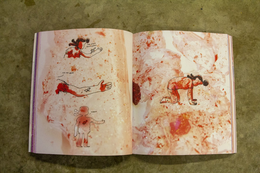
An open book featuring a series of red and white illustrations. The left page shows a figure’s arm and body with the handwritten words “the firm boundaries of my body” and “whoops!”. On the right, a figure is crouched on all fours against a splattered, abstract background.

Disa Wallander: Becoming Horses

If you are in need of something to cheer you up, then this book will do just that. It follows one child’s quest to find horses, leading them to meet all sorts of characters doing a whole host of things in this alternate universe. It’s illustrated in Disa’s signature style, combining drawing with scanned and photographed images that provide dreamy backgrounds and textures.
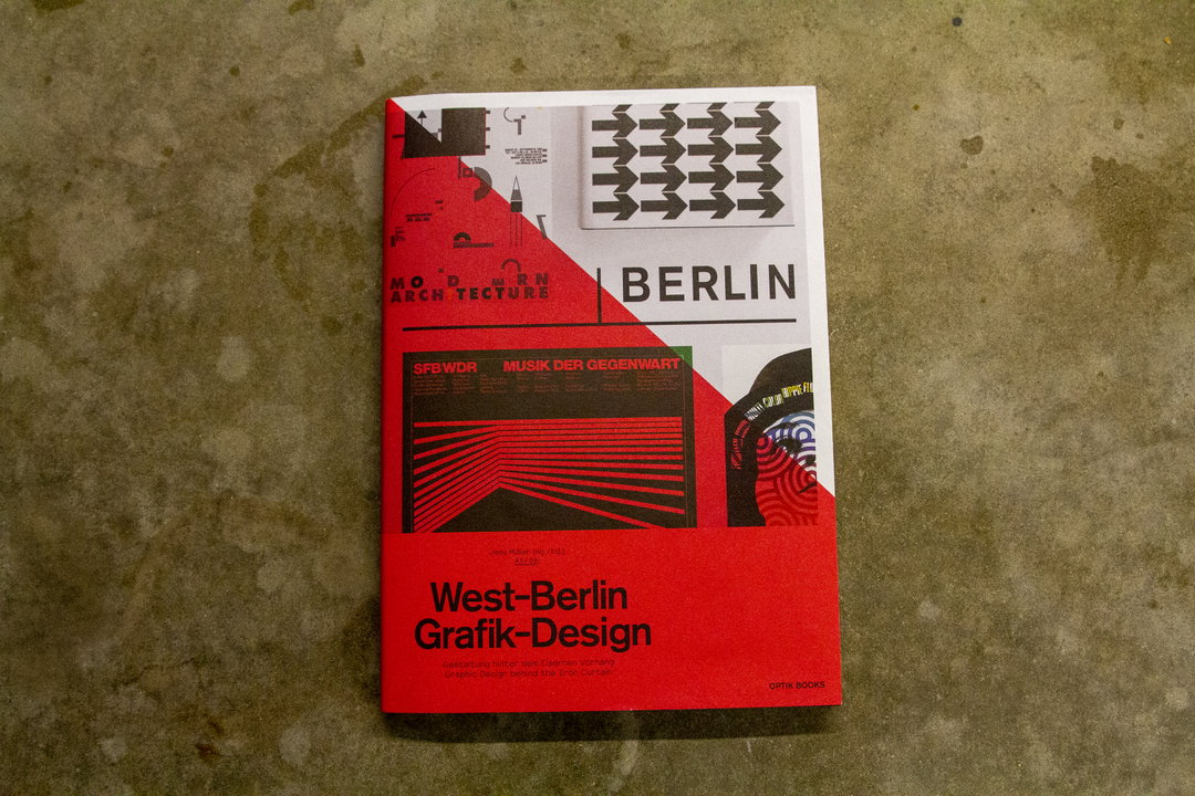
A book cover with a red and white split background featuring a collage of graphic design elements. The title reads “West-Berlin Grafik-Design” in bold black text.
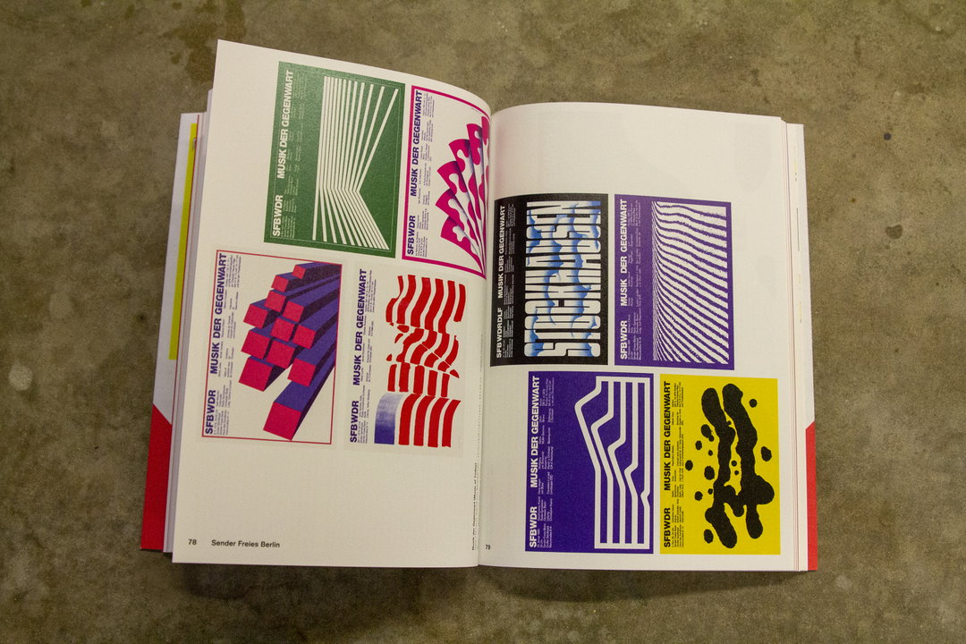
An open book displays a collection of graphic posters with bold colours and geometric patterns. Each poster features the text “SFB WDR” and “MUSIK DER GEGENWART”.
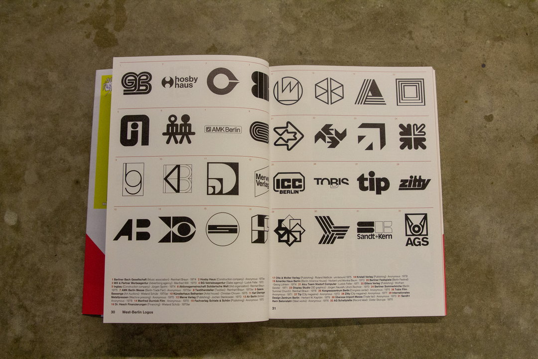
An open book displays a grid of black and white logos on two pages. The logos vary in style from geometric shapes to typographic marks, including “hosby haus” and “tip”.

West-Berlin Grafik Design

This book provides an insight into the visual languages employed in West Berlin, delving into all aspects of graphic design, including logos, typography, posters and packaging – many of which are relics of their time. It also looks at some components that you still see today, including much of the visual elements surrounding Berlin’s public transport systems.

Share Article

Further Info

About the Author

Charlie Filmer-Court

—

Charlie joined It’s Nice That as an editorial assistant in December 2019. He has previously worked at Monocle 24, and The Times following an MA in International Journalism at City University. If you have any ideas for stories and work to be featured then get in touch.

cfc@itsnicethat.com

It's Nice That Newsletters

Fancy a bit of It's Nice That in your inbox? Sign up to our newsletters and we'll keep you in the loop with everything good going on in the creative world.