Like a good Neapolitan ice cream, Happy Endings’ rebrand embraces variety
Land of Plenty worked with nostalgia, dessert memories and “subtle contradictions” over the course of the three-year makeover.
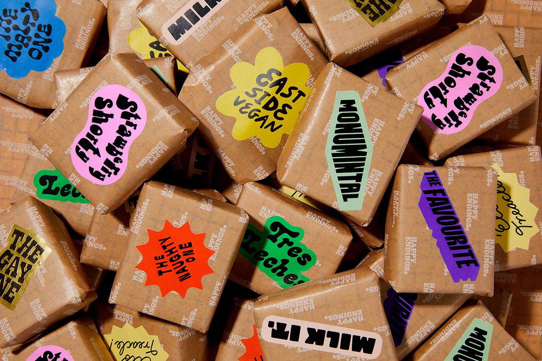
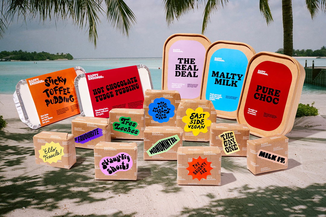
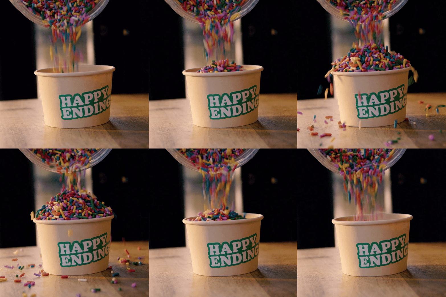
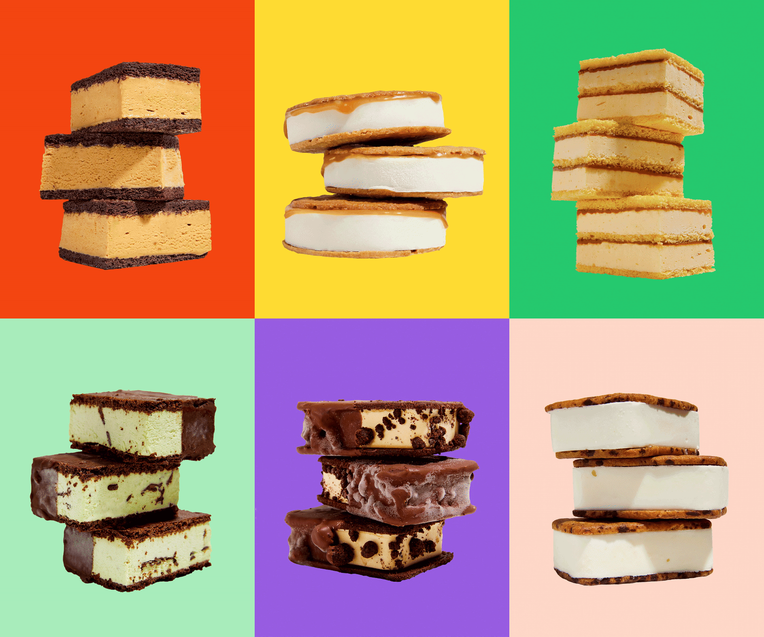
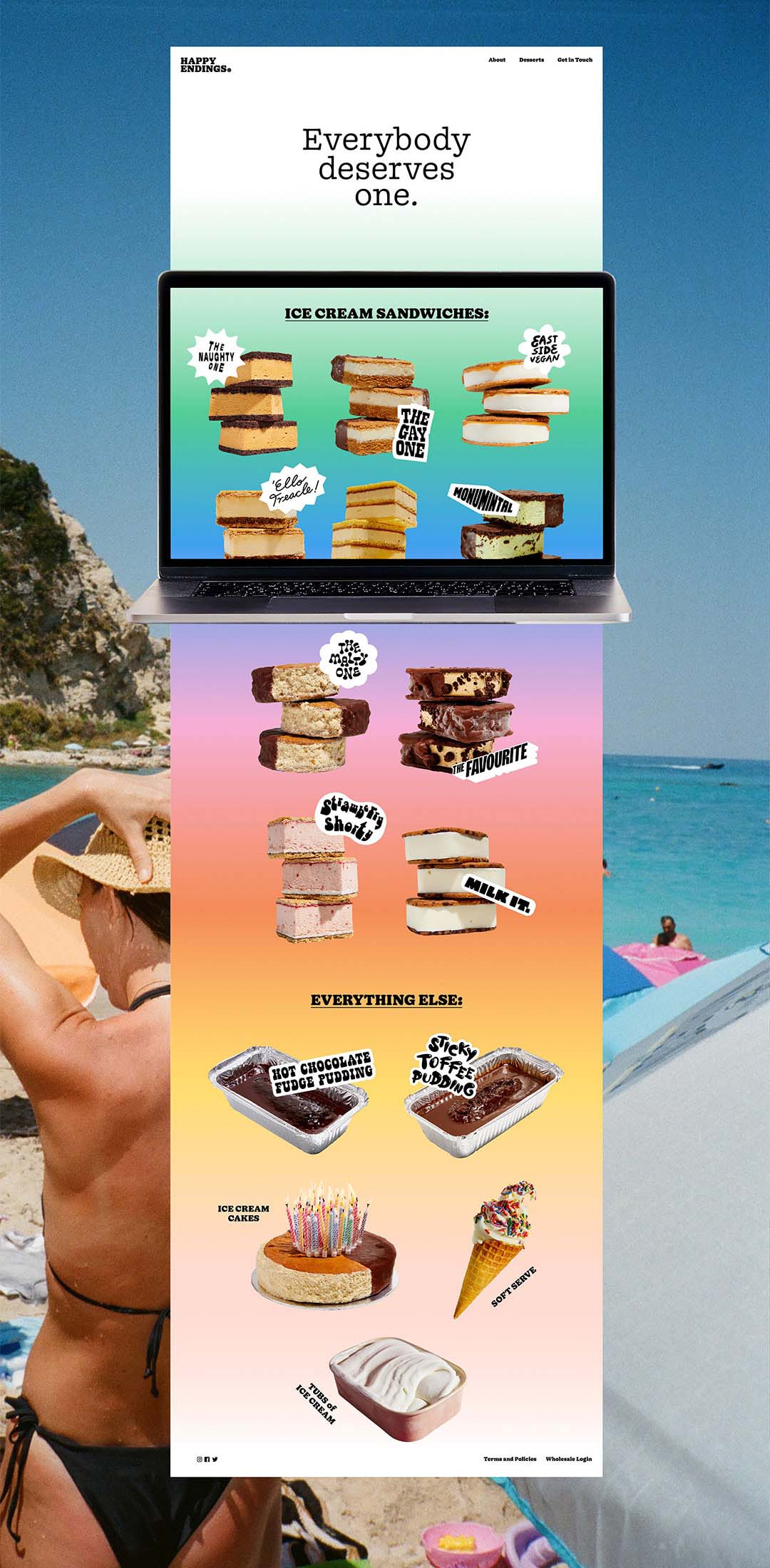
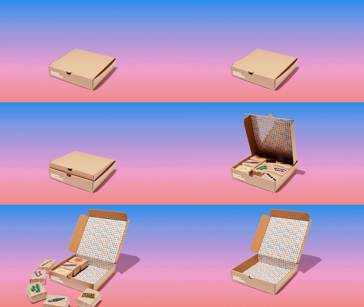
Happy Endings, the London-based ice cream shop, has always sat at the intersection between colourful and quaint, with packaging nodding to ice cream shops of yesteryear (check pattern ice cream wrapping, etc.) This quality has been broken down and rebuilt in a refresh from London agency Land of Plenty. Happy Endings now has a biodegradable packaging system (resembling old-school, brown paper packages), a rainbow sandwich gradient, and a slew of characterful typographic options, each representing a different personality.
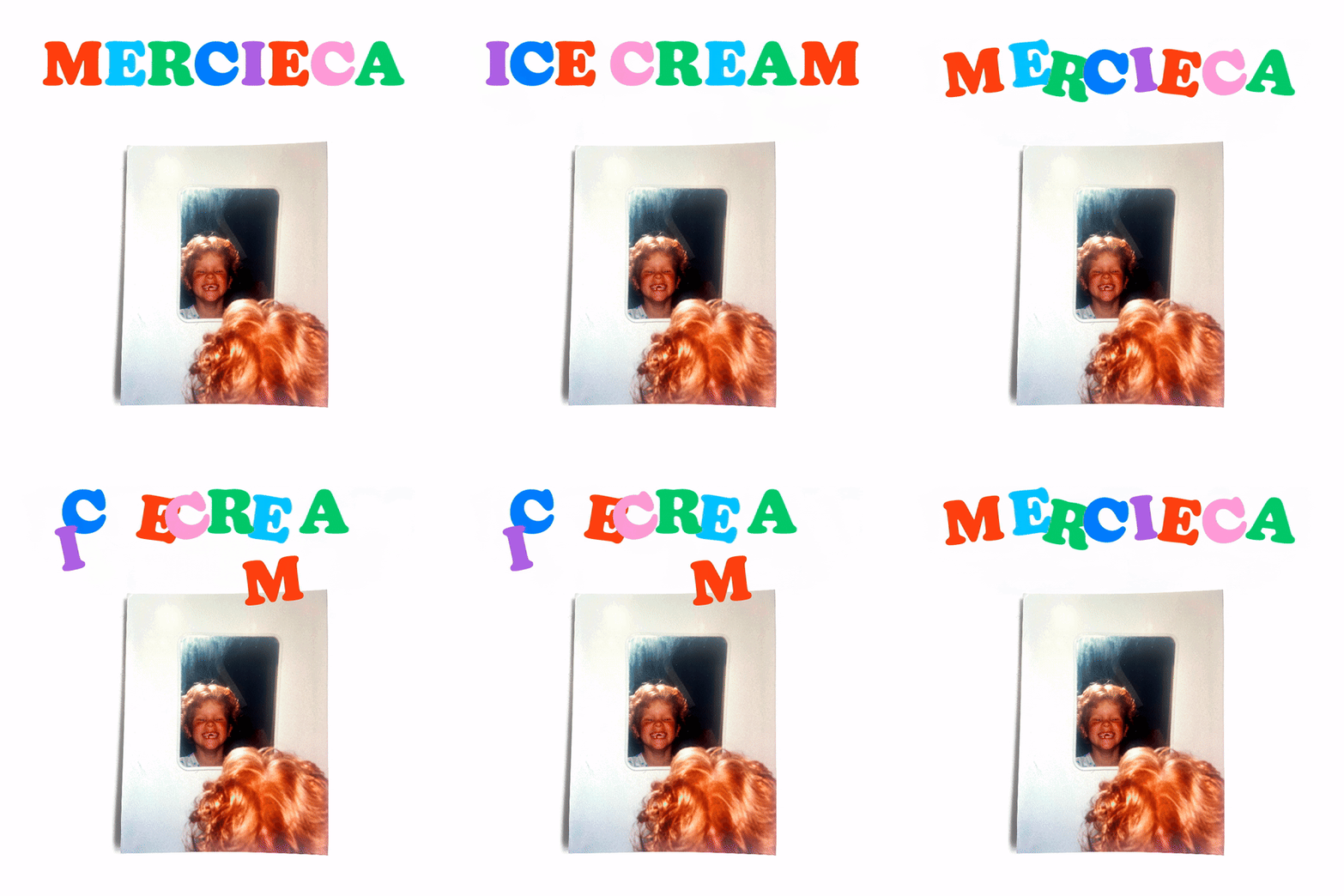
This work has been quietly ticking away since 2020. Land of Plenty landed the gig when its long-term client, Yard Sale Pizza, asked the studio to design a sticker for their pizza-ice cream collaboration with Happy Endings. “We actually approached Happy Endings founder Terri Mercieca after seeing so much potential in the brand, so from the get-go we were in unfamiliar waters,” says Jonny Rowe, Land of Plenty creative director. From there, the rebrand was worked on in stop-start intervals over three years – “not what we would usually advise”.
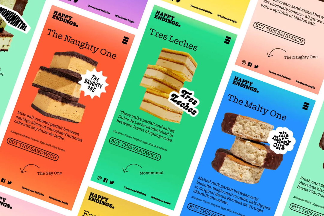
What would typically be a recipe for a sticky mess resulted in some unexpected juxtapositions. “It challenged us to relax our controlling instincts and allow a sense of variety to come to the fore, especially through the individual product personas and the photography art direction.”
Land of Plenty: Happy Endings (Copyright © Happy Endings, 2024)
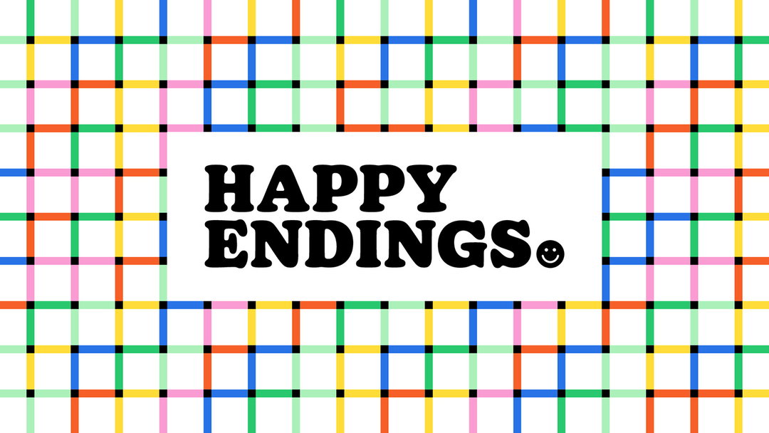
There is undeniably a mixed bag of approaches at play, but the north star here comes from colour and typography. The various colourways come together to form a rainbow brand pattern, which “references the brand’s LGBTQIA+ values” and serves as a nice update to the previous ice cream check. Like the colour palette, the idea of multitudes is key to typography too.
Sharp Type’s Doyle was chosen as the workhorse brand typeface “in part due to its split personality – a modern take on two iconic typefaces – Cooper Black and ITC American Typewriter,” says Jonny. The wordmark leans closer to the bolder Cooper Black end, and manages to evoke a sense of unplaceable nostalgia that so many brands have come to play with today; the idea of happy “dessert memories” being a central theme.
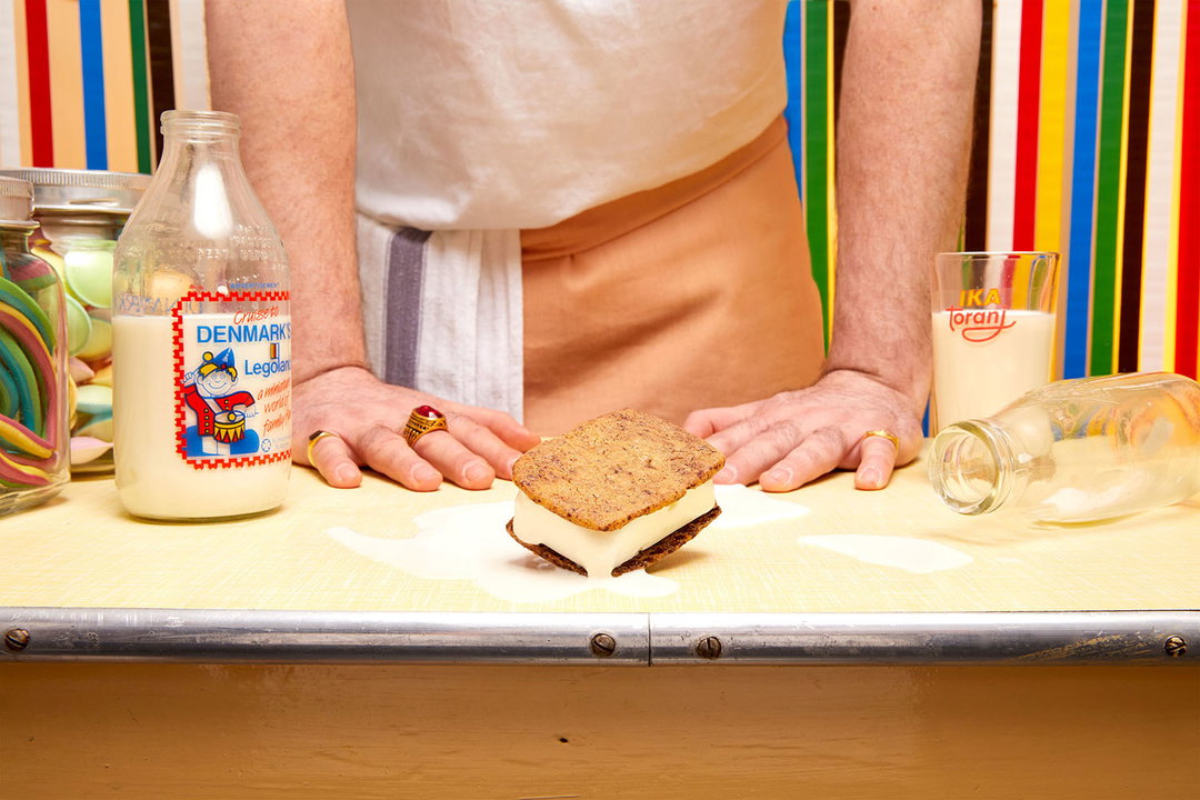
That brown sandwich wrap is NatureFlex, a plant-based film and alternative to harmful plastics. Land of Plenty has come up with sustainable solutions like this before, like compostable packaging for a farm-to-table delivery service, though this is its first time making these solutions food safe and market ready.
“The feeling we wanted to create across the brand was that of nostalgia for a time you might never have lived. Something fun, bright, full of love and packed with subtle contradictions in moments of ‘this doesn’t make sense but somehow it works’,” says senior Joshua Fanning.
GalleryLand of Plenty: Happy Endings (Copyright © Happy Endings, 2024)

Hero Header
Land of Plenty: Happy Endings (Copyright © Happy Endings, 2024)
Share Article
Further Info
About the Author
—
Liz (she/they) is the senior editor at Insights, a research-driven department within It’s Nice That. They previously ran the news section of the website. Get in contact with them for potential Insights collaborations or to discuss Insights’ public-facing reports.