Launch Recite Me assistive technology
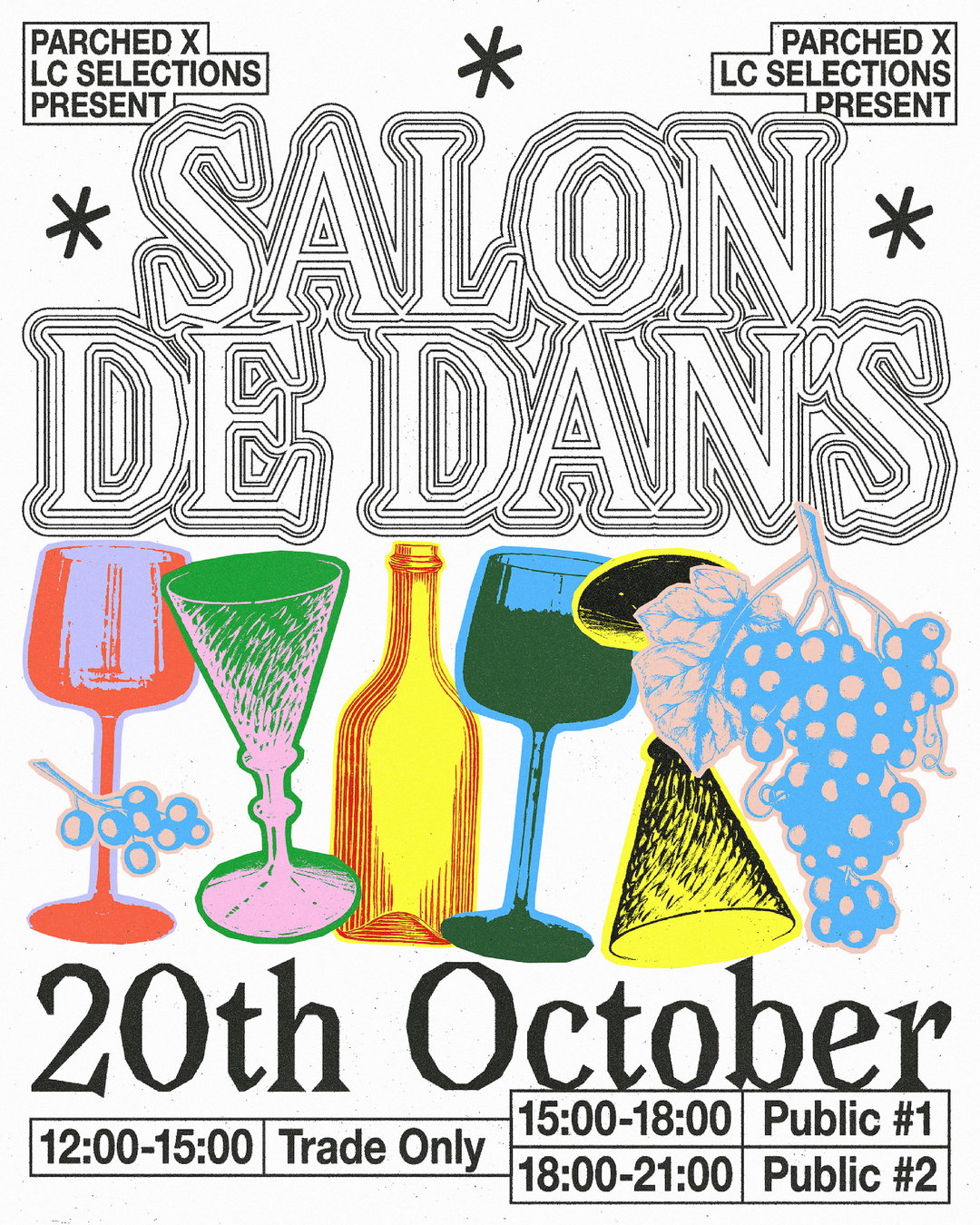
A graphic poster for an event titled “Salon de Dans”. The title is written in large, outlined 3D typography above a colourful illustration of wine glasses, a bottle and a bunch of grapes. The bottom of the poster reads “20th October” with a schedule for “Trade Only” and “Public” attendees. The top corners state “Parched x LC Selections present”.

Kate Pritchard’s playful approach to composition is anything but predictable

Drawing inspiration from poetry, religious handouts and vintage tea card sets, the designer creates unusual compositions that she describes as “absurd or whimsy”.

—
Date
12 March 2025

There’s some paths you expect to lead to a career in graphic design, but one that’s perhaps less expected is a degree in English language and linguistics. But that was exactly the precursor to Kate Pritchard’s design studies at Shillington, and now freelance work as a designer and illustrator. Rather than seeing the two eras as separate, Kate views them as very much intertwined, the “analytical approach to storytelling” she gained during the former leading naturally to the latter. Still you can find references and allusions to literature in Kate’s work, like Swan 2 Study, for example, which takes prompts from W.B Yeat’s poem The Wild Swans At Coole.

Kate approaches client and personal work in much the same way, experimenting with a number of different techniques from digital airbrush to painting, but what really makes her work stand out is her compositions, which she describes as “absurd or whimsy”. Take her poster for a vintage pop-up (below, left), which sees the type running off the side of the poster, cutting off the elegant lettering adornments. Or, her poster for Parched Wine (below, right), which shows imagery of grapes, bottles and glasses almost drunkenly bumping into each other and overlapping. This offbeat approach to composition leads to a sense of surrealism and a dreamlike feeling, often accentuated by her looking for “little hidden nuggets” of inspiration outside of the design sphere, like a pawn shop in Manchester. “I used to go all the time and I’d leave with odd bits like old religious sermon handouts and vintage tea card sets,” she ends. “Some I never use, but some come in really handy.”
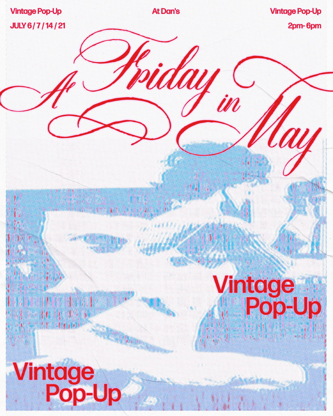
A poster for a “Vintage Pop-Up” featuring a blue and white halftone image of a person. Red cursive text across the top reads “A Friday in May”. Additional red text lists the dates “JULY 6 / 7 / 14 / 21”, the location “At Dan’s”, and the time “2pm–6pm”.
Above
Left

Kate Pritchard: Poster for A Friday in May Pop-up (Copyright © Kate Pritchard)

Right

Kate Pritchard: Poster for Alice in Jura-Land for Parched Wine (Copyright © Kate Pritchard)
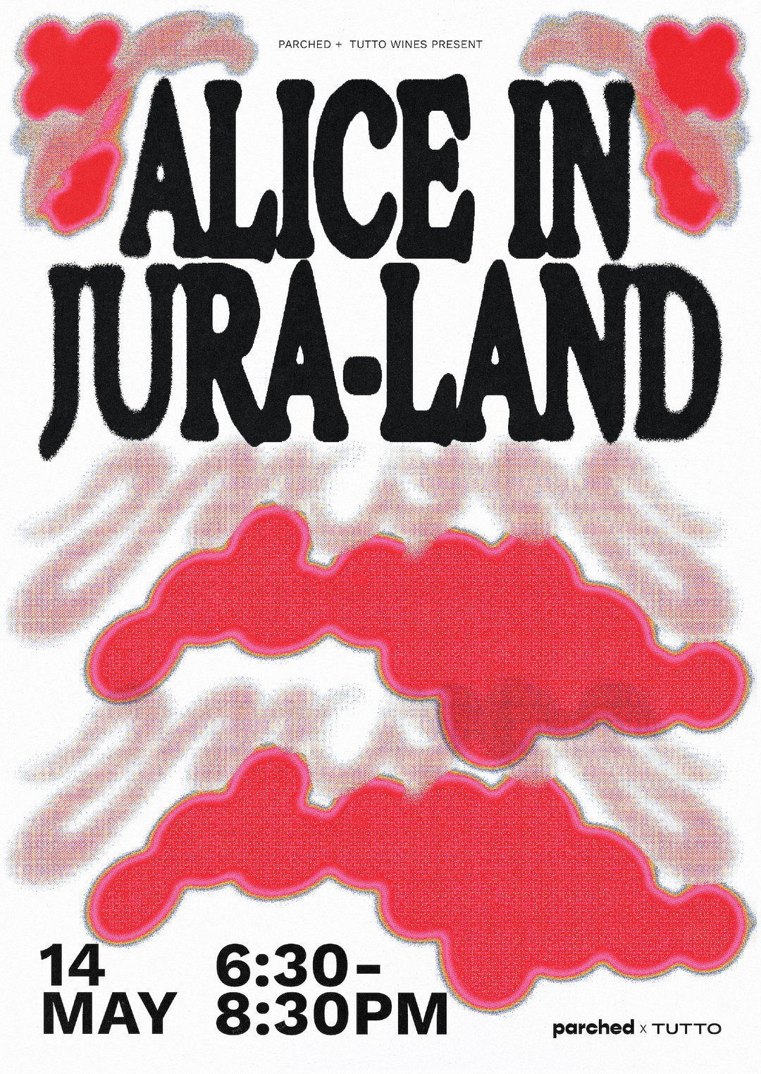
A bold typographic poster reads “Alice in Jura-land”. The black text is set in a heavy, distorted serif font against a white background with red, organic shapes. At the bottom, the date “14 May” and time “6:30–8:30pm” are listed alongside the logos for Parched and Tutto.
Above

Kate Pritchard: Poster for Alice in Jura-Land for Parched Wine (Copyright © Kate Pritchard)
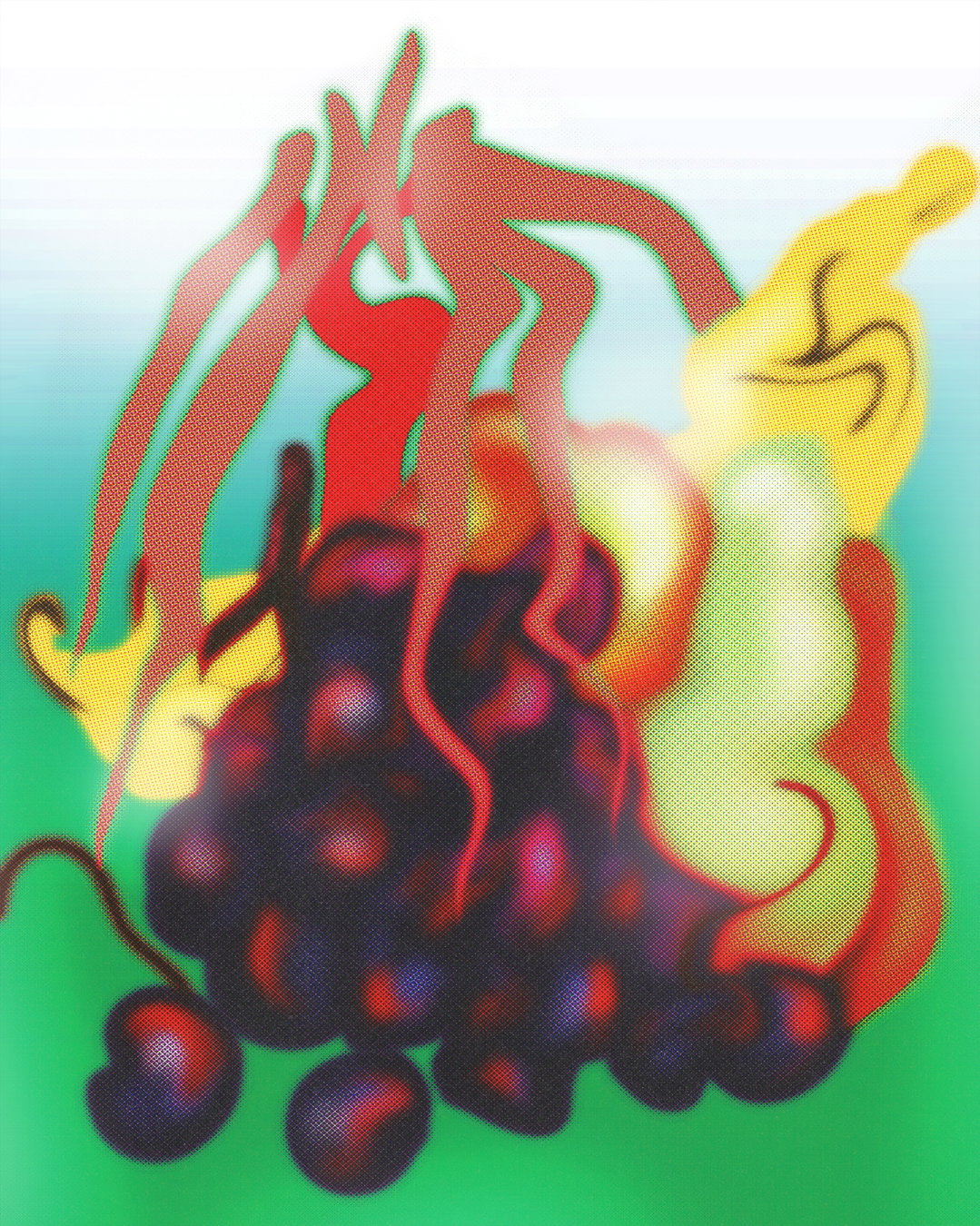
An illustration of a bunch of dark purple grapes against a bright green background. Red and yellow abstract shapes swirl around the fruit, creating a blurred, distorted effect.
Above

Kate Pritchard: Fruit Salad (Copyright © Kate Pritchard)
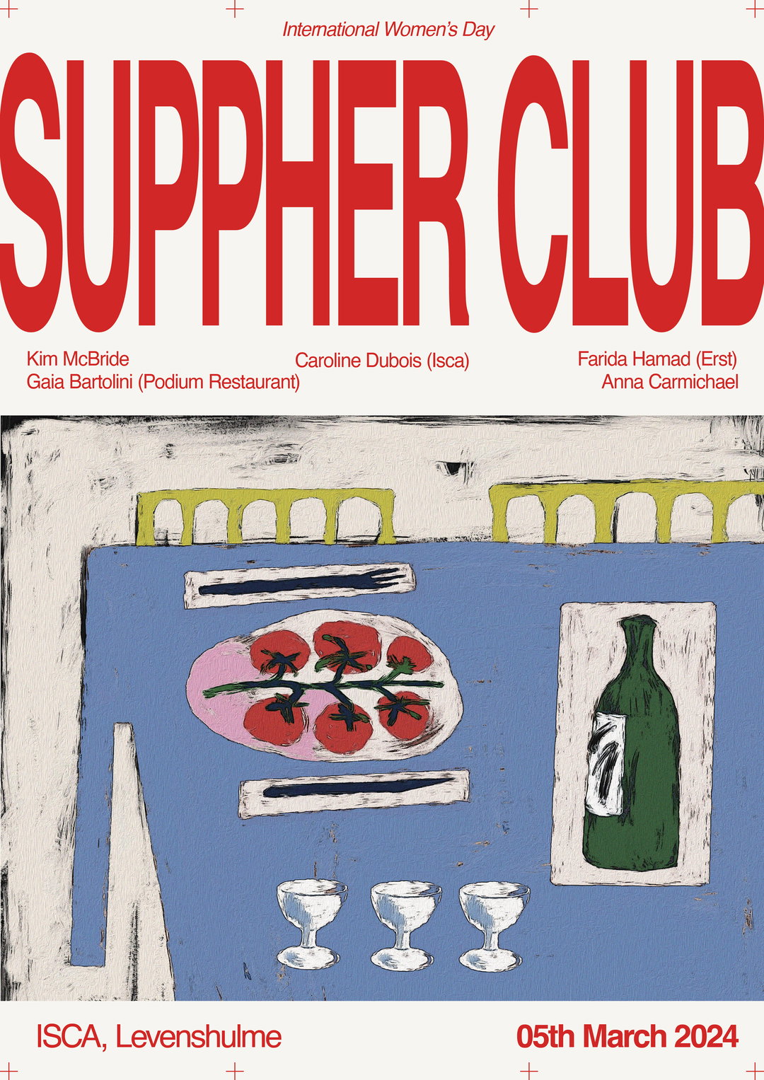
A poster for “Suppher Club” celebrating “International Women’s Day”. Bold red typography sits above an illustration of a blue table set with a plate of tomatoes, a bottle of wine and three glasses. The poster lists guests including Kim McBride, Caroline Dubois, Farida Hamad, Gaia Bartolini and Anna Carmichael. Text at the bottom reads “ISCA, Levenshulme” and “05th March 2024”.
Above
Left

Kate Pritchard: Poster for SUPPHER Event (Copyright © Kate Pritchard)
Right

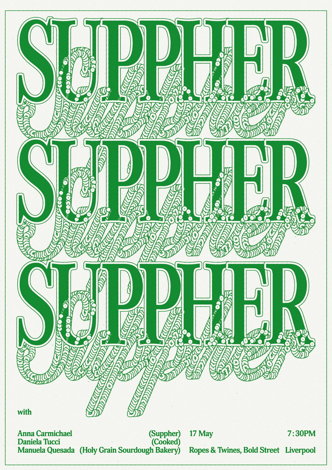
Kate Pritchard: Poster for SUPPHER Event (Copyright © Kate Pritchard)
A green typographic poster repeats the word “SUPPHER” three times in a bold, serif font. Each word is layered over a swirling, illustrative pattern of the same word in a cursive script. Text at the bottom lists the guests Anna Carmichael, Daniela Tucci and Manuela Quesada of Holy Grain Sourdough Bakery. The event takes place on 17 May at 7:30pm at Ropes & Twines, Bold Street, Liverpool.
Above

Kate Pritchard: Poster for SUPPHER Event (Copyright © Kate Pritchard)

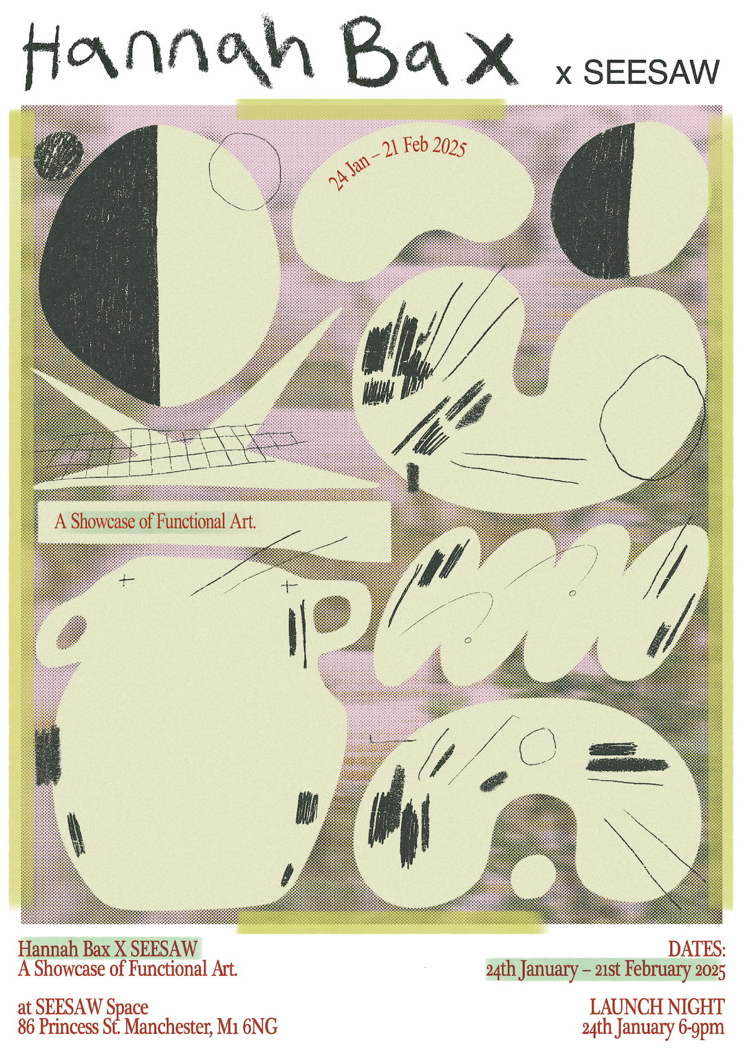
A graphic poster for a collaboration between “Hannah Bax x Seesaw”. It features abstract, organic shapes in cream and black over a textured purple and grey background. Text at the bottom reads “A Showcase of Functional Art” and lists the dates “24th January – 21st February 2025” at the “Seesaw Space” in Manchester.
Above

Kate Pritchard: Poster for Hannah Bax Solo Exhibition (Copyright © Kate Pritchard)
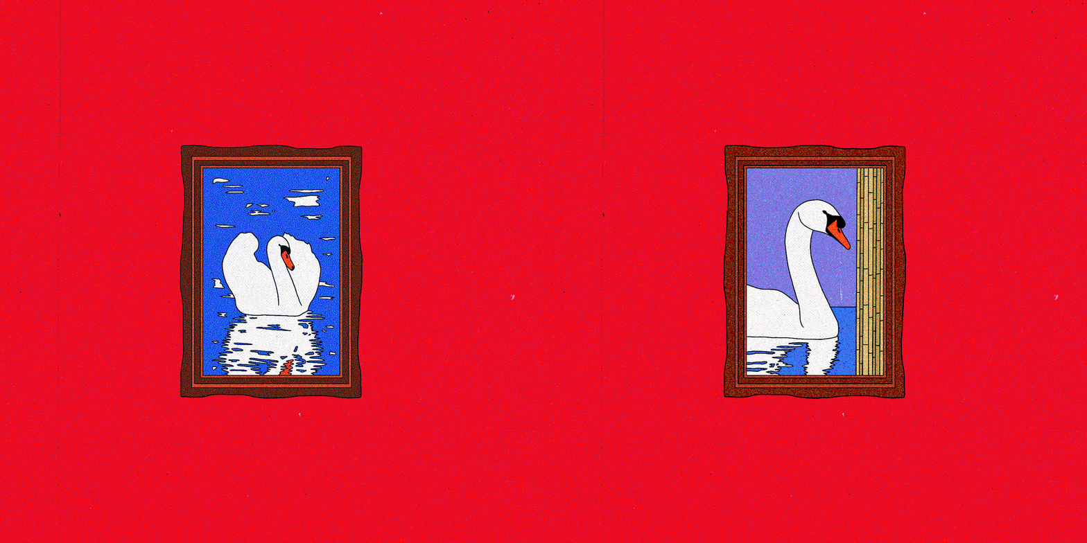
An animation of a framed illustration of a white swan on a bright red background. The swan shifts its position within the frame, moving from a curled pose to a more upright one.
Above

Kate Pritchard: Swan Study 1 (Copyright © Kate Pritchard)
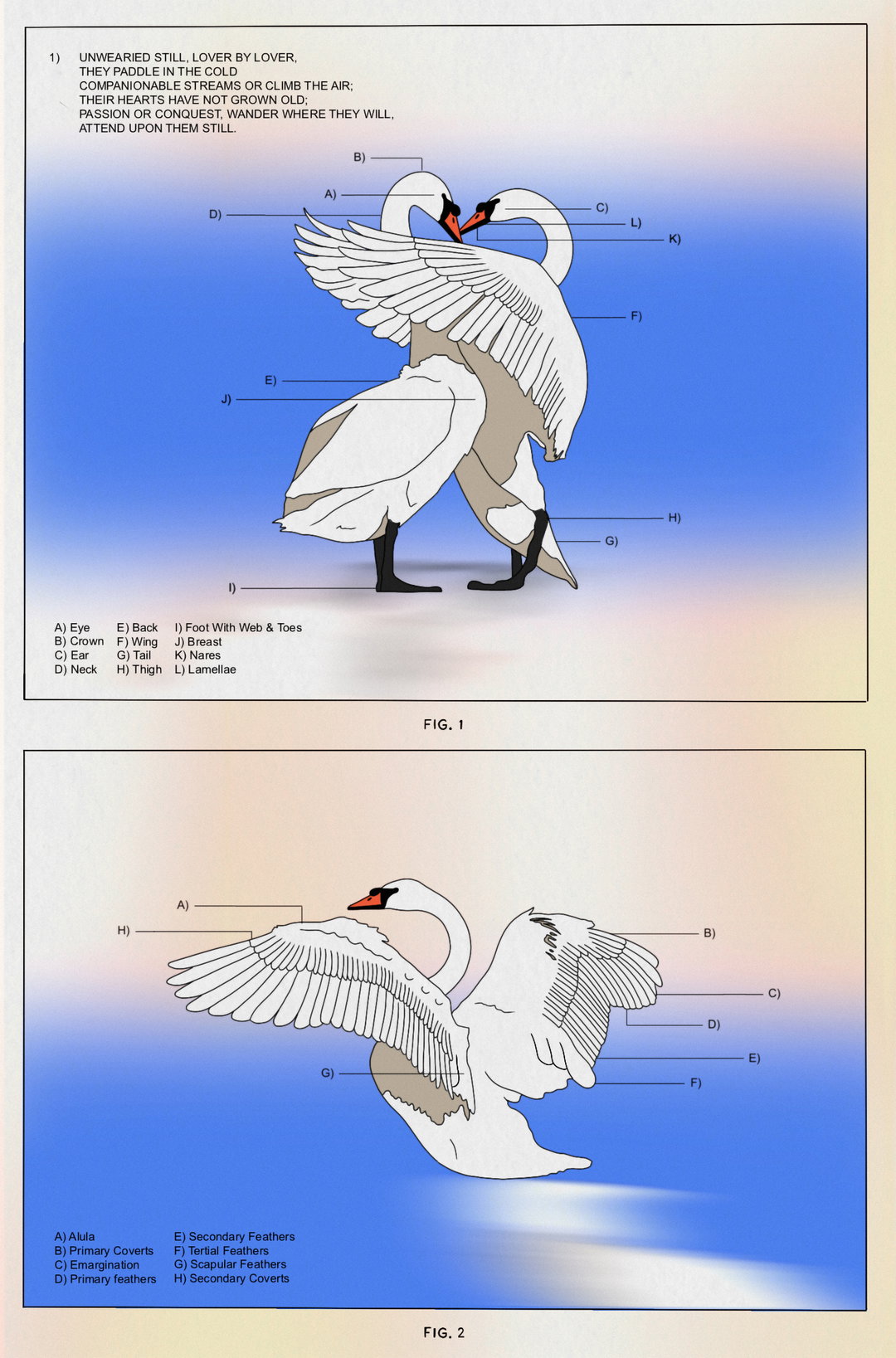
An anatomical diagram of two swans against a blue and white gradient background. The first image labels body parts from “Eye” to “Lamellae”, while the second focuses on wing feathers, including “Alula” and “Primary feathers”.
Above

Kate Pritchard: Swan Study 2 (Copyright © Kate Pritchard)
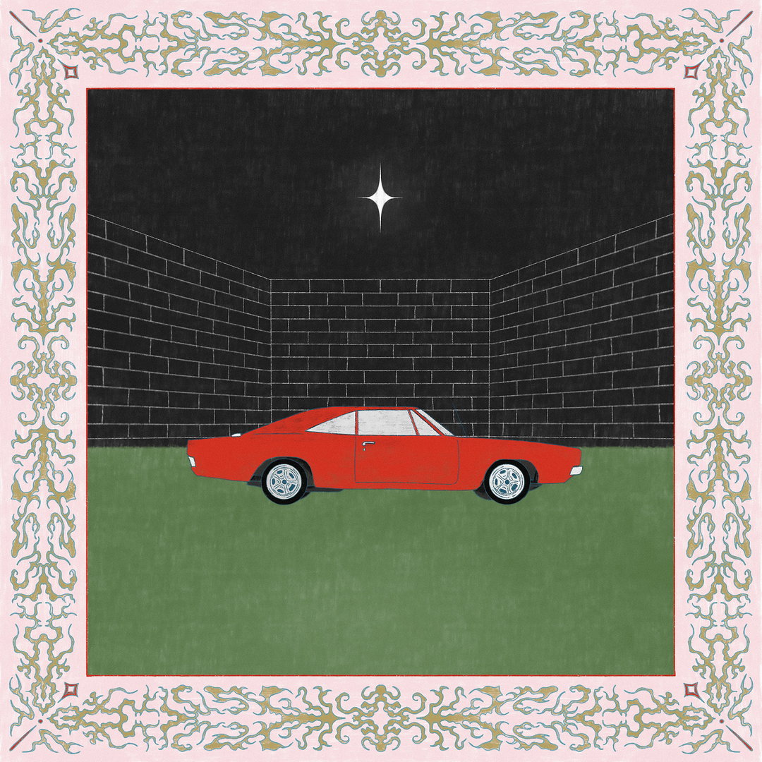
An illustration of a red vintage car parked on a green lawn. Behind the car is a dark brick wall under a black sky with a single white star. The scene is enclosed by a decorative pink and gold border.
Above

Kate Pritchard: Night Driving (Copyright © Kate Pritchard)
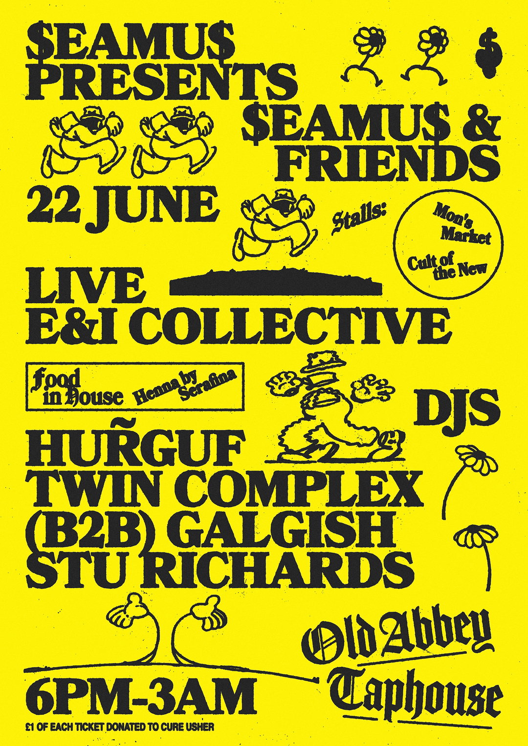
A yellow and black typographic poster for an event titled “$seamus$ presents $seamus$ & friends”. It lists the date as “22 june” and the venue as “Old Abbey Taphouse”. The line-up includes “live e&i collective” and DJs “hurguf”, “twin complex (b2b) galgish” and “stu richards”. Small illustrations of whimsical figures and flowers are scattered across the page.
Above
Left

Kate Pritchard: $EAMU$ PRESENTS Event (Copyright © Kate Pritchard)

Right

Kate Pritchard: $EAMU$ PRESENTS 3rd Birthday (Copyright © Kate Pritchard)
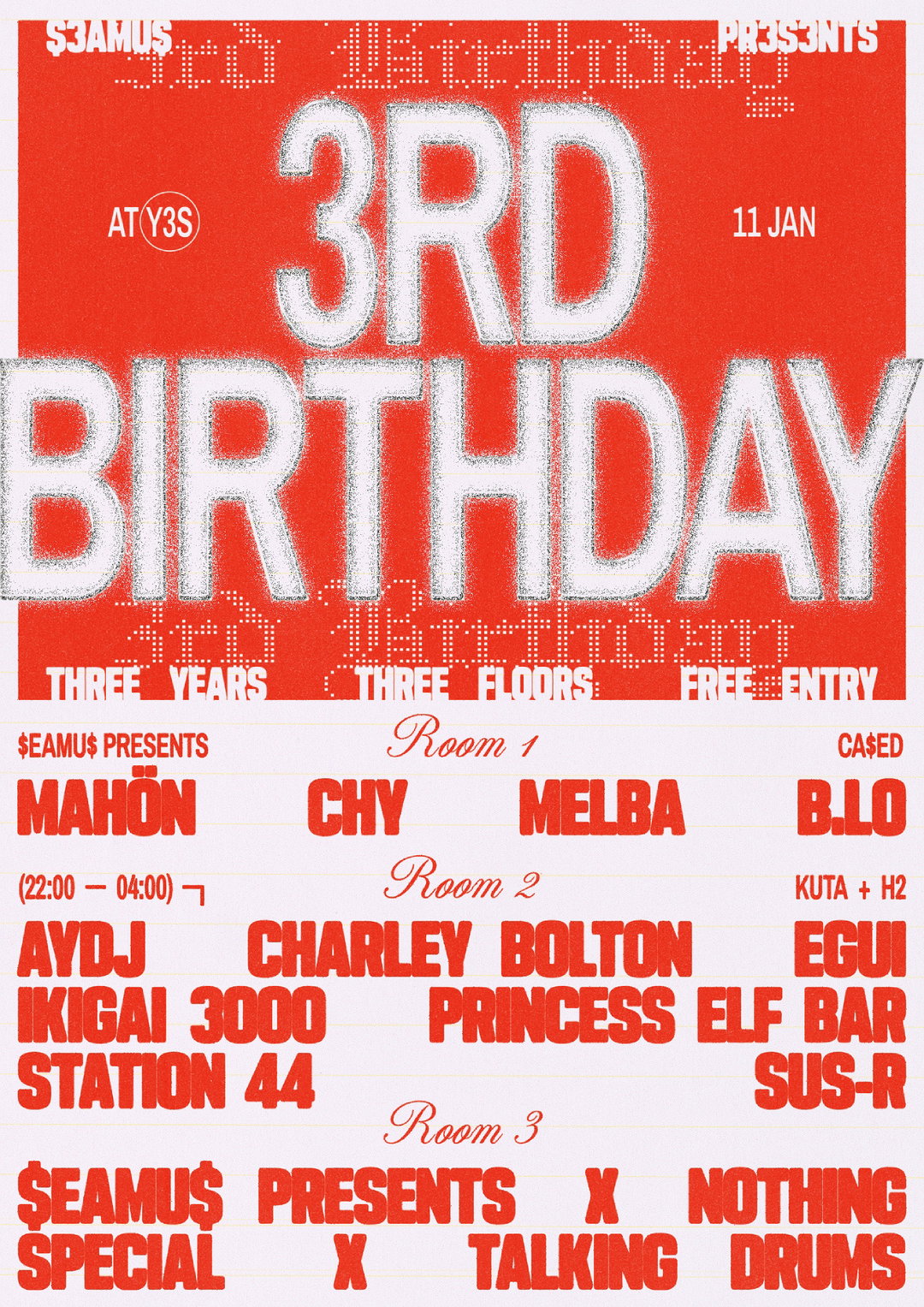
A red and white typographic poster reads “3rd Birthday” in large, textured white lettering. The event takes place on “11 Jan” at “Y3S” and features “three years”, “three floors” and “free entry”. The line-up is split across three rooms. Room 1 features Mahön, Chy, Melba and B.lo. Room 2 lists artists including Charley Bolton and Princess Elf Bar. Room 3 features “$eamu$ presents x Nothing Special x Talking Drums”.
Above

Kate Pritchard: $EAMU$ PRESENTS 3rd Birthday (Copyright © Kate Pritchard)
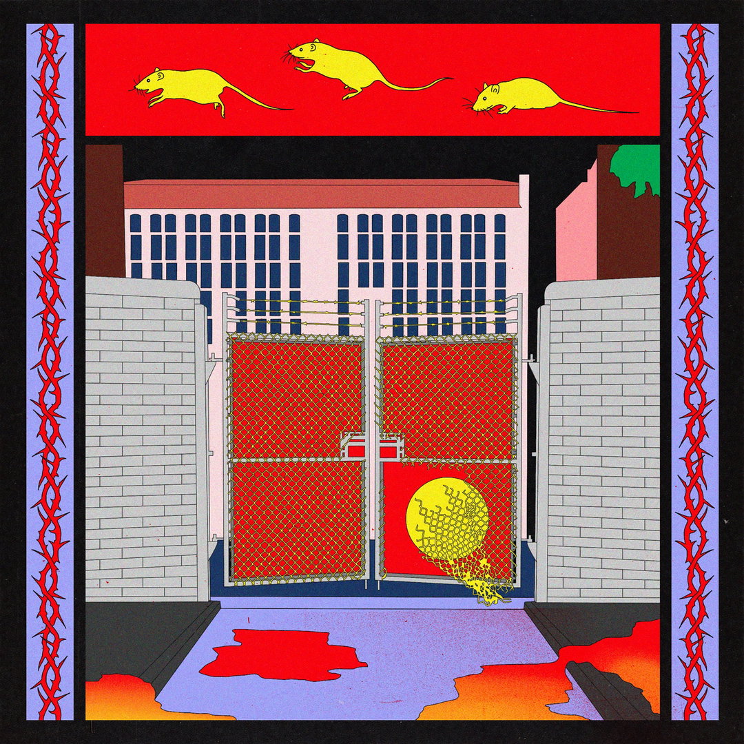
An illustration of a gated industrial entrance flanked by grey brick walls. A red chain-link fence blocks the way, featuring a yellow circular emblem on a red panel. Above the scene, three yellow rats run across a red banner, while red borders with jagged, thorn-like patterns frame the image.
Above

Kate Pritchard: Rat Palace (Copyright © Kate Pritchard)

Hero Header

Kate Pritchard: Poster Salon de Dan’s for Parched Wine (Copyright © Kate Pritchard)

Share Article

About the Author

Olivia Hingley

—

Olivia (she/her) is associate editor of the website, overseeing the day-to-day editorial projects as well as Nicer Tuesdays events. She joined the It’s Nice That team in 2021. ofh@itsnicethat.com

To submit your work to be featured on the site, see our Submissions Guide.
It's Nice That Newsletters

Fancy a bit of It's Nice That in your inbox? Sign up to our newsletters and we'll keep you in the loop with everything good going on in the creative world.