Slanted’s CEO Julia Kahl’s Bookshelf features Bambi, Arles and international writing systems
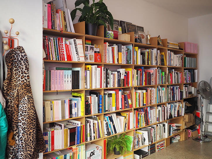
Slanted’s CEO and graphic designer Julia Kahl treats us to five influential titles from her bookshelf. No stranger to books after working in publishing for over a decade, she shares publications that continue to inspire her.
We can’t seem to get enough of Slanted over here at It’s Nice That. The German publishers, design studio and editorial platform have a lot to offer – most recently a 2019/20 Yearbook of Type and a special edition of Slanted Magazine exploring the values of Europe. Currently in its 34th issue, the established publication has made a name for itself with its relevance and topicality. Always beautifully designed with an emphasis on clarity, the publishers-cum-designers never fail to provide us design enthusiasts with insights into new corners of the sector.
In this week's edition of Bookshelf, Slanted’s CEO and graphic designer Julia Kahl treats us to five influential titles from her bookshelf. No stranger to books after working in publishing for over a decade, the editor consistently receives a number of books from all around the world to review. “As a result however,” Julia tells us, “I only take very few publications home with me to immerse myself in them and have also ‘had enough’ of a lot of other topics.” With an exceptionally high standard for books, the aficionado takes us behind the scenes of Slanted, offering up a tour of her personal bookshelf and the titles that continue to influence her.
GalleryFelix Bork: Oh, Ein Tier
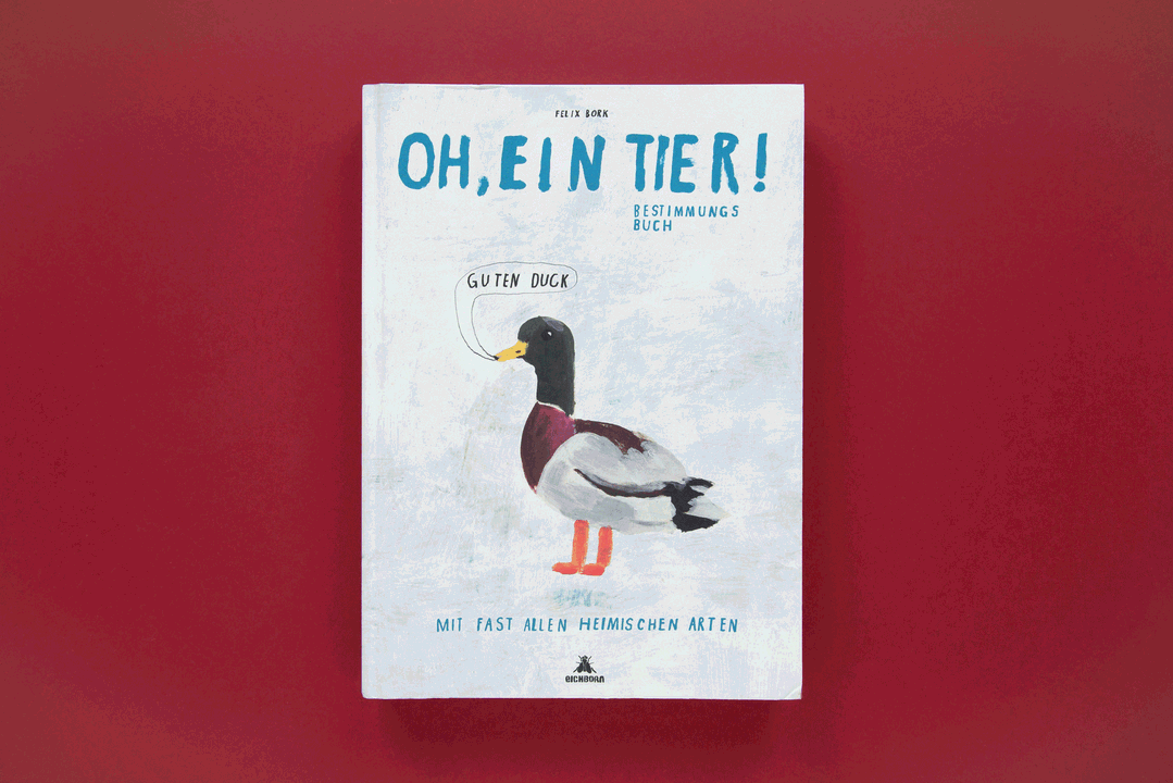
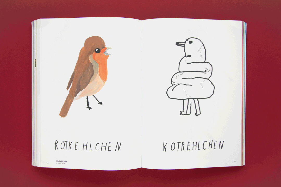
Felix Bork: Oh, Ein Tier
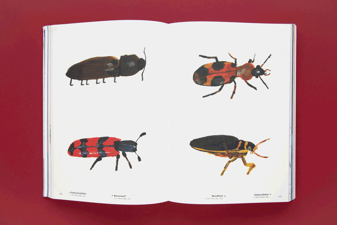
The 364-page book Oh, Ein Tier (Oh, an animal) by illustrator Felix Bork summarises exactly the thoughts you have when you meet one of these funny furry or feather creatures in the urban jungle. The book weighs a lot, but is light inside and anyone who still thinks Bambi is a deer should take a look inside.
Filled with stunningly beautiful illustrations and offensive wordplay, the book even helps to identify most of the native species that Felix Bork has also provided with his own observations. After flipping through it extensively, you know not to fry storks, why a bird has a beak and much more. Oh yes, and Bambi is a white-tailed deer.
It’s clear that Pokémon has given us false information about the development of animals, but this work can correct a mistake or two. A few species were new to me and I have seldom laughed so much at a book. It’s exactly my humour!
GalleryDetailtypografie
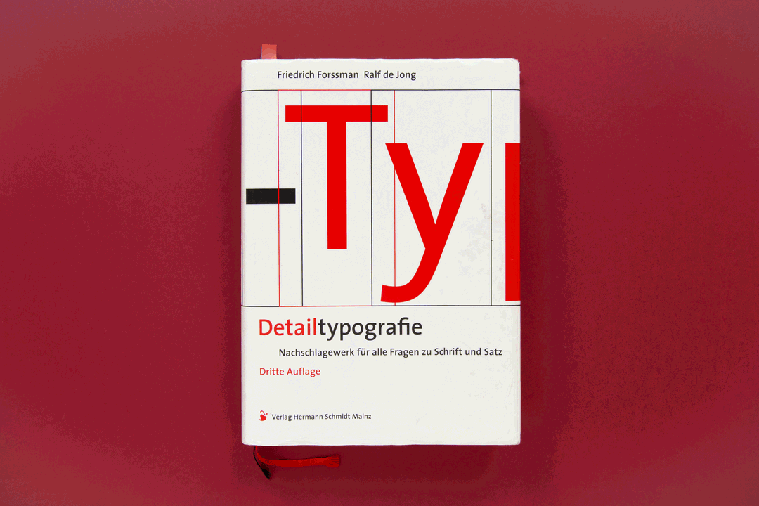
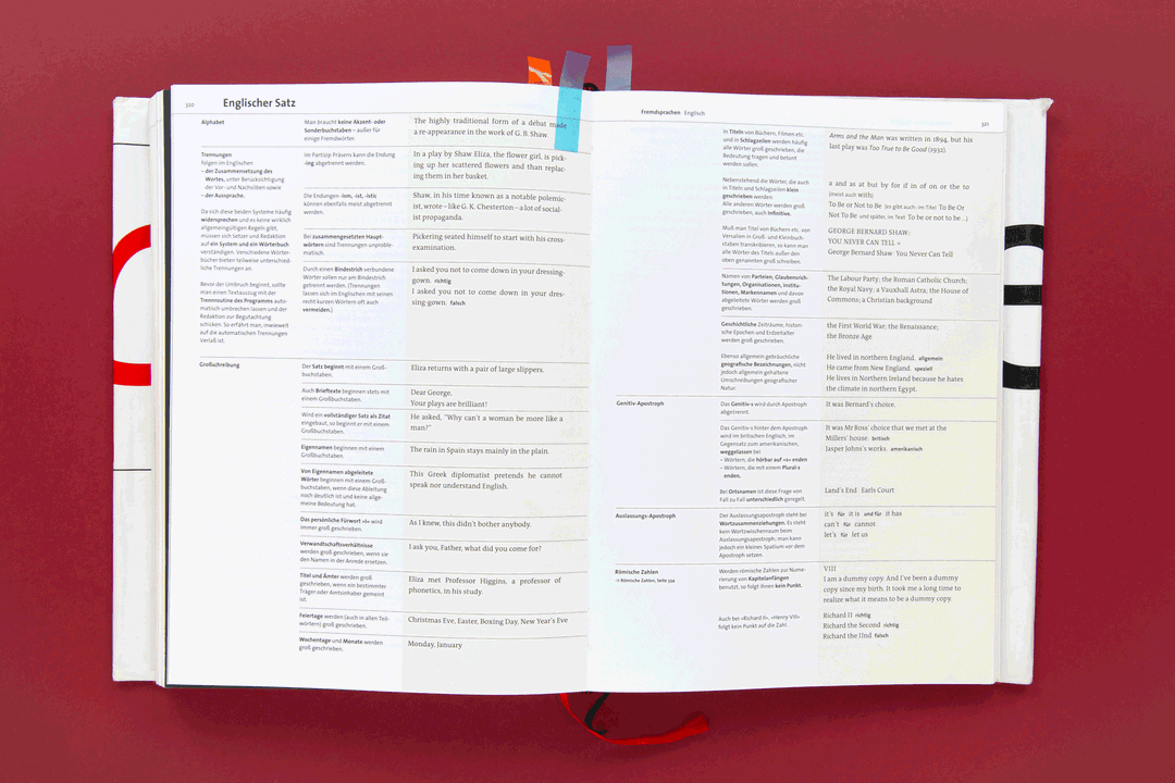
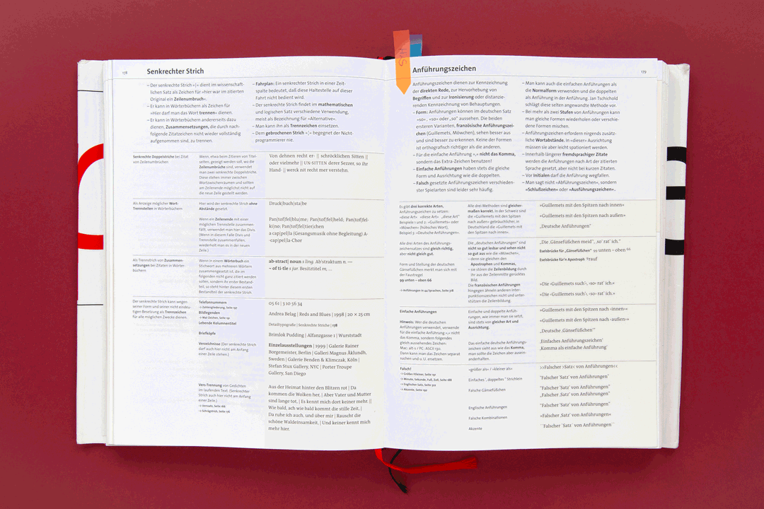
Detailtypografie
This book is probably the most important manual ever written for me. It is a comprehensive reference book for all those who care about typography and it (almost) wants to leave no question unanswered. From font selection to font editing, from marking, paragraph and line breaks and typesetting to punctuation marks, sentence forms to foreign language and mathematical formula types. There's hardly anything you can't find in it. Nothing goes to print until there has been a last look at the detailed typography to make sure that everything is correct. It’s an essential companion in my work.
Gallerydecodeunicode
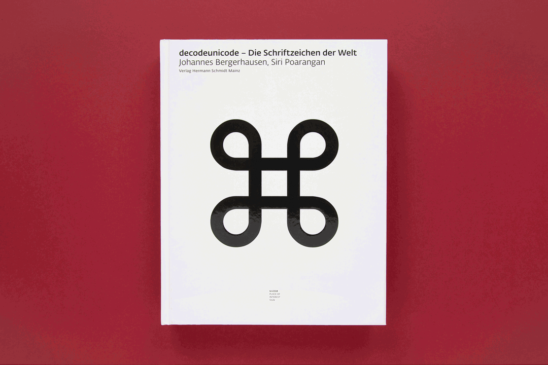
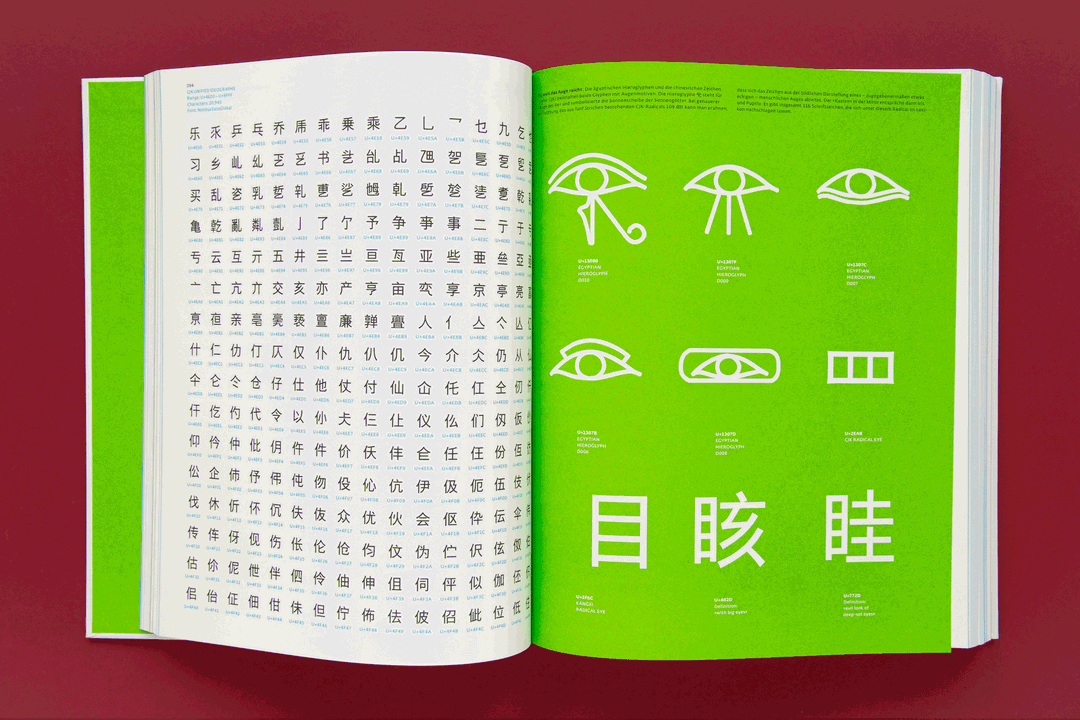
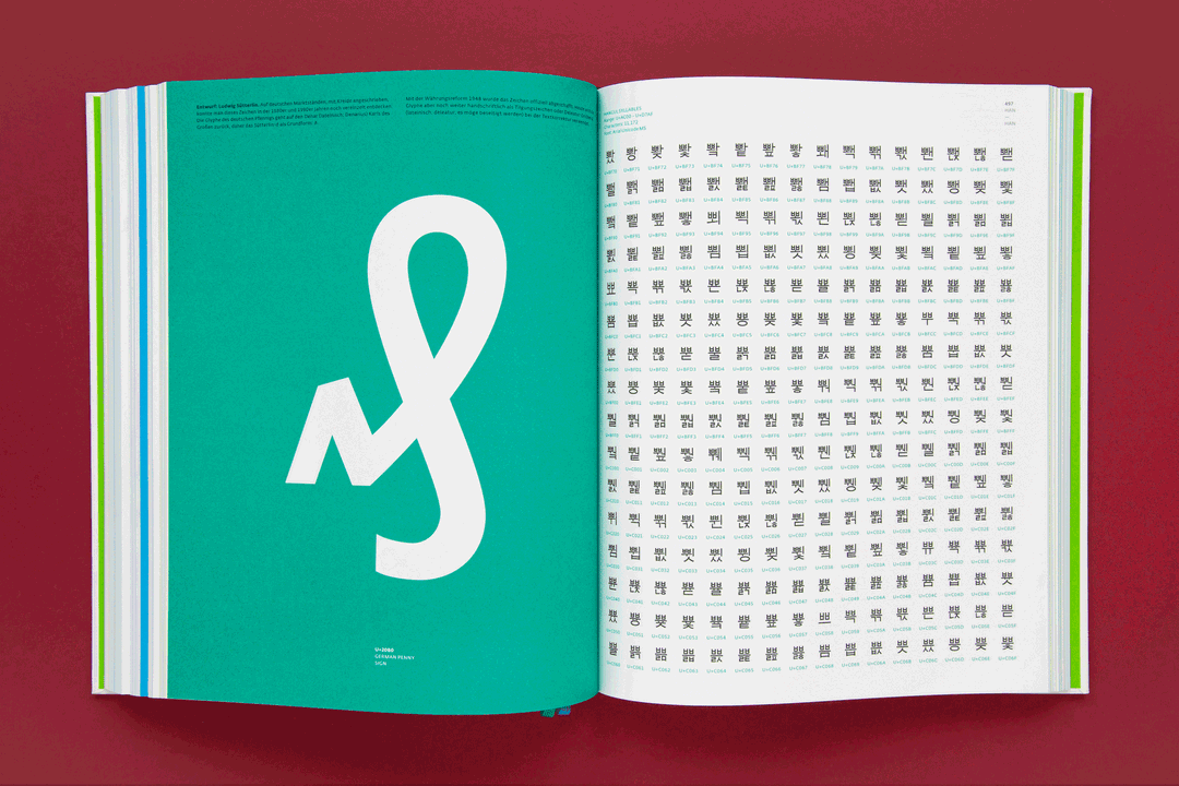
decodeunicode
Prof. Johannes Bergerhausen and Siri Poarangan have been working for many years on the decodeunicode project. It attempts to create a platform for basic typographic research via an independent online platform and provide computer users with access to the world’s writing systems.
In Slanted Magazine #6, the first issue I worked on back in 2008, we presented a report about cuneiform writing, which Bergerhausen called a “mega niche” at that time. I’d heard about the project when it started in 2005 and have been fascinated since then. In 2011, together with Siri Poarangan, he published the first book on the subject, which encoded all (so far discovered) 109,242 characters and introduced the individual writing systems. Both current and extinct characters can be found in the book.
Meanwhile there are 137,374 listed characters which can be viewed on the corresponding platform, even if the matching fonts have not yet been installed on the computer. I'm just a big fan of this groundbreaking project, that's why I love this publication!
GalleryArles Magazine
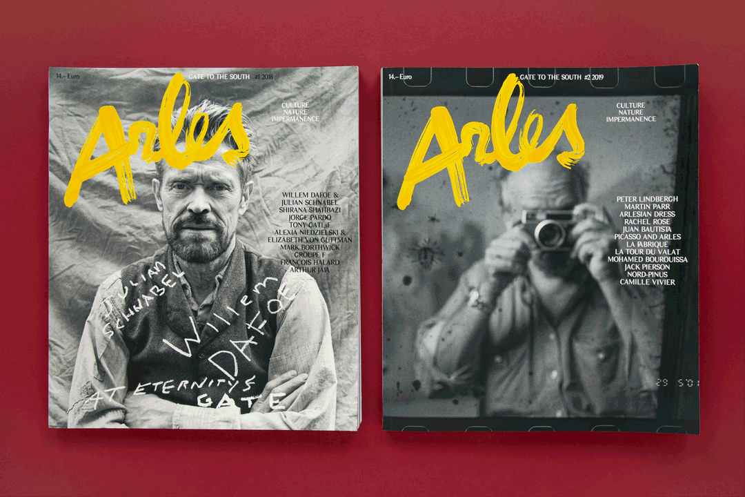
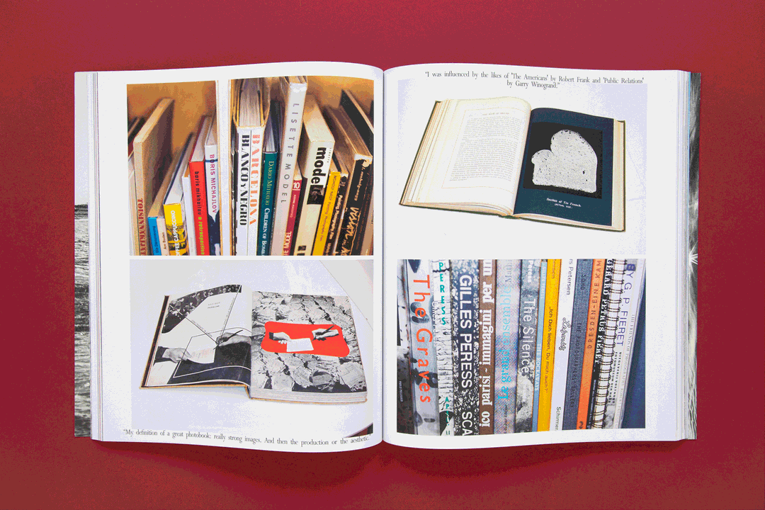
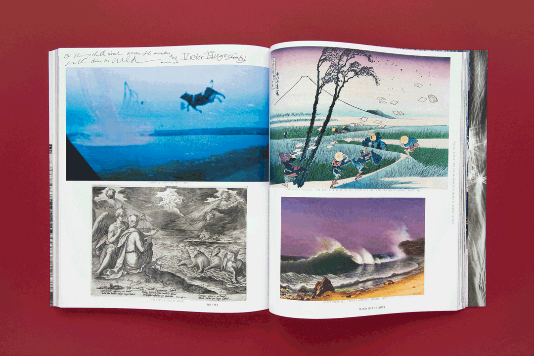
Arles Magazine (2018/2019)
Arles, particularly known for its famous photography festival Les Recontres d’Arles, is one of my favourite cities to travel to every year for several reasons. I was super excited in 2018 when I found out that Arles Magazine #1 was all about culture, nature and impermanence as is highlighted on the cover. Unfortunately I wasn't lucky enough to get a copy, but this summer issue #2 has been published and I managed to buy a copy, which I'm totally in love with.
From an editorial by Maja Hoffmann, she writes: “Peter Lindbergh, Martin Parr, Jack Pierson, Camille Vivier: an exceptional set of perspectives and an unprecedented diversity of talents have been bought together in this second issue of Arles.” This issue also plays tribute to the vitality and verve that half a century of photographic art in the city has seen through the festival thanks to the festivals founders Lucien Clergue, Michel Tournier, and Jean-Maurice Rouquette in 1969.
The issue also includes an in-depth interview with the extraordinary photographer Peter Lindbergh, an Arlesien by heart who recently passed away. He said: “These regions and their inhabitants are authentic; things are reduced to their essence.” And this is all I have to say about this extraordinary publication.
GalleryRosebud No. 5: Mystery
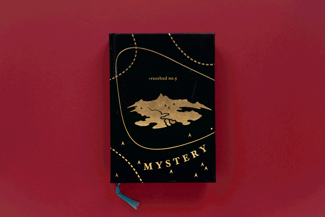
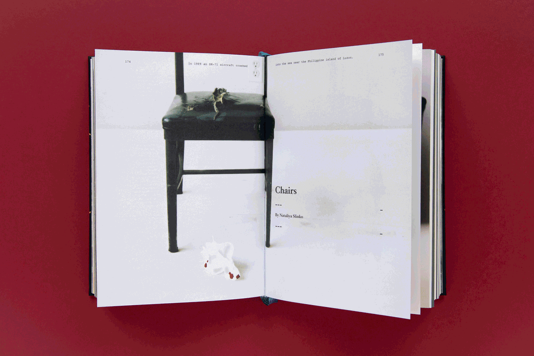
Rosebud No. 5: Mystery (2004)
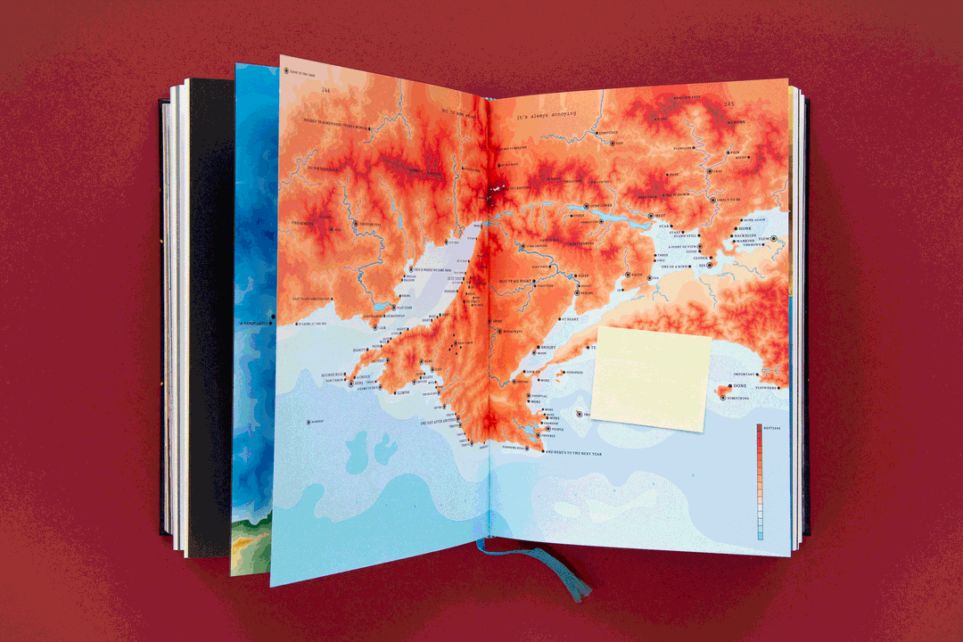
In 2004, during my studies, I came across this Bible-like book with this leather-like cover and golden hot foil that totally fascinated me. In Mysteryland the editors look to the heavens and down to mankind exploring the profound and elusive connection that every human creature has with each other. Mysteryland asks why is something one way and not the other. Photo series, texts, illustrations and artworks charmingly revolve around the subject and illuminate it in many different ways.
The book draws a surprising picture of our time in many respects. The contributors' experiments, which are wide-ranging in form and content, uncover unexplainable and paradoxical aspects in a wide variety of areas of life and puts social, cultural, political and spiritual aspects in a completely new light.
The small format lies pleasantly in the hand and, even after 15 years, this book is still very important for me. Perhaps it was even a milestone to becoming a graphic designer and editor.
Share Article
Further Info
About the Author
—
Jynann joined It’s Nice That as an editorial assistant in August 2018 after graduating from The Glasgow School of Art’s Communication Design degree. In March 2019 she became a staff writer and in June 2021, she was made associate editor. She went freelance in 2022.