





Very cool new Hot Chip album artwork will be unique for every single record
Hot Chip are one of those bands that have always had a fantastic visual sensibility. Illustrator Wallzo has been at the helm of it, bringing us glorious Michael Craig Martin -esque block colours and shapes to decapitated statues. Now, the band is moving into the world of bespoke printing, with the artwork for new album Why Make Sense by Nick Relph using an algorithm that means each copy’s design will be unique.
You can see what it’ll look like on a site devoted to the release, with some very cool, bright, minimal designs that hypnotically change colour. According to the band’s label Domino Records, there are 501 different colours, and “combined with subtle variations of the design, this means every copy of the album, on both CD and LP, will feature completely unique artwork.”
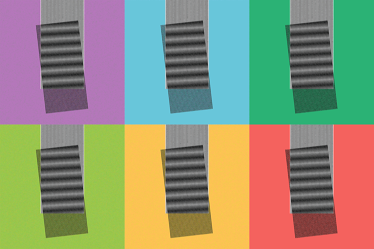
Nick Relph: Hot Chip, Why Make Sense artwork

Nick Relph: Hot Chip, Why Make Sense artwork

Nick Relph: Hot Chip, Why Make Sense artwork
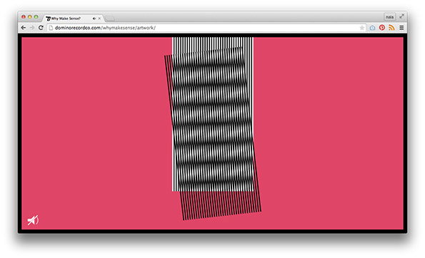
Nick Relph: Hot Chip, Why Make Sense artwork

Nick Relph: Hot Chip, Why Make Sense artwork
Share Article
Further Info
About the Author
—
Emily joined It’s Nice That as Online Editor in the summer of 2014 after four years at Design Week. She is particularly interested in graphic design, branding and music. After working It's Nice That as both Online Editor and Deputy Editor, Emily left the company in 2016.



