




Graphic designer Lisa H. Moura takes us through her sleek, considered portfolio
26-year-old graphic designer Lisa H. Moura grew up in rural Portugal. After graduating from Fine Arts Faculty in Lisbon in communication design, Lisa worked in the country as a graphic designer before upping sticks and relocating to São Paulo to work at studio ps.2 arquitetura + design with Flávia Nalon and Fábio Prata. Now, Lisa has returned to school, this time a master’s in design at Head, Geneva. Lisa’s highly considered work spans editorial, photography, visual identity and exhibition. We spoke to the young designer about how travelling has influenced her work and shone the light on two recent projects.
You grew up and studied in Portugal and then moved to Brazil. Now you live in Geneva. How have these different places affected your work?
I am still gradually figuring out how much Portugal, Brazil and Switzerland affected me and, through that, how much it affected my work. I think that in Portugal I was first introduced to a strong tradition of printed matter and I have come to realise that I try to translate this passion with the materiality of it in whatever medium, may it be in video or in website development. In Brazil, I became more aware of the cultural identity a work can represent. Especially during the time I lived there – during the Football World Cup and right before the Olympic games – there was a quest for a graphical translation of “what it is to be Brazilian” and I found it very intriguing how my work as a graphic designer could actually shape these notions of collective identity. And now, in Switzerland, I have come to explore graphic design in all its dimensions and possible materialities. I am now exploring the creation of space with graphic design, somehow.
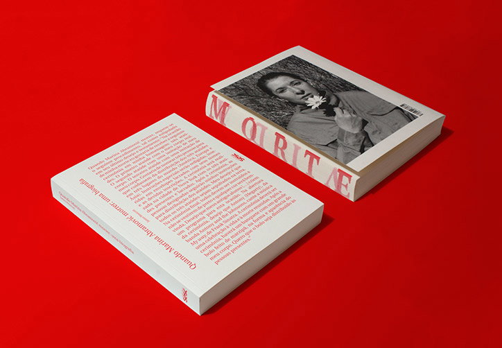
Lisa H. Moura: When Marina Abramović Dies
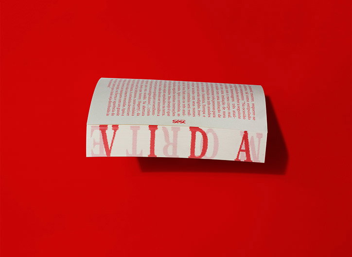
Lisa H. Moura: When Marina Abramović Dies
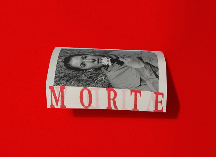
Lisa H. Moura: When Marina Abramović Dies
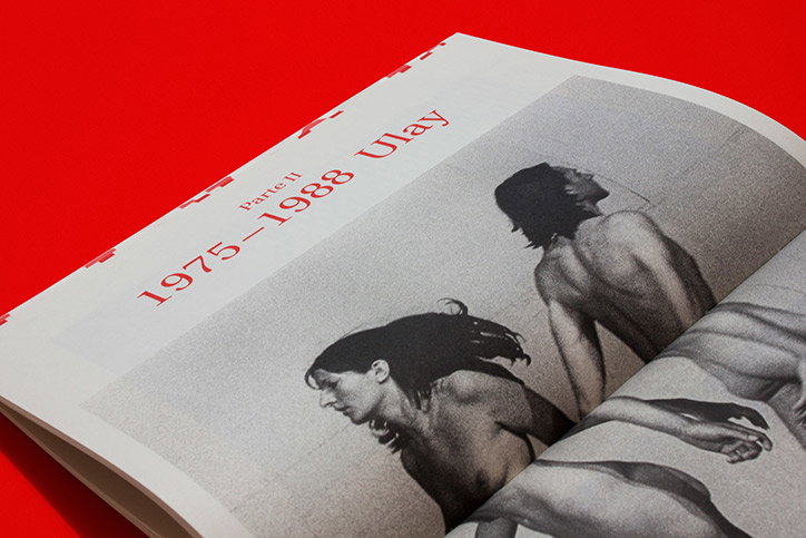
Lisa H. Moura: When Marina Abramović Dies
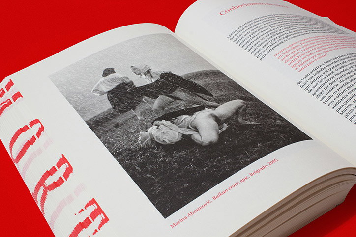
Lisa H. Moura: When Marina Abramović Dies
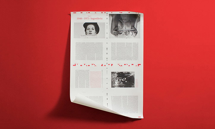
Lisa H. Moura: When Marina Abramović Dies
When we came across your portfolio we were particularly interested in the two projects shown here: When Marina Abramović Dies and Souvenirs of Places Never Visited: The Moon. Tell us about them.
The book When Marina Abramović Dies was developed while I was working in São Paulo, Brazil, in the studio ps.2 arquitetura + design with Flávia Nalon and Fábio Prata. The brief from Edições Sesc, a Brazilian publisher, was very straightforward: the format couldn’t be changed, there was no money to invest in big productions and special printing formats or colours. I could use two colours maximum, the pictures were all in black and white. With those conditions in mind, influenced by Fábio and Flávia’s approach in the studio of materialising strong concepts, came the idea of the book being a testimony to the passing of time between the words “VIDA” (life) and “MORTE” (death). So, whilst reading the biography of Marina Abramović life becomes unreadable and death appears. The colour red seemed like an obvious choice for Marina Abramović , since she has mentioned that for her it is a source of energy and life.
Souvenirs of Places Never Visited: the Moon is actually my master’s thesis. In it I have researched the popular culture phenomenon of the Paper Moon and I considered the hypothesis of these postcards from the beginning of the 20th century being souvenirs from the moon itself. With it I established a relationship to the commodified souvenirs of today and their symbolic aspect in representing entire cultures and identities in one single format, so, by analysing the context and the graphical aspect of these old postcards, I imagine what sort of collective identity these “souvenirs from the moon” could represent. In the book itself I have worked with the basic shape of the circle in a way of almost creating a flag for the moon and the use of the contrast between black and white as the basic association of the moon to day and night. What I enjoyed the most was the use of glittery white paper to print out the pictures of the Paper Moons, playing both with the “dreamy” aspect of them and with the materiality of silver crystals in photosensitive paper which was used in the postcards at the time. Also, the book works as a postcard itself, in that you can send it to someone with the custom stamps from the moon I have created. As a complement, I created another book with the more than 300 Paper Moon postcards that I have found during my research. I have found this project extremely rich in terms of content and conceptual possibilities so l am now developing a second phase to this research for my master’s final project.
Finally, what are the major influences on your work as a graphic designer?
The first “inspiration” folders I’ve created on my computer were basically a copy/paste of pictures of works by Experimental Jetset and some classics like Jan Tschichold, Paul Rand, Josef Müller Brockman or the Portuguese Sebastião Rodrigues. But now I have opened my spectrum to anything I find remotely interesting or curious on the internet, most of the time not even related to design itself. Stylistically I am still very drawn to the works of those designers, but conceptually I find more inspiration in everything else beyond design.
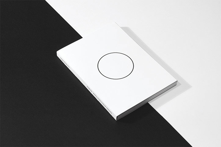
Lisa H. Moura: Souvenirs of Places Never Visited: the Moon
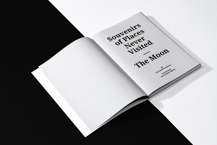
Lisa H. Moura: Souvenirs of Places Never Visited: the Moon
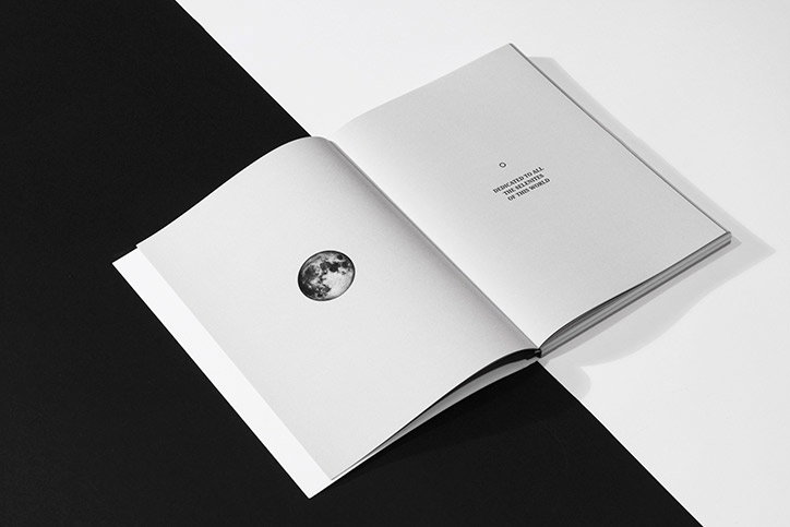
Lisa H. Moura: Souvenirs of Places Never Visited: the Moon
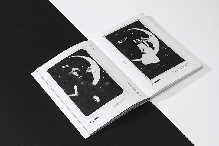
Lisa H. Moura: Souvenirs of Places Never Visited: the Moon
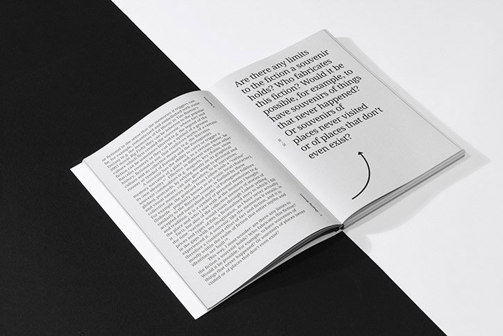
Lisa H. Moura: Souvenirs of Places Never Visited: the Moon
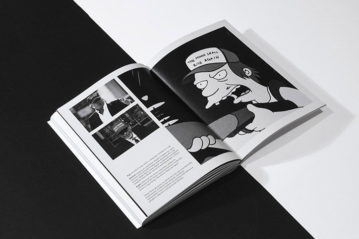
Lisa H. Moura: Souvenirs of Places Never Visited: the Moon
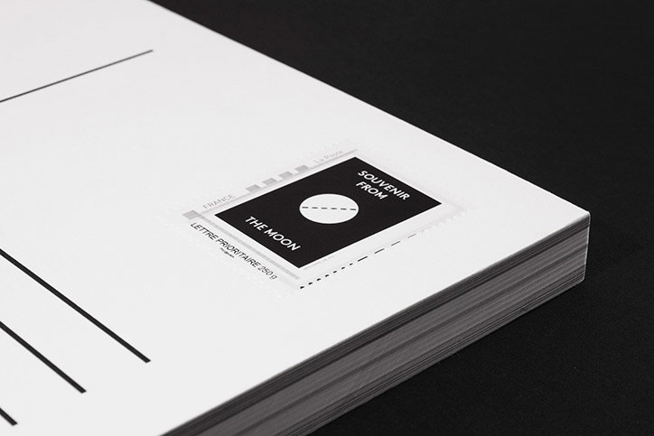
Lisa H. Moura: Souvenirs of Places Never Visited: the Moon
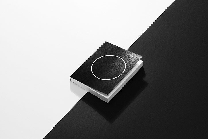
Lisa H. Moura: Souvenirs of Places Never Visited: the Moon
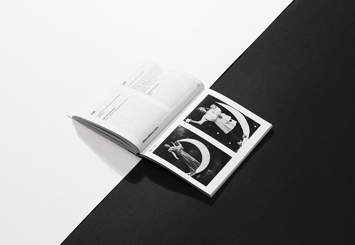
Lisa H. Moura: Souvenirs of Places Never Visited: the Moon
Share Article
Further Info
About the Author
—
Bryony joined It's Nice That as Deputy Editor in August 2016, following roles at Mother, Secret Cinema, LAW, Rollacoaster and Wonderland. She later became Acting Editor at It's Nice That, before leaving in late 2018.



