




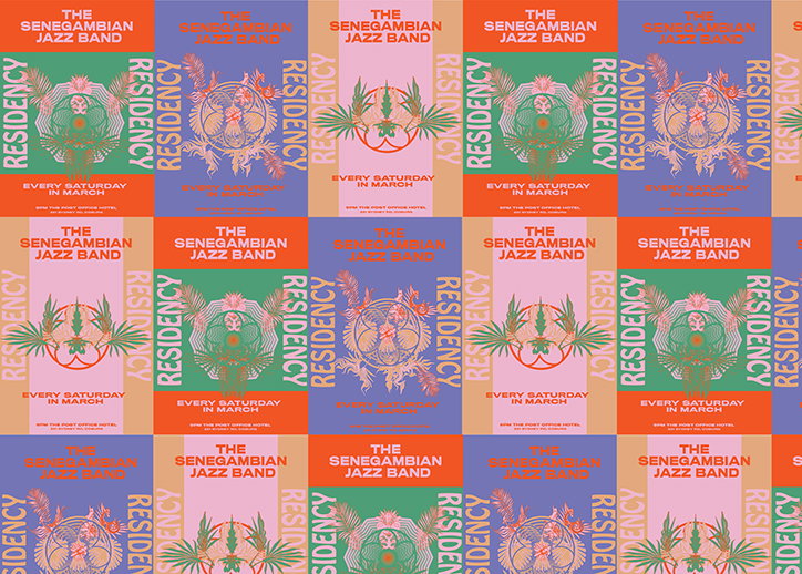
Gemma Mahoney, a graphic design student producing professional work
Melbourne-based Gemma Mahoney might still be studying her bachelor’s degree in communication design but her portfolio speaks the graphic design language of fully fledged professional.
This is largely due to Gemma’s own determination to nestle her way into the industry while studying, working as a freelance and intern designer at Confetti Studio for the past year. “Confetti has opened up my world to the exciting design industry and has reinforced how certain and passionate I am about my future in design,” she tells It’s Nice That.
On top of this Gemma also creatively directs and co-runs print and digital magazine, Accidental Discharge, a “project which explores art and culture through the lens of female identifying and gender fluid folk”. Providing “a platform for young designers, artists, writers and other important voices,” in a publication format.
Despite her busy schedule on top of university already, Gemma thinks of design as more of a hobby than a career path. “It’s what I do day to day and what I love to fill my free time with. Persistently and passionately obsessing at my computer is what I do.”
Three projects of Gemma’s display her preoccupation with the capacities of design. The first, The Segedinksy Jazz Band is a series of posters “all about colour, type and illustrative forms,” she says. With underlying tones of “subtle psychedelic influences” the visually busy works “aim to complement one another and almost fight for your attention”. Any fans of 60s and 70s artworks will be taken with Gemma’s posters, which “intend to be loud and a tad wacky”.
A branding project at the opposite side of the design spectrum is Gemma’s works for Fell Pressed Juice, “a premium organic brand that is wholesome and modern for the everyday consumer”. The designer developed the design grid from the product’s name, which “comes from the idea fruit is fallen and then freshly pressed” and Gemma’s work sophisticatedly reflects the ethos.
Another project, The Odyssey and The Iliad, shows Gemma flexing her editorial design muscles designing covers for the pair of epic poems. “The design is representative of the narrative, reflecting the chaotic and destructive storyline of struggle, journey and war,” explains the designer. Her use of typography and structure is purposeful: “The dark, rough and gestured illustrations are symbolic of this chaos, while acting as a dust jacket to then expose symbolic repetition of text that further explores the narrative. The Odyssey’s text flows in a pattern to represent an endless journey to return home, while The Iliad text is repeated in decreasing size to suggest a loss of power.”
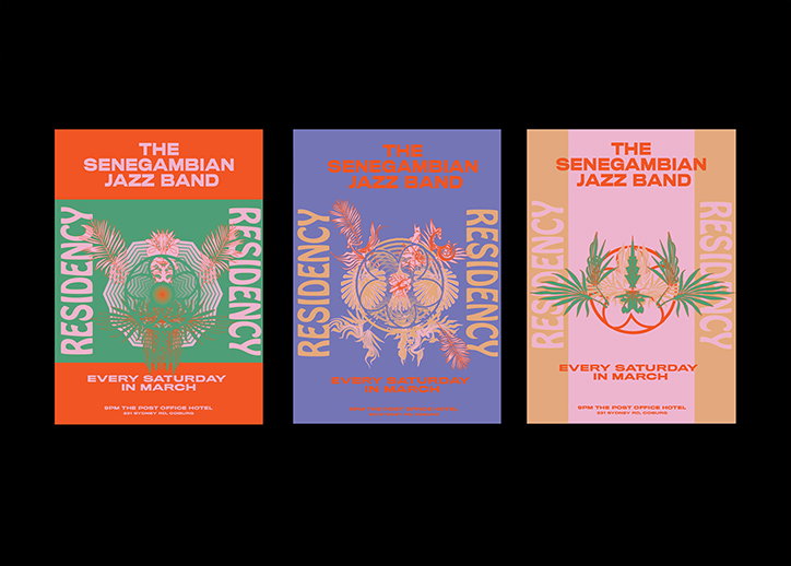
Gemma Mahoney: The Segedinksy Jazz Band

Gemma Mahoney: The Segedinksy Jazz Band
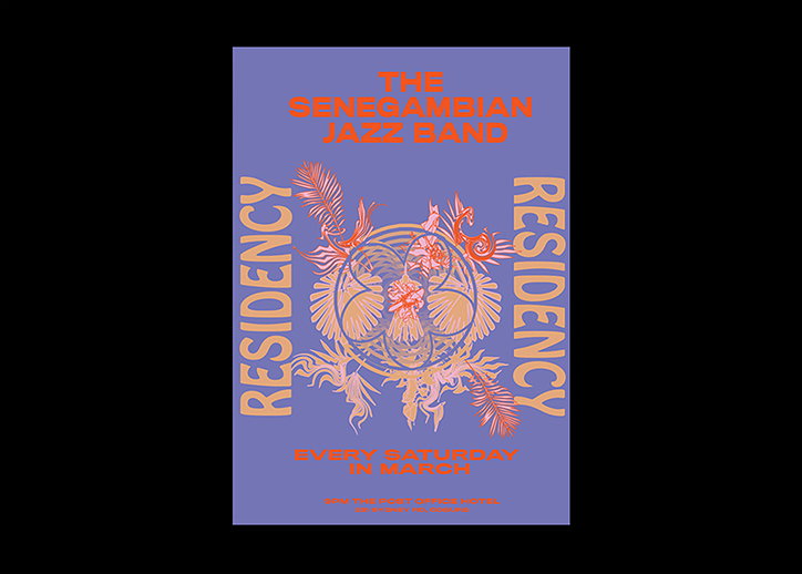
Gemma Mahoney: The Segedinksy Jazz Band
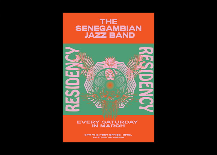
Gemma Mahoney: The Segedinksy Jazz Band
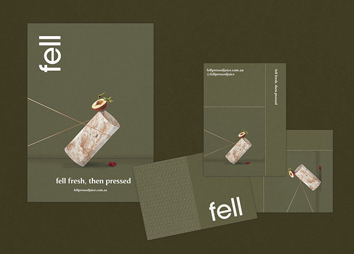
Gemma Mahoney: Fell Pressed Juice
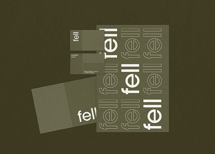
Gemma Mahoney: Fell Pressed Juice

Gemma Mahoney: Fell Pressed Juice
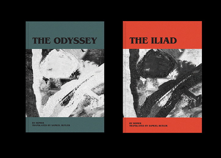
Gemma Mahoney: The Odyssey and The Iliad
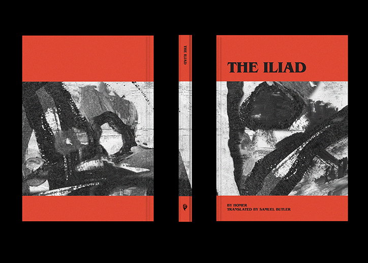
Gemma Mahoney: The Odyssey and The Iliad
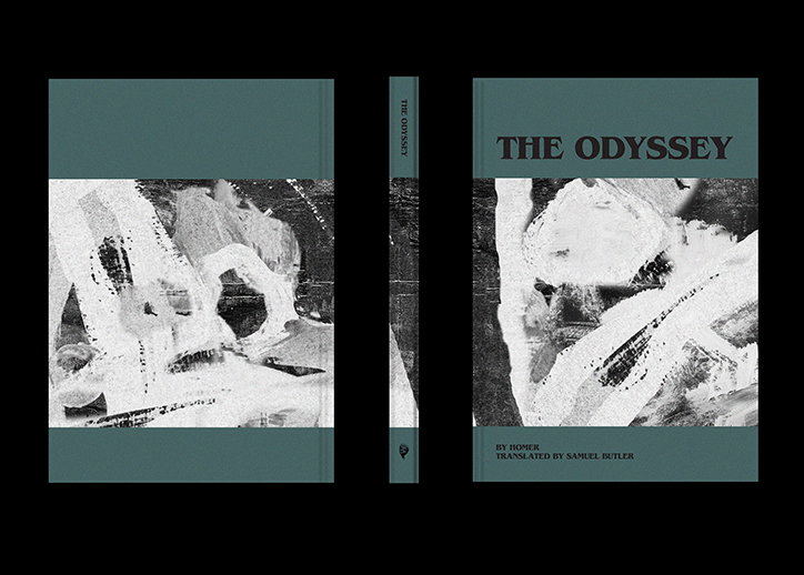
Gemma Mahoney: The Odyssey and The Iliad
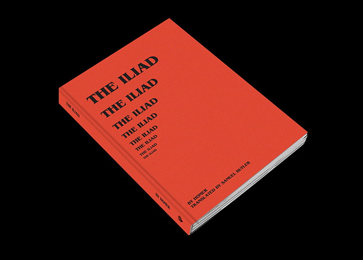
Gemma Mahoney: The Odyssey and The Iliad
Share Article
Further Info
About the Author
—
Lucy (she/her) was part of the It’s Nice That team from 2016–2025, first joining as a staff writer after graduating from Chelsea College of Art with a degree in Graphic Design Communication, eventually becoming a senior editor on our editorial team, and most recently at Insights, a research-driven department with It’s Nice That.



