Rick Banks revives Möhring’s Florida typeface made famous by Ingmar Bergman
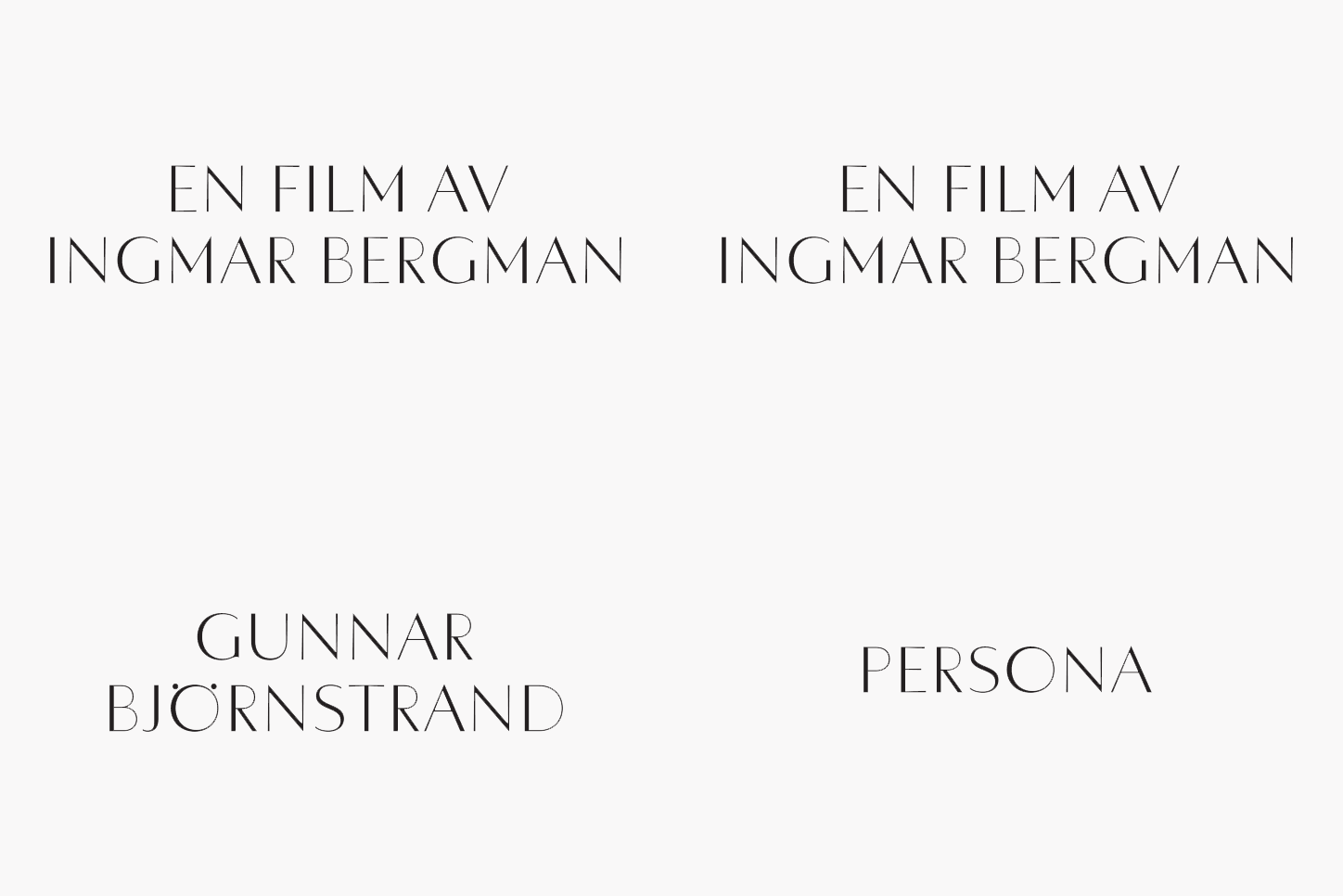
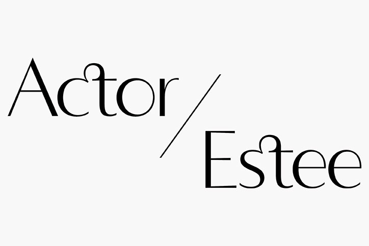
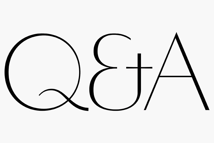
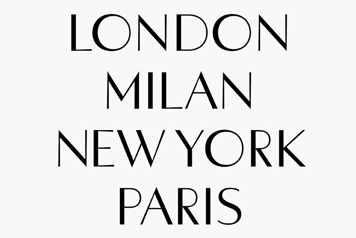
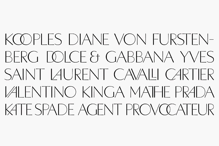
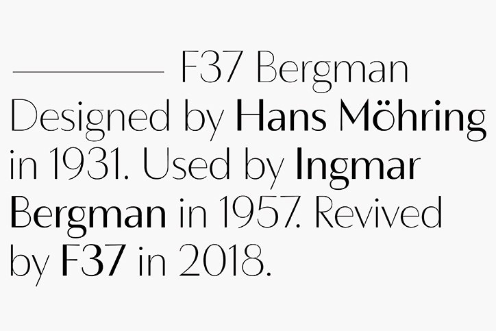
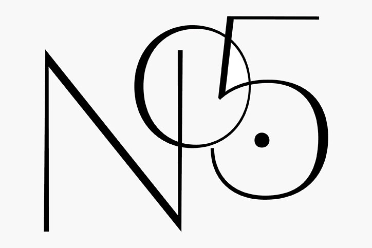
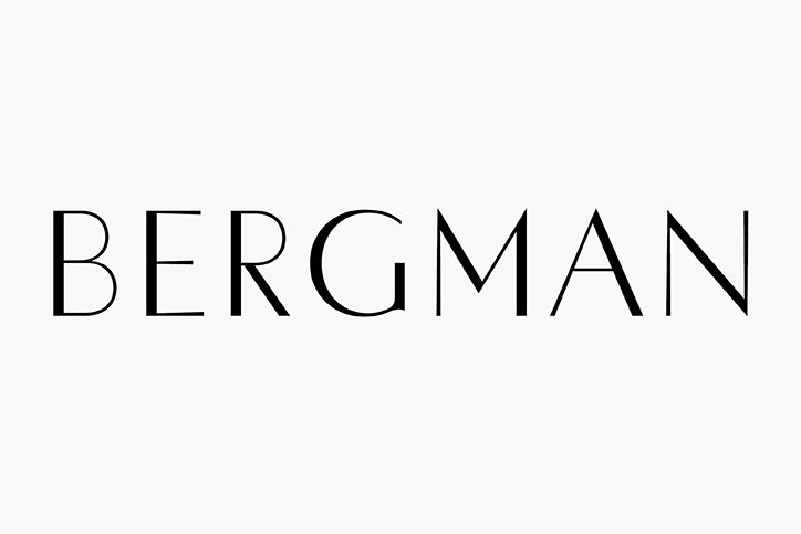
Face37, the type foundry founded by Rick Banks, has revised and digitalised Hans Möhring’s Florida typeface. Now available in a range of weights and in lowercase, Rick has updated the font in four weights and made it available for use. “We loved Möhring’s juxtaposition of the tapered stems and the geometric thick and thin lines, making it perfect for luxurious branding and editorial work,” says Rick. “We’ve also injected a bit of modernity into the design by creating numerous ‘Herb Lubalin’ style alternates, as well as stylistic diacritics.” It’s Nice That caught up with the designer to learn more about the project and its origins.
What inspired you to revisit Florida? Where did you encounter it and why did it make such an impact?
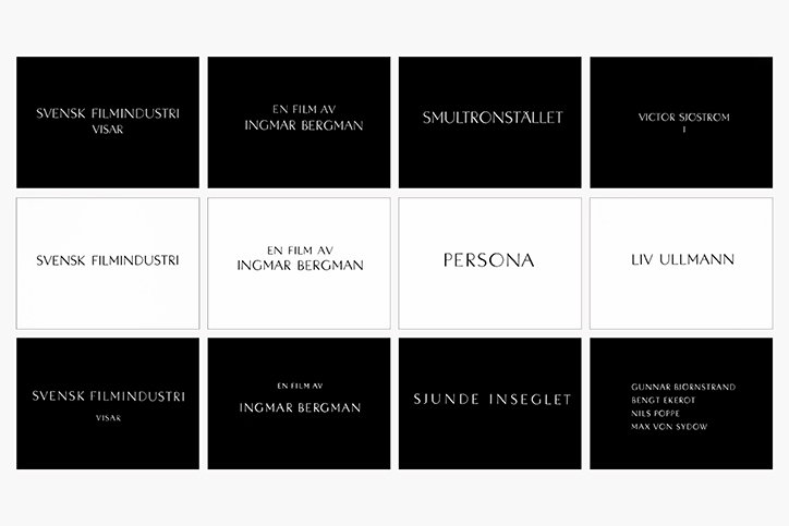
I first encountered Florida whilst watching Ingmar Bergman’s classic 1957 film Wild Strawberries. After watching Persona and The Seventh Seal, I soon realised Florida also featured in his other two seminal films. Bergman presented the title credits in a minimal and stark way — always in black or white. This really hit a chord with me. I also fell in love with Möhring’s asymmetric O too.
How did you go about making sure you had a full set of reference characters and glyphs?
As well as using screengrabs from the Bergman DVDs, I tracked down the original 1931 specimen of Hans Möhring’s Florida font in an old ’50s book called Encyclopedia of Typefaces by Jaspert, Berry & Johnson. This had the original uppercase A-Z and numerals. I don’t think the full punctuation set was ever designed, so that has been drawn from scratch.
What was the process of updating the typeface? What digital or analogue procedures were involved?
First and foremost, I wanted the font to have an accompanying lowercase. After the uppercase was scanned and digitalised it was case of drawing lowercase letterforms that had harmony with the original design. The original design also only had one weight — I wanted the revival to have multiple weights. The font also features Opentype stylistic diacritics as seen in Bergman’s films.
How did you decide/alight upon the Lubalin-style ligatures? How did you make sure that the style remained coherent?
I wanted to bring something new to the revival and make it modern. Designing the Opentype ligatures was also an ode to the original uppercase and makes the font really versatile. Although their style is coherent, I think using the ligatures creates a different look and feel — which I like.
Where do you hope to see the typeface used?
I hope to see F37 Bergman used in editorial work and luxury/fashion brands. The typeface is available from at F37 Foundry & HypeForType.
F37: Florida
F37: Florida
F37: Florida
F37: Florida
F37: Florida
F37: Florida
F37: Florida
F37: Florida
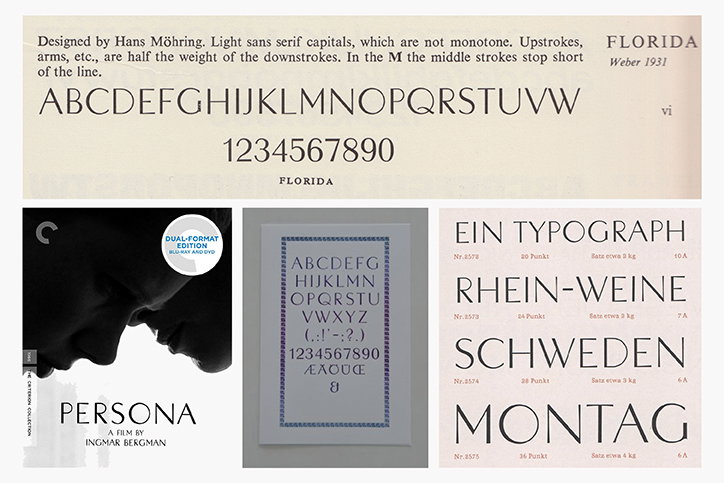
F37: Florida reference material
Share Article
Further Info
About the Author
—
Owen joined It’s Nice That as Editor in November of 2015 leading and overseeing all editorial content across online, print and the events programme, before leaving in early 2018.