Launch Recite Me assistive technology
An animation in which a purple shape morphs against a black background. The form shifts from a rounded, double-lobed figure into a single circle.

Estonian design agency AKU creates versatile design identity for new banking service Pocopay

—
Date
25 February 2016

Estonian design agency AKU has designed a versatile brand identity for new banking app Pocopay. Aiming to revolutionise the way users handle their day-to-day finances, Pocopay’s fluid product, branding and communication design looks to reflect the business’ innovative approach.

Responding to the constantly evolving ways people access and manage their money, AKU has developed a mobile-first visual identity, website and app. The modular and aesthetically simplistic design elements draw focus to the concept’s user experience and bring calm and clarity to banking, an area commonly synonymous with overwhelming jargon.

Having integrated animation from motion design specialists Tolm and mobile UX-UI from Mobi Lab, AKU’s work for Pocopay is an example of how a considered and comprehensive approach to design for banking and finance, an area that so often sees products developed from an archaic perspective, can transform the efficiency of our everyday tasks.
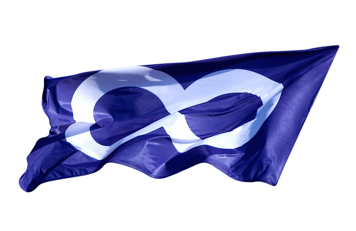
A deep blue flag ripples against a black background. A large, white infinity symbol is printed across the centre.
Above

AKU: Pocopay

A purple infinity symbol centred on a plain black background.
Above

AKU: Pocopay

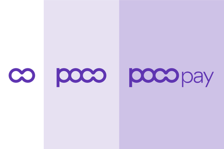
A purple and black graphic featuring a purple infinity symbol on a black background. To the right, the words “BUSD” and “Paxpay” appear in a subtle, tonal purple.
Above

AKU: Pocopay

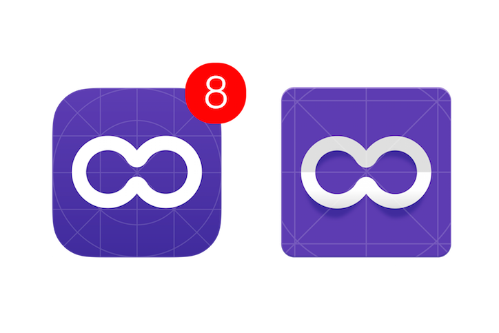
Two versions of a purple app icon featuring a white infinity symbol. The left icon has a red notification badge with the number “8” and is set against a technical grid. The right icon is framed by circular and linear alignment guides.
Above

AKU: Pocopay

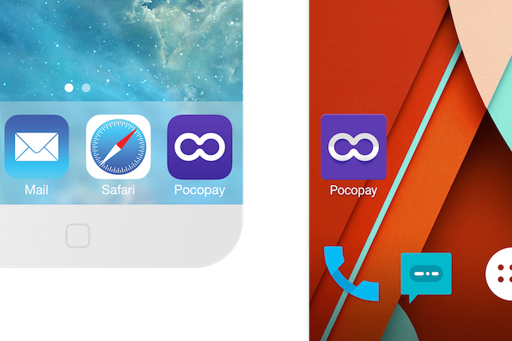
A split screen shows the Pocopay app icon on two different mobile interfaces. On the left, the purple icon with a white infinity symbol sits alongside Mail and Safari. On the right, the same icon appears on a red and orange abstract background.
Above

AKU: Pocopay

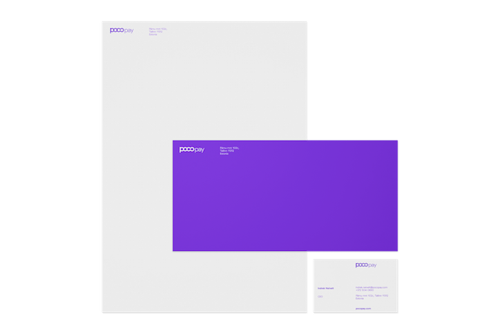
A branding mockup for “pocopay” featuring a white letterhead, a purple envelope, and a white business card. The logo appears in the top corner of each item in a simple purple typeface.
Above

AKU: Pocopay

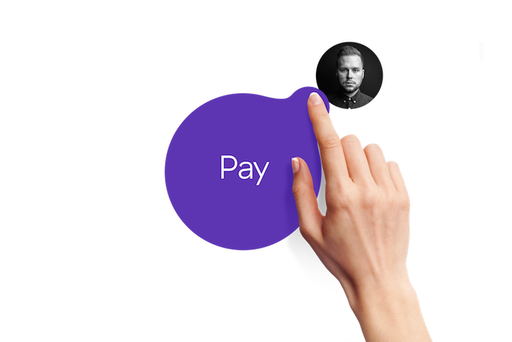
A hand reaches up to touch a purple, organic-shaped button that reads “Pay”. A small, circular black-and-white portrait of a person floats just above the button.
Above

AKU: Pocopay

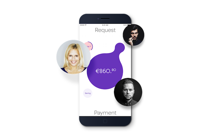
A 3D render of a smartphone displaying a payment app. A purple organic shape in the centre shows the amount “€860.80”, surrounded by circular portraits of three people.
Above

AKU: Pocopay

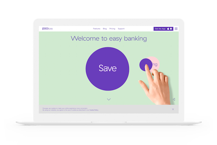
A laptop displays a website for a banking service called “pocopay”. The page features a light green background with the headline “Welcome to easy banking” and a large purple circle containing the word “Save”. A hand reaches into the frame to press a smaller purple button.
Above

AKU: Pocopay

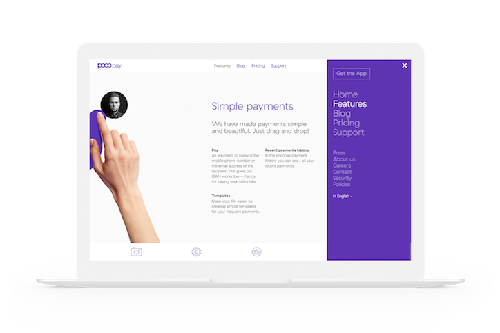
A laptop screen displays a website for a payment service called “pocopay”. A hand reaches into the frame to drag a profile picture of a person across the page.
Above

AKU: Pocopay

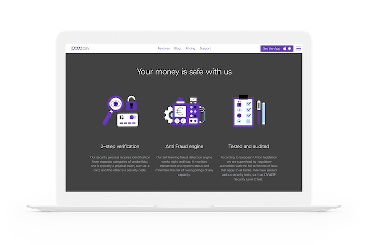
A laptop displays a website for a service called “Poocopay”. The dark landing page reads “Your money is safe with us” above three purple icons and columns of text.
Above

AKU: Pocopay

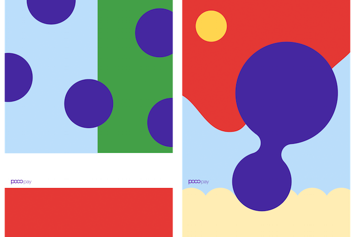
Two abstract graphic compositions featuring bold colours and circular shapes. The left image shows purple circles over light blue and green panels, while the right image features a large, fluid purple form against red and blue backgrounds. Both include a small “poopay” logo.
Above

AKU: Pocopay

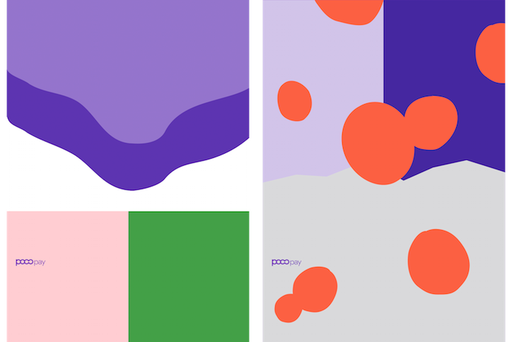
Two graphic compositions for “poopay”. The left shows purple wavy shapes over a white background and a split pink and green panel. The right features orange circles scattered across purple and grey backgrounds.
Above

AKU: Pocopay

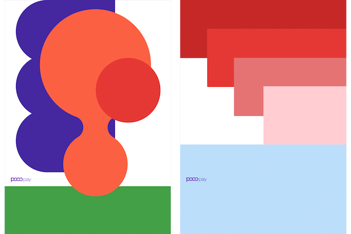
Two graphic posters for “poopay”. The first features overlapping purple, orange and red organic shapes over a green base. The second shows a series of red and pink rectangles descending in a stepped pattern over a light blue base.
Above

AKU: Pocopay

Share Article

Further Info

About the Author

Milly Burroughs

—

Milly Burroughs (@millyburroughs2.0) is a Berlin-based writer and editor specialising in art, design and architecture. Her work can be read in magazines such as AnOther, Dazed, TON, Lux, Elephant, Hypebeast and many more, as well as contributing to books on architecture and design from publishers Gestalten and DK. She is It’s Nice That’s Berlin correspondent.


It's Nice That Newsletters

Fancy a bit of It's Nice That in your inbox? Sign up to our newsletters and we'll keep you in the loop with everything good going on in the creative world.