





Graphic designer Emma Dragovic on finding her niche in the food and drink world
The London-based designer has a wealth of experiencing designing for and collaborating with small businesses in the food, drink and hospitality sector. Here, she explains what draws her to that space.
Finding your niche as a graphic designer is tricky. But if you manage it, a career filled with possibilities to become an expert in a certain field while building a distinctive body of work opens up to you. It was just after Emma Dragovic moved to Bristol in 2016 that she discovered her specialism. Struggling to find a design job in her new city, she took a job at a natural wine bar, ended up designing a couple of posters for them and “then just fell down the rabbit hole,” she tells It’s Nice That. “Bristol has a vibrant food scene, and so I quickly began meeting people in the industry, particularly in the natural wine scene, and designing for their events.” Six years later, and she’s made a name for herself designing everything from identities to packaging to magazines in the food, drink and hospitality sector.
Emma is now based in London, having grown up in Rotherham, south Yorkshire. She left school with the intention of becoming an architect and studied the subject at the Glasgow School of Art. “It was only when I reached the end of this long and arduous degree and started working within the industry, that I realised I didn’t want to pursue architecture as a career,” she explains. “I much preferred the graphic processes of storytelling and making visuals, to the structural and technical focus of architecture.” And it’s no surprise that Emma found solace in the procedures of graphic design, as it’s a medium she had been dabbling in, albeit unknowingly, since childhood: “As a kid, I was obsessed with making my own books, by stapling scraps of paper together and filling them with drawings and cut-outs from magazines and catalogues.”
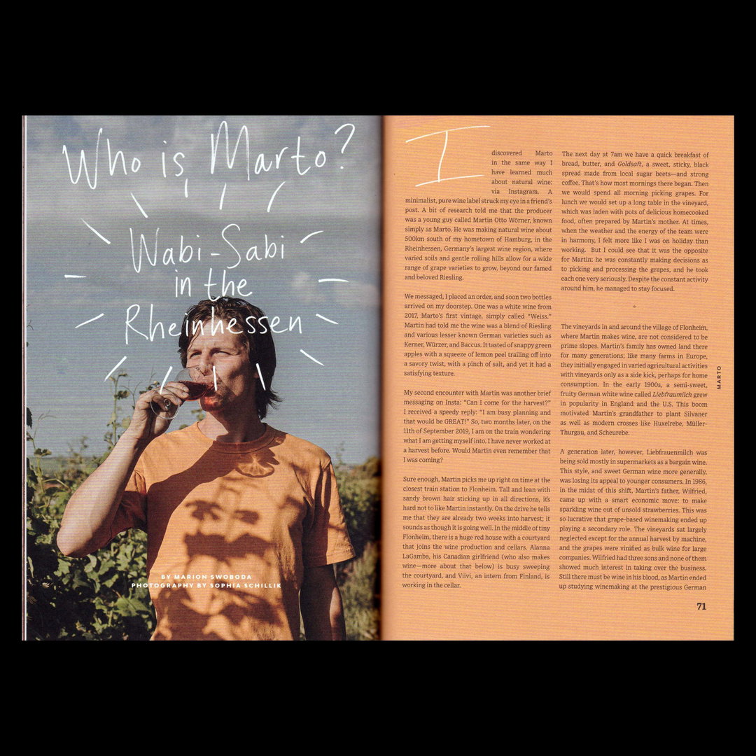
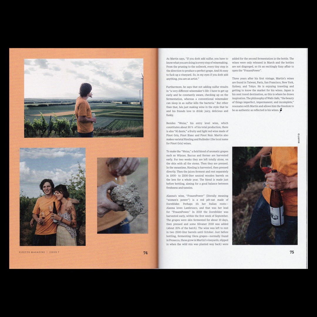
A major cause of Emma’s progression into the graphic design – and food and drink – world has been her work with Pipette. Around the time she was designing posters for the Bristol-based natural wine bar, Rachel Signer, the editor of Pipette, an independent magazine all about natural wines, reached out to Emma and asked her to design her new venture. The magazine highlights small producers of natural wine and the communities around them through a contemporary perspective, and the visual language Emma has developed reflects this. It’s precise at times, but allows room for idiosyncrasies, almost mimicking the wine-making process which is tried and tested but which promotes experimentation and an injection of personality where fitting. “The stories are always so unique, and I feel that it’s important to capture the right tone of voice for each piece, therefore I tend to add hand-drawn elements and curate them individually,” Emma says. “I’m honoured to have worked with her on Pipette until October of 2021, when we released the final issue.”
GalleryEmma Dragovic: Pipette Magazine Issue 7, Marto (Copyright © Pipette Magazine, 2020)
Also in the field of natural wine, Emma has been designing posters for Dalston Wine Club, a group founded by Hannah Crosbie, aimed at bringing young people into the world of wine “by demystifying a topic that is often seen as profound,” Emma explains. “Each month the club hosts a tasting based around a different theme, and I try and evoke the personality of the theme in the posters by adding a sense of charisma with sketch-like illustrations and juxtaposing typographic styles.” Riffing off of a product or event in this sense is exactly what draws Emma to the natural wine world. “[I] love that each wine and its winemaker has a story behind it – a sense of place and time,” she adds. “The wines are made with nothing but grapes and real dedication to natural practices and cultivation. They’re artisanal products, that are unique, raw and a bit rough around the edges and I like that the usual graphic design rules don’t apply – they’re like individual works of art.”
This love of understanding a product and the processes that went into making it perhaps explain why most of Emma’s work focuses on branding. She tells us how she finds the “initial researching, sketching and problem-solving stage really satisfying” when it comes to working on visual identities. But the reward from working within the food, drink and hospitality industry specifically is that she gets to regularly interact “with smaller businesses and people who are passionate about making or selling their products. It’s great to connect with them and bring their initial ideas to life in a visual way.”
One such business is Poolside Beers, for which Emma created an identity last year. Honest, approachable and playful, Emma was tasked with turning their specific process into something visual. “Poolside is an Amsterdam-based contract brewery – which means it doesn’t have permanent premises, instead it develops the recipes and collaborates with different breweries to make the finished product,” she explains. The branding was inspired by that and is, in turn, “experimental, fluid and changing all the time”. Just as each beer has its own style and favour, so do Poolside’s cans. “I take inspiration from the hop blends and tasting notes,” Emma says. “If the beer is zingy and fruity it will have a different look and feel to one that’s creamy and oaty.”
With a wealth of experience in the industry under her belt, Emma has recently taken on a role as a graphic designer at Mob (formerly Mob Kitchen), which was recently rebranded by Studio Nari. “It’s my job to make sure that this is implemented effectively across all areas of the platform,” she says. “It’s pretty full-on as I’m the first and only designer on the team and my day-to-day varies a lot, there’s always something new in the works.” She concludes that “there are lots of exciting things in the pipeline for next year – so watch this space”. We certainly will!
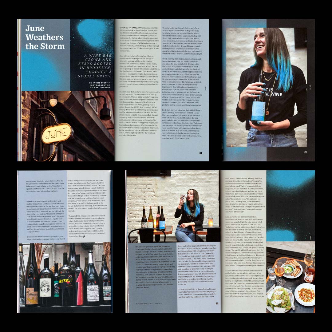
Emma Dragovic: Pipette Magazine Issue 6, Bar June (Copyright © Pipette Magazine, 2020)
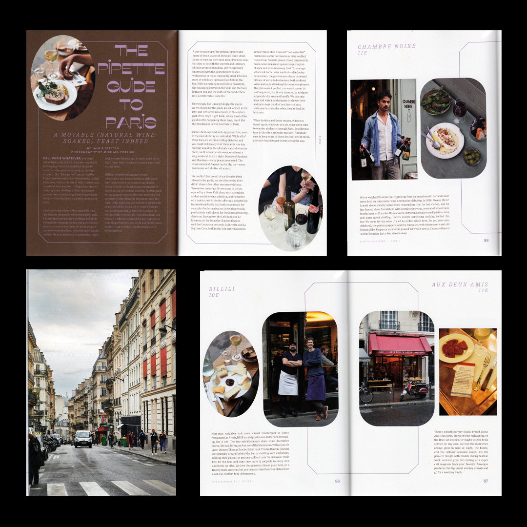
Emma Dragovic: Pipette Magazine Issue 6, Paris Guide (Copyright © Pipette Magazine, 2020)
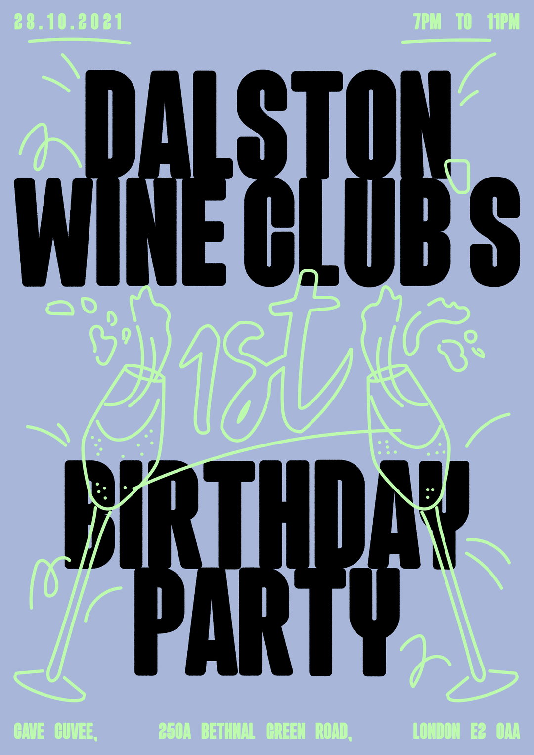
Emma Dragovic: Dalston Wine Club Birthday (Copyright © Emma Dragovic, 2021)
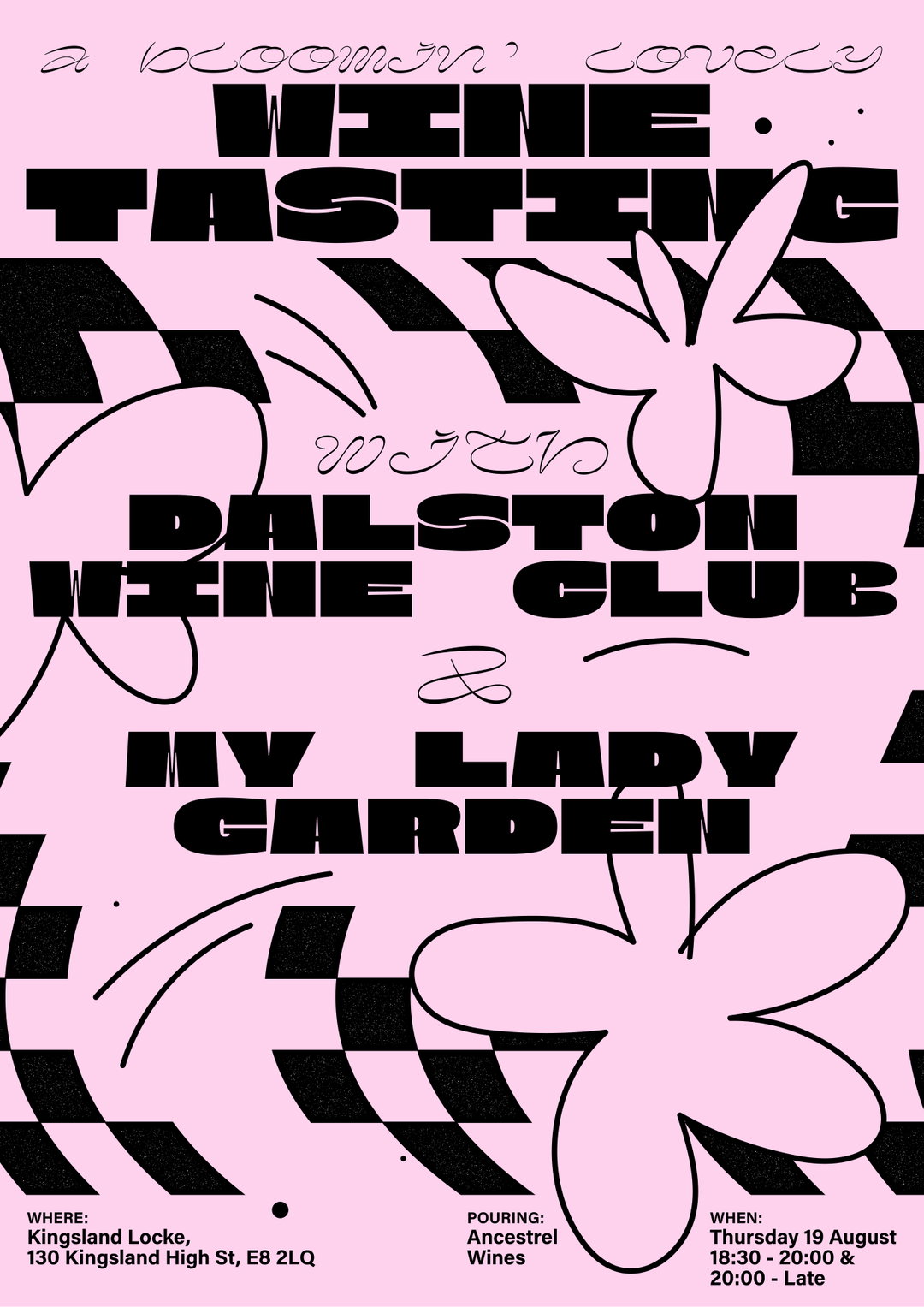
Emma Dragovic: Dalston Wine Club / My Lady Garden (Copyright © Emma Dragovic, 2021)
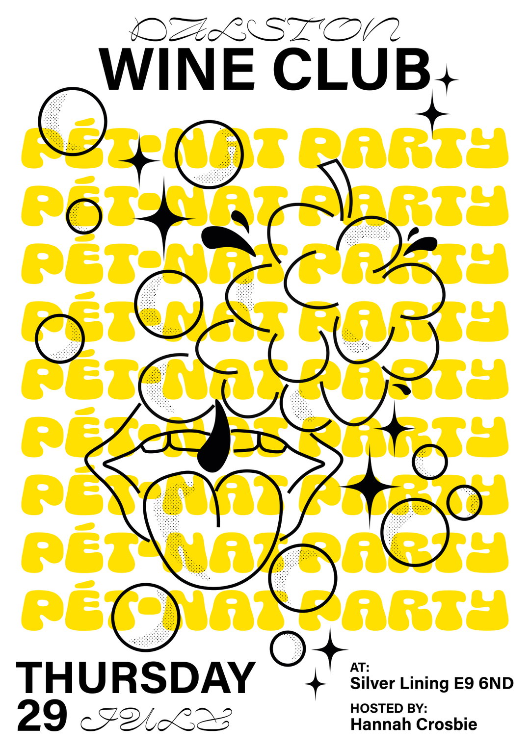
Emma Dragovic: Dalston Wine Club, Pet Nat (Copyright © Emma Dragovic, 2021)
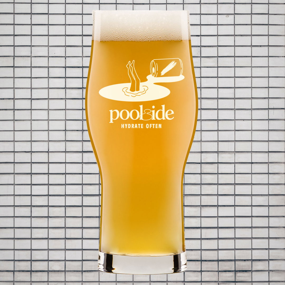
Emma Dragovic: Poolside Beers, Glass (Copyright © Emma Dragovic, 2021)
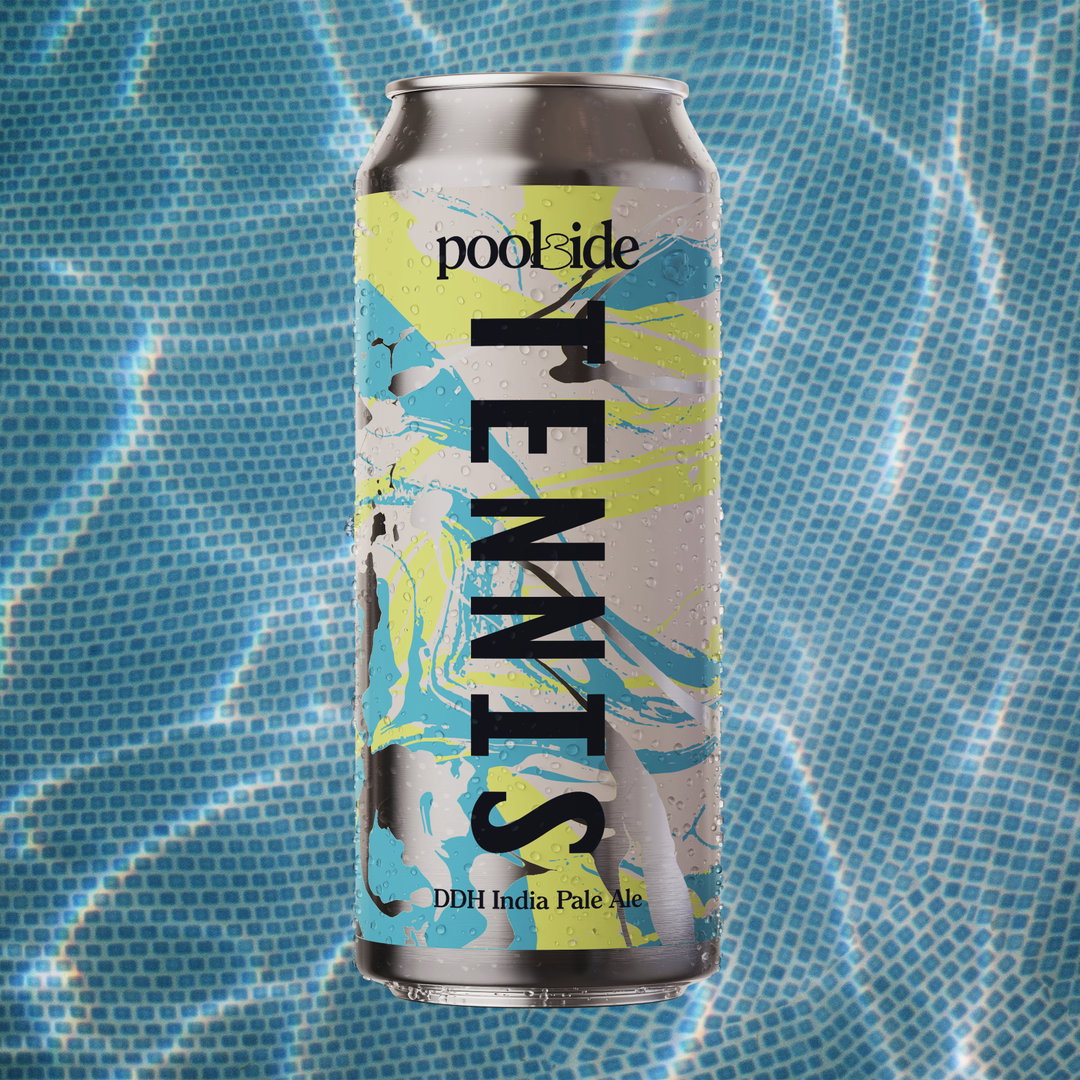
Emma Dragovic: Poolside Beers, Tennis (Copyright © Emma Dragovic, 2021)
Emma Dragovic: Poolside Beers, Gemini (Copyright © Emma Dragovic, 2021)
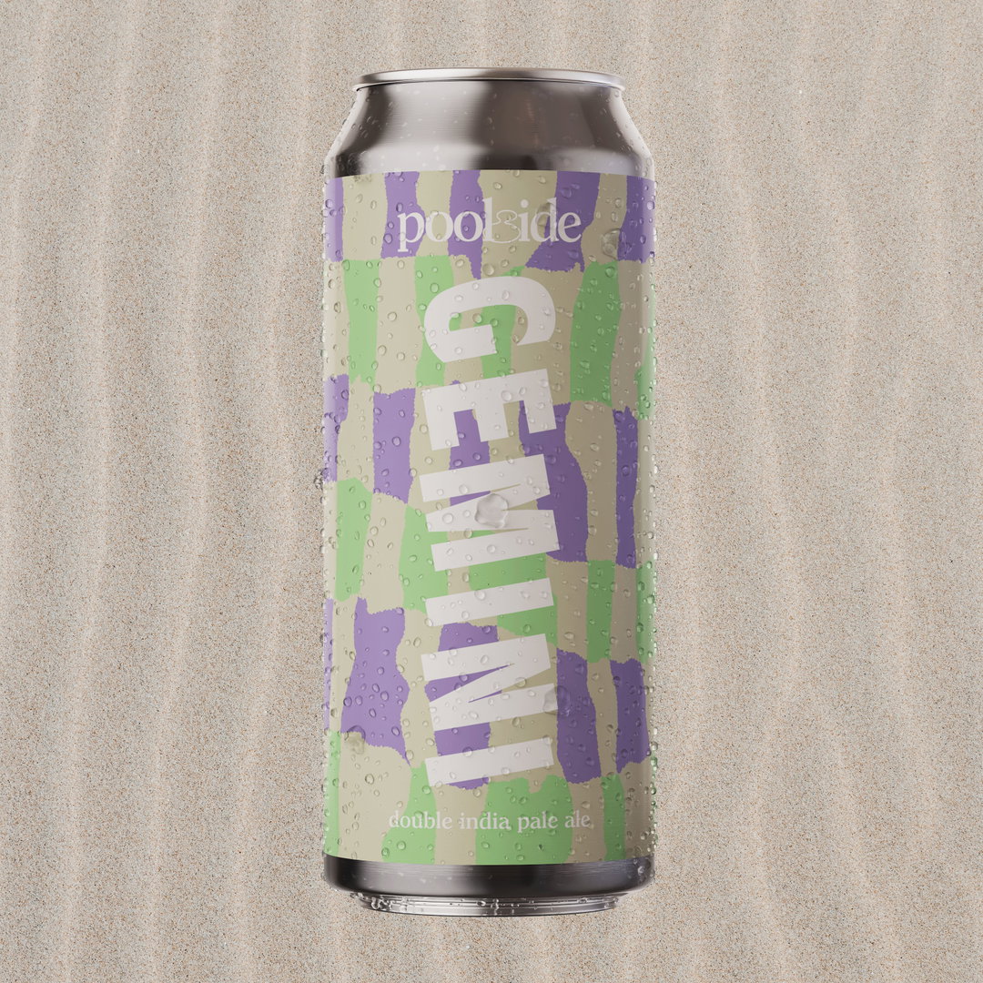
Emma Dragovic: Poolside Beers, Gemini (Copyright © Emma Dragovic, 2021)
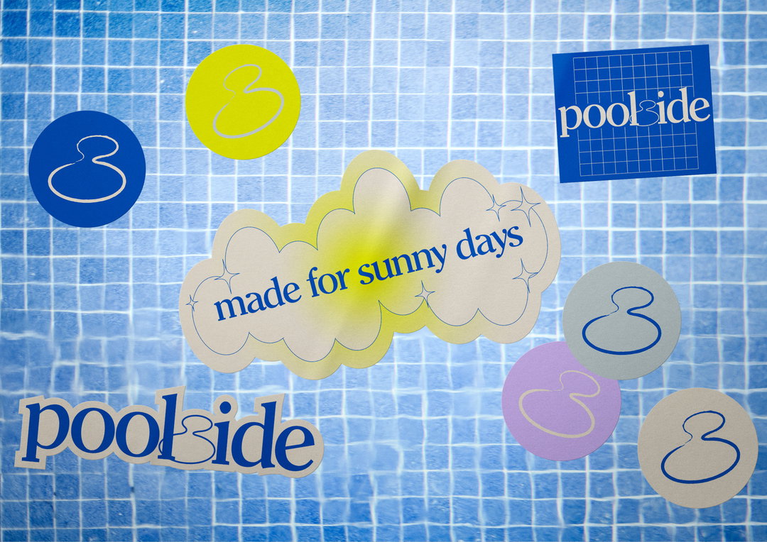
Emma Dragovic: Poolside Beers, Stickers (Copyright © Emma Dragovic, 2020)
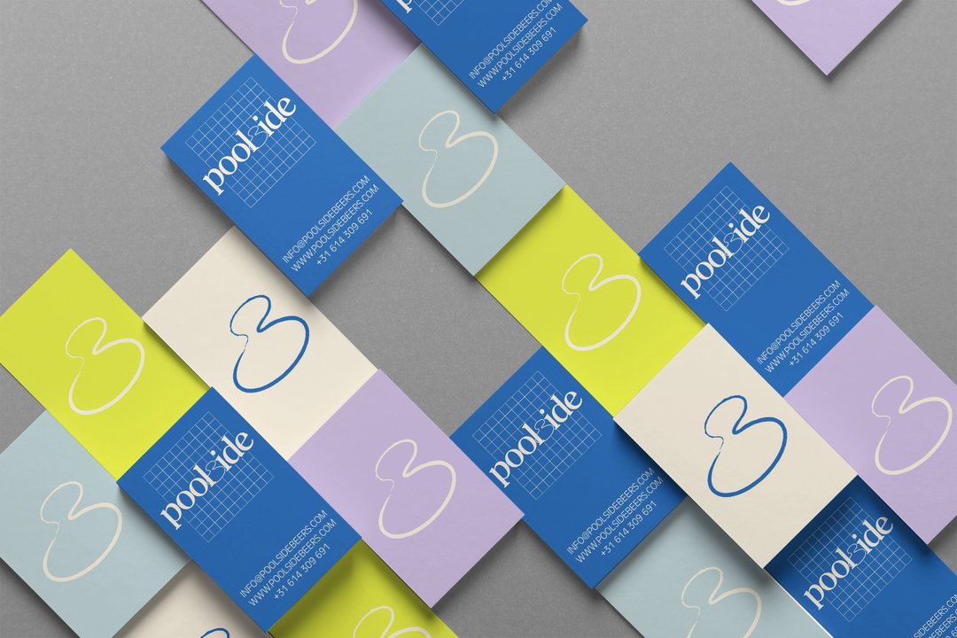
Emma Dragovic: Poolside Beers, Cards (Copyright © Emma Dragovic, 2020)
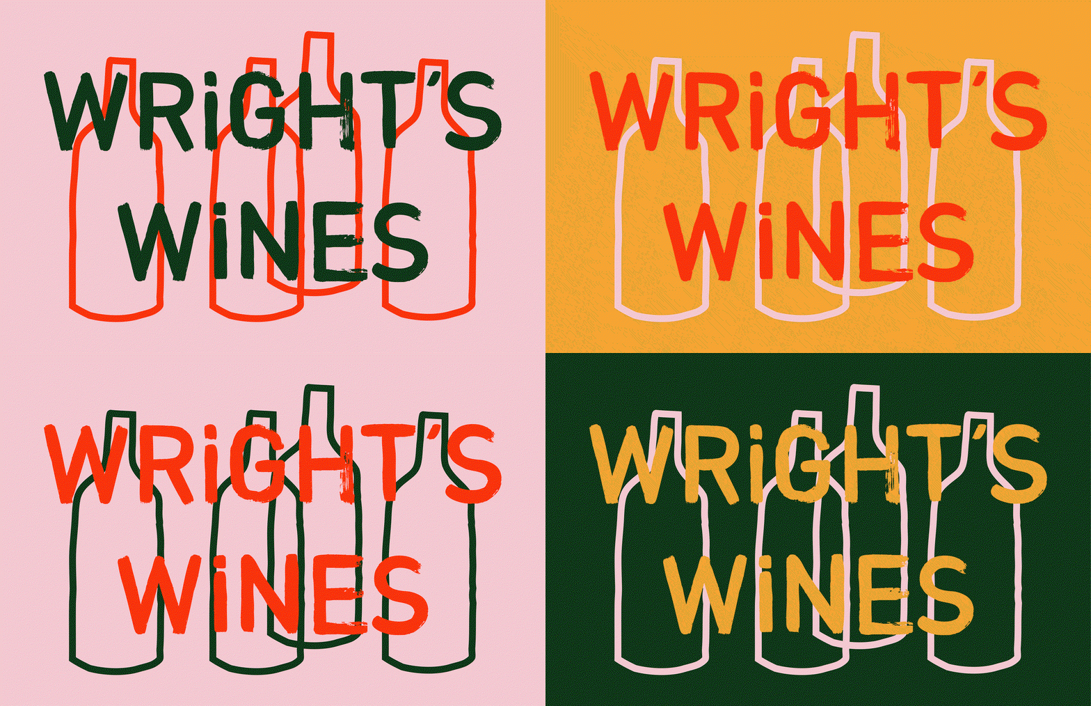
Emma Dragovic: Wright’s Wines (Copyright © Emma Dragovic, 2018)
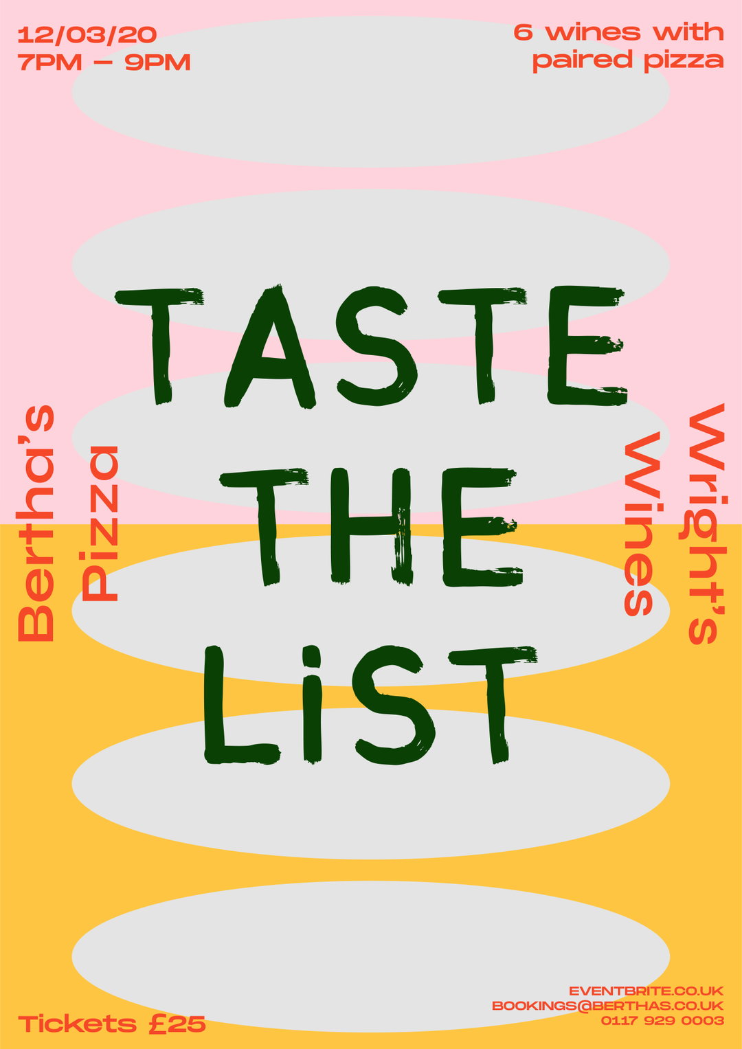
Emma Dragovic: Wright’s Wine / Berthas (Copyright © Emma Dragovic, 2020)
Hero Header
Emma Dragovic: Top Cuvee / Thomas Straker (Copyright © Emma Dragovic, 2021)
Share Article
Further Info
About the Author
—
Ruby is Senior Creative at It's Nice That, overseeing our visual output across platforms and projects. Before that, she was associate editor on the editorial team, after joining in September 2017 following graduation from Central Saint Martins.


