





Our next Grad is Falmouth-based illustrator and all-round nice man David Doran
David Doran is an illustrator so on top of his game that he’s already knocked up a cracking client list, and he’s only just finished his degree in Illustration at Falmouth. It’s not hard to see why, though – his skill is second to none, interweaving layers of soft texture, muted palettes and characters so animated that you almost recognise them, to create some of the snazziest tableaux we’ve seen in ages. We can’t wait to see what he’s got up his sleeve next, but in the meantime, get a load of this! Cor.
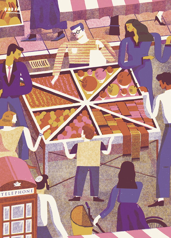
David Doran: Hunger Magazine
Why or who or what made you go to art school?
I’ve been drawing my whole life, but the decision to go to art school came when I was studying Graphic Design at Canterbury college. I’d always loved design, but wanted to involve drawing more. Once I found out that being an illustrator was possible, I knew that it was exactly what I wanted to do! I skipped doing a foundation year and headed straight to the other side of the country to study illustration by the sea at Falmouth University.
Tell us about your best project
I enjoy working on editorial projects the most. I love developing concepts and the satisfaction of answering a brief in a single image. My favourite project is probably Going Home Again, which was for The New York Times Book Review and just won the Editorial New Talent category in The AOI Awards. The image depicts the secluded and contemplative scene of a man travelling back home alone, whilst also involving the stripped back colour palette of the Canadian flag in the spotlight – helping communicate the subtle questions of identity raised in the article.
Tell us about your worst
I made a short book called Fin the Writer in my first year (“Fin” meaning “the end”). It was about a writer who became a depressed alcoholic through a downward spiral of situations in his life. I don’t think I’ve used black in a single illustration since. It was a fleeting dark moment and I cringe looking back!
If you could show one person your portfolio, who would it be and why?
I’d love to sit down with some of the great designers from New York in the 1960’s. I always find listening to how passionate they feel to make good work really inspiring and motivating. I’d love to hear their thoughts on my illustration.
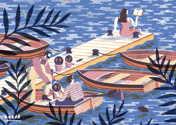
David Doran: Nobrow 9, It’s Oh So Quiet
What was the best moment of your three years at uni (extra curricular included)?
Being in Cornwall during the summer each year has been great; swimming, skateboarding, BBQs, boats and fishing. There’s a pontoon that we visit regularly, which my illustration for Nobrow 9, It’s Oh So Quiet is based on. It’s on a huge expanse of water and at night you can hear all the wildlife on the water’s edge come to life.
A lot is changing – would you recommend art school to someone who is considering going?
I would totally recommend art school to someone considering going now. The tuition fees would initially put me off, but the chance to have three years focused purely on illustration with help and feedback from experienced tutors is an incredible opportunity.
Finally, if your dreams come true, where will you be in a year’s time?
I feel blessed with the freedom that comes with illustration. This past year I’ve been working from my space in Falmouth overlooking the sea while sending illustrations off to busy offices in London, New York and San Francisco. It’s shown me that there is the possibility to be working from anywhere in a year’s time, providing there’s wifi! I want to be as productive as possible and am excited to carry on working editorially, developing ideas and hopefully branching out into book covers and other contexts.

David Doran: Going Home Again for the New York Times Book Review
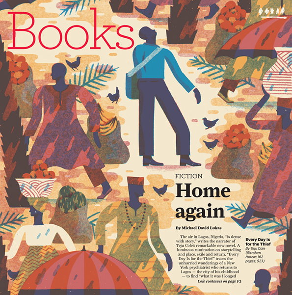
David Doran: Book Review Cover for the SF Chronicle
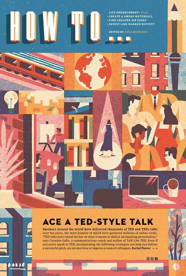
David Doran: How to Ace a Ted-Style Talk for WIRED

David Doran: Quotes and Sayings
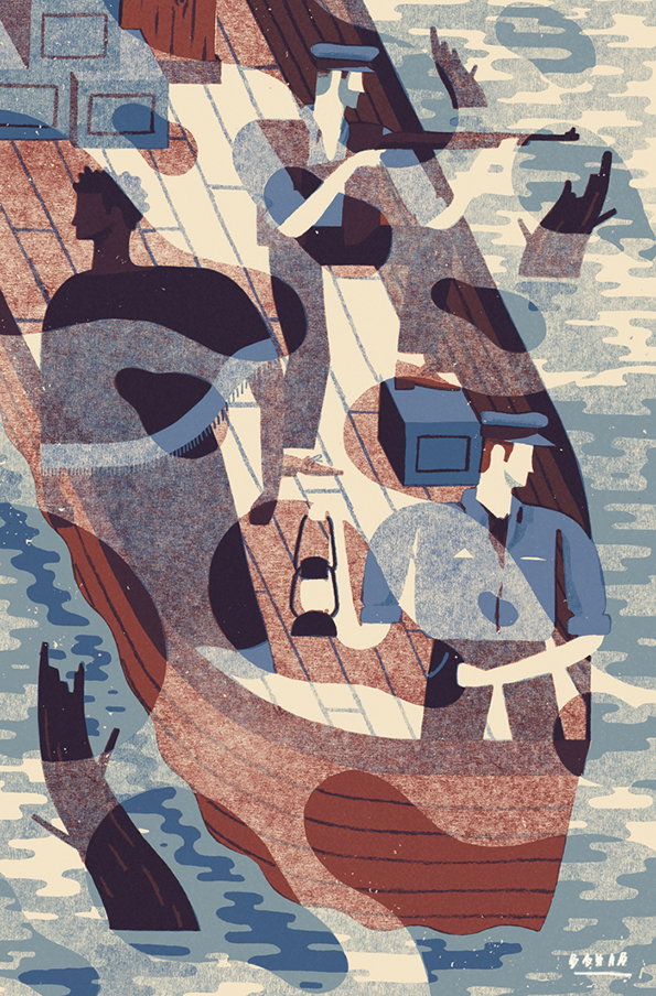
David Doran: Heart of Darkness
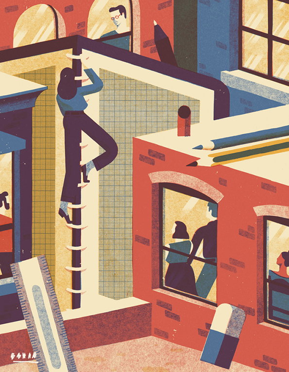
David Doran: Computer Arts
Supported by Represent
We are very pleased that The It’s Nice That Graduates 2014 will once again be supported by Represent Recruitment. The graphic design recruitment specialists have developed a peerless reputation working with designers of all levels and matching them up with the right positions in some of the top agencies around. Represent’s support has helped us grow the Graduate scheme over recent years and we are thrilled they have partnered with us again in 2014.
Share Article
Further Info
About the Author
—
Maisie joined It’s Nice That fresh out of university in the summer of 2013 as an intern before joining full time as an Assistant Editor. Maisie left It’s Nice That in July 2015.


