Launch Recite Me assistive technology

Brasilia #3 by Bureau Bordeaux: thoughtfully designed reflections on the subject of waiting
—
Date
16 August 2016
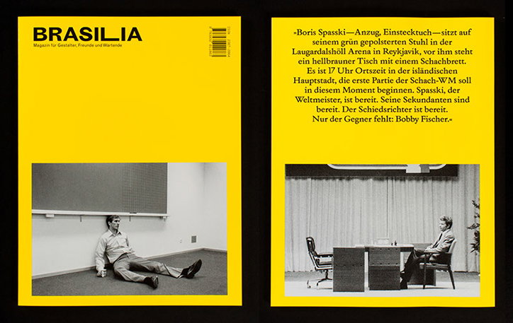
A yellow magazine cover and spread for “Brasilia”. The cover shows a person sitting on the floor of a sparse white room, leaning against a wall. The opposite page features a black and white photo of a person sitting at a desk, accompanied by a block of German text.
Above

Bureau Bordeaux: Brasilia #3

Under the art direction of Hannover-based design studio Bureau Bordeaux, each volume of Brasilia thoughtfully considers a single, versatile theme through the voice and vision of contributing design students at University of Hannover.

Bureau Bordeaux, working alongside a trio of bright designers Jasper Eisenecker, Arne Meyer and Christian Vukomanovic, compile the content simply yet imaginatively, laying out its contributors disparate perspectives side-by-side, through clashes and juxtapositions in composition, type and colour.

“For Brasilia No. 1, we once set up some pretty rough typographical ground rules that specify the layout grid, the logo placement and the use of three typefaces — MT Grotesque, Times and an additional style font, that varies from issue to issue and fits the topic,” say the Bureau Bordeaux team.

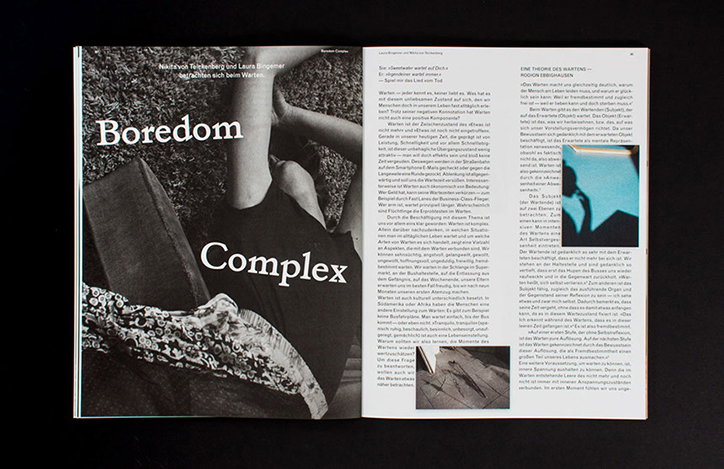
This edition of Brasilia considers the notion of “waiting”, approaching the subject from all angles in a series of written, illustrated and photographic editorials — Katrin Brümmer sees waiting as a test of endurance, while Nikita von Teickenberg and Laura Bingemer view that same boredom as a stimulus for inspiration.

The third volume’s bold front and back covers are a departure from the design of the previous two editions, featuring instead of a full page image two black and white photographs (the famous image of Boris Spassky and the referees expectantly awaiting his opponent Bobby Fischer in Reykjavík) contrastively surrounded by yellow space. “By combining two pictures that were taken by different photographers during the world chess championship, we wanted to compare the two protagonists by showing them in totally different waiting positions,” explain the Bureau Bordeaux team.

Throughout, the page numbers run backwards in an anticipatory countdown to the end, heightening the anticipation the publication seeks to convey. The German-language magazine previously covered the topics of neighbours (#1, 2014), and ideals and doubt (#2, 2015).
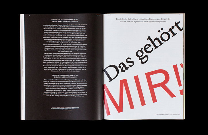
An open book with a black left page and a white right page. The right page features large, slanted text in black and red that reads “Das gehört MIR!”.
Above

Bureau Bordeaux: Brasilia #3

An open magazine spread features a black and white photograph of a person lying down. Bold white text over the image reads “Boredom Complex”. The opposite page contains columns of German text and a small, grainy photograph of a person sitting.
Above

Bureau Bordeaux: Brasilia #3

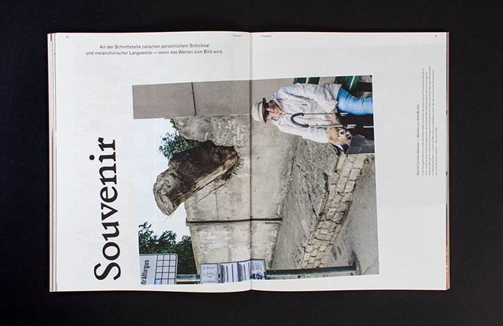
An open book shows a photograph of a person reclining against a weathered stone wall. To the left, the word “Souvenir” is printed in a large, bold serif typeface.
Above

Bureau Bordeaux: Brasilia #3

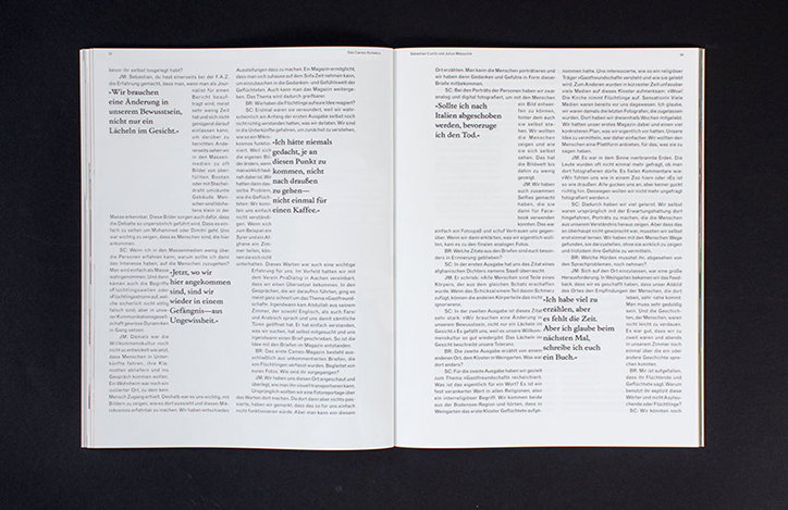
An open magazine showing two pages of dense German text. Several short phrases and sentences are highlighted in a larger, bold typeface.
Above

Bureau Bordeaux: Brasilia #3

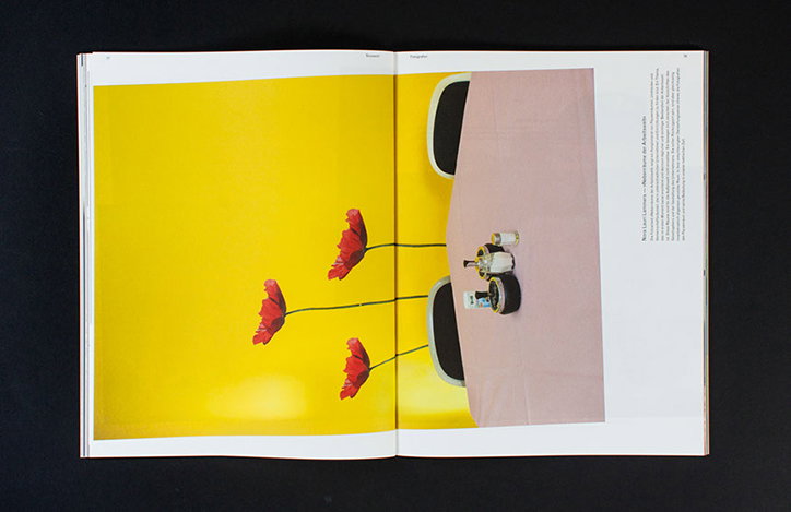
An open book shows a photograph of three red poppies growing from a pink tabletop. The table is set against a bright yellow background, with a black chair partially visible.
Above

Bureau Bordeaux: Brasilia #3

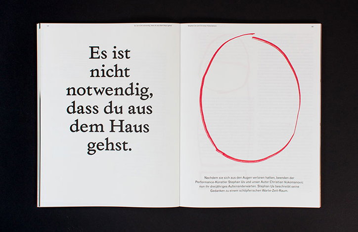
An open book shows a bold German phrase on the left page: “Es ist nicht notwendig, dass du aus dem Haus gehst.” The right page features a large, hand-drawn red circle above a short paragraph of text.
Above

Bureau Bordeaux: Brasilia #3

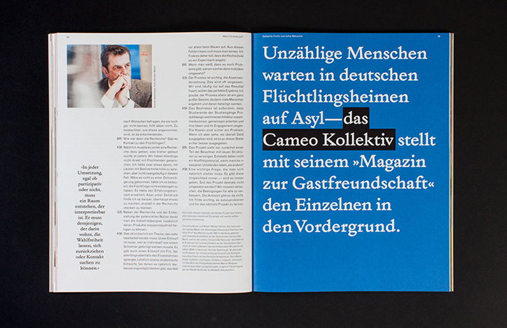
An open magazine showing a portrait of a person resting their chin on their hand next to columns of German text. The opposite page is a solid blue with a large white headline that reads “Unzählige Menschen warten in deutschen Flüchtlingsheimen auf Asyl—das Cameo Kollektiv stellt mit seinem »Magazin zur Gastfreundschaft« den Einzelnen in den Vordergrund.”
Above

Bureau Bordeaux: Brasilia #3

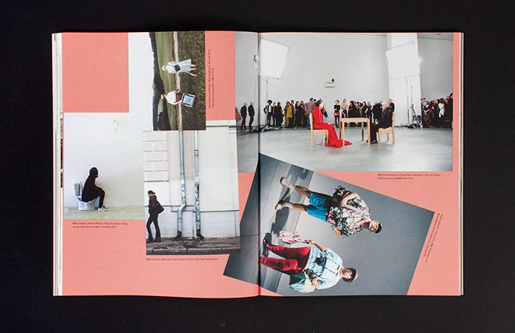
An open book displays a collage of photographs across two pages. The images show people in various settings, including a person in a long red dress standing in a studio and figures posed against a white wall.
Above

Bureau Bordeaux: Brasilia #3

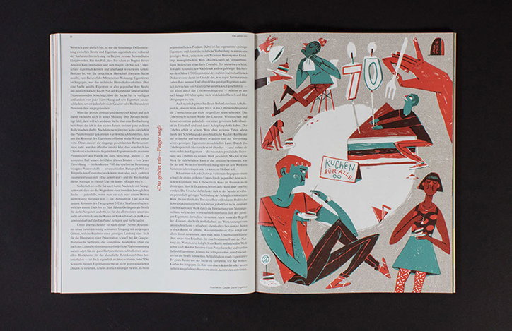
An open book shows a page of German text opposite a colourful illustration. The artwork features stylised figures, a cake, and a large number “70” set against a white background.
Above

Bureau Bordeaux: Brasilia #3

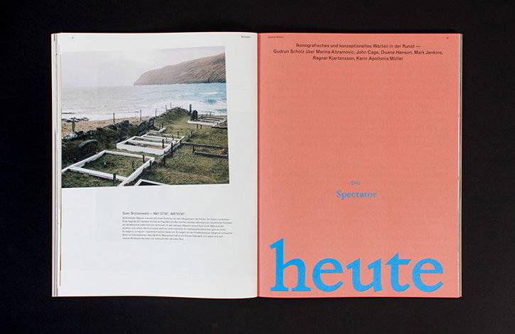
An open book shows a photograph of a coastal cemetery with white-bordered graves on the left page. The right page is a solid coral pink with blue text that reads “heute” at the bottom.
Above

Bureau Bordeaux: Brasilia #3

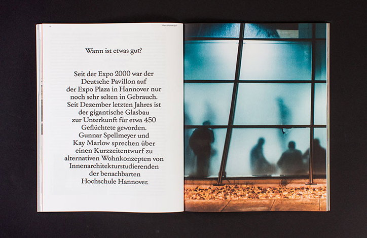
An open book shows a page of German text opposite a photograph. The image depicts blurred figures seen through a large glass wall, with a scattering of autumn leaves on the ground.
Above

Bureau Bordeaux: Brasilia #3

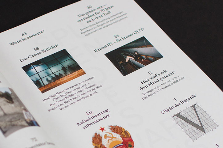
An open magazine displays a layout of articles with German headlines and accompanying images. One page features a grid of dark windows and a person reclining in a narrow space.
Above

Bureau Bordeaux: Brasilia #3

Share Article

About the Author

Jamie Green

—

Jamie joined It’s Nice That back in May 2016 as an editorial assistant. And, after a seven-year sojourn away planning advertising campaigns for the likes of The LEGO Group and Converse, he came back to look after New Business & Partnerships here at It’s Nice That until September 2024.

It's Nice That Newsletters

Fancy a bit of It's Nice That in your inbox? Sign up to our newsletters and we'll keep you in the loop with everything good going on in the creative world.