Launch Recite Me assistive technology
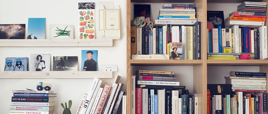
A white wall with two floating shelves holds a collection of small artworks, postcards and a notebook. Beside them, a wooden bookshelf is packed with a dense variety of books and a small plush toy.

The top five books of POST magazine’s Louise Benson

—
Date
8 July 2014

Louise Benson from POST Magazine has curated a selection of books from her bookshelf for us! Since we first wrote about POST in 2011, the digital magazine dedicated to showcasing cutting-edge creativity has spectacularly grown, and has become a very intriguing and forward-thinking online platform. The site explores the blurring boundaries between art, fashion, science and technology, and in the past they have published iPad editions of their magazines. For an afternoon, Associate Editor Louise pulled herself out of the digital realm and spent some time with her physical bookshelf. On to Louise for her list of all time favourites.
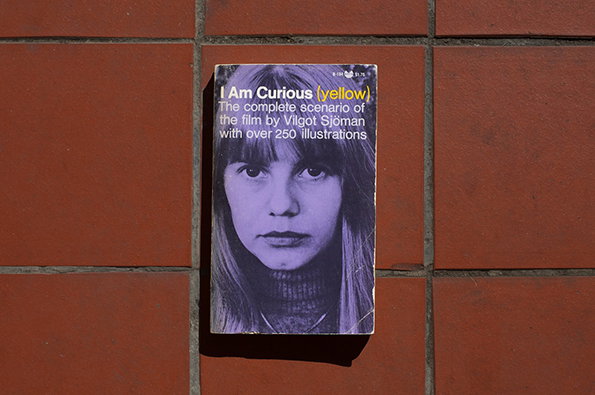
A booklet is pinned to a red tiled wall. The cover features a purple-tinted portrait of a person and the text “I Am Curious (yellow) The complete scenario of the film by Vilgot Sjöman with over 250 illustrations”.
Above

Vilgot Sjoman: I Am Curious (Yellow)

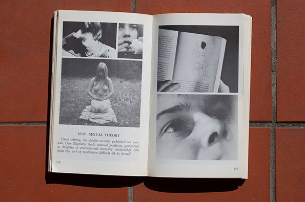
An open book lies on a red tiled surface. The left page features black and white photographs of a person and the heading “10:05 SEXUAL THEORY”, followed by a short paragraph of text.
Above

Vilgot Sjoman: I Am Curious (Yellow)

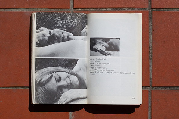
An open book lies on a red tiled surface. The pages feature black and white photographs of two people in intimate poses, accompanied by a short dialogue between characters named “Borje” and “Lena”.
Above

Vilgot Sjoman: I Am Curious (Yellow)

An open book rests on a red brick surface. The left page features two black and white photographs of people lying in grass, while the right page contains a small image and a dialogue between “Boris” and “Lena”.
Above

Vilgot Sjoman: I Am Curious (Yellow)

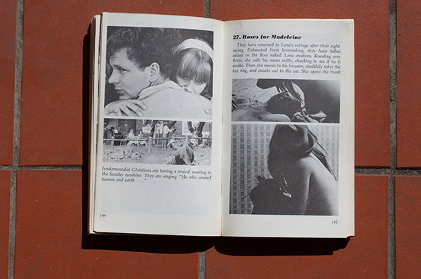
An open book lies on a red tiled surface. The pages feature black and white photographs and text, including a heading that reads “27. Roses for Madeleine”.
Above

Vilgot Sjoman: I Am Curious (Yellow)

Vilgot Sjoman: I Am Curious (Yellow)
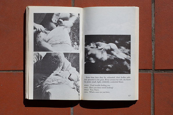
This has it all, really. A pair of young Swedish lovers, protests and politics, nude yoga, and a cameo from Martin Luther King. Released in 1967, it was initially censored in parts of America, but overall brought in a new acceptance of sex and nudity on screen in films not restricted to pornographic cinemas. I found an old VHS copy of the film knocking around in the grubby and wonderful Notting Hill Exchange film shop when I was about 16. It really shaped my fondness for non-linear ways of filmmaking, where the story itself is less important than the ways of telling it. A couple of years later, I found this accompanying book and knew that I had to buy it.
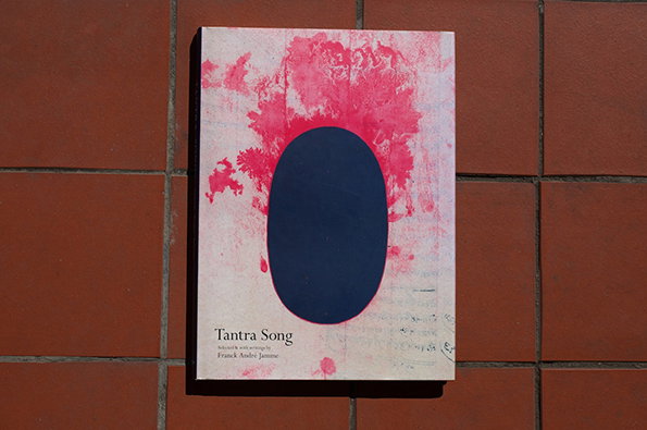
A book cover featuring a dark blue oval set against a textured, pink-splattered background. Text at the bottom reads “Tantra Song”, with a smaller credit to “Franck André Jamme”.
Above

Frank Andre Jamme: Tantra Song

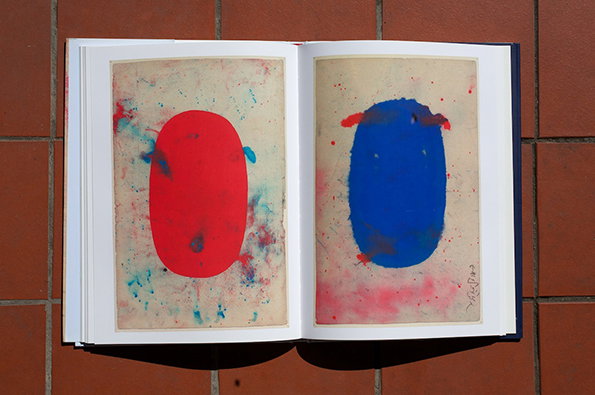
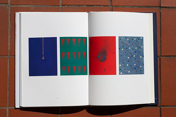
An open book displays two abstract paintings on facing pages. The left page shows a bold red oval, and the right shows a blue oval, both set against textured, splattered backgrounds.
Above

Frank Andre Jamme: Tantra Song

An open book lies on a red tiled surface. Two facing pages each feature a purple textured square set against a weathered, cream-coloured background.
Above

Frank Andre Jamme: Tantra Song

An open book rests against a red brick wall. Two pages display four small, abstract colour blocks featuring geometric shapes and patterns in blue, green and red.
Above

Frank Andre Jamme: Tantra Song

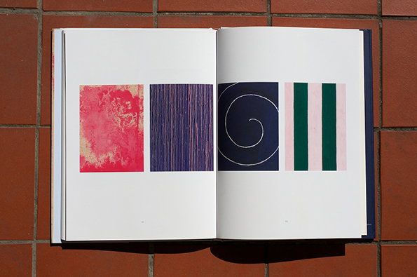
An open book lies flat against a red tiled wall. Four abstract colour studies are printed across the pages, featuring a red textured square, blue vertical lines, a white spiral on navy, and green and pink stripes.
Above

Frank Andre Jamme: Tantra Song

Frank Andre Jamme: Tantra Song
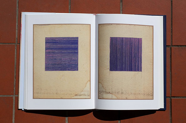
Tantric practitioners anonymously produced these paintings on used paper as a form of meditation in Rajasthan, India. They would then discard them, never laying claim to them as artists. It was all about the freely spiritual process, which is maybe what makes the collected results so strikingly beautiful. Their bleeding edges, block colours and simple shapes seem strangely prescient of spare modernist compositions. Beautifully restrained.
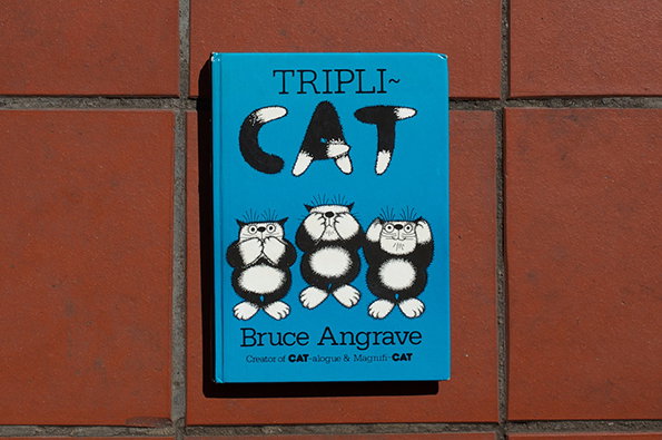
A bright blue book cover features an illustration of three fluffy black and white cats. The title reads “TRIPLI~ CAT” above the figures, with the author “Bruce Angrave” listed below.
Above

Bruce Angrave: Tripli-Cat

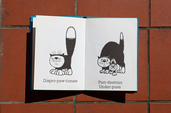
An open book on a red brick surface shows two black and white illustrations of cats. The first page shows a cat with a long tail and the word “Dispro-paw-tionate”. The second page shows a larger cat with a smaller kitten and the words “Purr-destrian” and “Under-puss”.
Above

Bruce Angrave: Tripli-Cat

An open book on a red tiled surface shows two black and white illustrations of cats. The first is a sphinx cat labelled “S-fur-inx”, and the second is a cat in a suit labelled “Ar-kit-ect” standing before a “Civic Centre”.
Above

Bruce Angrave: Tripli-Cat

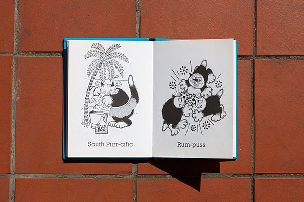
An open book on a red tiled surface shows two black and white illustrations of cats. The left page shows a cat by a palm tree with the caption “South Purr-cific”, and the right shows two cats fighting with the caption “Rum-puss”.
Above

Bruce Angrave: Tripli-Cat

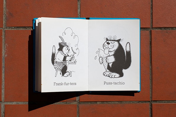
An open book shows two black and white illustrations of cats. The first cat wears a hat and eats from a bowl, captioned “Frank-fur-ters”. The second cat eats an ice cream cone, captioned “Puss-tachio”.
Above

Bruce Angrave: Tripli-Cat

Bruce Angrave: Tripli-Cat
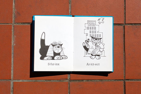
Endless cat-themed puns and monochrome illustrations, anyone? To be honest, the puns are terrible and the drawings are repetitive, but good on Bruce Angrave for picking a theme and running with it. He’s pretty much run a marathon with it, and I’d definitely say that he won that race. His warped, feline-filled world never fails to make me laugh.
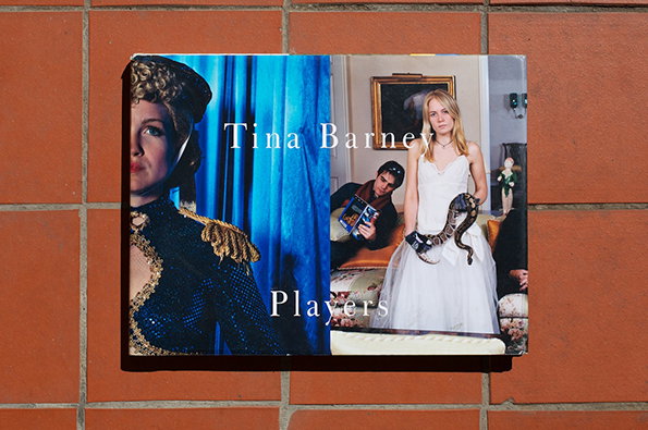
A book cover titled “Tina Barney Players” is mounted on a red brick wall. The cover features two images: a person in a blue sequinned military costume and a person in a white wedding dress holding a snake.
Above

Tina Barney: Players

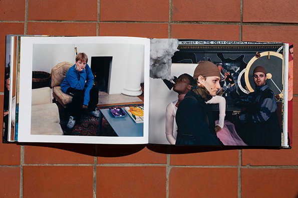
An open book rests on a red brick surface. The left page shows a person in a blue jacket sitting on a sofa, while the right page features a collage of figures in dark clothing.
Above

Tina Barney: Players

An open photo album rests on a red tiled surface. The left page shows three ballet dancers in ornate white and gold costumes, while the right page shows a group of people in formal black attire gathered in a room.
Above

Tina Barney: Players

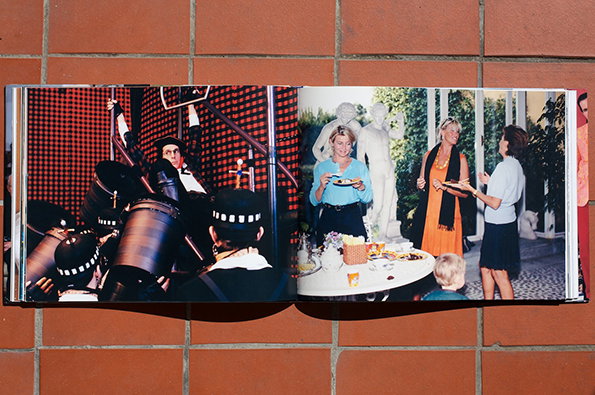
An open book rests on a red tiled surface. The left page shows a person playing drums in a dark room, while the right page shows three people standing around a table outdoors.
Above

Tina Barney: Players

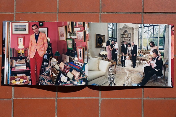
An open book resting on a red brick surface. The left page shows a person in a bright orange patterned blazer and red trousers standing in a cluttered room, while the right page shows a group of people gathered in a bright, high-ceilinged living room.
Above

Tina Barney: Players

Tina Barney: Players
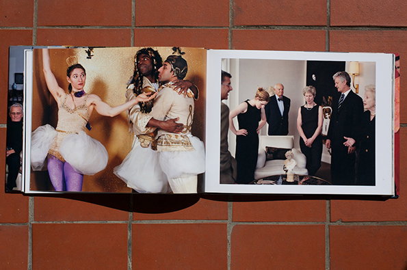
New Yorker Tina Barney’s photographs of her wealthy family and friends are kind of surreal, while at the same time managing to pick up very ordinary details. In her portraits, stuffy sofas and badly fitting shoes are captured in vivid, beautiful colours. She seems to catch the feeling of slightly awkward family gatherings, or those brief odd moments of self-reflection you sometimes get in the middle of a crowded party. Her mix of fashion and fiction, drama and documentary, really push my ideas of what style can be, and show how photography can be both posed and naturally relaxed.
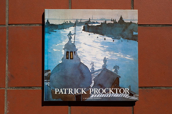
A square book cover featuring a watercolour painting of a Venetian canal. The artwork shows a blue waterway with a domed building in the foreground and a distant city skyline. The text “Patrick Procktor” is printed in white across the bottom.
Above

Patrick Procktor: Patrick Procktor

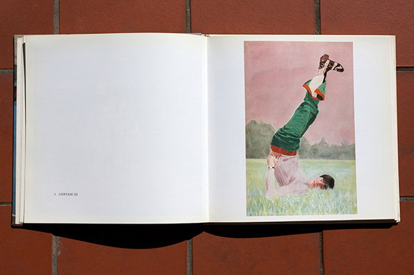
An open book shows an illustration of a person lying on their back in a grassy field. Their legs are raised straight up in the air, wearing green trousers and brown shoes. Small text on the opposite page reads “V. GERVAISE III”.
Above

Patrick Procktor: Patrick Procktor

An open book lies on a red tiled surface. The right page features a watercolour illustration of a person reclining on a patterned rug, accompanied by the caption “Ole’s Dream.”
Above

Patrick Procktor: Patrick Procktor

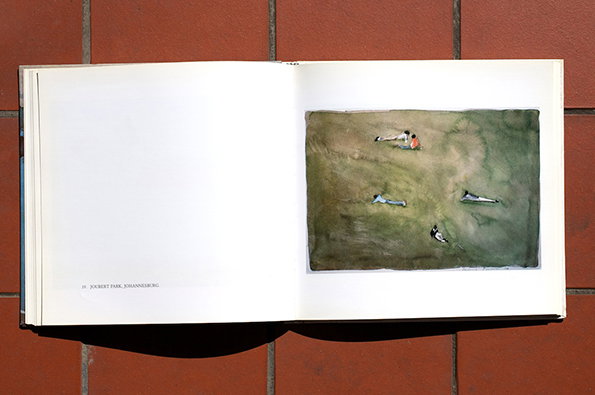
An open book lying on a red tiled surface. The right page features a watercolour painting of people lounging in a green field, with the text “Joubert Park, Johannesburg” printed on the opposite page.
Above

Patrick Procktor: Patrick Procktor

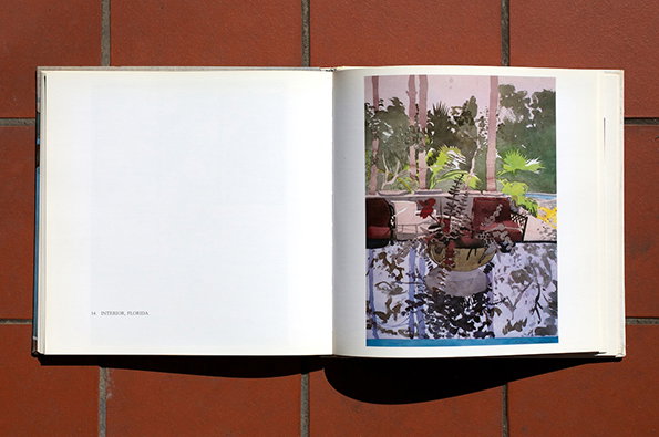
An open book lies flat on a red tiled surface. The right page shows a painting of a sunlit patio with potted plants and furniture, while the left page is mostly blank with the text “14. INTERIOR, FLORIDA” at the bottom.
Above

Patrick Procktor: Patrick Procktor

Patrick Procktor: Patrick Procktor
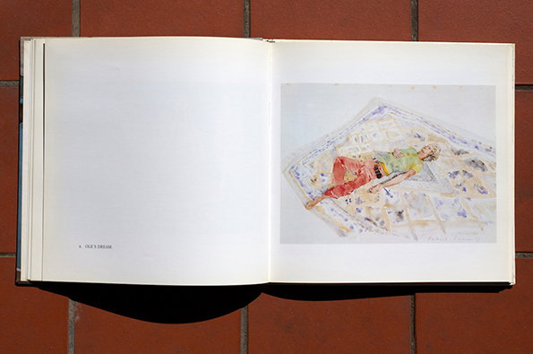
Dreamily distorted watercolours, lazy afternoon portraits, delicately painted still lifes of nothing much… these sum up Patrick Procktor’s work for me. His friends and contemporaries included David Hockney, Derek Jarman and Francis Bacon, and collectively they were frequently in the spotlight as the up-and-coming creative generation of the 1960s. It’s quite strange now to look back, as he was also my step-grandfather, and came to live and work at our house for a time while I was growing up. Just imagine if the close friends of your twenties ended up reaching the heights of Hockney, while your own work falls slightly under the radar. I love the indistinct, evocative quality of his watercolours though, with a few simple brush strokes conjuring each scene.


Share Article

It's Nice That Newsletters

Fancy a bit of It's Nice That in your inbox? Sign up to our newsletters and we'll keep you in the loop with everything good going on in the creative world.