




“Everything can be designed”: Barkas Studio on working with clarity, function and flair
Founded by Mike Wittrup and Daniel Rørbæk, the branding studio works on a range of briefs for the likes of Ikea, Mercedes-Benz, Space10 and Acne Studios.
How many studios can you name that have not only worked with major clients including Space10, Acne Studios and Ikea, but also started up their own bagel bakery and beverage label on the side? Not many. At first this might seem like an odd pairing, but once you get to hear a little more of the story behind Barkas, a design studio based between Copenhagen and Stockholm, you understand why it makes complete sense.
Founded in 2014 by Mike Wittrup and Daniel Rørbæk, who both have backgrounds in advertising and design, it was after they’d both worked in agencies abroad that they started to try things out on their own. That’s when the idea for Barkas arose, which now comprises six partners and 30 staff members in total, with an ethos to create a platform “for great people with great ideas”, says Mike.
When the studio isn’t taking on briefs for the likes of Mercedes-Benz, Danish Royal Theatre, Rains and Postevand, its founders manage their own convenience store, called Depanneur, which is where they bake their bagels and work on beverage label designs. “Basically,” Mike says, “we believe that everything can be designed, from a logo to a business model. It’s the same fundamental approach we use no matter the task – we base our work on insight-driven research, which helps us design and articulate narratives that create clarity in an increasingly complex world.” With this, Barkas is able to work with function, structure, clarity and creative flair all at once.
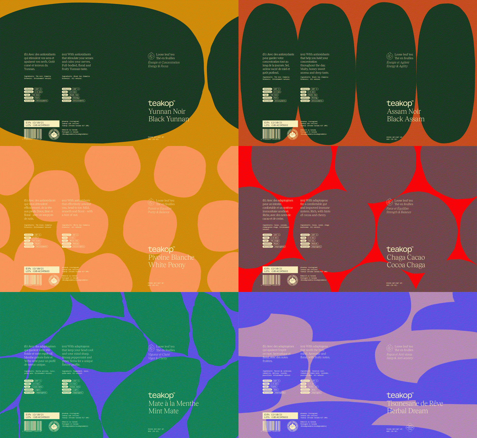
Barkas: Teakop (Copyright © Barkas, 2020)
This approach can be seen throughout Barkas’ entire portfolio. Last year, for example, the studio worked with Norwegian design and ergonomics brand Varier. Asked to steer away from the branding of a traditional, functional ergonomic furniture company and towards a more contemporary design, Barkas sought to redefine the typical associations of ergonomics. “Ergonomic aesthetics haven’t traditionally been something people found appealing,” says Mike. “In general, people have a stronger focus on their health and body, and design that looks good is not enough anymore.” This is particularly relevant now, as we navigate through the pandemic while some continue to work from home, only emphasising the need for healthy sitting positions.
Proceeding to work on imagery, video, design philosophy, graphic identity, packaging and tone of voice, Barkas successfully created a coherent brand image that’s set to be released in the coming months. “For us, it has been really interesting to find new ways of articulating and visualising ergonomics in a positive and compelling way,” says Mike.
The studio also worked with Postevand, a Danish beverage brand that tackles the harmful plastic water-bottle industry through putting water in cartons. “The concept is simple and no-nonsense, which is something we wanted to embrace in the graphic identity as well, getting rid of all unnecessary noise, focusing on the important essentials,” says Mike. The design system works across both web and app, using a “strict gridded approach” – one where graphics are kept simple, while the campaign’s art and photography stands in its own right.
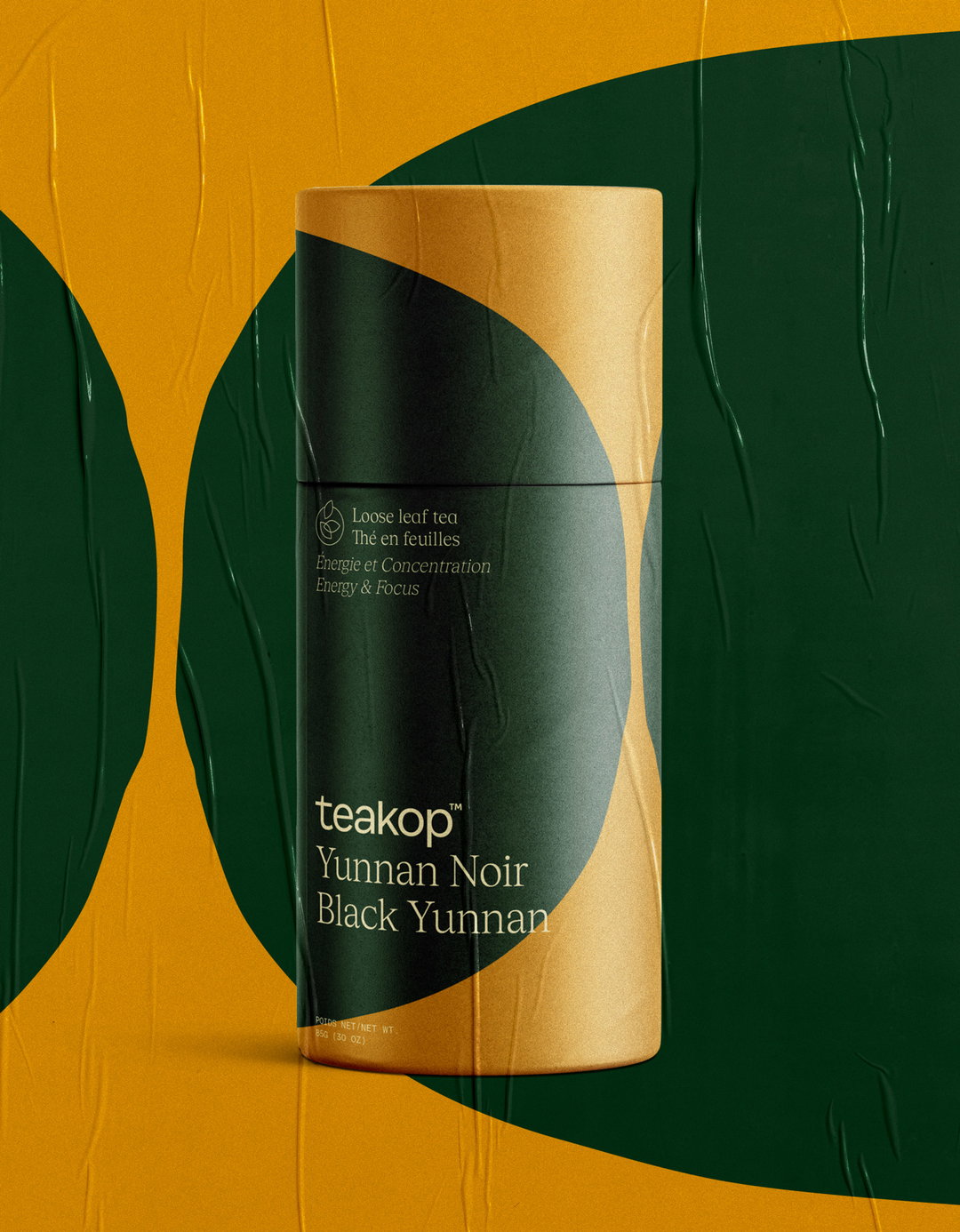
A further project in the studio’s weighty portfolio is a piece of branding work for Teakop, a new Canadian tea brand that focuses on the health benefits of its leaves. “We might know that tea is good for us, but we don’t know why,” says Mark. In need of a redesign that respected craft and heritage, Barkas chose a modern expression that represented minimalist contemporary art, “with the humble aspiration to visually express a feeling and benefit for each tea”. Barkas was responsible for everything from the graphic identity to the illustrations to the package design and, once again, the results demonstrate the flair and personality that comes with such a thoughtful and considered design approach.
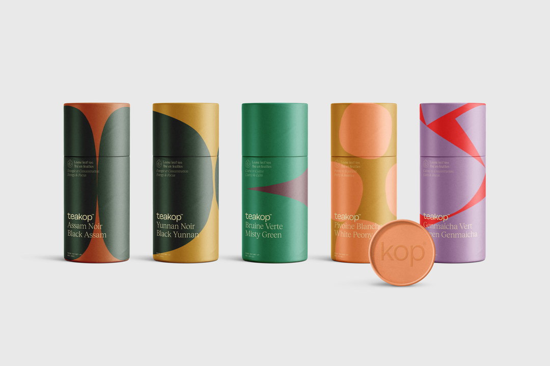
Barkas: Teakop (Copyright © Barkas, 2020)
Barkas: Teakop (Copyright © Barkas, 2020)
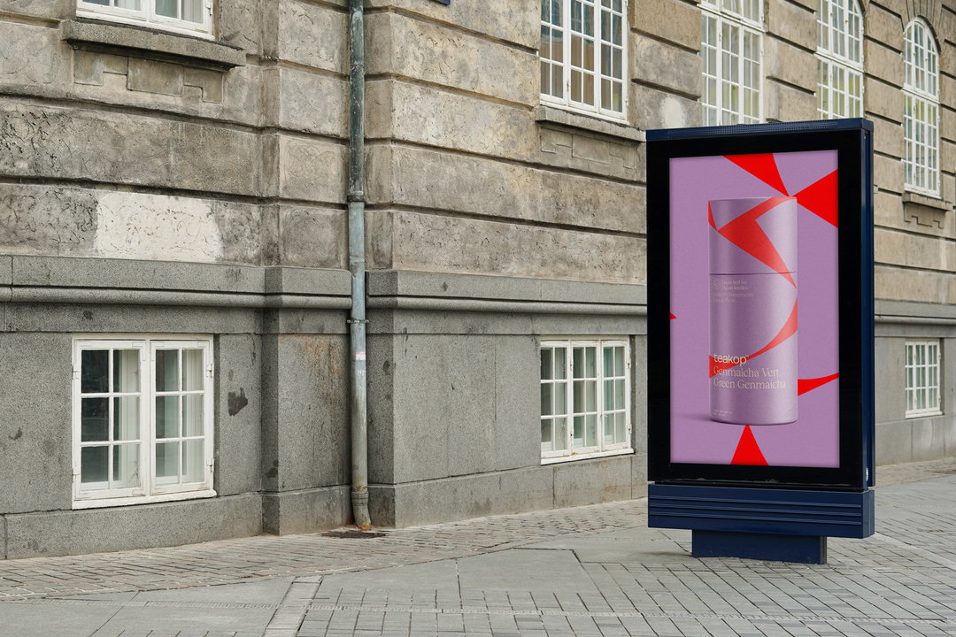
Barkas: Teakop (Copyright © Barkas, 2020)
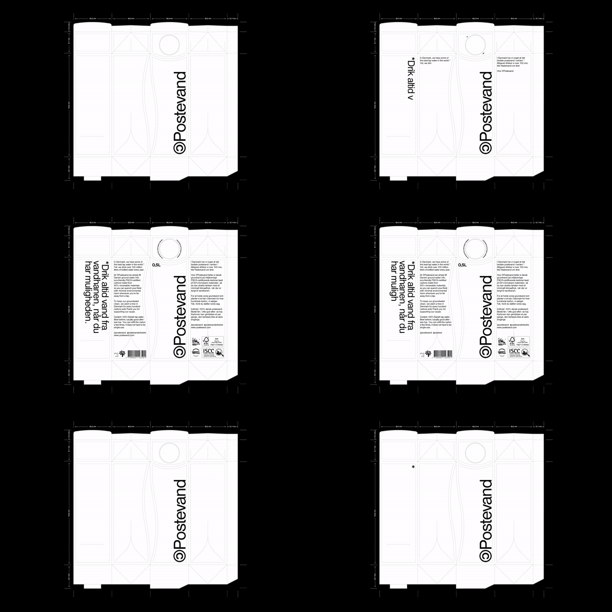
Barkas: Postevand (Copyright © Barkas, 2020)
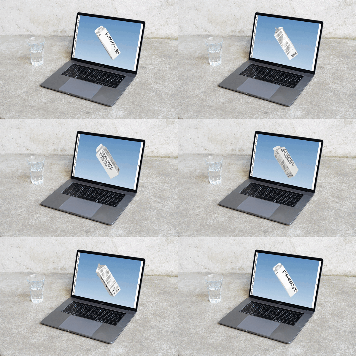
Barkas: Postevand, Photo by Sarah Stenfeldt (Copyright © Barkas, 2020)
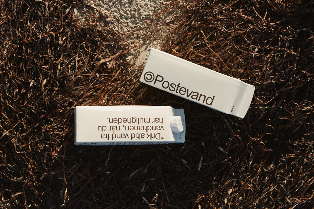
Barkas: Postevand, Photo by Sarah Stenfeldt (Copyright © Barkas, 2020)
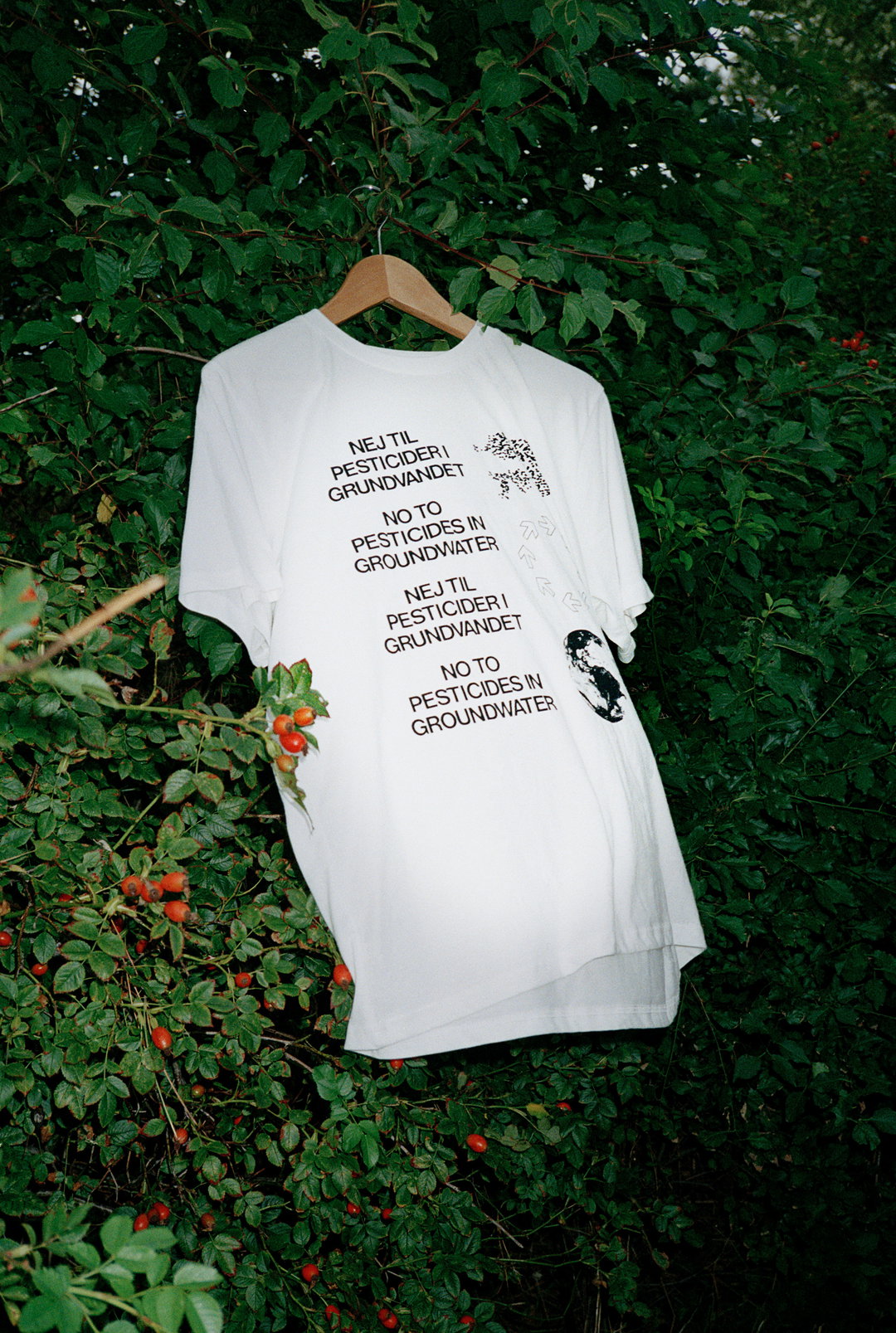
Barkas: Postevand, Photo by Sarah Stenfeldt (Copyright © Barkas, 2020)
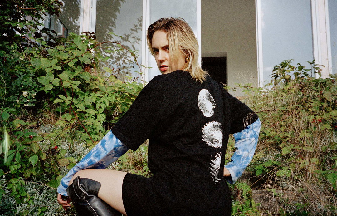
Barkas: Postevand, Photo by Sarah Stenfeldt (Copyright © Barkas, 2020)

Barkas: Varier, Styling by Josefine Hedeman (Copyright © Barkas, 2020)
Share Article
Further Info
About the Author
—
Ayla is a London-based freelance writer, editor and consultant specialising in art, photography, design and culture. After joining It’s Nice That in 2017 as editorial assistant, she was interim online editor in 2022/2023 and continues to work with us on a freelance basis. She has written for i-D, Dazed, AnOther, WePresent, Port, Elephant and more, and she is also the managing editor of design magazine Anima.


