




Building Mad: Ba’ndo’s dive into eccentric brand design
With a name like Mad, it’s no surprise that Ba’ndo’s identity for the digital news platform leans into boldness, irreverence, and creative freedom.
Known for its cutting-edge brand identities, Istanbul-based agency Ba’ndo has been making waves since its launch in 2016. With a team spread across Istanbul and London, they seamlessly blend the cultural vibrancy of their Turkish roots with London’s global design flair. At the heart of Ba’ndo’s ethos are three key values: curiosity, passion, and talent. These drive the agency’s bold and forward-thinking work, the latest of which is the wildly creative identity for Mad: a digital news platform that covers marketing, advertising, and design.
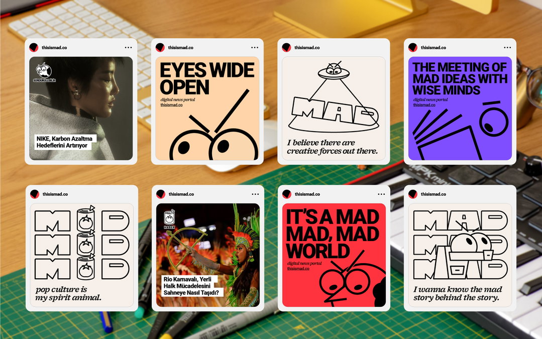
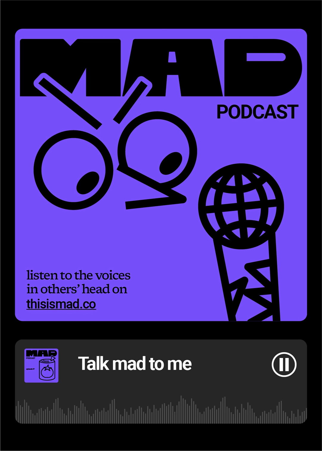
“Given the name Mad, the identity had to pack a punch,” says Ba’ndo co-founder Emrah Doğru, reflecting on the challenge of developing a brand that would live up to its moniker. Alongside graphic designer Bengisu Demirkaya, Emrah set out to capture the bold, creative essence of the brand. “The acronym stands for Marketing, Advertising, and Design, but we also wanted to lean into the playful, slightly ‘mad’ side of the word,” he adds. With the phrase ‘meeting of mad ideas with wise minds’ at the core, the team crafted an identity that celebrates creativity in all its daring, eccentric glory.
GalleryBa'ndo: This is Mad (Copyright © Ba'ndo, 2024)
Starting with a blank canvas, Ba’ndo approached the project with its signature mix of freedom and discipline. “Creating a brand from scratch is always exhilarating, but the freedom can be overwhelming,” says Bengisu. “We thrive on that balance; [first] we establish a strong conceptual framework, then let the design take off from there.” For MAD, this meant creating an identity that could channel creative chaos while staying grounded in a cohesive, functional system.
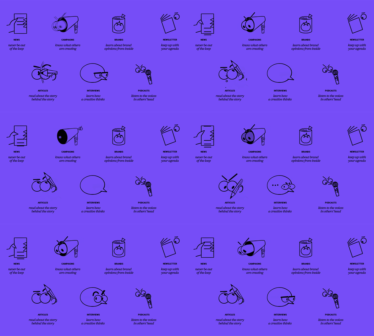
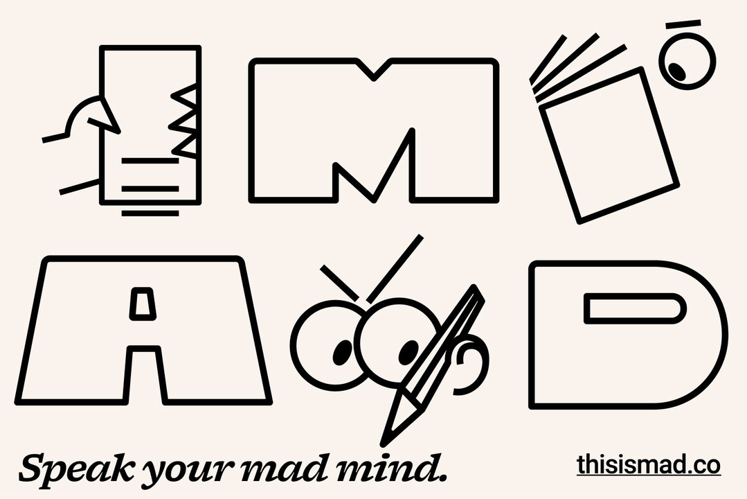
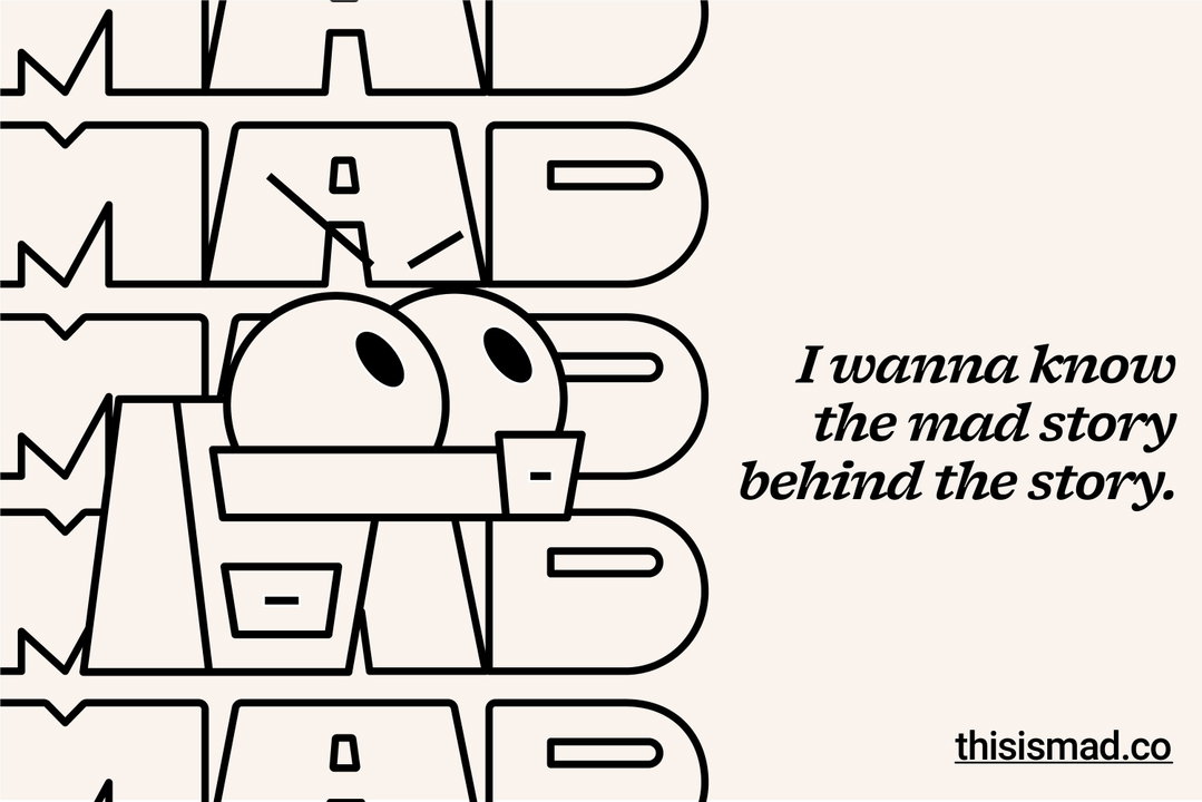
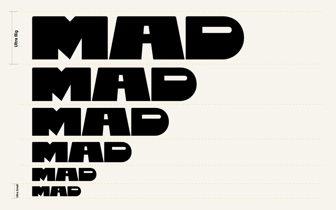
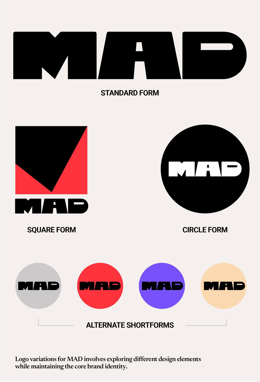
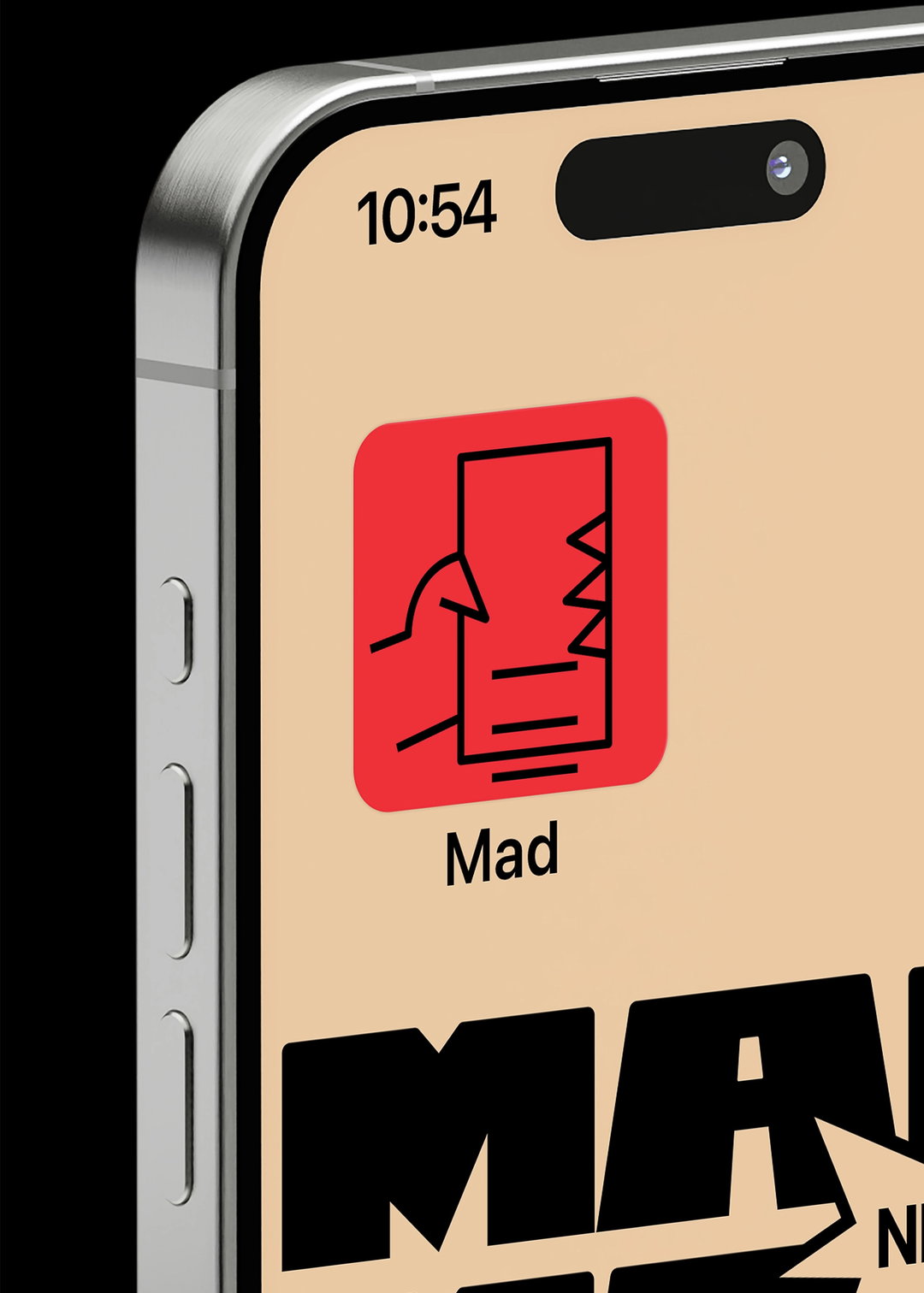
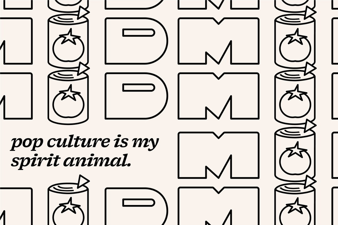
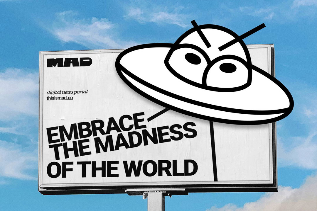
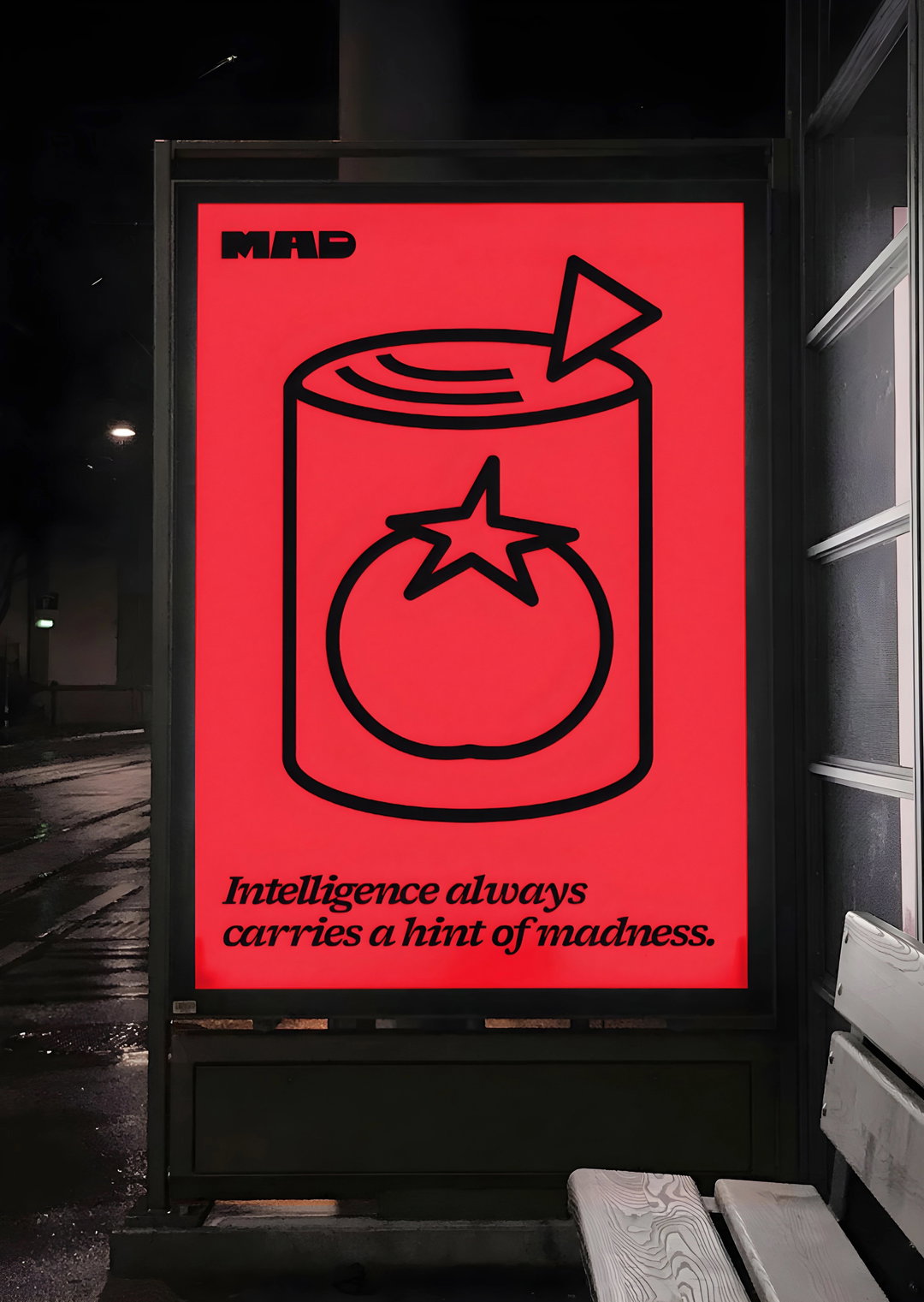
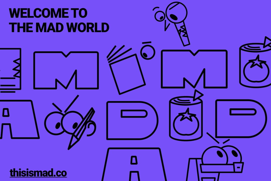
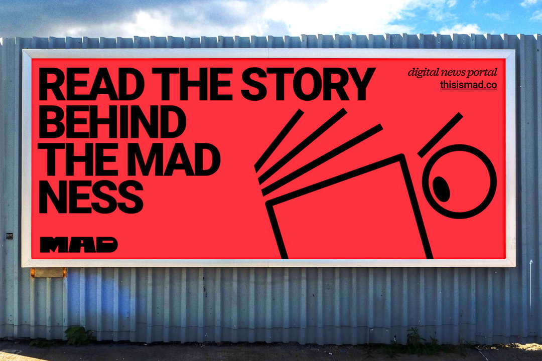
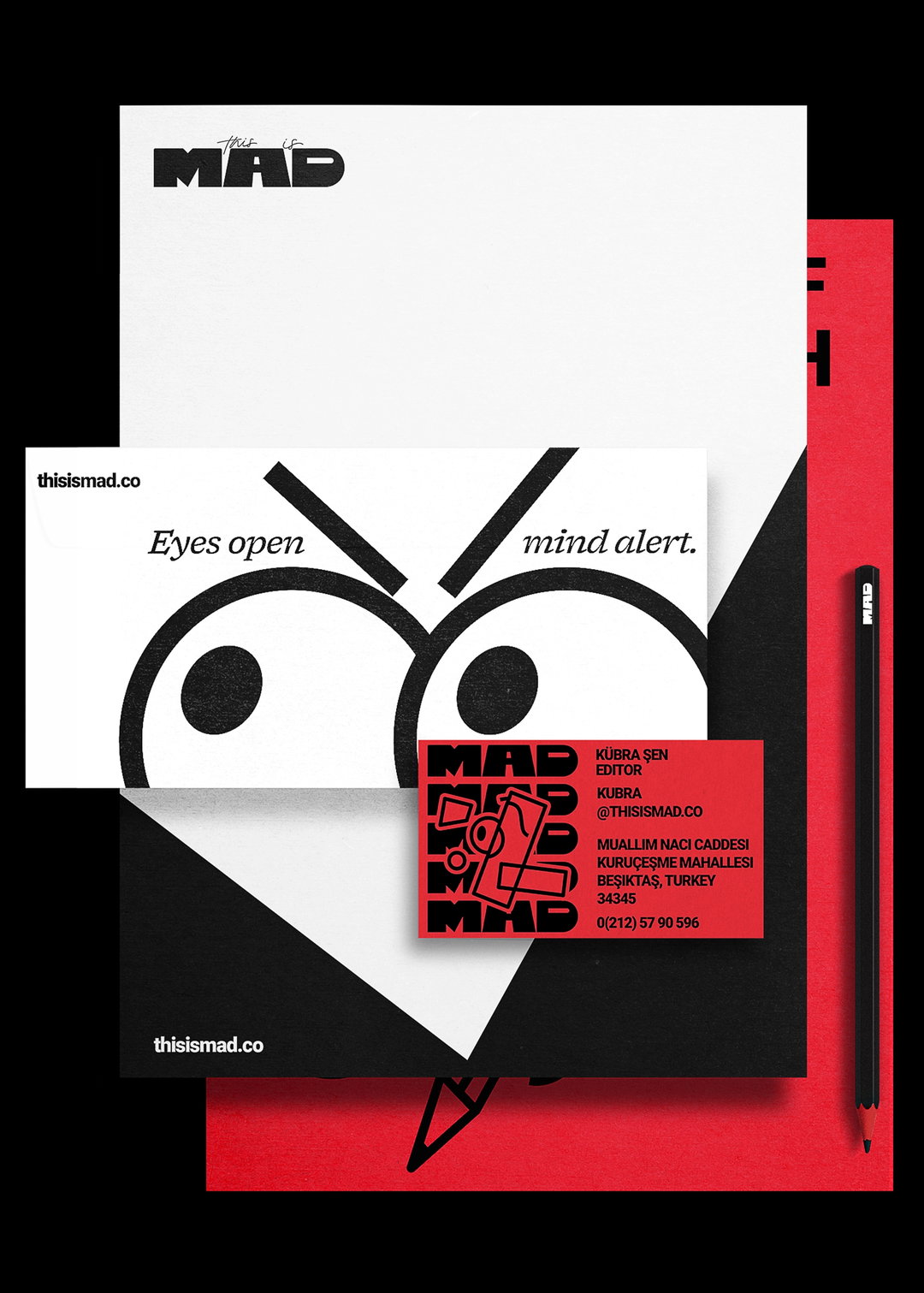
The centrepiece of Mad’s identity is a striking three-block logo, with a bold, rebellious ‘M’ taking pride of place. “We exaggerated the lower legs of the ‘M’ to give it that distinctive, mad energy,” Emrah explains. This playful twist carries through the entire brand system, lending Mad a sense of irreverence and fun. But, the madness doesn’t stop there. Ba’ndo also introduced mascots to the identity, acting as playful extensions of the logo itself. “The mascots are like little avatars of MAD’s users, interacting with the platform and bringing that creative energy to life,” adds Emrah.
Ba'ndo: This is Mad (Copyright © Ba'ndo, 2024)
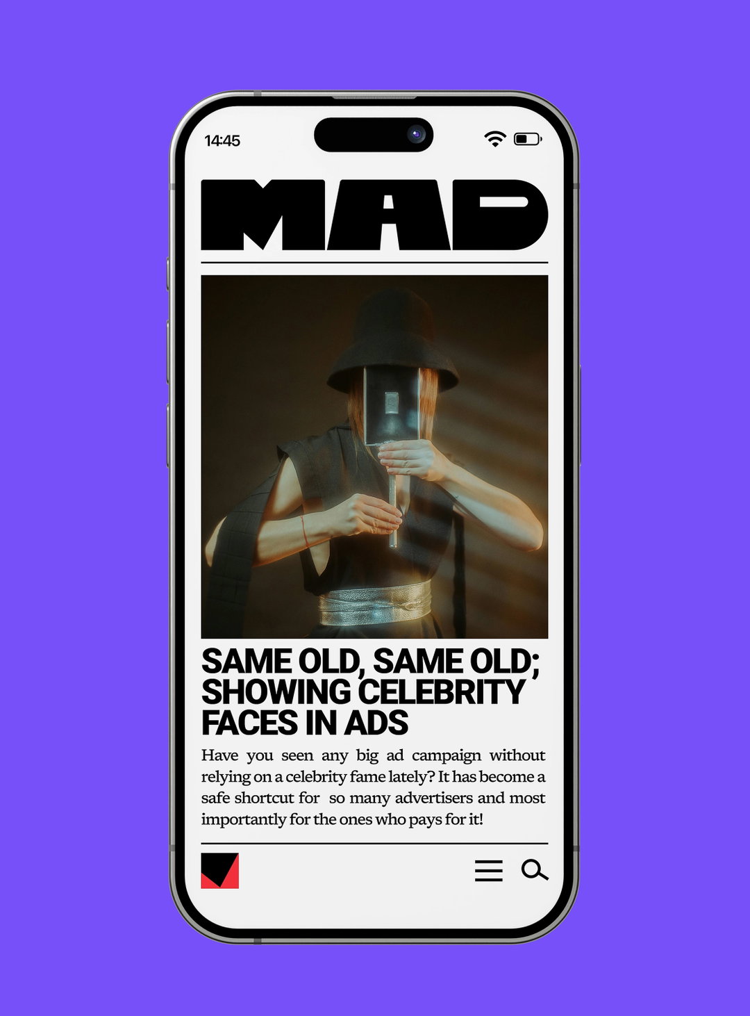
Typography plays a starring role in the identity too. For headlines, Ba’ndo opted for Roboto, with tight kerning and all-uppercase for a bold, dynamic feel, while Newsreader was chosen for body text, tying in nicely with Mad’s news-oriented purpose. “We wanted typography that was both functional and packed with character,” Bengisu explains. The colour palette is simple yet impactful, balancing energy with clarity to ensure the design never feels overwhelming.
Through this playful and layered identity, Ba’ndo has created something that embodies Mad’s purpose as a hub for creative minds. “We didn’t just want a news platform, we wanted Mad to feel like a meeting place for mad ideas and sharp minds,” says Emrah. The result is a brand that’s bursting with life, a creative playground that invites users to explore and engage with its bold, vibrant world.
GalleryBa'ndo: This is Mad (Copyright © Ba'ndo, 2024)
Hero Header
Ba'ndo: This is Mad (Copyright © Ba'ndo, 2024)
Share Article
About the Author
—
Joey is a freelance design, arts and culture writer based in London. They were part of the It’s Nice That team as editorial assistant in 2021, after graduating from King’s College, London. Previously, Joey worked as a writer for numerous fashion and art publications, such as HERO Magazine, Dazed, and Candy Transversal.




