Anna Mills’ bespoke lettering for musicians balances rough edges, offbeat kerning, ink bleeds and wobbly lines
“When the style of the sound and the visuals align, something really magical happens,” says the London-based designer and illustrator.
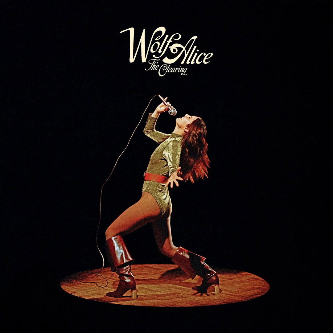
Over the past few years, Anna Mills has carved herself a bit of a niche creating bespoke lettering for musicians – the likes of Wolf Alice, Mel C, Biig Piig and Orla Gartland, to name just a few. In Anna’s words this is down to “lucky timing”; the fact that visuals in the music industry – in the hyper-digitised face of AI – have seen a “resurgence of analogue styles”. This, overall, has proved pretty useful for Anna as she admits she’s “not really that techy”. While she may have the odd Photoshop trick up her sleeve, she always finds herself returning to the trusty pencil on paper (and maybe the back of a napkin, as must be done if Shaun Mendes ends up sending you a brief while you’re on holiday in Greece).
Alongside her other projects – small-press printing, calendars and dreamy animations – lettering for musicians has now become one of Anna’s favourite things to work on. “I find that musicians are often deeply conscious of the visual world they’d like to build around their sound – which eras to nod to, styles to dial up, etc, making them great brief-writers,” says Anna. “Perhaps because musicians can pin down an emotion so accurately, they can also describe the ‘feeling’ they want to get from a piece of lettering.”
The work is also incredibly varied; no two briefs are the same. And, as Anna shares, neither is the way she gets briefed. Willie J Healey briefed Anna solely by voicenote; Orla Gartland’s logo involved a long email thread discussing the precise fine tunes of each letter; while Wolf Alice’s lettering began with a traditional deck, an album listening session at Sony, before ending with a Whatsapp chat with the band for quickfire feedback.
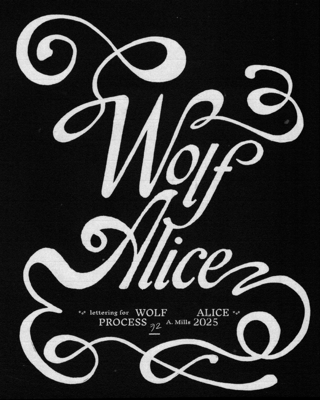
Anna Mills: Wolf Alice logo swash (Copyright © Anna Mills, 2025)
When it came to the lettering for Wolf Alice, to adorn various elements of the release of the band’s album Bloom Baby Bloom, its creative director Rachel Fleminger Hudson was very specific about the vision – ‘hand-drawn but not childlike’, ‘fairytale element but not too whimsical’ and ‘70s but not too on the nose’. “I often find that clients will like to describe their desired aesthetic with a ‘this but not that’ sentence structure,” says Anna. And while overly prescriptive clients may scream red flags in other projects, in this line of work it’s something Anna loves. “I like trying to find this middle ground,” she continues, “as if together we’re creating a Venn diagram of styles and I’m trying to illustrate the intersection of ideas in the centre.” In the end, Anna ended up trailing a whole milieu of different styles, from blackletter alphabets to record covers and jackets of 70s romance novels, before ending on the final sweeping design with elegant serifs and a musical movement about it.
Anna’s preference for the hand-drawn comes down to, quite simply, the unique effects it creates that just can’t be replicated digitally: “rough edges, offbeat kerning, ink bleeds, the odd wobbly line”, she lists. “I stay away from anything with too much of a ‘perfect’ finish, partly because that’s my preferred aesthetic, but mainly because I wouldn’t know how to make it.” This dedication to the analogue shines in Anna’s work for the singer and rapper Biig Piig. Aiming for a “sticky” and “tacky” type with an “oozy bubblegum feeling”, the final lettering looks like lettering blu-tack or plasticine, with visible fingerprints and moulding marks. While projects like this have a more physical outcome, Anna still begins with pen and paper to “get comfortable with the letters” and work out each one’s “relationship” to the other which, once she’s perfected the flow and – moving back and forth between her lightbox to redraw – sometimes involves a “little computer magic” for the final deliverables.
This bounty of trials and iterations don’t get lost in the ether, however. Anna has found that turning these “killed” versions into an animation is a good way of giving the designs, and in turn the many layers of her process, some airtime. They’re super satisfying to watch, with each transition feeling like you’re in Anna’s mind in real time, iterating with her as she twitches serifs and adds (or removes) adornments.
Anna has found that working with musicians has resulted in a satisfying synthesis of two creative worlds, and, when it goes well, nothing feels better. “I think when the style of the sound and the visuals align, something really magical happens.” ends Anna. “I suppose it boils down to music and design being two modes of storytelling, with each amplifying the other.”
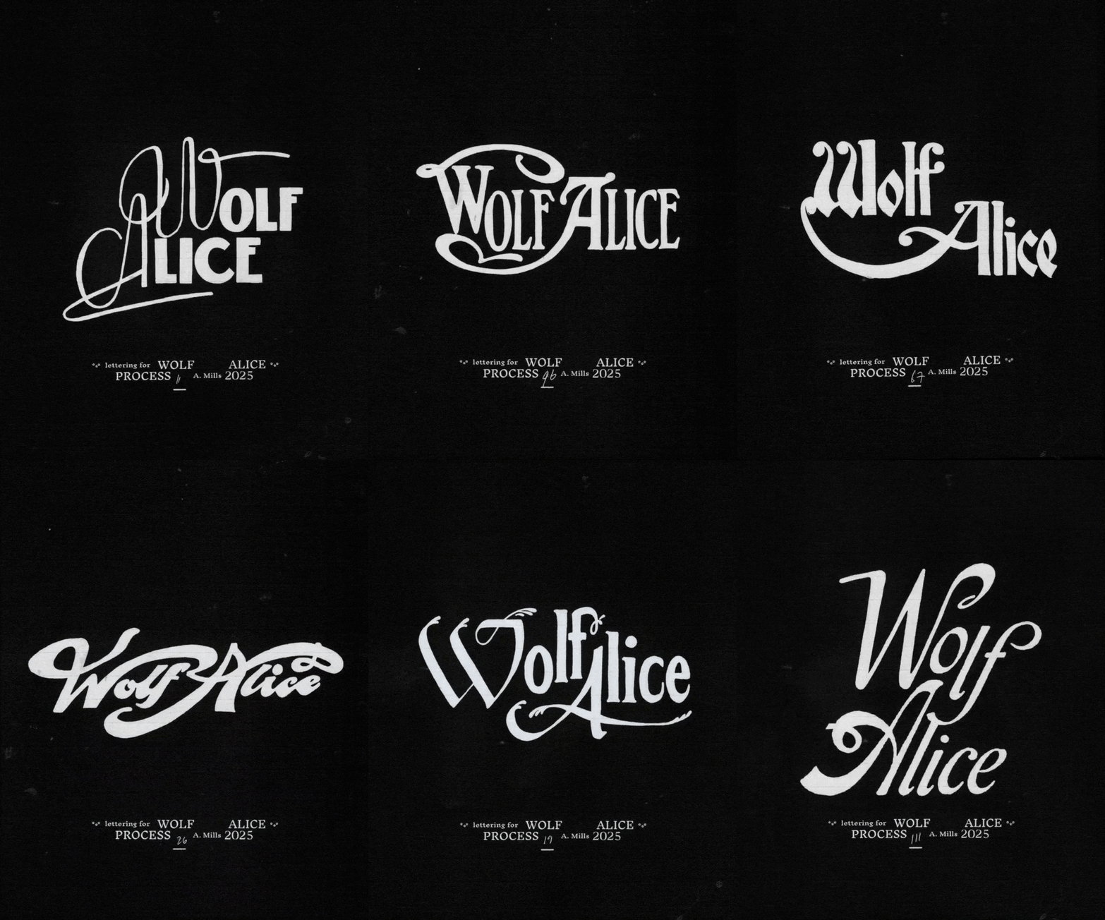
Anna Mills: Wolf Alice process animation (Copyright © Anna Mills, 2025)
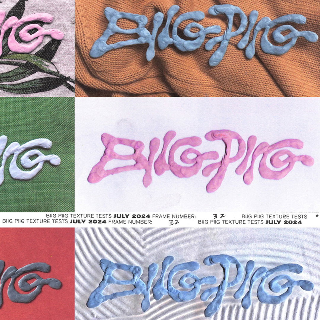
Anna Mills: Biig Piig lettering (Copyright © Anna Mills, 2024)
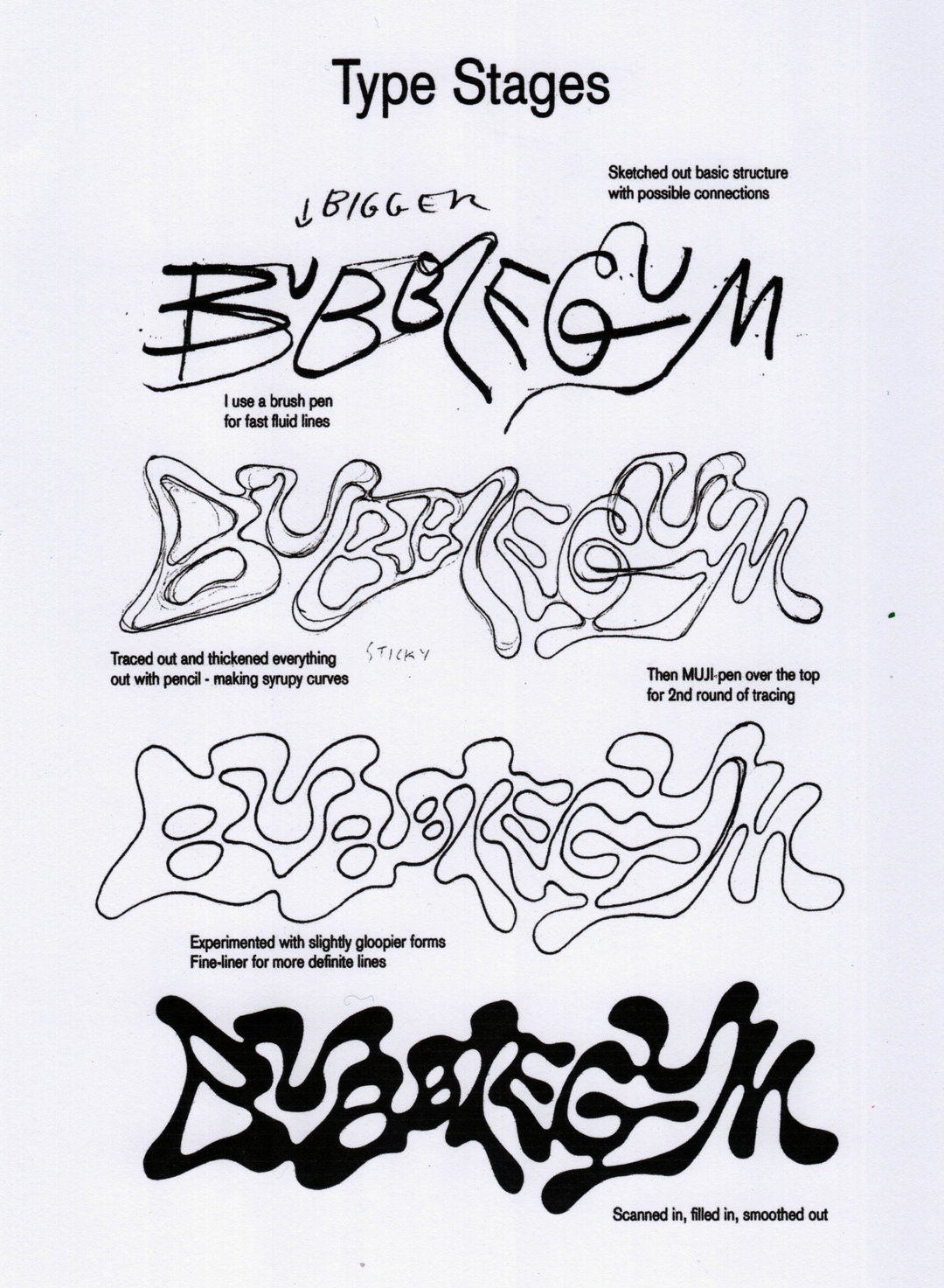
Anna Mills: Bubblegum lettering process (Copyright © Anna Mills, 2022)
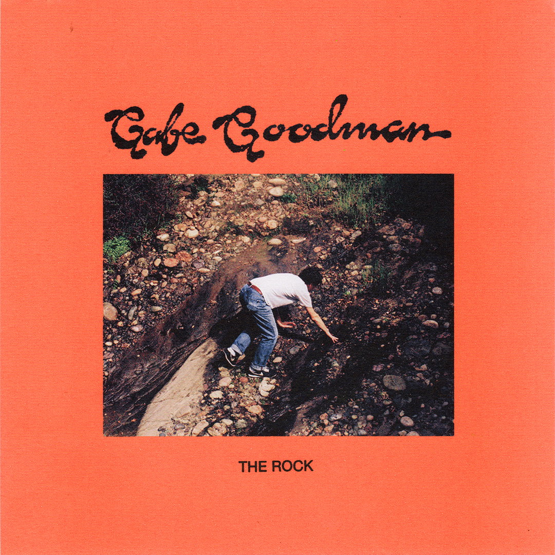
Anna Mills: Gabe Goodman album cover (Copyright © Anna Mills, 2024)
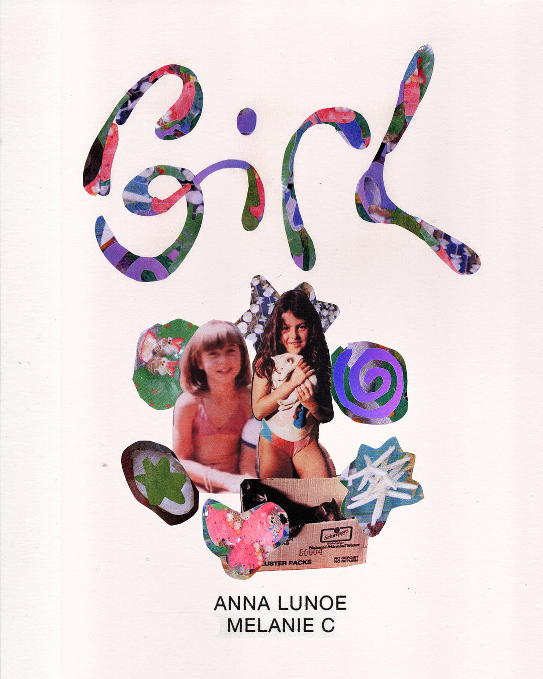
Anna Mills: Girl - Mel C and Anna Lunoe (Copyright © Anna Mills, 2025)
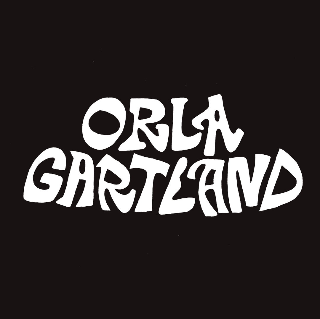
Anna Mills: Orla Gartland logo (Copyright © Anna Mills, 2024)
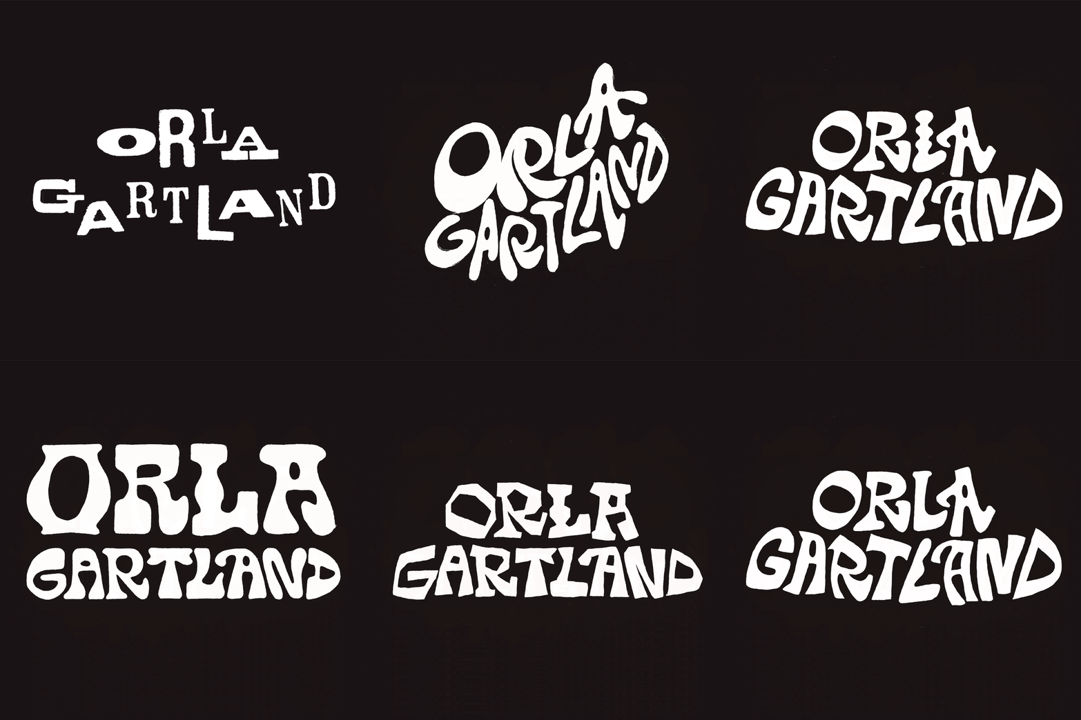
Anna Mills: Orla Gartland logo (Copyright © Anna Mills, 2024)
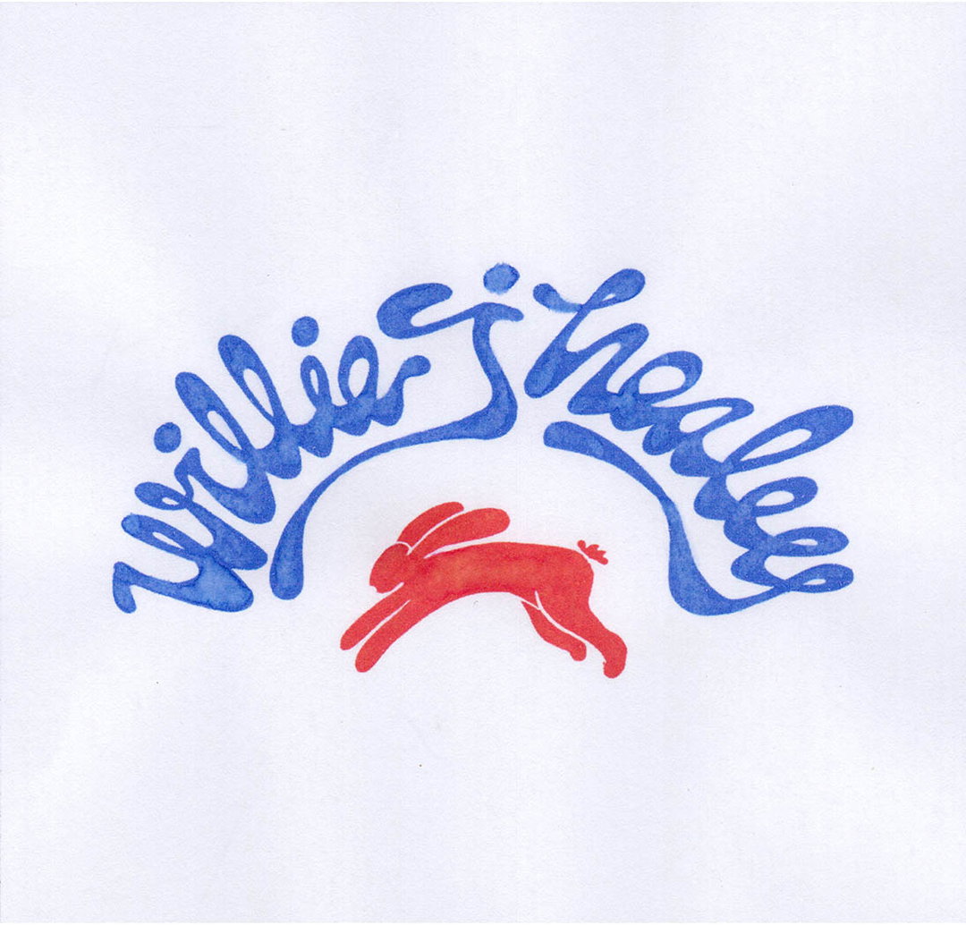
Anna Mills: Willie J Healey lettering (Copyright © Anna Mills, 2023)
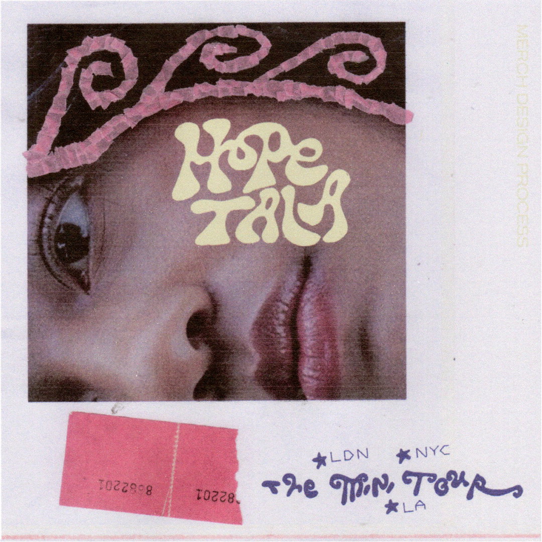
Anna Mills: Hope Tala lettering (Copyright © Anna Mills, 2024)
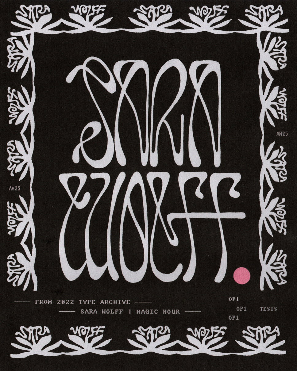
Anna Mills: Sara Wolff lettering (Copyright © Anna Mills, 2025)
Anna Mills: Helena Deland tour poster (Copyright © Anna Mills, 2022)
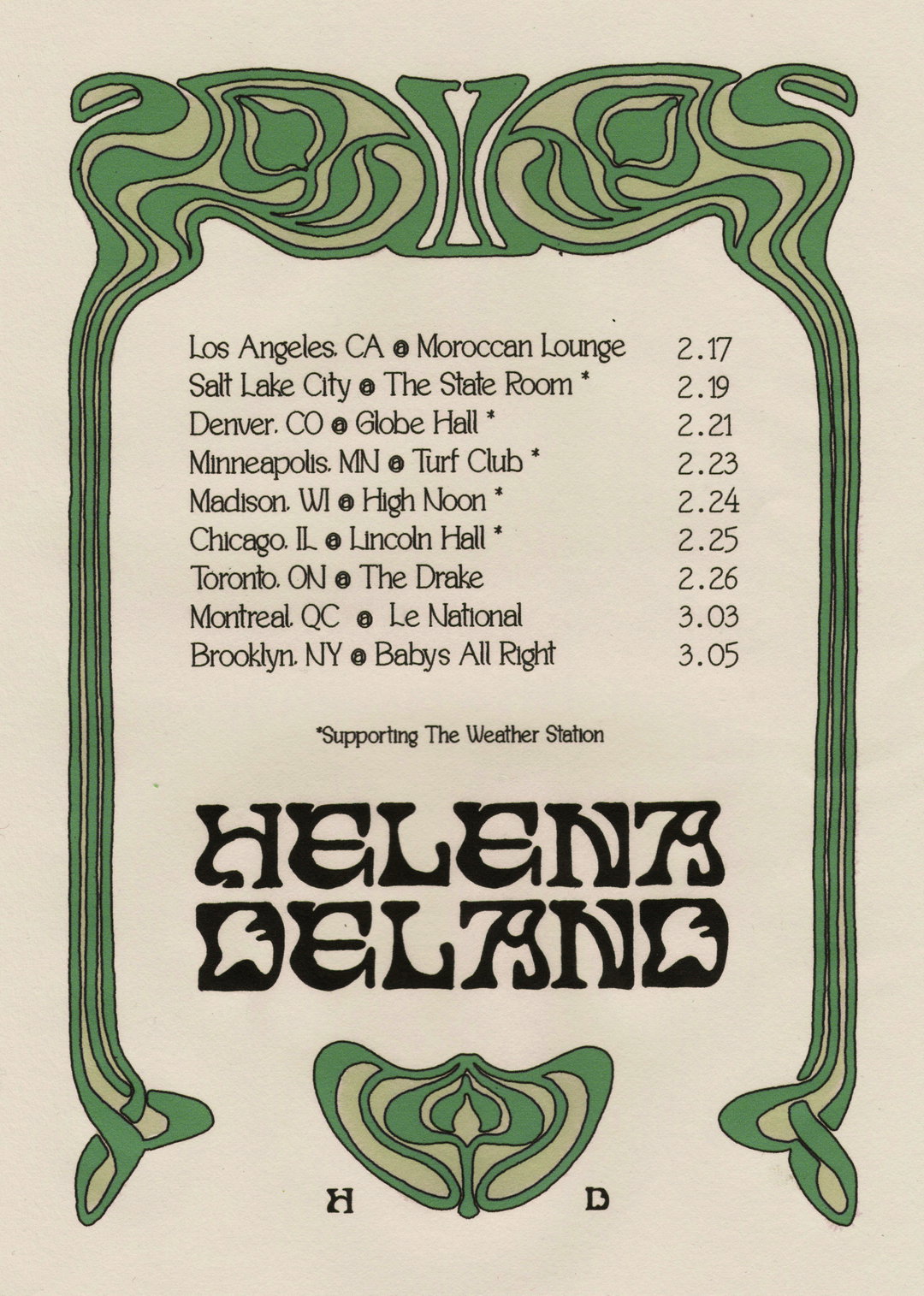
Anna Mills: Helena Deland tour poster (Copyright © Anna Mills, 2022)
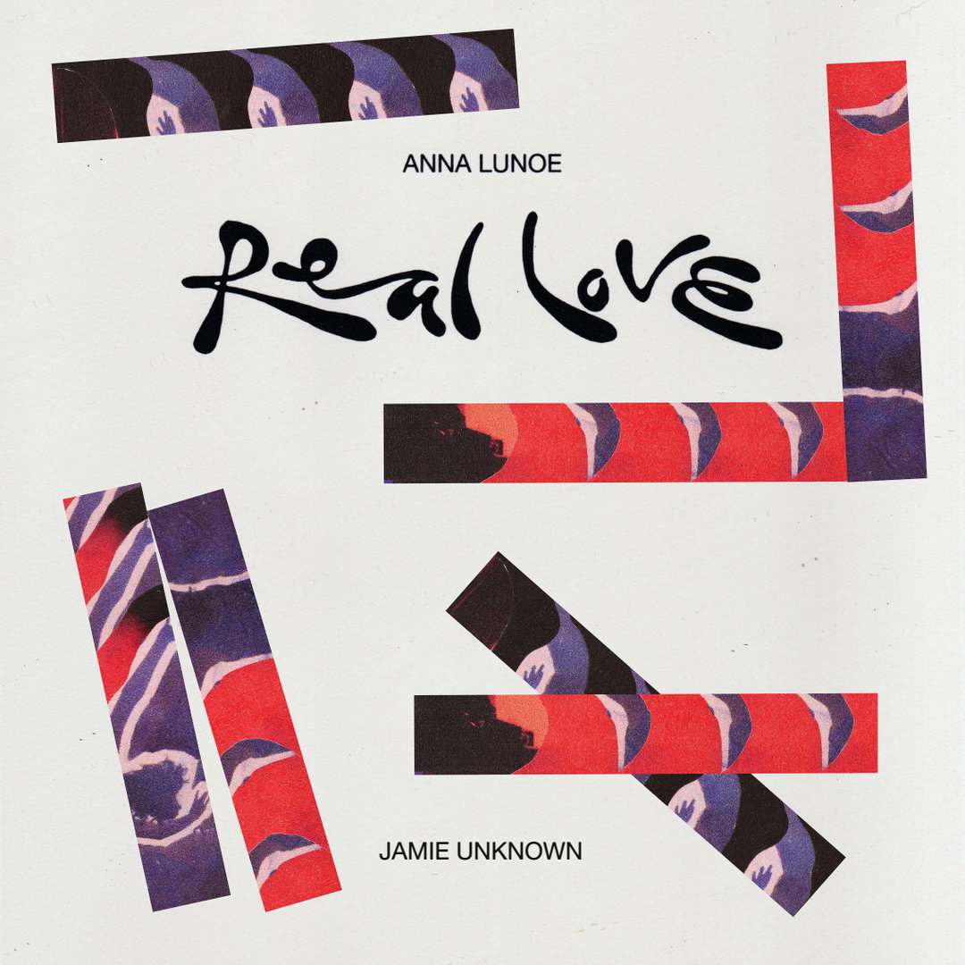
Anna Mills: Real Love - Anna Lunoe lettering (Copyright © Anna Mills, 2023)
Share Article
Further Info
About the Author
—
Olivia (she/her) is associate editor of the website, overseeing the day-to-day editorial projects as well as Nicer Tuesdays events. She joined the It’s Nice That team in 2021. ofh@itsnicethat.com
To submit your work to be featured on the site, see our Submissions Guide.