This candy-filled photo series takes corner shop staples and turns them into luxury items
Commercial Candy explores how something mass market can be turned into rare treasure when under the right lens.
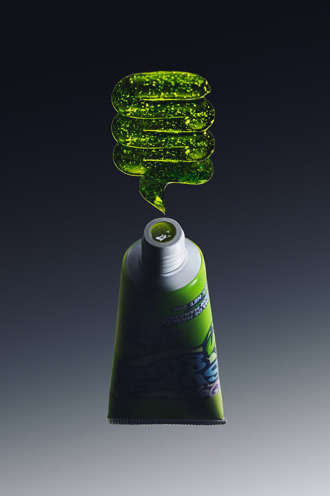
When something is everywhere you usually stop really seeing it; even the most wonderful design details can disappear into the fabric of daily life when they clothe everyday objects. For Mexico-city-based creative duo Adriana Mora and Cèlia Pladevall an unsuspecting graphic design hero has to be Mexican sweets; the brightly coloured everyday treats that “live in street stands, neighbourhood markets and convenience stores all over”, says Adriana. Like much of the eclectic furniture of the mundane, “we take for granted that someone designed those wrappers, chose those colours, engineered that specific shade of neon green, arbitrarily”, the designer continues. So the pair decided to look at these classic dulcería delights from a new angle – one that would celebrate them as precious artefacts instead.
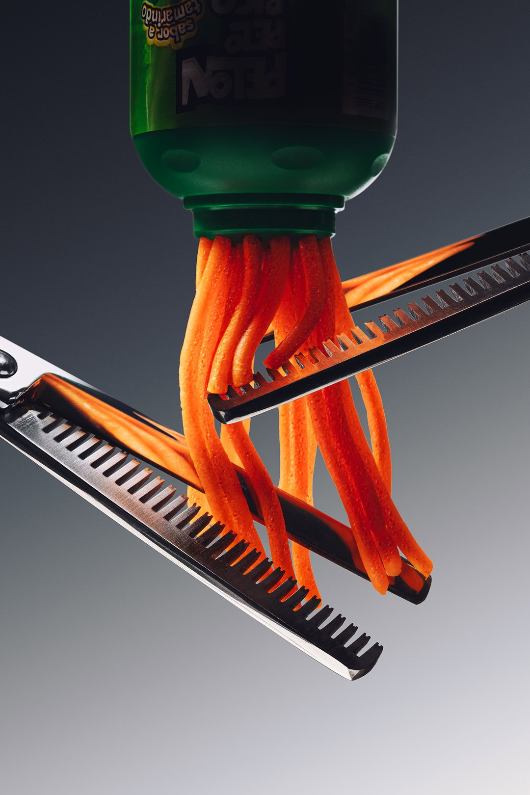
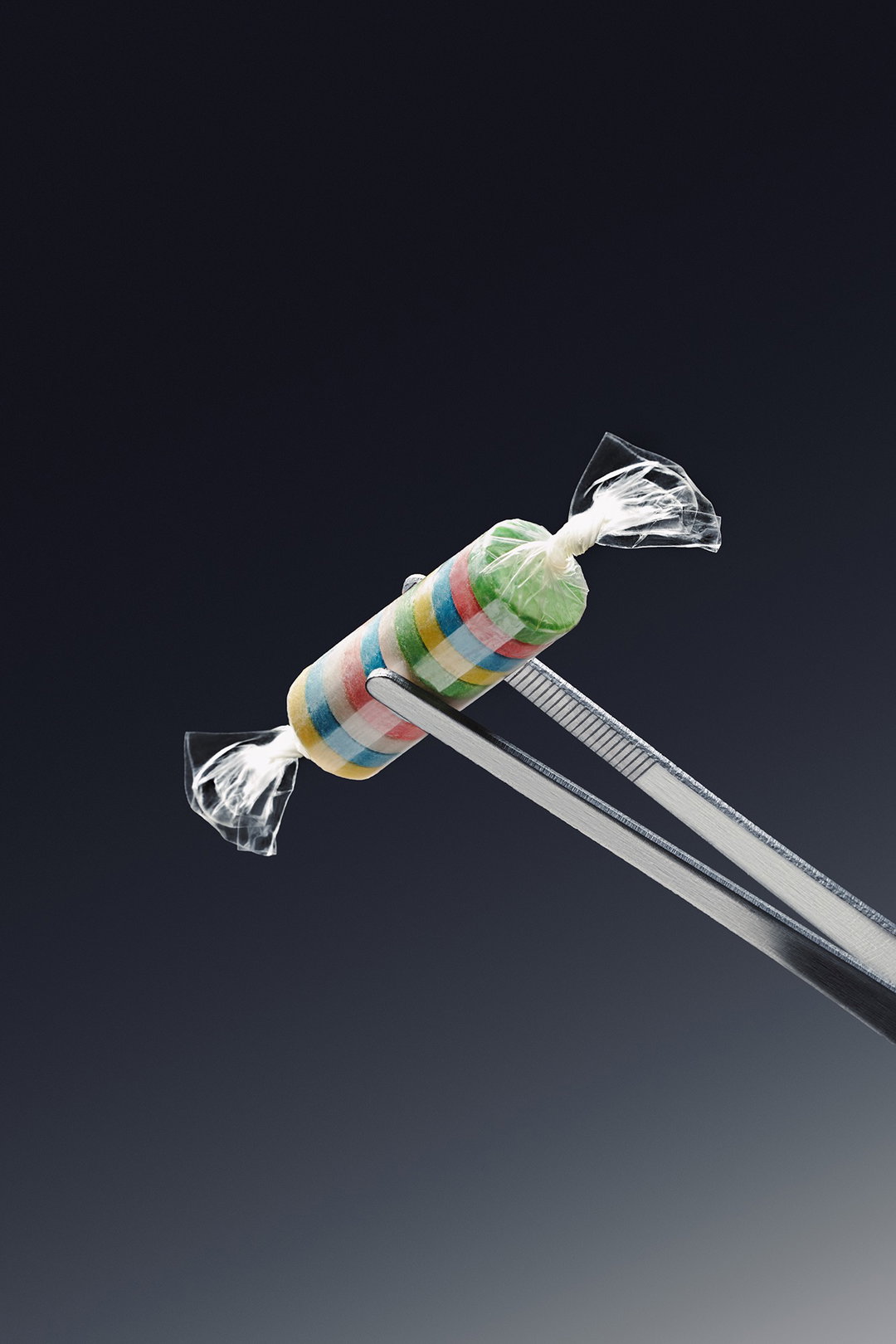
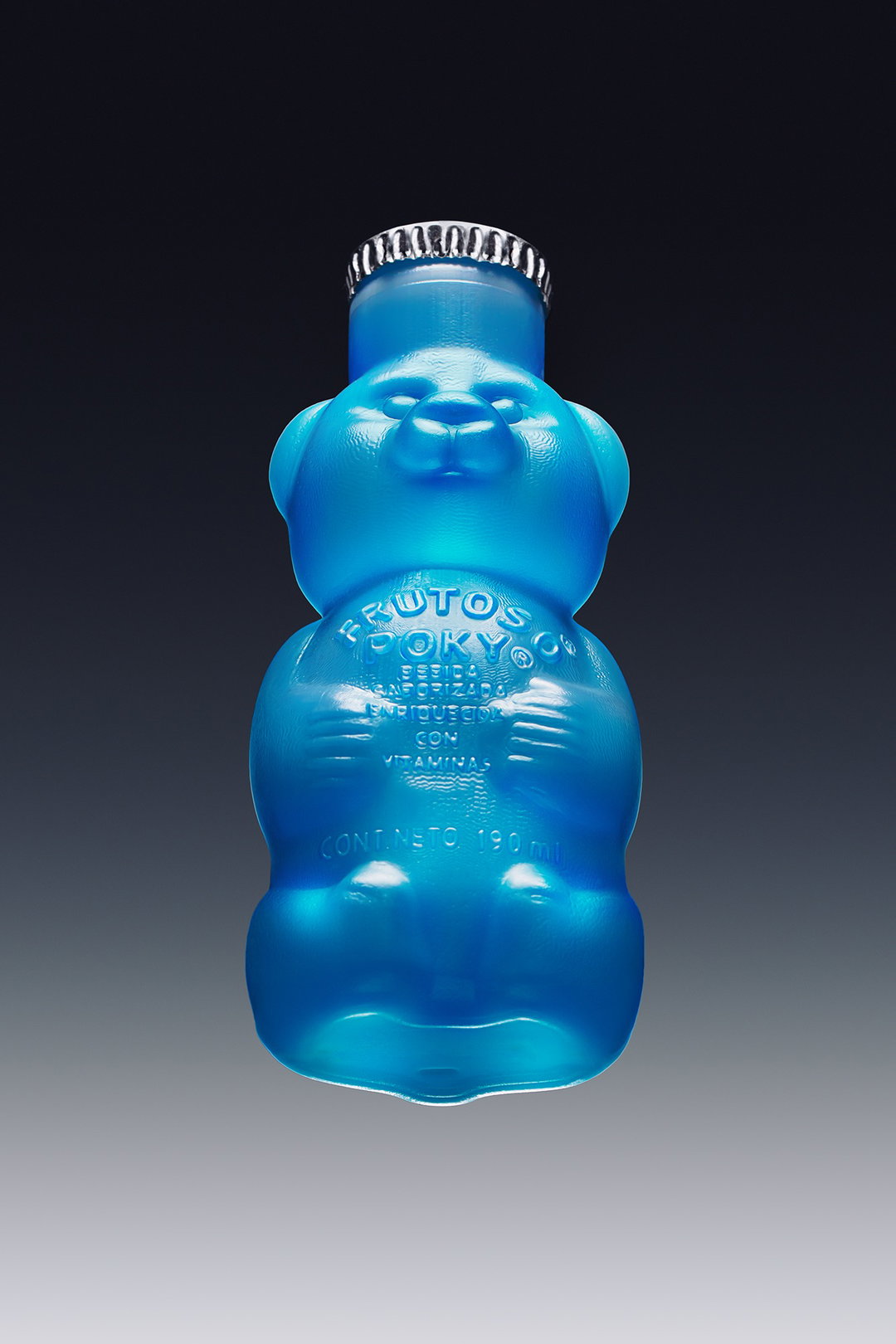
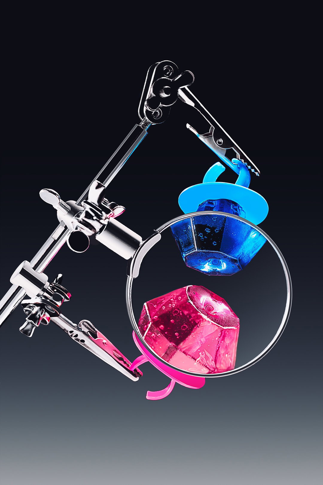
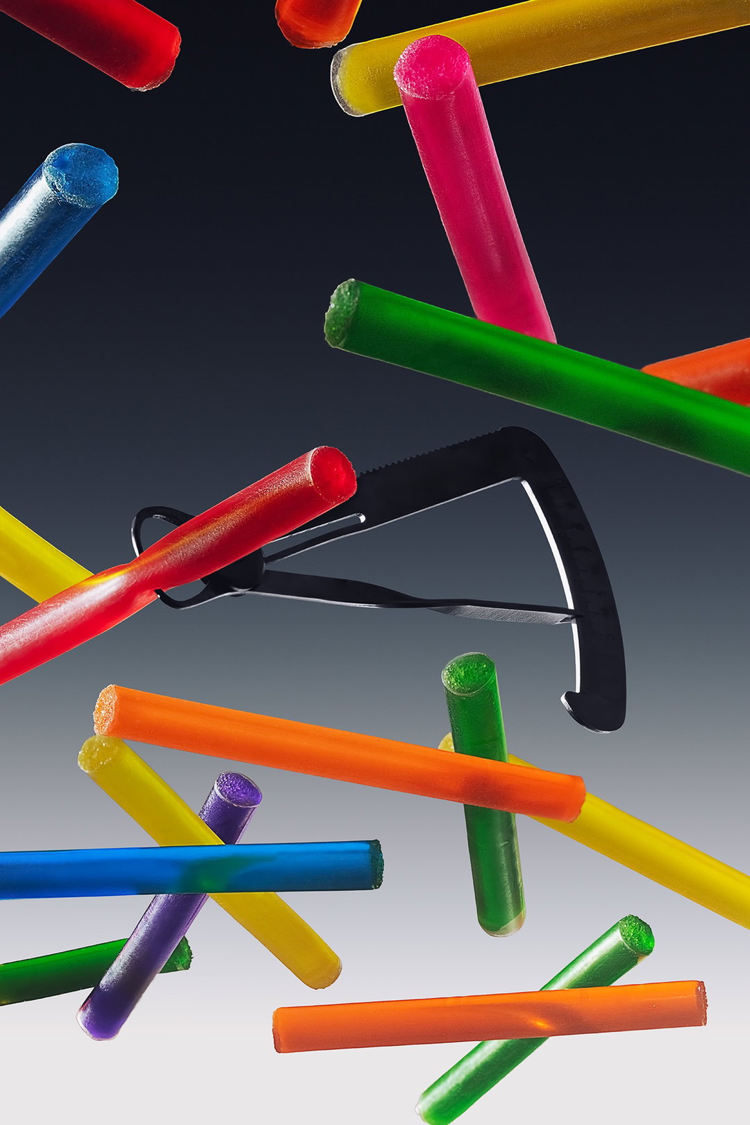
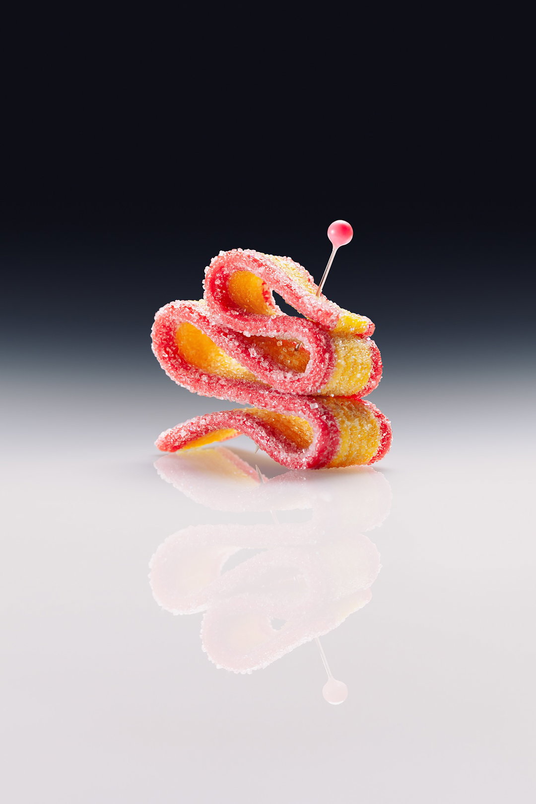
In their editorial photo project Commercial Confectionery Adriana and Cèlia give these sweet treats the spotlight that they deserve in clean, clinical compositions shot with the kind of detail and care that’s usually preserved for still life’s of luxury goods. With Cèlia coming from a background in scenic design and fine arts and Adriana from 3D design and image-making, the duo’s respective specialisms were the perfect combination to see this collaborative concept through to fruition. While Cèlia led production and set design, Adriana handled lighting and retouching – “photography sits somewhere in between; it’s not our primary discipline, but it’s the tool we always reach for when we need to document or present ideas at a certain level of control,” Cèlia says.
ByElectra: Commercial Confectionery (Copyright © ByElectra, 2026)
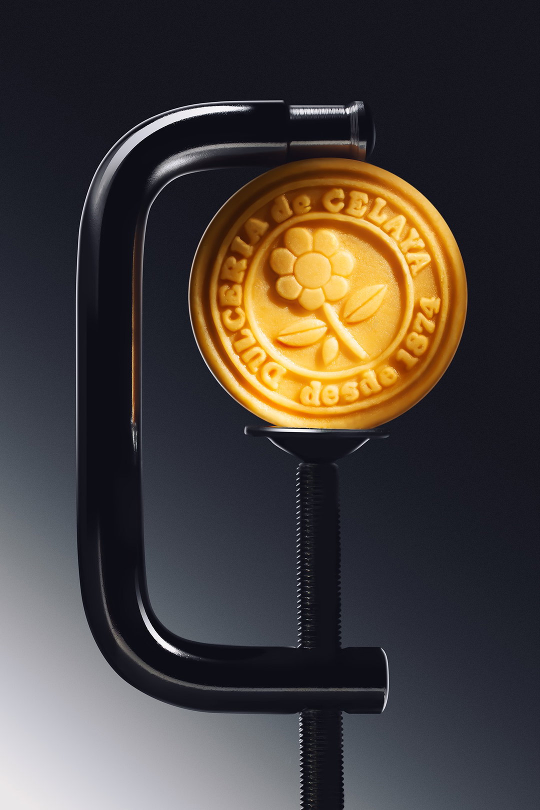
The duo shot each piece of candy in a pared back studio, with expertly restrained lighting. Their sterile backgrounds and precision instrument props are not “just aesthetic choices” Adriana shares, but a careful “reframing device,” she says. “A C-clamp holding an Aleluya, from la dulcería de Celaya forces you to look at it the way you’d look at a watch movement. The clinical environment signals: this object was selected deliberately. It deserves your attention!” The contrast between the brightly coloured candy and these cold steel environments is an effect that “made both things feel at once stranger and more visible”, Cèlia says. “The tension between them is where the project lives.”
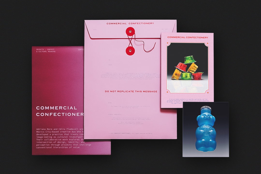
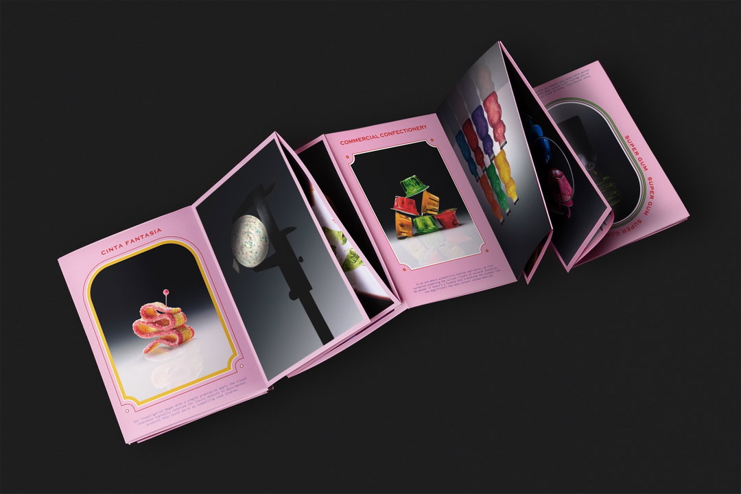
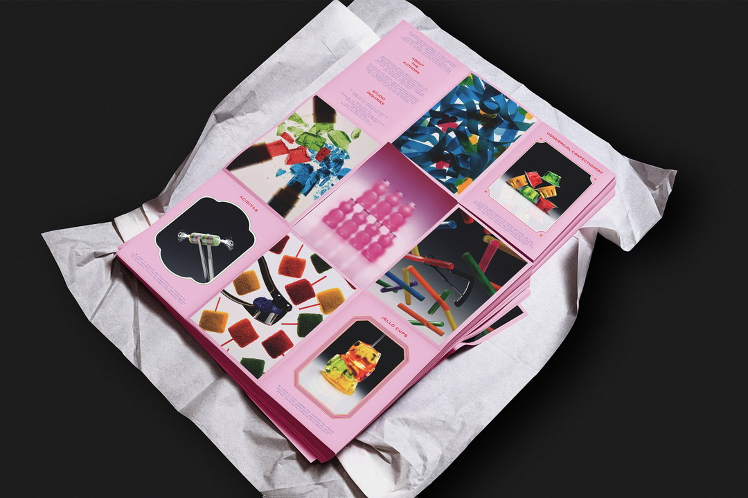
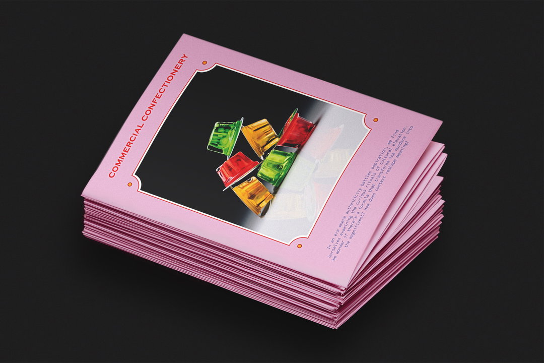
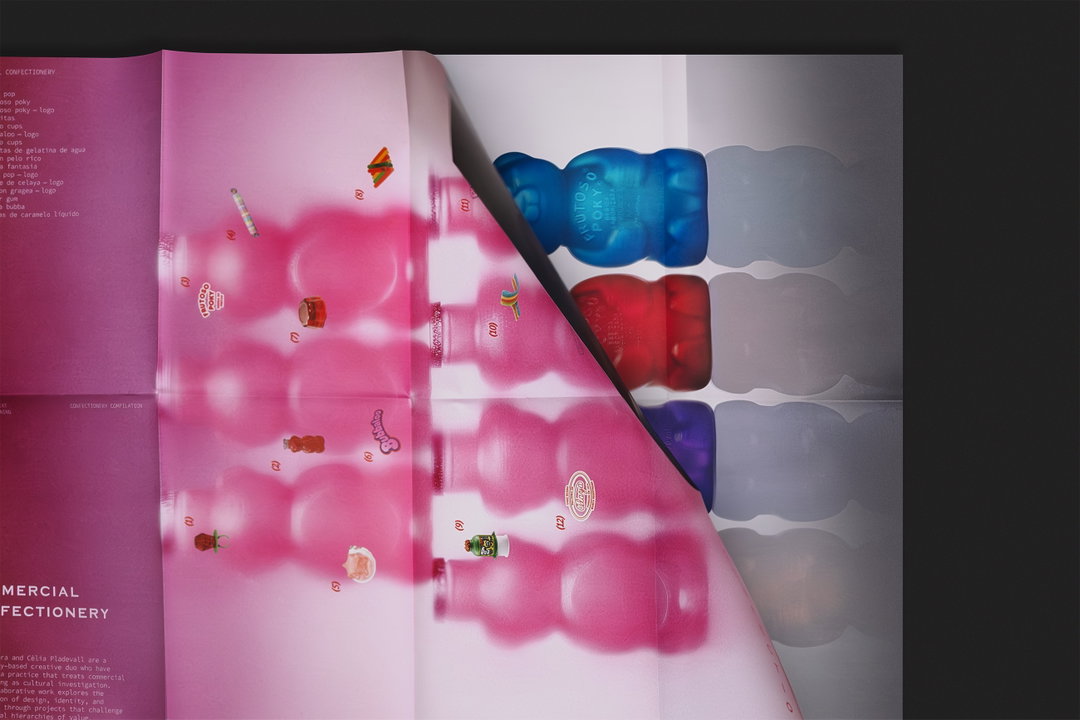
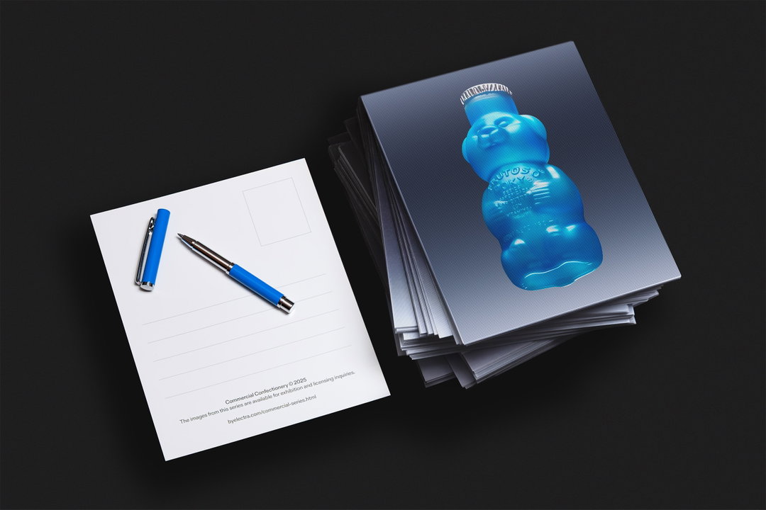
With the help of Daniel Larsen, the photographic series slowly evolved into a physical publication: a custom envelope containing an 18-page zine and a double-sided poster, accompanied by holographic postcards. The design references the vernacular of the Mexican papelería: “The dulcería and papelería are two of the most specific retail environments in Mexico – the candy shop and the stationery shop – often in the same place, or at least sharing the same block. What makes them visually distinctive is a complete disregard for restraint: every surface covered, every colour used, frames within frames, decorative borders borrowed from completely unrelated contexts,” Adriana says.
Using this visual language as a key design reference to transform the project into a series of printed objects, the designers decided to border the zine’s images with decorative frames that draw directly from “planillas biográficas”, says Cèlia, “those ubiquitous classroom sheets sold in papelerías depicting historical figures in ornate portrait frames, somewhere between a stamp collection and a saint’s card.” The publication’s poster took its tips from “candy availability sheets you find at a dulcería counter” and the cover of the publication itself – an envelope made from “cartulina rosa” – is lovingly wrapped in pink paper card stock ubiquitous in Mexico.
If you’re based in Mexico City the publication will be available to get your hands on at selected independent bookshops soon!
GalleryByElectra: Commercial Confectionery (Copyright © ByElectra, 2026)
Hero Header
ByElectra: Commercial Confectionery (Copyright © ByElectra, 2026)
Share Article
About the Author
—
Ellis Tree (she/her) is a staff writer at It’s Nice That. She joined as a junior writer in April 2024 after graduating from Kingston School of Art with a degree in Graphic Design. Across her research, writing and visual work she has a particular interest in printmaking, self-publishing and expanded approaches to photography. ert@itsnicethat.com
To submit your work to be featured on the site, see our Submissions Guide.