Accept & Proceed’s new system for Vans is a lesson in how to inject clarity into an iconic brand
The visual and conceptual overhaul of the shoemaker speaks to the brand’s place in culture and its role as a conduit for expression.
Share
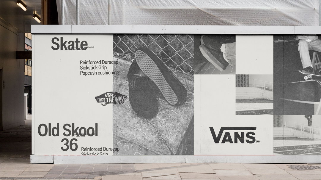
There aren’t many shoes more iconic than Vans, whether it’s their silhouette, chequered patterns or place in pop culture; you know a pair of Vans when you see them. From a branding perspective, however, it’s not quite as singular. Whilst its logo hasn’t changed much since, if at all, since it was founded in 1966, it’s had a number of owners and eras across the decades that followed, leaving a somewhat fragmented brand in its place. This was the problem faced by London-based design studio Accept & Proceed, who have completely rewired that brand’s visual and conceptual foundation, culminating in a new brand system, standards and product branding guidelines.
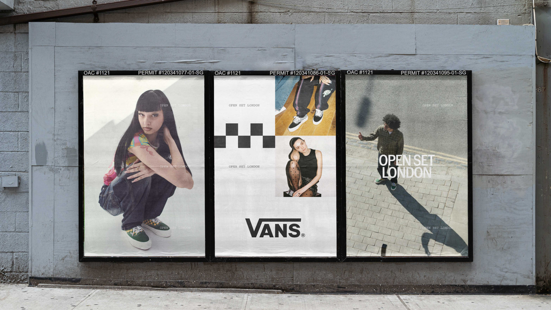
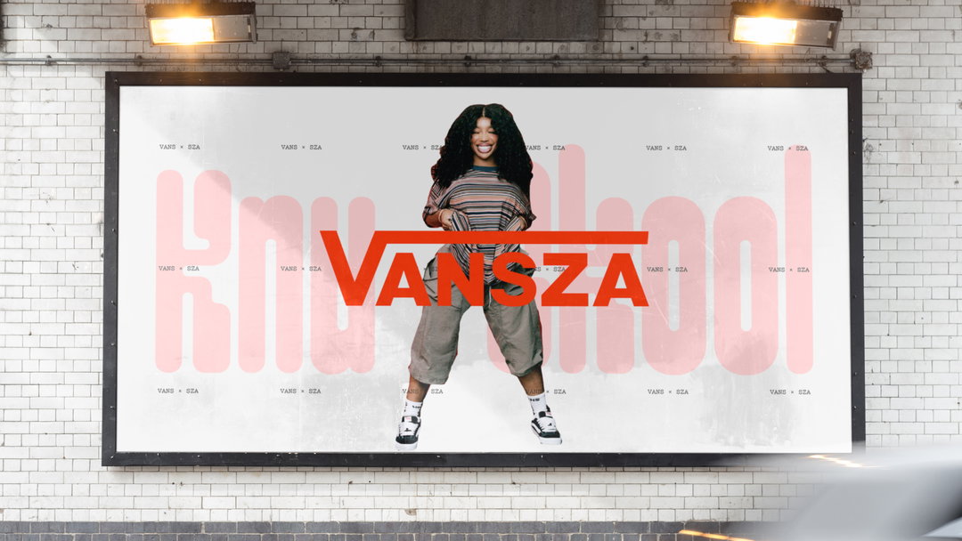
This reset and new standardisation – providing the shoemaker with greater clarity and consistency across the entire brand – is conceptually-led, guided by the north star: ‘Our Canvas. Your Way.’ Speaking to Vans’ history and how its products have been adopted, customised and used as a medium for expression, the concept centres the brand’s relationship with communities at the heart of its output. “Rather than replacing the brand’s existing assets, we created a simple two-layer framework that gave them a clearer role to play,” Accept & Proceed’s creative director, Stephen Heath, says, defining what remains fixed within the system and what can flex. “It stays true to the origins of Vans,” Stephen adds, “while giving future teams the freedom to express it in ways that feel relevant to new audiences.” In essence, the studio have created a system that encourages participation over stringent control.
Accept & Proceed began the project by stripping the brand back to its very basics. “We asked what genuinely made Vans recognisably Vans,” Stephen says. “Once we understood those core ingredients, it became clear that the role of the system wasn’t to create more rules. We then undertook a comprehensive audit of how the brand was applied across the entire product portfolio,” finding the inconsistency and opportunities throughout Vans’ output. “The resulting product branding standards helped define the constants,” Stephen says, “while giving teams the confidence and flexibility to apply the brand more coherently.”
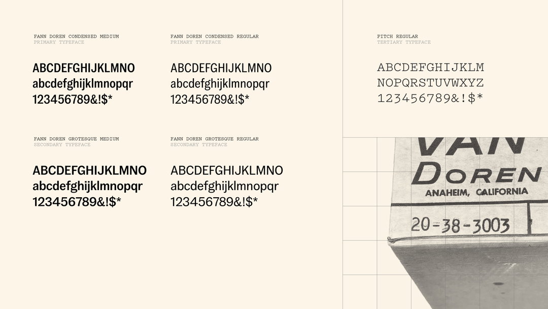
This ethos is only expanded through the brand’s approach to typography. “We introduced Pitch Mono as a supporting voice, adding a more functional, expressive layer,” Stephen explains, with the monospace typeface complementing Vans’ existing Fann Doren family. “We placed greater emphasis on its condensed styles to improve consistency and confidence in application,” he adds. They deliberately didn’t tinker with the typography too much, and instead opted to clarify what they already have.
“Like any project of this scale, there were many different stakeholder perspectives to balance,” Stephen says, “but the bigger challenge was cultural.” After all, sports and subcultures like skateboarding are fiercely independent and, as Stephen suggests, “sceptical of anything that feels manufactured”. So Accept & Proceed needed to strike a balance between creating a brand system that respected what came before and allowing the brand to grow beyond it. “The breakthrough came when we stopped thinking about Vans as a skate brand,” he says, “and started thinking about it as a brand built around a spirit of creative possibility,” ends Stephen. “That gave us a framework that could honour its roots, while creating space for its new audiences, sports and forms of expression.”
GalleryAccept & Proceed: Vans (Copyright © Accept & Proceed, 2026)
Hero Header
Accept & Proceed: Vans (Copyright © Accept & Proceed, 2026)
Share Article
Further Info
About the Author
—
Hailing from the West Midlands, and having originally joined It’s Nice That as an editorial assistant in March 2020, Harry is a freelance writer and designer – running his own independent practice, as well as being one-half of the Studio Ground Floor.