Launch Recite Me assistive technology
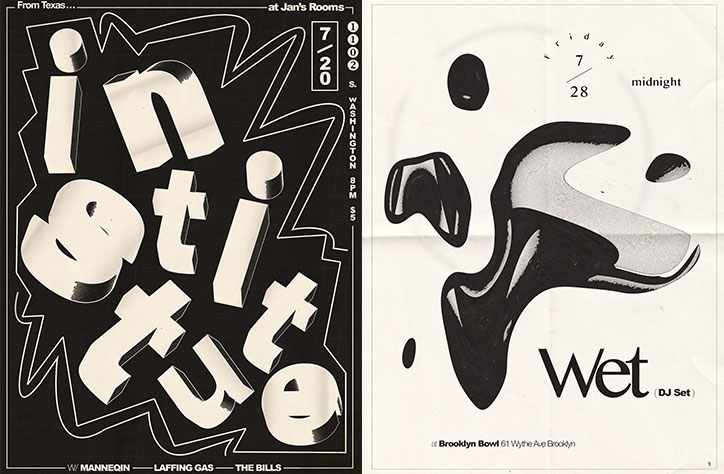
Two black and white posters. The first features bold, 3D typography reading “institute” set against a jagged starburst shape, with event details including the date “7/20” and the venue “Jan’s Rooms”. The second shows a fluid, organic black shape on a white background with the word “wet” and the text “(DJ Set)”.

“I was drawn to designing posters out of necessity”: Aaron Denton on his poster infatuation

—
Date
30 August 2017

By focusing primarily on poster designs and album artwork for bands, Aaron Denton has made a creative dent in the music scene and isn’t going anywhere soon. From monthly calendars for the residency Call & Response in Bloomington, to designing T-shirts, merchandise and various retro-infused flyers, Aaron has been intertwining his infatuation with music to create powerful and perspective-changing identities. The fast turnaround of the industry excites this designer, as well as a particular interest in the ways an eye-catching poster can alter an event entirely. We spoke to Aaron to find out more about his creative process and why he specifically chose to go down the path of poster design.

To sum up, how exactly did you get into design?

I’ve been making things for as long as I can remember and I’ve also been playing in bands from an early age. When I was a teenager and into my early 20’s, I was booking shows for bands all the time and would make flyers to post around town. I was studying at Indiana University and as a student they give you the Adobe suite for free — that’s when I started getting into Illustrator and Photoshop. Things just evolved from there.

Tell us about your creative process and main source for inspiration.

Usually I go at projects with a blank slate, and then I’ll start drawing shapes and manipulating things on the computer until something strikes me. It’s really just trial and error until there’s no other way I can think to make it look good. Lately, people have been asking me about my technique, but there’s no one way I go about it. I have a cache of old books and papers I scan in and use for texture, although a lot of my design comes from just messing around and experimenting with shapes, colour and texts.  

As for inspiration, I studied Art History at University. My thing back then was writing and I was so into the art history classes I took up a second major in it. I’m thankful for that time now, because I essentially spent four years just looking at art and not trying to make it. I think I might have a better eye for knowing what’s working based on that period. My favourites are Kandinsky, Helen Frankenthaler, Donald Judd, Miro, Barnett Newman, Bridget Riley — I go to them a lot when I need a spark.
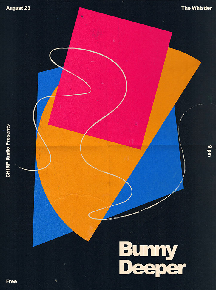
A graphic poster on a black background features overlapping abstract shapes in pink, orange and blue. A thin white line curves across the composition. Text reads “Bunny Deeper”, “CHIRP Radio Presents”, “August 23”, “The Whistler”, “9 pm” and “Free”.
Above

Aaron Denton

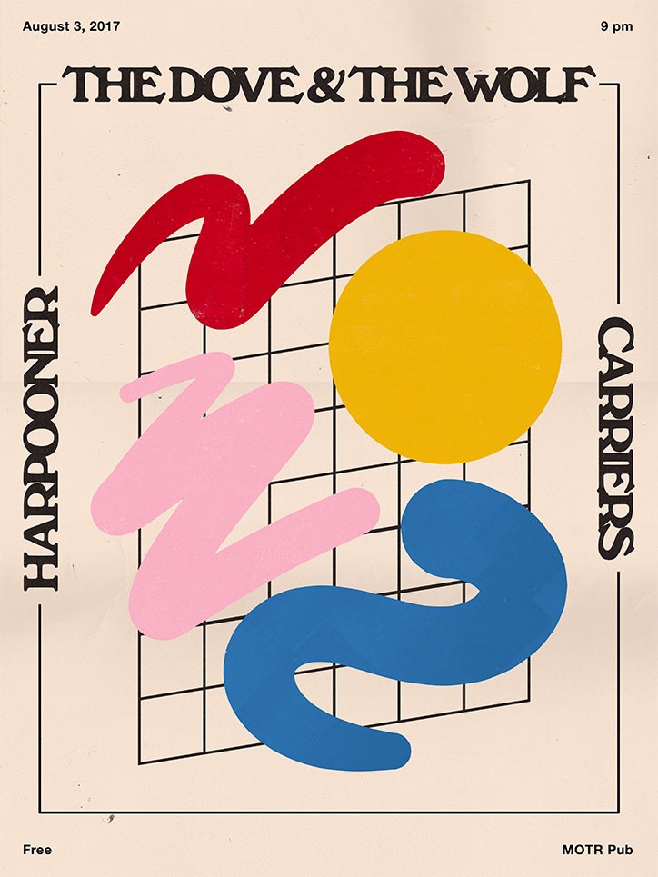
A graphic poster for a music event featuring bold, colourful abstract shapes over a black grid. Text at the top reads “The Dove & The Wolf”, with “Harpooner” and “Carriers” written vertically on the sides. The poster includes the date “August 3, 2017”, the time “9 pm”, and the venue “MOTR Pub”. The word “Free” appears in the bottom left corner.
Above

Aaron Denton

Run us through a couple of your recent music poster projects. Were you given a brief? If so, how did you approach it?

In my experience with music posters there’s never much of a brief. It’s just “here’s the info”, or occasionally “we want our name a little bigger than the other bands”. I did a poster for my friends in a band called Carriers, who are from Cincinnati, Ohio. They were playing with two other bands but they emphasised that no one was necessarily headlining, which is actually harder for me in terms of creating a poster where one band isn’t emphasised. I remember that one took me forever, figuring out how to balance the names with the shapes. In the end it’s one of the simplest designs I’ve done, but I like to think the hours spent getting it right come through. I enjoy looking at it. 

What is it about poster design that drew you towards this medium? Have you dabbled in any other forms?


I was drawn to designing posters out of necessity. I was putting on events that needed a face and I didn’t know anyone else in town who was doing it. I’m also attracted to the play between shows and their posters. Going to shows and playing music myself, I know that by having a thoughtful and nice looking poster it can change perspectives on what the event is going to be. I like to think of it as an extension of an already highly creative thing; a collaboration with the bands, the venue and the audience. It’s nice to have the pressure too, because bands are always needing something with, at times, an insane turnaround time. I like saying yes and just going for it. Things get created and used quickly and I think that kind of utility draws me to the medium. It’s an immediate gratification. From initial concept to seeing a design hanging around town, there can be a four or five day timeline. That’s exciting.
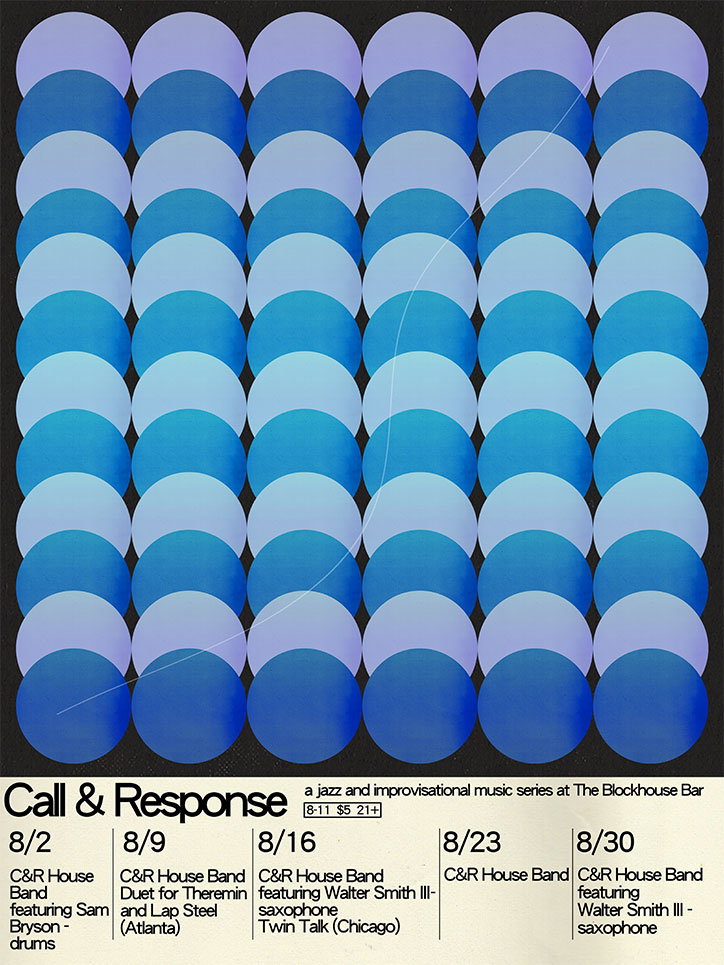
A poster for a jazz series titled “Call & Response” at The Blockhouse Bar. The top half features a grid of overlapping blue and purple circles on a black background. Below, a schedule lists five dates in August, featuring the C&R House Band and guest musicians.
Above

Aaron Denton

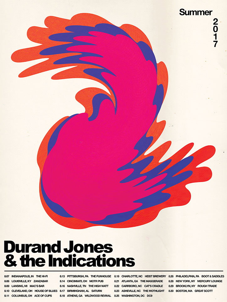
A psychedelic poster for Durand Jones & the Indications featuring a swirling, organic shape in pink, purple and orange. Text at the bottom lists tour dates and venues for “Summer 2017”.
Above

Aaron Denton

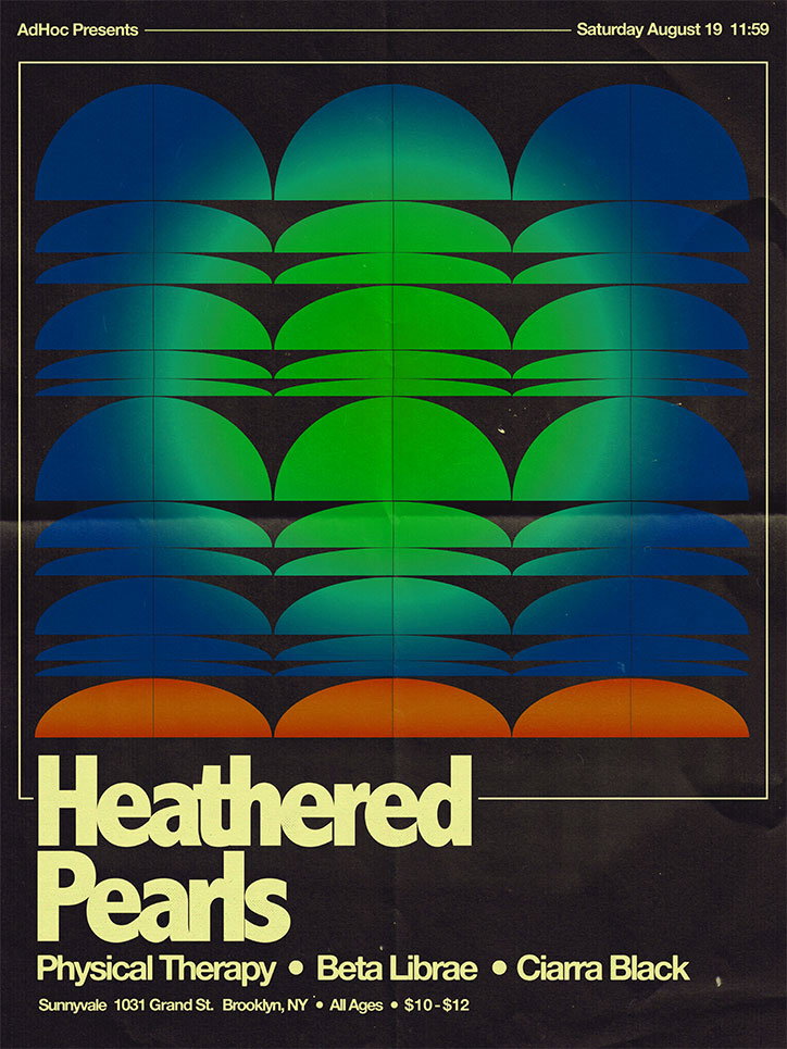
A graphic poster for a music event featuring a grid of semi-circular shapes in gradients of blue, green and orange. Bold text at the bottom reads “Heathered Pearls”, followed by the names “Physical Therapy”, “Beta Librae” and “Ciarra Black”. Smaller text at the top and bottom provides the date “Saturday August 19” and the venue address in Brooklyn, NY.
Above

Aaron Denton

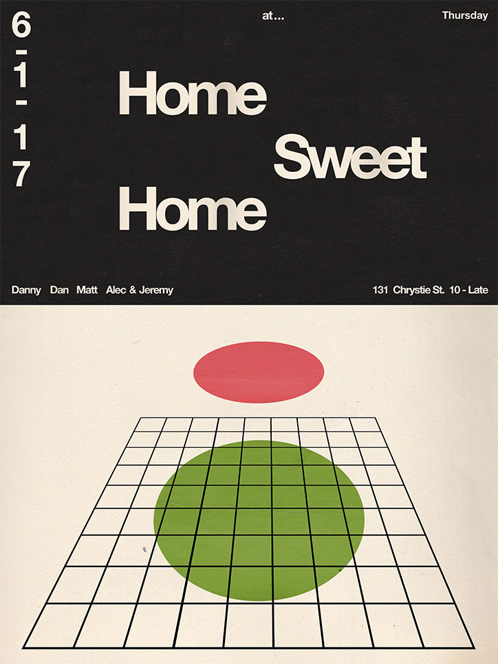
A graphic poster divided into two sections. The top half is black with bold white text that reads “Home Sweet Home”, alongside the date “6-1-17” and the address “131 Chrystie St. 10 - Late”. The bottom half is cream with a black perspective grid. A large green circle sits on the grid, with a red oval floating above it.
Above

Aaron Denton

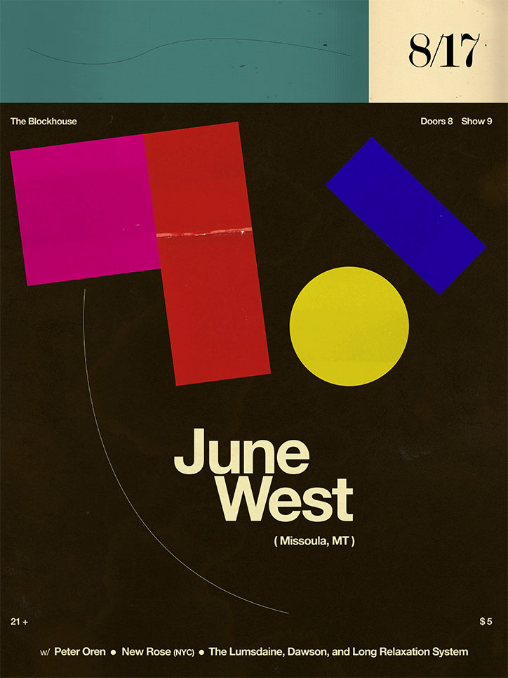
A graphic poster for a performance by “June West (Missoula, MT)”. Bold magenta, red, blue and yellow geometric shapes float above the text against a dark brown background. The top of the poster features the date “8/17” and the venue “The Blockhouse”. A line-up at the bottom lists Peter Oren, New Rose (NYC), The Lumsdaine, Dawson, and Long Relaxation System.
Above

Aaron Denton

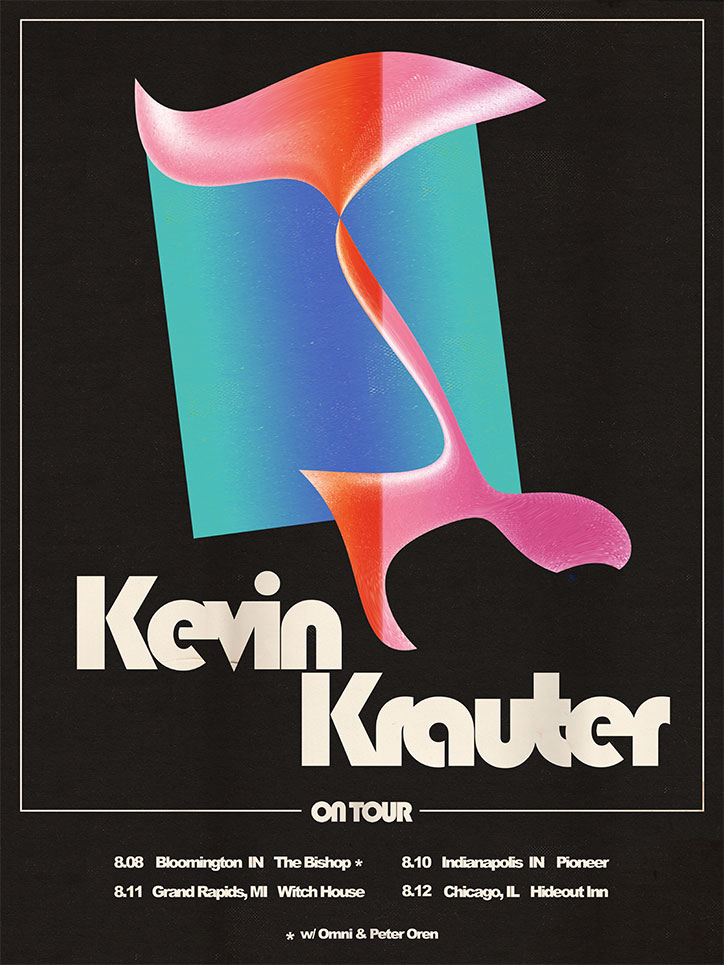
A graphic poster for Kevin Krauter on a black background. A fluid, pink and orange 3D shape twists across a teal gradient rectangle. Bold white text reads “Kevin Krauter” and “ON TOUR”. A list of tour dates and venues in the US follows below.
Above

Aaron Denton

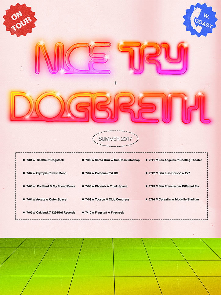
A colourful tour poster with a pink gradient background and a green tiled floor. Bold, glowing text reads “Nice Try + Dogbreath” above the words “Summer 2017”. A list of tour dates and venues across the US west coast follows, including stops in Seattle, Los Angeles and San Francisco.
Above

Aaron Denton

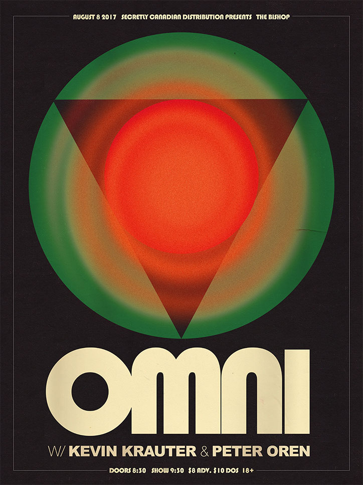
A graphic poster for a musical event featuring a large green circle containing a red inverted triangle and a central red orb. Below the graphic, the word “Omni” appears in a bold, cream-coloured typeface. Text at the top reads “August 8 2017 Secretly Canadian Distribution presents The Bishop”. Further text below the main title reads “w/ Kevin Krauter & Peter Oren”, followed by event timings and ticket prices.
Above

Aaron Denton

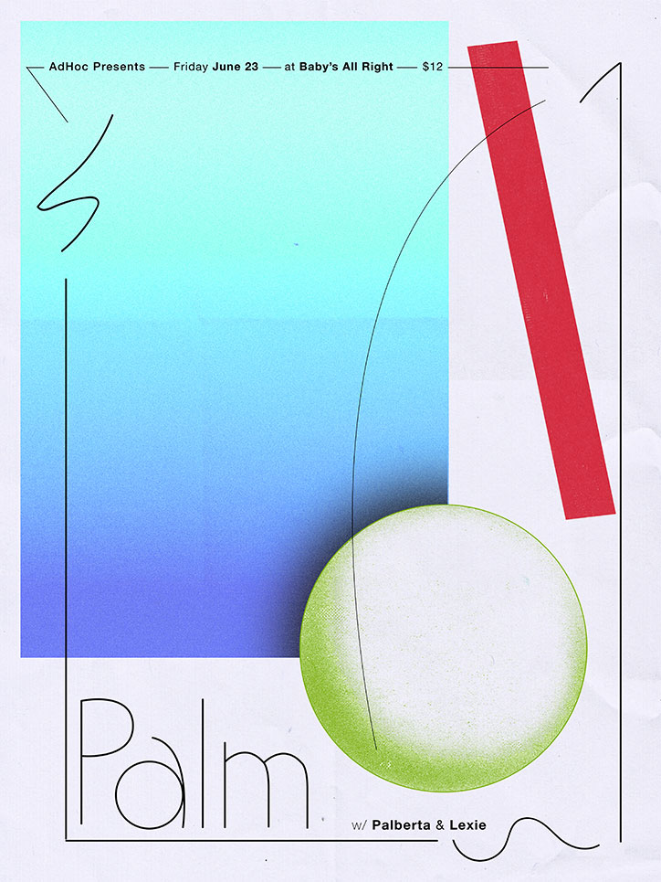
A graphic poster with a blue and teal gradient background and a large, lime green circle. A bold red diagonal bar and thin black lines create a geometric composition. Text at the top reads “AdHoc Presents — Friday June 23 — at Baby’s All Right — $12”, while the word “Palm” appears in a thin outline font at the bottom.
Above

Aaron Denton

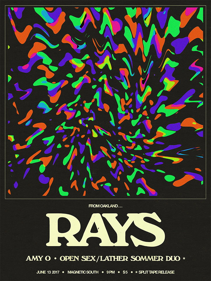
A psychedelic poster featuring a swirling, kaleidoscopic pattern of neon green, purple and orange shapes on a black background. Below the graphic, bold cream text reads “Rays” under the phrase “From Oakland...”. Smaller text lists the performers “Amy O” and “Open Sex/Lather Sommer Duo”, followed by the date “June 13 2017” and venue “Magnetic South”.
Above

Aaron Denton

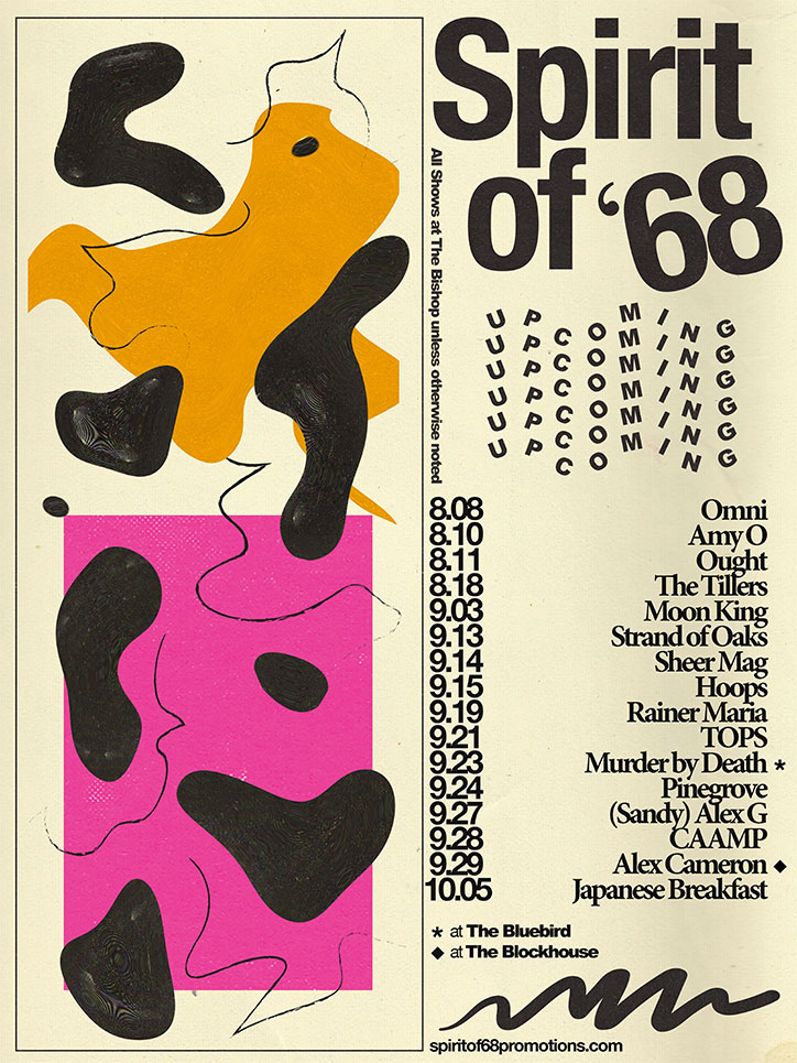
A typographic poster for “Spirit of ‘68” featuring abstract orange, black and pink shapes on a cream background. A list of dates and artists is displayed on the right, including “Omni”, “Pinegrove” and “Japanese Breakfast”.
Above

Aaron Denton

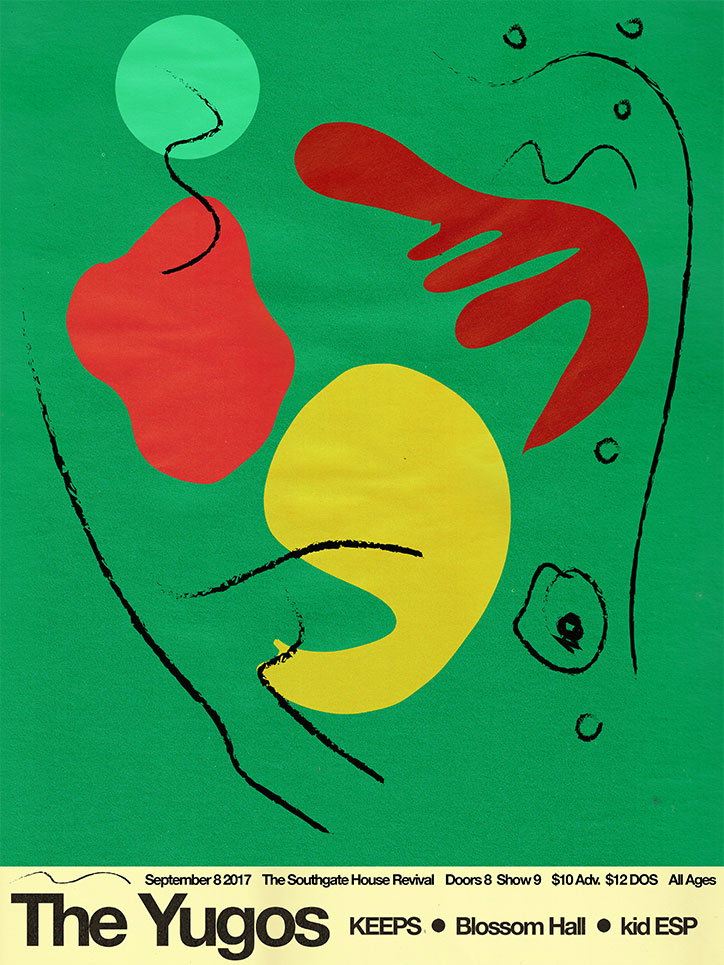
An abstract poster on a green background featuring organic shapes in red and yellow. Thin black lines curve across the composition, accompanied by small circular marks. At the bottom, a white banner reads “The Yugos” alongside event details for 8 September 2017 at The Southgate House Revival.
Above

Aaron Denton

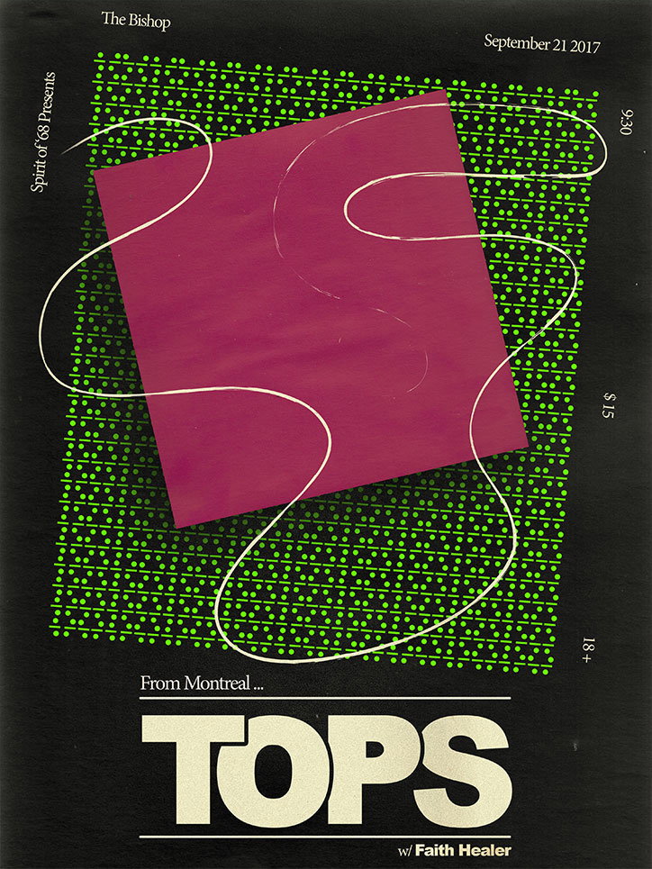
A graphic poster for a musical performance by the band Tops. A large magenta square is layered over a grid of green dots, with a white winding line flowing across both. Text at the top and sides reads “The Bishop”, “September 21 2017”, “Spirit of ’68 Presents”, “9:30”, “$15” and “18+”. The bottom reads “From Montreal ... TOPS w/ Faith Healer”.
Above

Aaron Denton

Share Article

About the Author

Ayla Angelos

—

Ayla is a London-based freelance writer, editor and consultant specialising in art, photography, design and culture. After joining It’s Nice That in 2017 as editorial assistant, she was interim online editor in 2022/2023 and continues to work with us on a freelance basis. She has written for i-D, Dazed, AnOther, WePresent, Port, Elephant and more, and she is also the managing editor of design magazine Anima. 

It's Nice That Newsletters

Fancy a bit of It's Nice That in your inbox? Sign up to our newsletters and we'll keep you in the loop with everything good going on in the creative world.