




McDonald’s releases global redesign of packaging with a focus on illustration
Highlighting specific ingredients from its globally recognisable menu, the redesign hopes to showcase the brand’s “playful point-of-view”.
Share
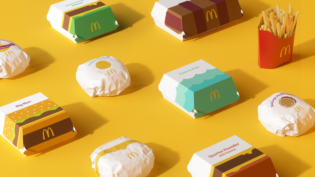
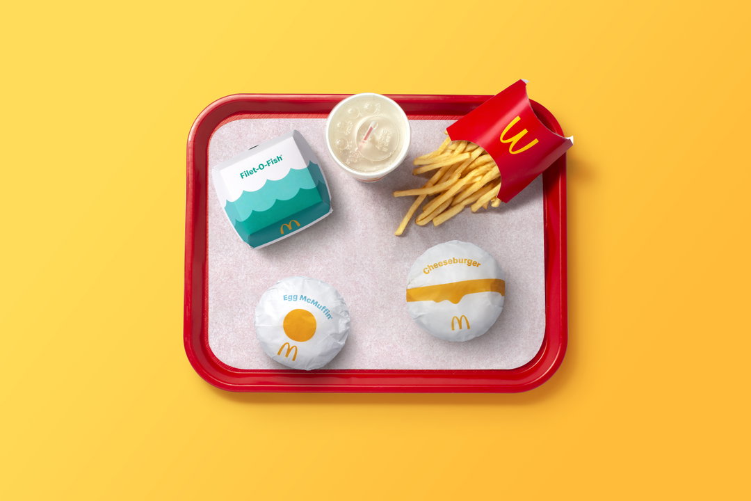
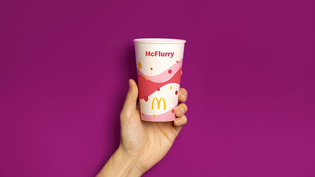
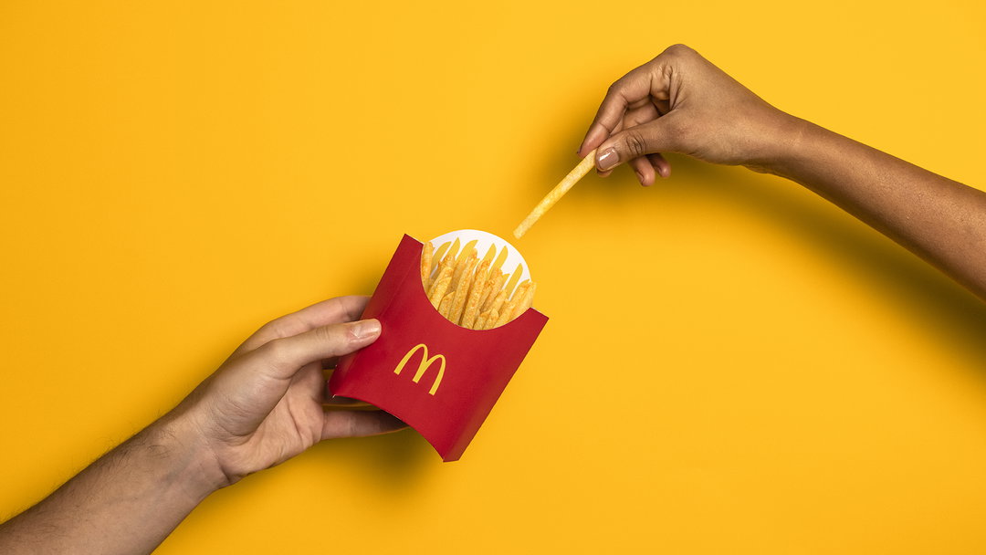
Independent brand agency Pearlfisher has redesigned the entire global packaging system for McDonald’s, creating a new visual framework for the brand’s long line of products. Consisting of a new graphic system, the redesign aims to bring “a sense of joy and ease to the brand” by placing “bold graphics” at the forefront of the fast food chain’s packaging going forward.
Partnering with the brand to create this ambitious redesign – which includes over 60 million touchpoints every day – Pearlfisher has transitioned McDonald’s previous packaging to a design system featuring prominent on-pack messaging.
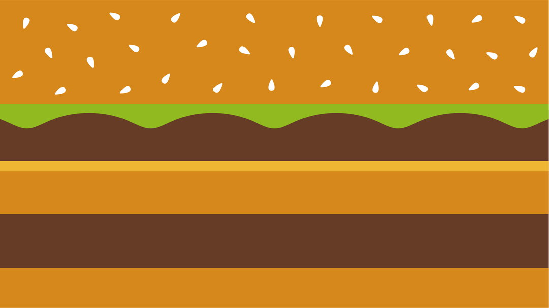
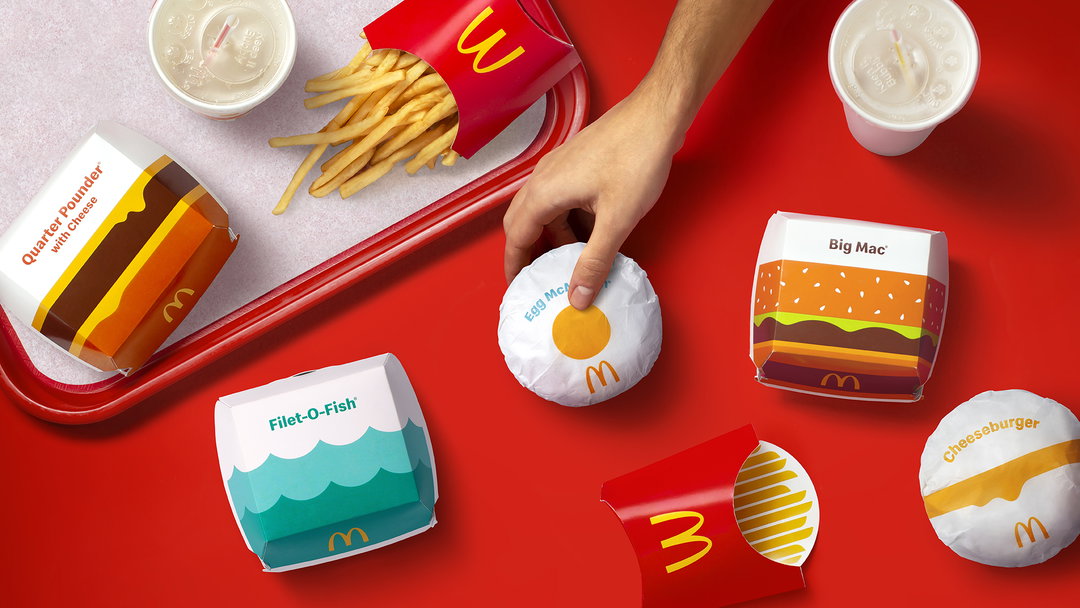
Centring around new vector style illustrations of iconic items off the McDonald’s menu, each new item of packaging heroes an ingredient from the yolk of an Egg McMuffin, the angular shape of a fry, or the stacking of bread, meat and cheese in the cross-section of a Big Mac. The approach of creating “graphic representations of the menu” sees Pearlfisher showcase how each element of the menu can be “more connected and evocative of McDonald’s playful point-of-view,” explains a release on the redesign.
This approach has also been developed to ensure operations remain efficient during the rollout of changes, favouring imagery to create “easy-to-understand graphics” which can also “drive recognition regardless of where in the world orders are being assembled, shared and enjoyed.” Matt Sia, creative director at Pearlfisher adds: “Our task was finding out what was really special about each menu item to design a system that would make it easy for others to do the same.”
By focusing on the globally recognisable elements off the menu, Pearlfisher’s team highlights how there can be “beauty in the simplicity of McDonald’s iconic menu items,” continues Sia. “We aimed to find the most special, recognisable and iconic expression of each – celebrating them in a way that makes people smile.” Sticking close to the brand’s recognisable colour palette, these relatively simple illustrations also aim “to be functionally unique, easy to identify, aesthetically minimal and, most importantly, emotionally joyful.” For the McDonald’s internal teams this focus on illustration “helped to ensure that this redesign modernises our brand,” adds senior director of global menu strategy, Barbara Yehling, adding how it “highlights the specialness of our menu, and delivers on our commitment to quality.”
GalleryPearlfisher: McDonald’s packaging redesign (Copyright © Pearlfisher/McDonald’s, 2021)

Hero Header
Pearlfisher: McDonald’s packaging redesign (Copyright © Pearlfisher/McDonald’s, 2021)
Share Article
Further Info
About the Author
—
Lucy (she/her) was part of the It’s Nice That team from 2016–2025, first joining as a staff writer after graduating from Chelsea College of Art with a degree in Graphic Design Communication, eventually becoming a senior editor on our editorial team, and most recently at Insights, a research-driven department with It’s Nice That.


