





CIA rebrand looks to diversify its agents, though critics say it’s a trendy step too far
The US federal agency’s new website hopes to appeal to young recruits using contemporary graphics and typefaces such as GT America, which has prompted some scathing comparisons.
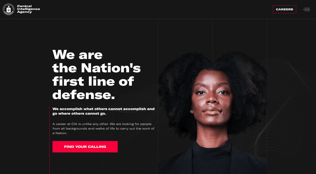
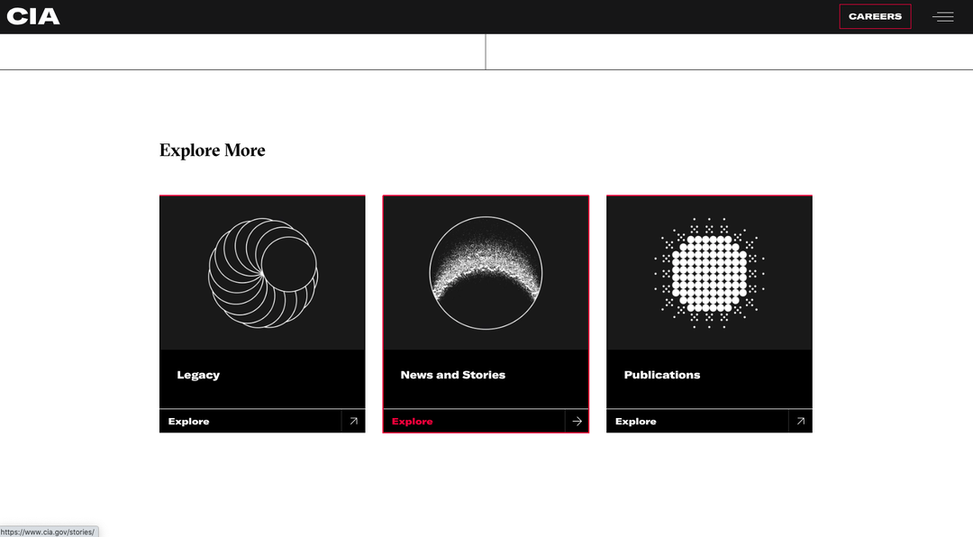
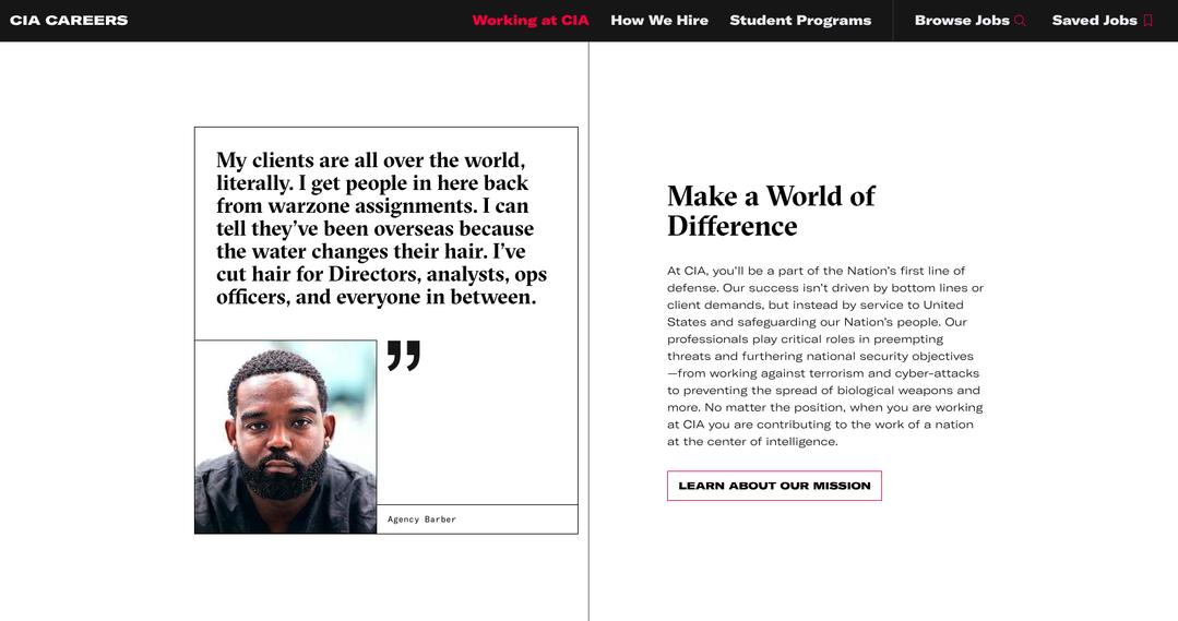
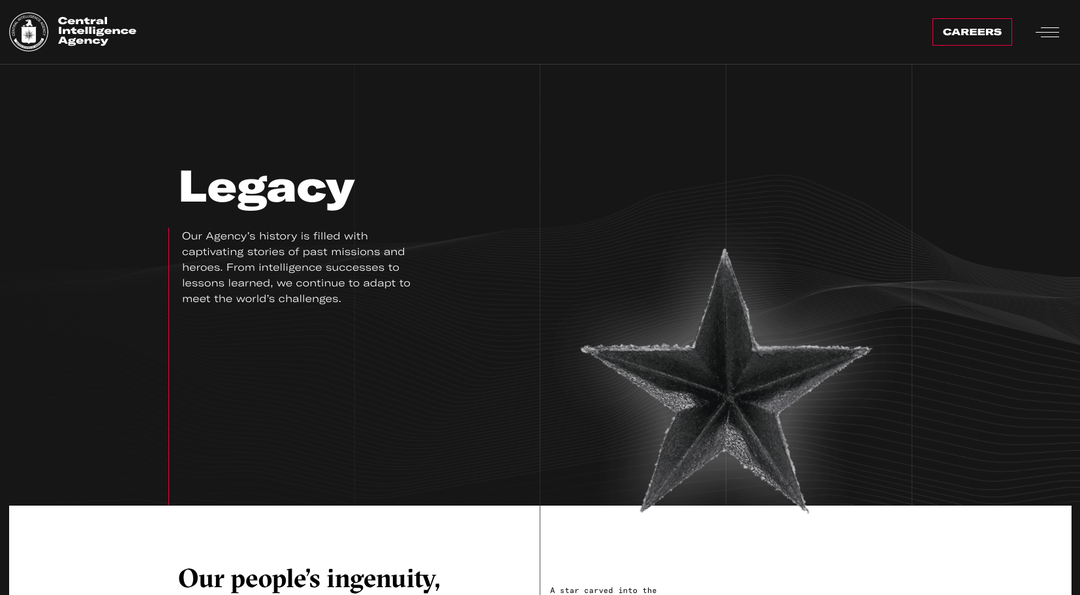
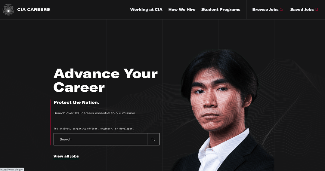
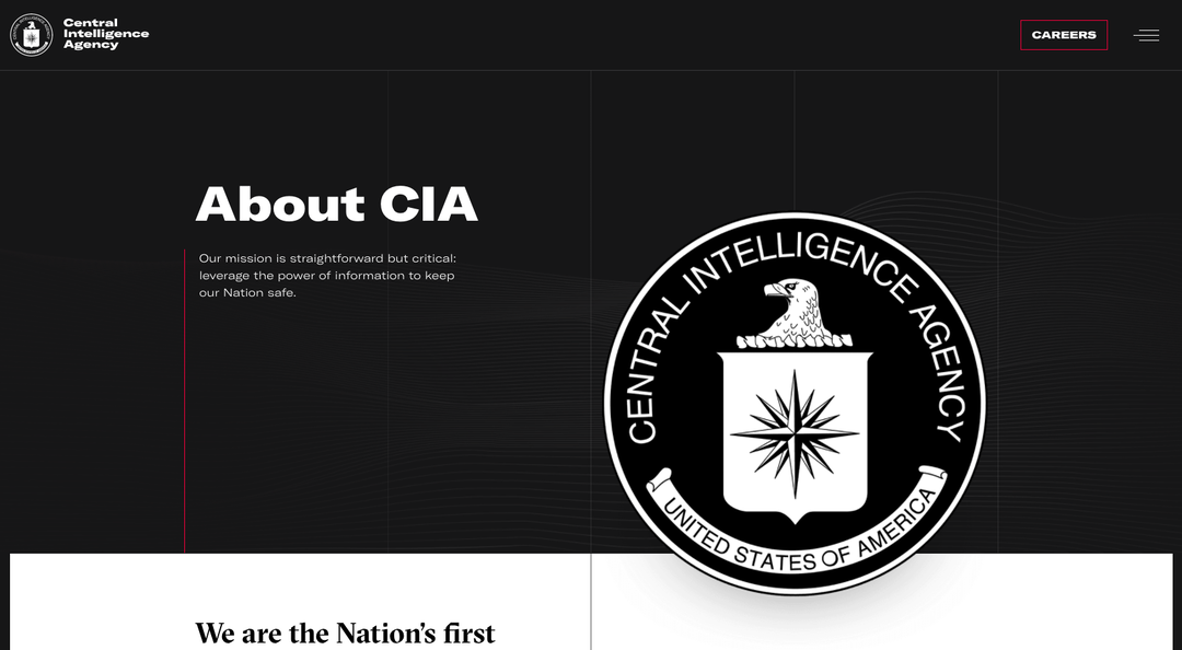
In 2019, a report found that the CIA had one of the least diverse workforces of any agency in US federal government with just 26.5 per cent of its staff BIPOC. CIA director Gina Haspel (the agency’s first female director) has launched a string of initiatives attempting to attract a broader range of recruits, from launching an Instagram account to advertising on streaming services, and the latest is design overhaul of its website, featuring a far more diverse pool of headshots. Deploying graphics and typefaces (such as Grilli Type’s GT America) more commonly seen among tech brands, design agencies and record labels, the rebrand is… visually surprising.
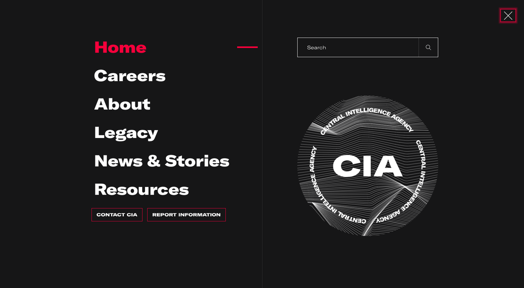
Haspel said in a statement that she hopes the CIA’s new website gives a sense of the “dynamic environment that awaits them here”. Meanwhile on Twitter, critics have other ideas, comparing the redesign to club flyers, “a modular synthesizer festival in Berlin,” says comedian and illustrator Sarah Squirm, and a “hungry independent ad agency focused on their culture as much as their work” says Zach Roif, creative director at RGA. Others have been comparing the graphic device – which uses undulating parallel lines to allude to data and sound recordings – to the work of Peter Saville, particularly his Joy Division cover. Designer David Rudnick didn’t hold back, stating “with this rebrand, the CIA has lost all credibility”; while Michael Bierut had a subtle dig, referencing graphic design for the TV series Homeland.
However, while the design community on Twitter tears into the visuals, this is unlikely to be the much of the same community the CIA is looking to recruit. Who’s to say a rebrand that aligns more with contemporary cultural tropes won’t appeal to its target demographic, and catch the attention of large swathes of potential future agents, with branding that feels younger, more futuristic and less ‘part of the system’? According to CIA spokesperson Nicole de Haay, the agency’s latest recruitment drives are working. “Our incoming class is the third largest in a decade and represents the most diverse talent pool, including persons with disabilities, since 2010,” she said in a statement; so only time will tell.
GalleryCIA rebrand (Copyright © CIA, 2021)
Share Article
Further Info
About the Author
—
Jenny oversees editorial output across It’s Nice That. Get in touch with writing pitches for features or opinion pieces, big creative story tips, or questions about all things editorial. jb@itsnicethat.com
To submit your work to be featured on the site, please see our Submissions Guide.


