- Words
- Rebecca Fulleylove
- —
- Date
- 7 July 2016
- Tags
John Molesworth's colourful approach to image making is all-encompassing
Share
Share
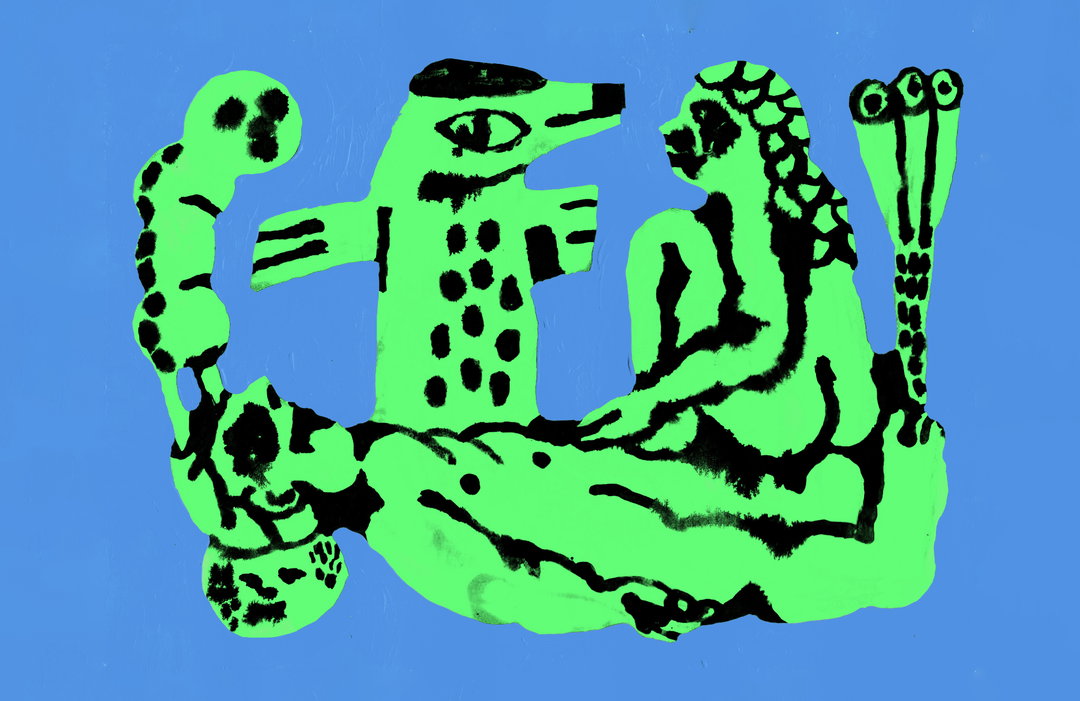
John Molesworth studied illustration at Camberwell College of Art and his colourful sensibility and process-driven approach to image-making is refreshing. Exploring the discipline through paintings, posters, publications and drawings, there’s a sense of freedom in John’s work which has been helped by his time at university.
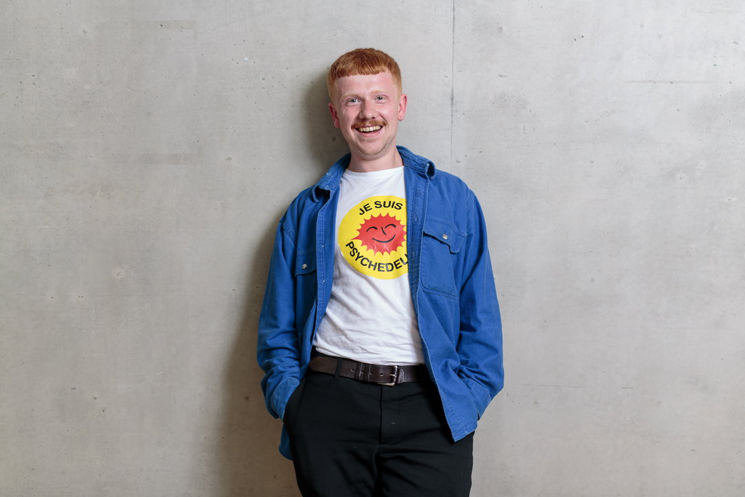
Tim Bowditch: John Molesworth
“The illustration course at Camberwell offered such a wide variety of things to learn and do, it’s what drew me to studying there,” he says. “It not only supports a variety of practical vocations but offers support in conceptual ideas as well.”
John’s first few months at Camberwell were an adjustment with his peers already knowing what part of illustration they wanted to specialise in. “I wanted to paint, print and make and it seemed really bizarre to me that people already had a ‘style’. As a result I tried to produce what I thought illustration should look like, when in fact this is the last thing I should have been doing to improve my work.”
After finding his stride in second year, John found it was confidence that made his work better. “I think people, myself included, can get hung up on whether or not this is ‘who they are’ or what they should make,” he says. “I think something that really stuck with me from Camberwell is to do what you feel like and more importantly, what you enjoy.” One of his final projects, Lines atop a porcelain bowl is a perfect example of this – a four-colour Risograph, the book is a series of simple, botanical illustrations. “I made it with my talented friend Harry Reddick – he wrote the poem I did the illustrations,” says John. “I suppose it felt like I was truly putting something into the world, it wasn’t a brief or illustrating someone else’s cover, it was mine!”
John also incorporates wonderful abstract ceramics into his work and this added element fits in with his overall ethos: “I like to keep the energy going across my practice and I move quickly so I don’t get bored of what I’m doing,” he says. “I’ve always tried to do as much as I can, without tying myself down to a specific way of working or ‘style’, For me working at one thing in particular takes the fun, playfulness and exploration out of creating art.”
Now graduated, John wants to to travel abroad and work with creatives from all over the world, and he wants to continue experimenting with his work. “I hope to expand even further with the mediums I use, I have only recently started using ceramics and I’d like to delve deeper into a 3D area. I’d also like to work further within the gallery context.”
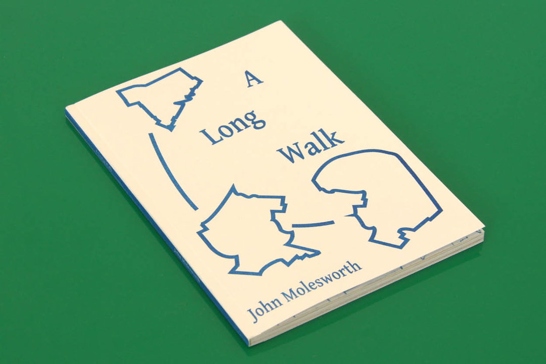
John Molesworth: A Long Walk
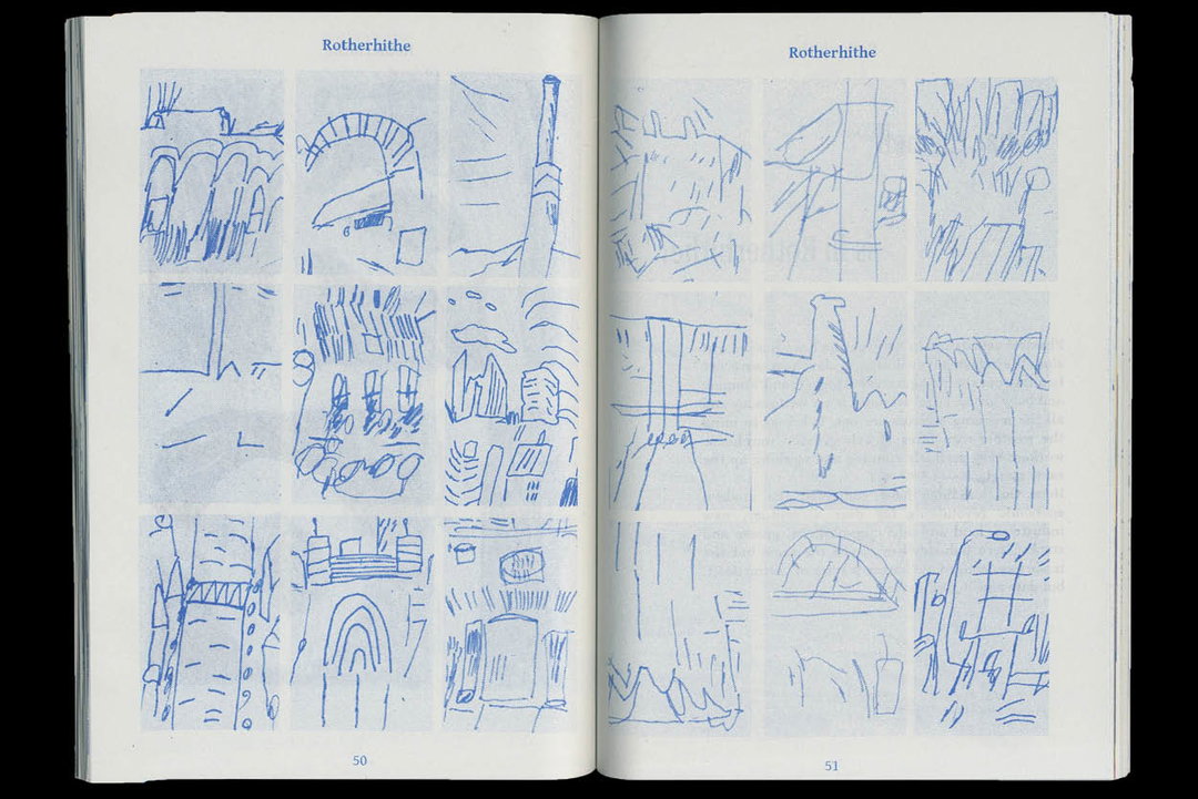
John Molesworth: A Long Walk
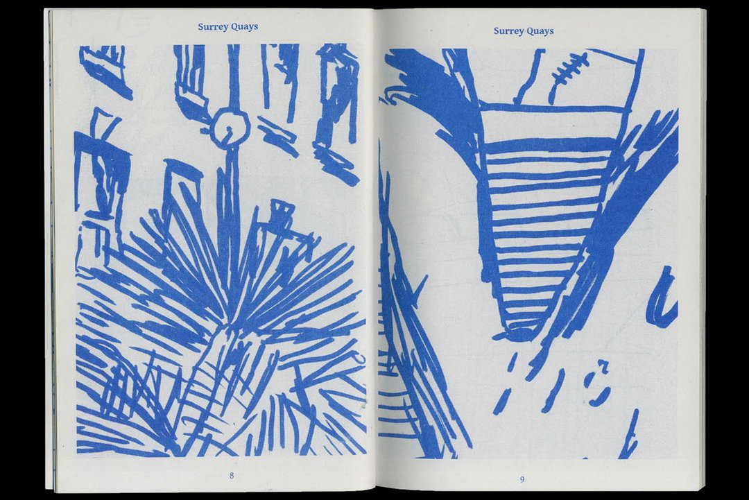
John Molesworth: A Long Walk
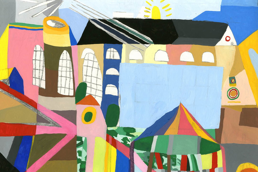
John Molesworth: Wapping
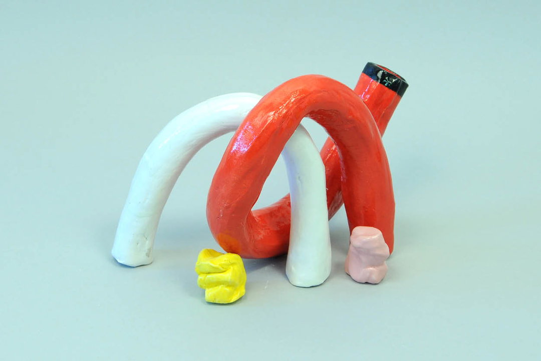
John Molesworth: Tubes
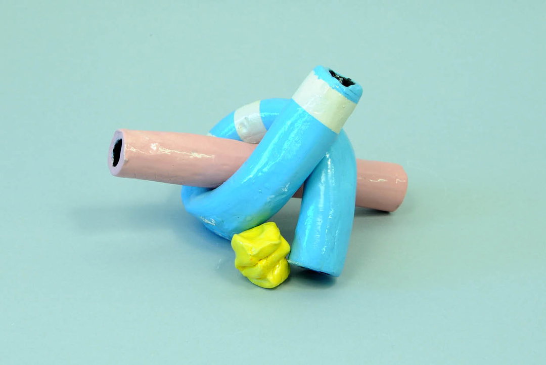
John Molesworth: Tubes
John Molesworth: Boxing
John Molesworth: Baseball
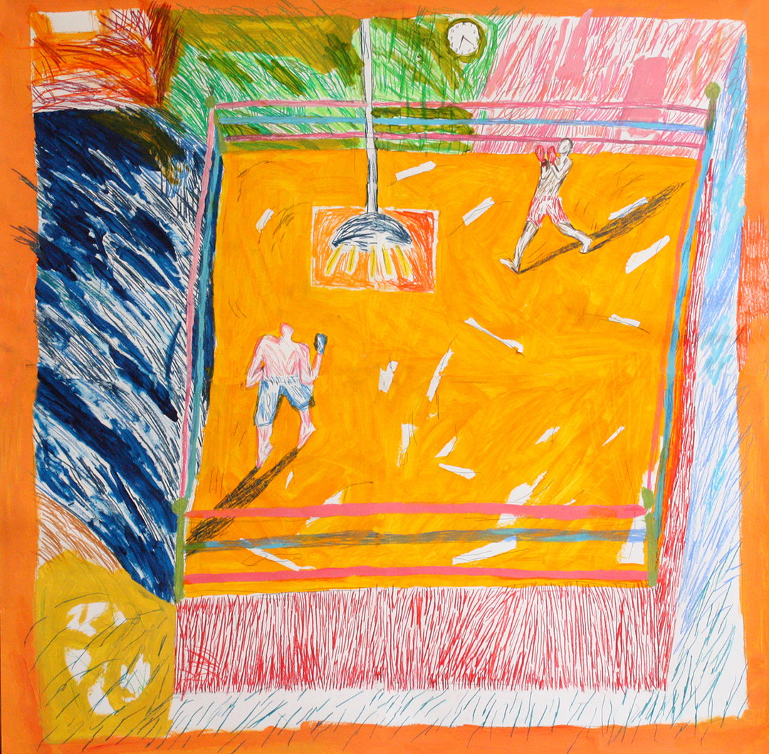
John Molesworth: Boxing
John Molesworth: Baseball
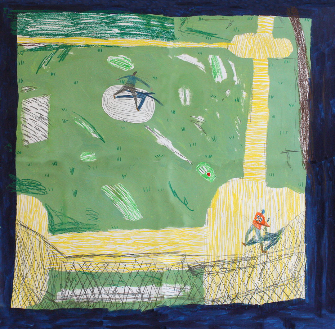
John Molesworth: Baseball
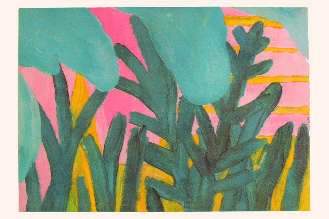
John Molesworth: Risograph
G . F Smith
It’s Nice That’s Graduates 2016 is kindly supported by G . F Smith, whose gorgeous range of papers and services can be just the thing for new and soon-to-be creative grads. The 130-year-old paper company has a long history of working with designers and artists at all stages of their careers, with its high-quality and innovative paper products offering a huge range of creative possibilities.
Share Article
Further Info
About the Author
—
Rebecca Fulleylove is a freelance writer and editor specialising in art, design and culture. She is also senior writer at Creative Review, having previously worked at Elephant, Google Arts & Culture, and It’s Nice That.