- Words
- Liz Gorny
- —
- Date
- 4 January 2023
- Tags
What does a truly accessible future look like?
We consider the frameworks, tools and perspectives shaping accessible design today. How do you create inclusively? And, what are the barriers preventing a future shaped by these practices?
Share
Share
It’s Nice That’s 2023 Forward Thinking campaign is supported by Material Design, whose latest design system update, Material You, signals a radical new way to think about design for the entire tech industry. Material You explores a more humanistic approach to design, celebrating the tension between design sensibility and personal preference, and not shying away from emotion. Click here to find out more.
Identity coded by Yannick Gregoire.
Generative type made with Phase by Elias Hanzer.
Accessibility is a subject on the rise. From ongoing conversations on aesthetics to claims that the pandemic has increased focus towards areas such as web accessibility (though the pandemic had countless negative impacts on people with disabilities), the design industry seems, at face value, to be re-evaluating the real-world impact of its daily decisions. It goes beyond buzz; there are strongholds in the space pushing for the industry to take measurable, considered steps forward too. This year alone has seen the launch of the likes of Trifle, the UK’s first design studio whose work is made by creatives with learning disabilities. It joins an incredibly wide-ranging selection of organisations working towards a future in which inclusion is embedded into design, like social equity enterprise Project Inkblot.
However, we have a long way to go to reach that future, and the effects of designing under non-inclusive systems are everywhere. Sometimes the results are well-documented, such as the average of 50.8 distinct accessibility errors across the top one million website homepages – over 50 million overall – or the deadly effects of gender bias in car product design. Other times, they go unrecorded, but not unnoticed. With the AIGA Design Census 2019 finding that 71 per cent of designers are white, with 15 per cent identifying as LGBTQIA+, we know underrepresented identities and lived experiences continue to be cut out of the design process. As Trifle Studio’s Tom Dorkin puts it: “15 per cent of the global population live with some form of disability. So if you are not including these people in the design process or considering their needs with the outcome, then you are neglecting an audience of over one billion”.
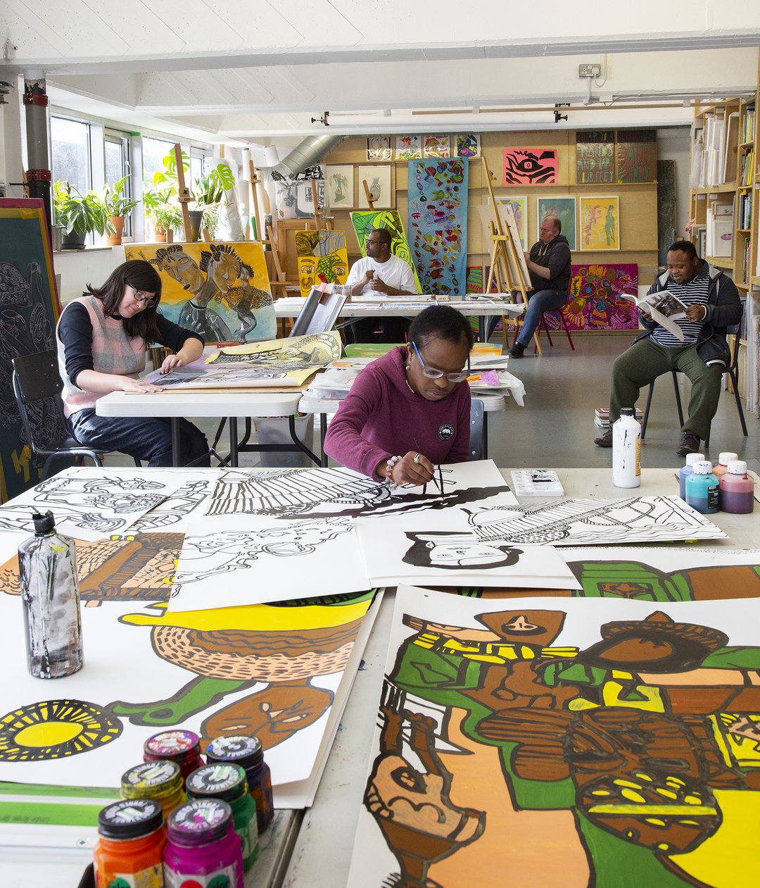
Intoart: Intoart Studio (Copyright © Intoart and the artist, 2021) Photography by Josef Konczak.
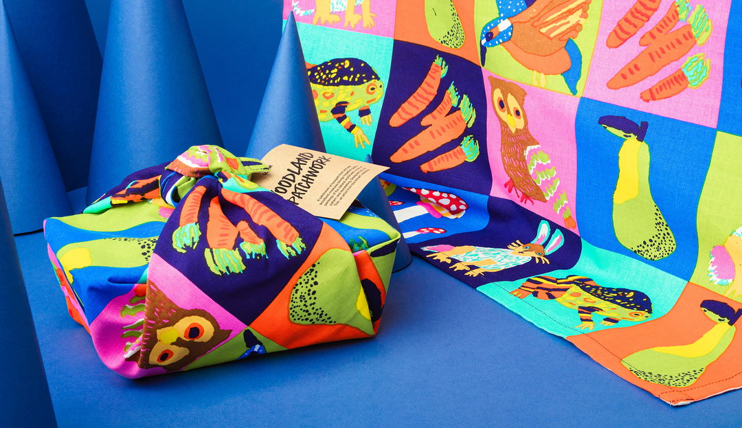
Lisa Trim / Intoart / Lush: Woodland Patchwork Knot Wrap (Copyright © Intoart and the artists, 2021)
But, what does designing inclusively actually mean? And, how do you do it? Accessible and inclusive design can be defined in all sorts of ways, depending on the project, context and conversation. For Charlotte Fereday – a product leader who has spent years working on inclusive design-centred projects at companies such as 11:FS and Idean – “accessible design is the intent to design products and services that people with a range of physical access needs can use.” According to Do-It Centre, “it is a design process in which the needs of people with disabilities are specifically considered.” Charlotte frames inclusive design as the “broadening” of this definition, to designing for “a diverse group of users with varied physical, mental and cognitive needs”, “intersectional identities” and “contexts that may leave them vulnerable”. Project Inkblot sets up the crucial framing that a truly inclusive design future comes from designing with those that are excluded. Sometimes inclusive and accessible are used interchangeably – ultimately, you can’t have one without the other. Inclusion requires access and vice versa.
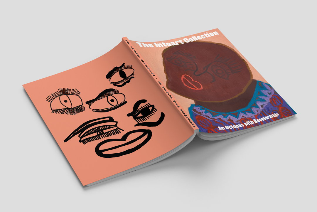
Intoart: The Intoart Collection, An Octopus with Boomerangs (Copyright © Intoart and the artists, 2022)
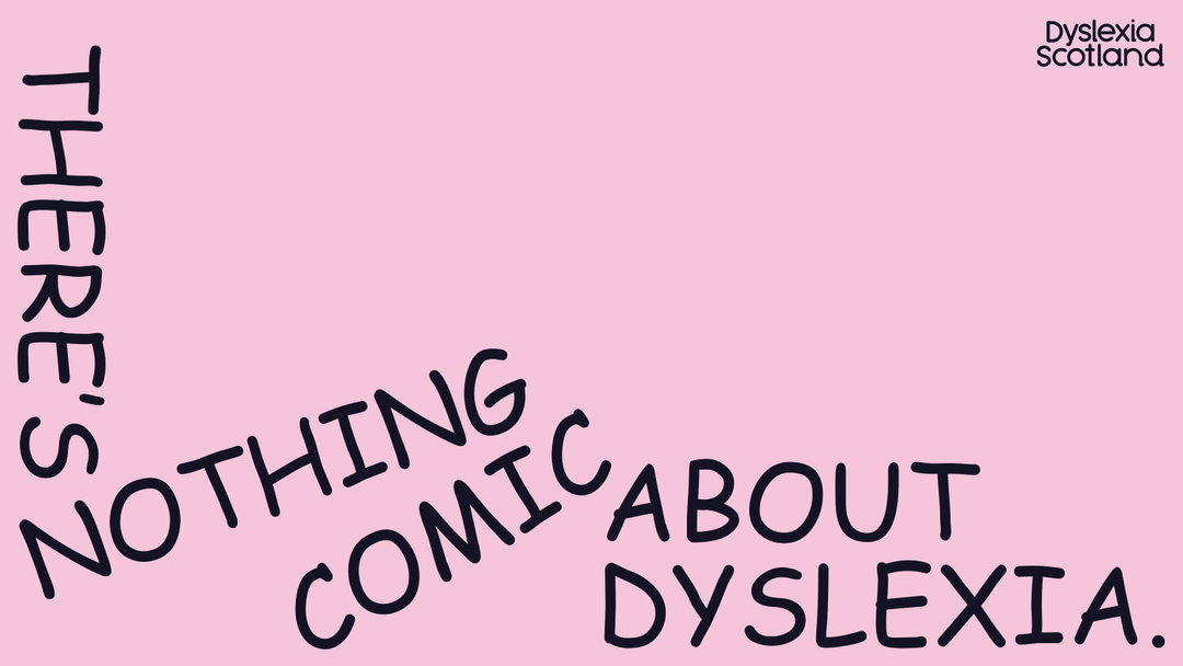
Dyslexia Scotland / Innocean Berlin / WeTransfer / Daniel Brokstad: There’s Nothing Comic About Dyslexia (Copyright © Dyslexia Scotland / Innocean Berlin / WeTransfer / Daniel Brokstad, 2022)

Just like the what of accessible design has countless definitions, the how can too. There are a range of tools that could technically be used to assist with designing inclusively. A wealth of tools have been created around the idea of unconscious bias, for example. Take Cards for Humanity, a tool that you can “play” to test a design from a “different perspective” via prompt cards. Then there are guides to assist in designing products and services that cater to as many people as possible, like 11:FS’s recent report. There are also resources to help with specific design considerations, like one from Nothing Comic About Dyslexia, helping with the variables that go into readability and accessibility. None, however, present an ‘answer’ to inclusive design.
“Let’s debunk any one-and-done ‘solutions’ to the dynamic and complex world of equity,” explains Boyuan Gao, co-founder of Project Inkblot, which equips people to become co-designers of an equitable world. While the idea of tools might feel like an easy way to arrive at a ‘solution’, Boyuan explains that “‘tools’ can come off as purely tactical”. “The core of what we are shifting are relational dynamics, our thinking and our behaviours, which requires a lot of practice.” To achieve an accessible future, Project Inkblot argues we need practices rather than tools. This is why the organisation leads with dedicated workshops and education programs that centre lasting shifts in “mindsets and mental models”, rather than quick fixes.
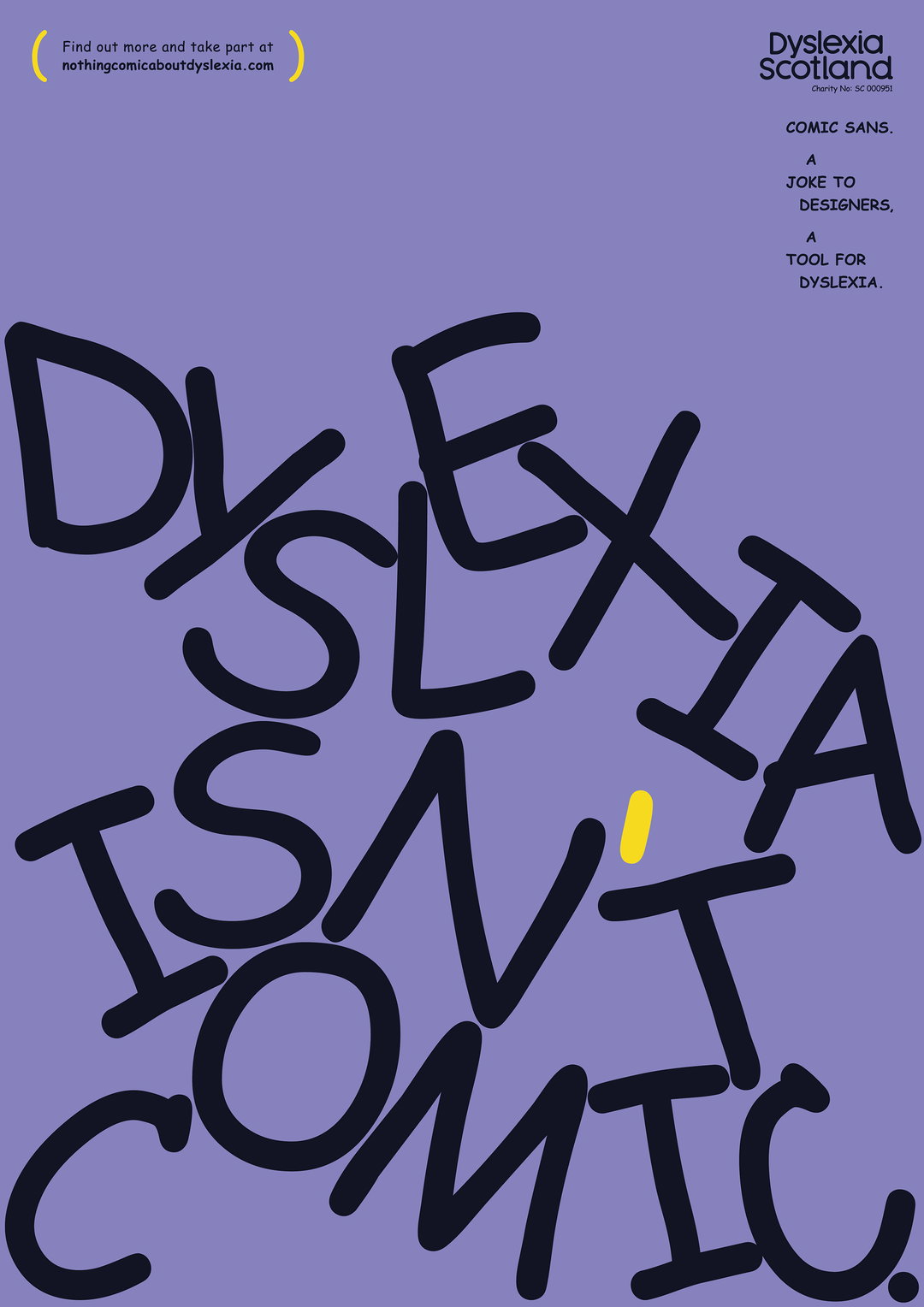
Dyslexia Scotland / Innocean Berlin / WeTransfer / Daniel Brokstad: There’s Nothing Comic About Dyslexia (Copyright © Dyslexia Scotland / Innocean Berlin / WeTransfer / Daniel Brokstad, 2022)
A shift in mindset, Boyuan notes, is a vital aspect of this work. In fact, the co-founder lists the “number one barrier to achieving any type of transformative change toward equity” as what Project Inkblot coins “Dominant Defaults”. This is the human tendency to fall into the age-old way of thinking that ‘we’ve always done it this way’, which typically dominates all our decision making. Boyuan explains: “This often invisible mechanism continues to preference dominant groups that have always been preferenced, and penalises those who have always been penalised, be it whiteness, able-bodiedness, the wealthy, etc.”
If inclusive design needs to be practice driven, perhaps the question isn’t: ‘How do I design inclusively?’ but, ‘What could this process look like?’ Boyuan says breaking out of standard practices – such as the common, debunked design prompt of ‘How might we’ – starts with asking a set of critical inquiries before rushing to solutions. (These strategic and relational practices are part of the Inkblot Design™ framework.)
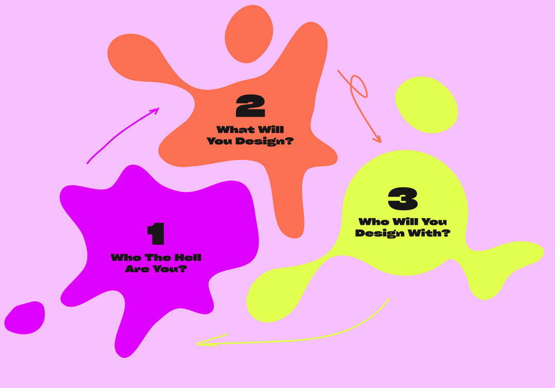
Adam M Morris / Project Inkblot: Project Inkblot (brand collaboratively created in partnership with Adam M Morris using the principles and thinking shown) (Copyright © Project Inkblot, 2022)
The first of these is simply: “Who the hell are you?” Boyuan elucidates: “Well really, who are we? What are the lenses, lived experiences, beliefs, biases that we bring into every space with us? [...] Let’s see if we are even the right people to be staffed on this project?” This reframes personal experience as a critical skill set to any design project. The next is: What are you designing? This interrogates if this solution is even needed in the first place, or if it might cause a new problem or worse harm. A further inquiry is: “Who are you designing with?” Boyuan explains that this question intentionally “moves us away from ‘designing for’ people and imposing solutions that maybe they never asked for in the first place”.
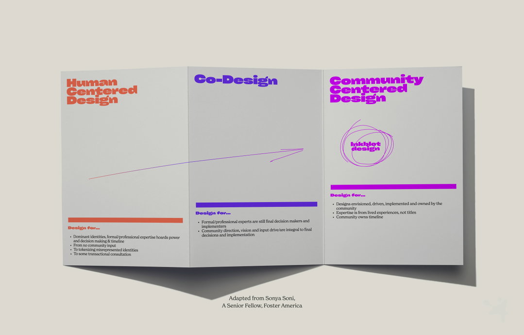
Adam M Morris / Project Inkblot: Project Inkblot, adapted from Sonya Soni (brand collaboratively created in partnership with Adam M Morris using the principles and thinking shown) (Copyright © Project Inkblot, 2022)
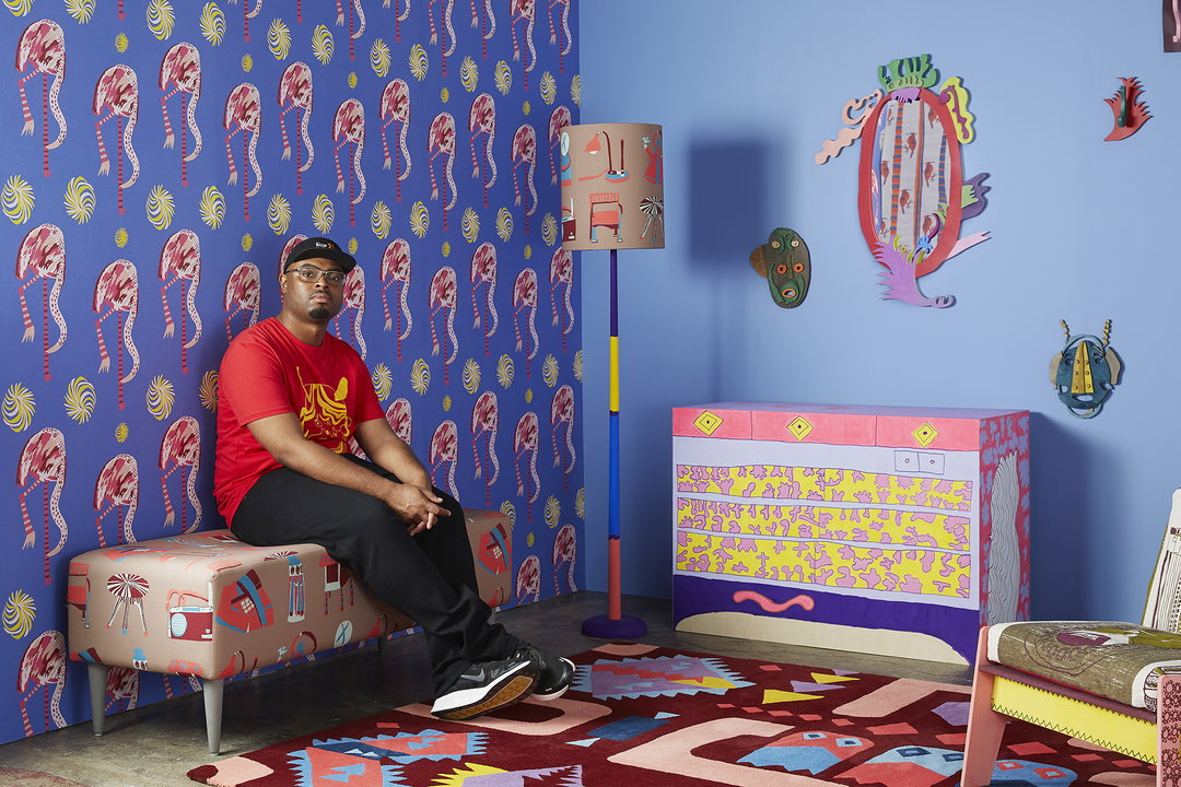
Andre Williams / Intoart: Room for Doubt (Copyright © Intoart and the artist, 2021) Photography by Kristy Noble.
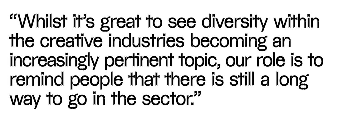
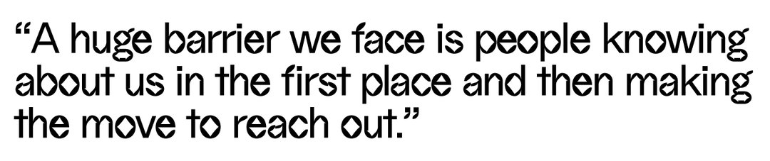
Collaborating directly with voices who have been historically excluded from design is surely the only way to reach an inclusive future, yet it’s still not happening on scale. “Creatives with learning disabilities are often overlooked for commercial design commissions,” Tom Dorkin, studio manager at Intoart and Trifle Studio explains. The two organisations are here to bridge that gap. “A huge barrier we face is people knowing about us in the first place and then making the move to reach out [...] While it’s great to see diversity within the creative industries becoming an increasingly pertinent topic, our role is to remind people that there is still a long way to go in the sector.”
Despite facing numerous barriers around visibility and a lack of opportunities, Trifle offers an exciting look into how innovative design practices can work to invigorate the industry. “In the studio we lead with a person-centred approach, which means the needs, priorities and interests of our creative team are the foundation for any project.” Tom adds that the biggest tool Trifle can draw on “is the lived experience of people with learning disabilities”. For clients and collaborators looking to work with a greater range of perspectives, the studio manager stresses the importance of honesty and openness within client interactions. “We encourage our clients and commissioners to ask questions, learn about what makes our studio different and to get to know how we work.”
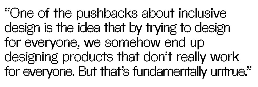
Trifle presents a snapshot into a future of possibility. But what are some of the other obstacles in getting there? From a product perspective, “One of the pushbacks about inclusive design is the idea that by trying to design for everyone, we somehow end up designing products that don’t really work for everyone,” says 11:FS’ Charlotte. “But that’s fundamentally untrue.” For Charlotte, designing inclusively enables you to push personalisation to the forefront of the process. “For example, everyone’s Google Search results are different because they’re highly contextual and intelligent. But Google has also laid strong foundations that mean everyone [...] can access it.”
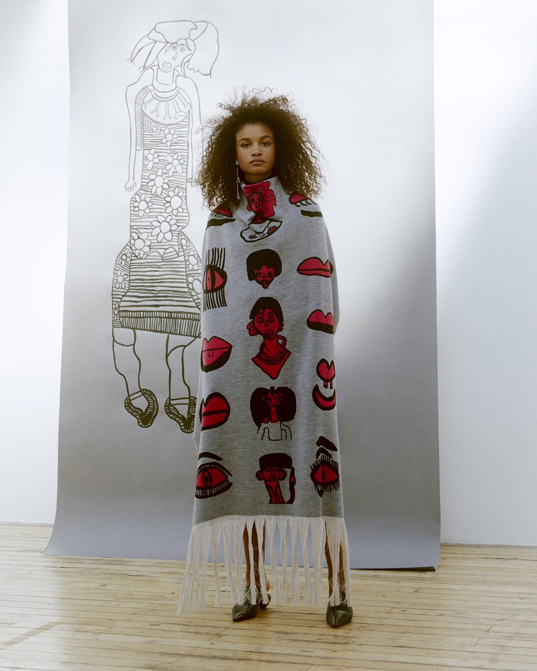
Ntiense Eno-Amooquaye / Intoart: Intoart X John Smedley Knitwear Collection (Copyright © Intoart and the artist, 2018) Takahito Sasaki.
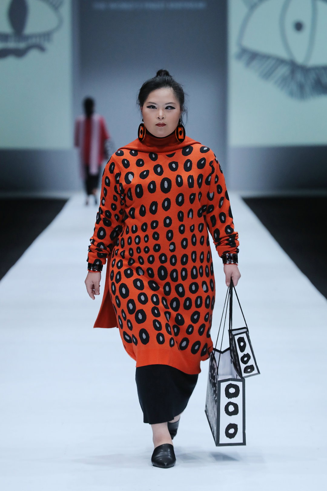
Yoshiko Phillips / Intoart: Intoart X John Smedley at Jakarta Fashion Week (Copyright © Intoart and the artist, 2019)
Ruth Alemayehu / Christian Ovonlen / Intoart: Print Ready Garment Collection (Copyright © Intoart and the artist, 2022) Photography by Alun Callender.
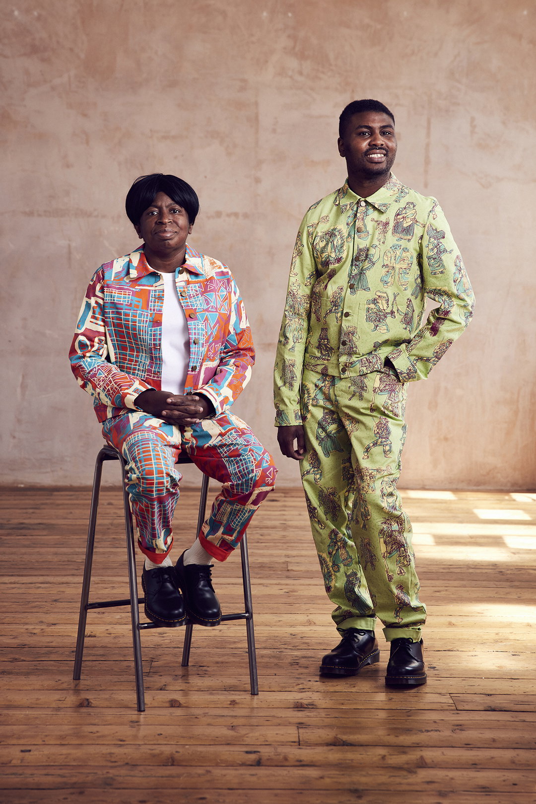
Ruth Alemayehu / Christian Ovonlen / Intoart: Print Ready Garment Collection (Copyright © Intoart and the artist, 2022) Photography by Alun Callender.
In many ways, design itself – or at least, design as merely a process of aesthetic-driven solutions – can be a barrier to an inclusive future. Making choices for purely aesthetic results can result in everything from poor readability to exclusionary imagery. However, that doesn’t mean the two are in antithesis – as proven by There’s Nothing Comic About Dyslexia, a recent campaign from Dyslexia Scotland, Innocean Berlin and WeTransfer. It uses Comic Sans, a font which can help people with dyslexia read texts more easily, to encourage designers to rethink how their design choices affect accessibility and push past well-worn visual pathways. “Designers have the power to shape the way information is presented and they have a bigger responsibility than just creating beautiful designs,” Maso Heck, head of art and creative director at Innocean Berlin states. However, in Heck’s mind, a truly accessible design future is “one where designers can challenge what has been considered beautiful so far and hopefully become more aware of the various audiences everywhere.”
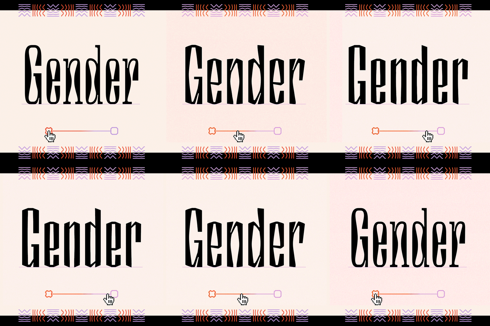
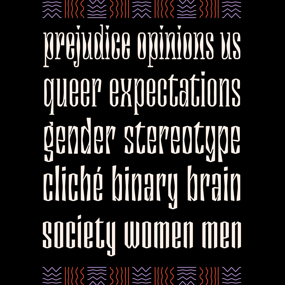
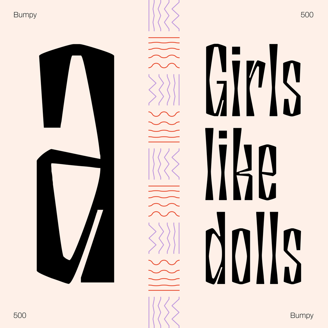
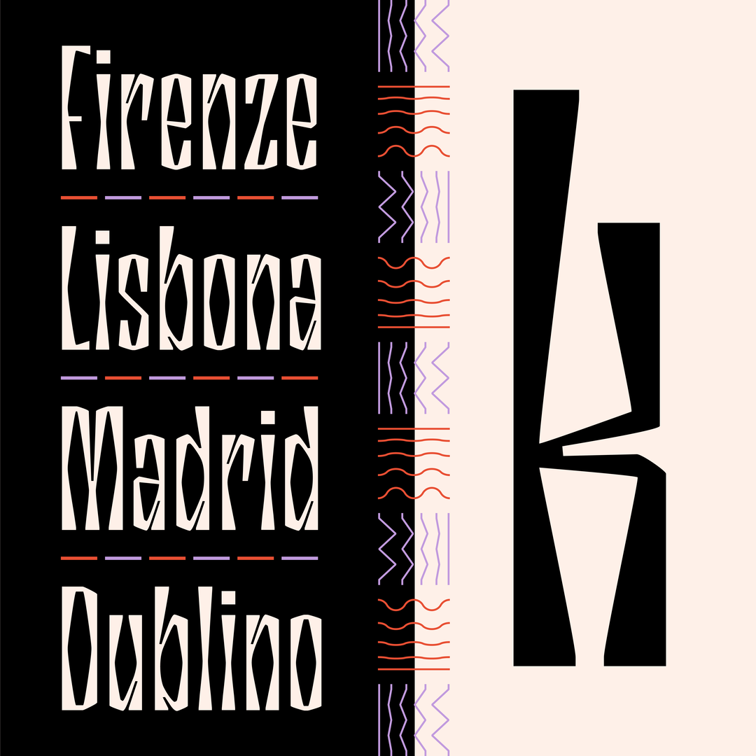
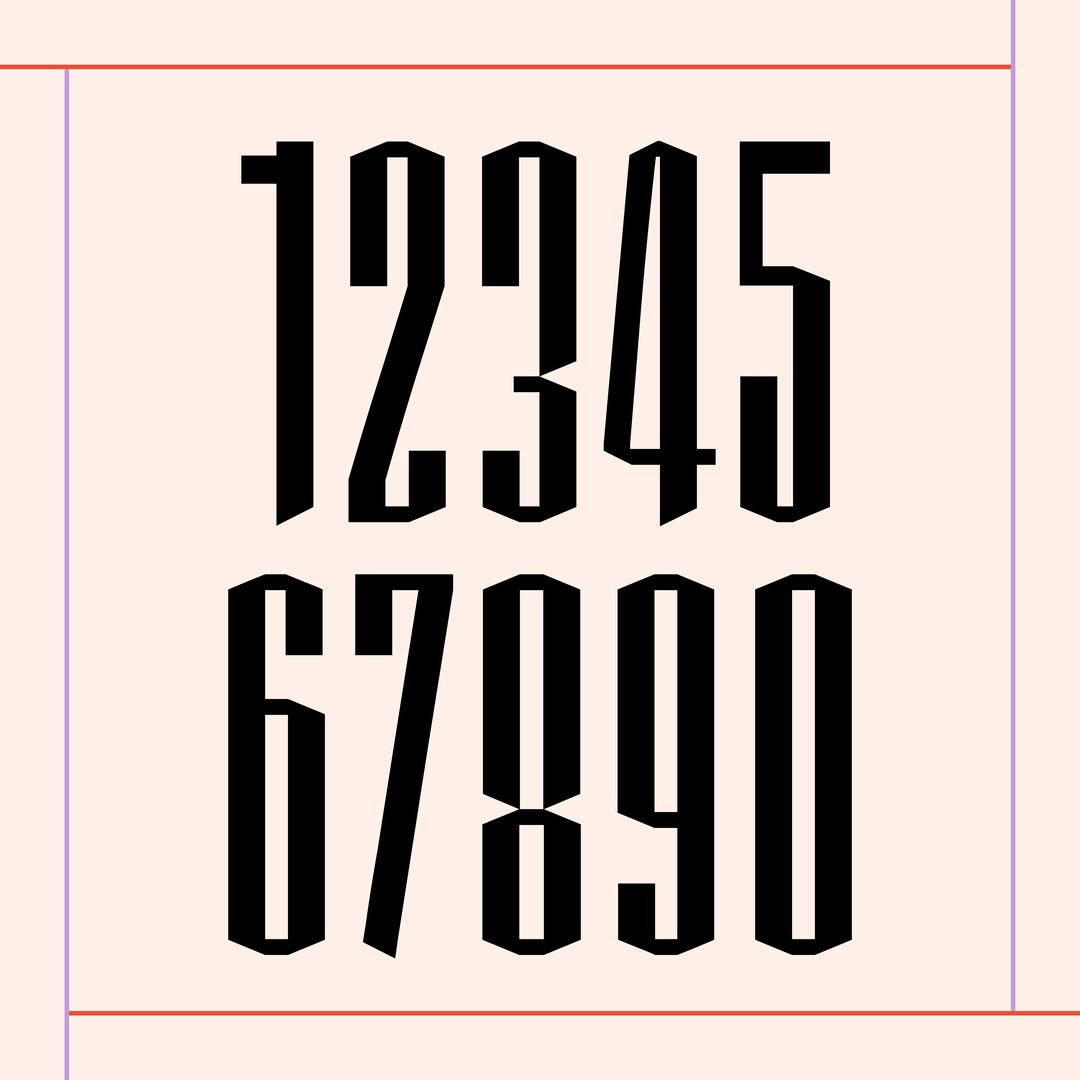
Encouragingly, There’s Nothing Comic About Dyslexia is far from the last project working to untangle typography from non-inclusive practices. Beatrice Caciotti’s Bumpy Typeface, a variable font, boasting 400 different typefaces united only by the typographic cage, was made to confront the gendered stereotypes baked into type – a twirly type for a woman, a bold sans serif for a man, for example. Beatrice states that gendered stereotypes, enforced by seemingly innocent design choices, “will inevitably have an echo in our lives: we can choose not to have prejudice against someone or something, but not that someone can’t have them on us.”
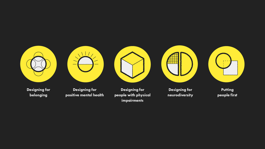
Sacha Holub / Charlotte Fereday / 11:FS: Inclusive Design, Building financial services for everyone (Copyright © 11:FS, 2022)
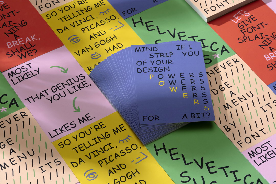
Dyslexia Scotland / Innocean Berlin / WeTransfer / Daniel Brokstad: There’s Nothing Comic About Dyslexia (Copyright © Dyslexia Scotland / Innocean Berlin / WeTransfer / Daniel Brokstad, 2022)
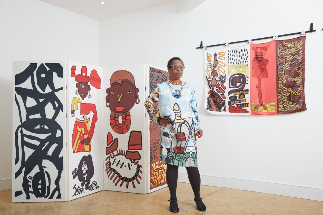
Ntiense Eno-Amooquaye / Intoart: Art Deco Zebra Crossing (Copyright © Intoart and the artist, 2021) Photography by Josef Konczak.
1 of 5
Beatrice Caciotti: Bumpy Typeface (Copyright © Beatrice Caciotti, 2021)
1 of 5
Beatrice Caciotti: Bumpy Typeface (Copyright © Beatrice Caciotti, 2021)
Beatrice’s work on Bumpy Typeface can be seen as an example of how important it is to reframe inclusion from a problem ‘over there’, to a problem we all have. In this instance, design made to conform to ‘standard’ gendered systems causes everyone to suppress the elements of ourselves that don’t uphold these concepts. By interrogating these systems, we can begin to get a sense of what freedoms an inclusive future might open up to everyone, even those who assume that accessibility doesn’t concern them.
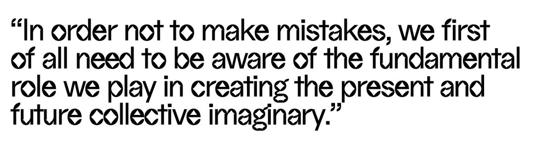
To try to get a grasp on what this future might look and feel like, we asked each of our contributors exactly what a truly accessible future means to them. “People who are most impacted by systemic inequities (BIPOC, LGBTQIA+, people with disabilities, etc), are not just consulted, but are centred in leading the solutions,” says Project Inkblot of what this truly inclusive future might be. Tom describes that a shift “would be to change our societal approach to accessibility being proactive rather than reactive to the needs of your community.” For Beatrice, it is “design that leaves no one behind and that does not hurt anyone [...] In order not to make mistakes, we first of all need to be aware of the fundamental role we play in creating the present and future collective imaginary”. Charlotte offers it as “one in which everyone has equal access to excellent products and services that are easy to use and make them feel represented with their needs taken into account.”
Across the board, we received a different definition from all those we asked – which only serves to reflect the issue at hand. A truly accessible design future can’t be built on a singular solution.
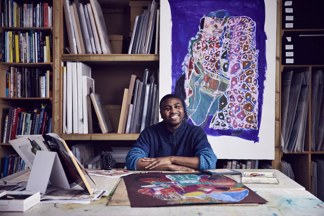
Christian Ovonlen / Intoart: Theatrical Textiles (Copyright © Intoart and the artist, 2021) Photography by Alun Callender.
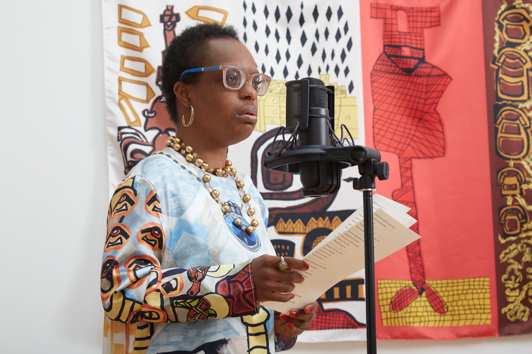
Ntiense Eno-Amooquaye / Intoart: Art Deco Zebra Crossing (Copyright © Intoart and the artist, 2021) Photography by Josef Konczak.
Hero Header
Inconstant Regular Legibility video: Daniel Brokstad: Inconstant Regular (Copyright © Dyslexia Scotland / Innocean Berlin / WeTransfer / Daniel Brokstad, 2022)
Share Article
About the Author
—
Liz (she/they) is the senior editor at Insights, a research-driven department within It’s Nice That. They previously ran the news section of the website. Get in contact with them for potential Insights collaborations or to discuss Insights’ public-facing reports.