- Words
- Ellie Robertson
- —
- Date
- 13 August 2018
- Tags
Graphic designer Andy Liang merges art with artificial intelligence
Share
Share
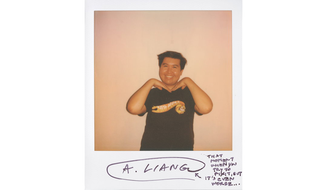
“I wish I could say I was one of those designers whose parents were artists or designers, or one whose parents exposed them to different types of art and design at a very early age,” Andy Liang tells It’s Nice That, but as a child of working class, first generation immigrants, they just didn’t have the means or the resources to do so.
Andy was born in Guangzhou, China but immigrated to Los Angeles with his parents when he was about a year old. He grew up in a part of the Greater Los Angeles area where there was a flourishing Asian community, giving him a “unique, amalgamated experience of American and Asian culture”, something which feeds into his creative practice today. “Having Frosted Flakes before school on a Friday morning then having dim sum with my extended family the next morning was always a trip for me a child, but it reminded the importance of intersection and interconnection, which later translated into how I design.” Particularly fitting given his surname – Liang – roughly translates to “bridge” in English.
Andy’s creativity first manifested itself in the era of Myspace; “Every day, after I was done with my schoolwork, I would work on designing and coding a website that offered layouts I had designed that others would then use to personalize their own Myspace profiles. Every day was a new challenge, whether it was designing the graphics for a new Myspace layout in Photoshop, or learning HTML and CSS to customise my website.” The real turning point came in his junior year of high school, “I distinctly remember my friend telling me, on the first day back at school, about a Journalism class,” Andy recalls, “after that conversation, something in me (that I’ve never felt before) ignited” so he rushed to his counsellor and swapped Calculus for Journalism. On the course, Andy learnt about grids and columns, budget and timing restraints, and how to use InDesign. He’d officially been bitten by the design bug.
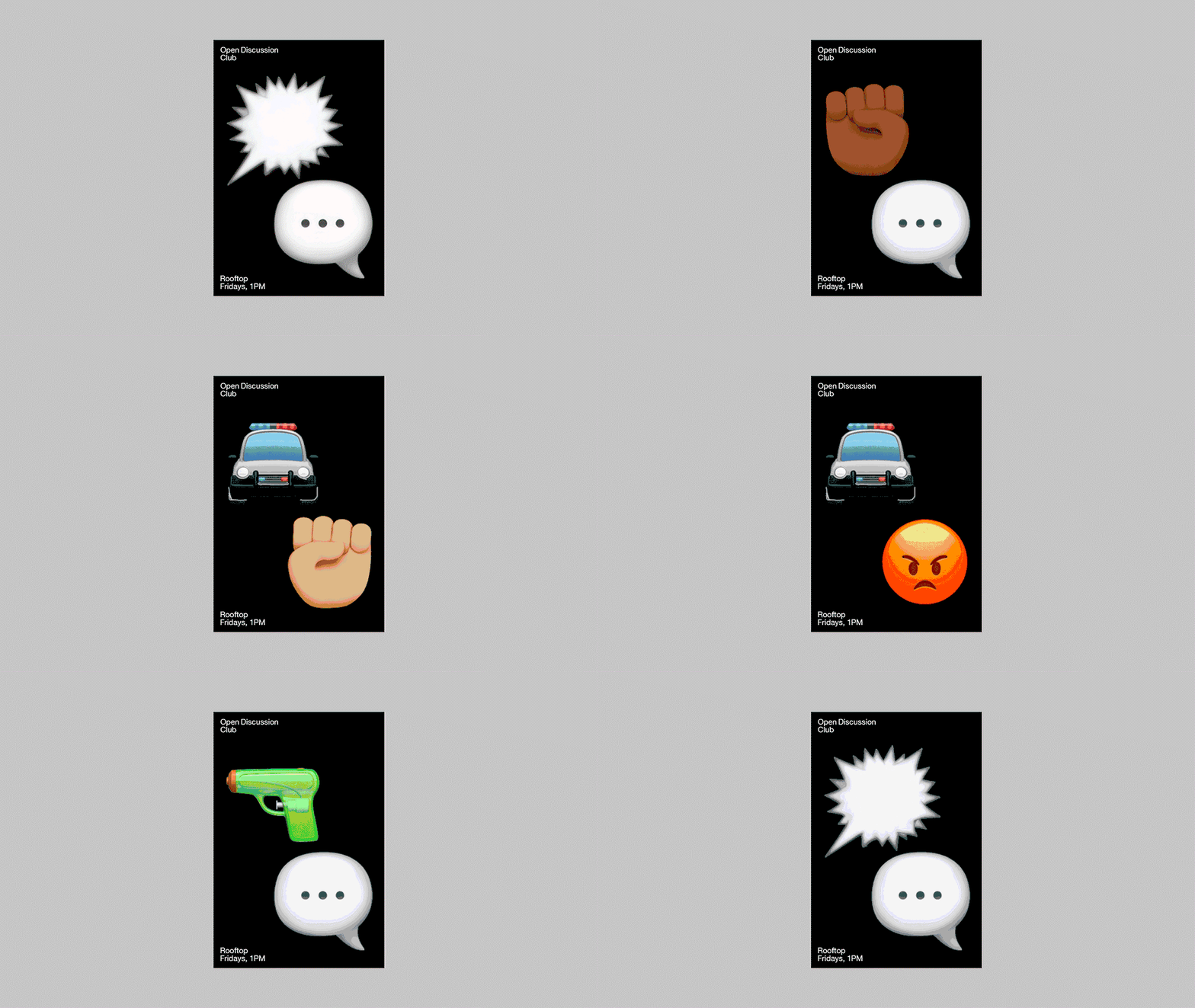
His work today is influenced by other designers such as Tony Brook of Spin, OK-RM, Sulki & Min, and Eric Hu, along with music, “there is something about how a certain song can make me feel that I harness and translate into design.” It also draws on Andy’s personal interest in merging culture with technology, “I think it’s super interesting how technology can be used to positively (and negatively) impact us as individuals and as a collective culture. In one way, technology is used to bring us closer together, but in the other, it is used to alienate us.” Andy explains.
It’s Nice That: Why did you decide to study at Graphic Design at ArtCenter College of Design?
Andy Liang: In high school, my graphic design teacher Ms.Hopper saw something in me and suggested I look into the summer programs that ArtCenter had on offer to high school students. I applied for one of their summer classes there and, through a generous scholarship, was fortunate enough to take a class there. After I graduated from high school, I studied at a state university for two years, taking general education courses with a bit of graphic design peppered through, but I felt like I wasn’t being challenged enough there. I was enrolled in one of ArtCenter’s night classes and at that point, it just felt like the right school for me, so I decided to apply for their undergraduate program.
Another reason was because of its proximity to where I am from. I applied to places farther out on the east coast, but I realised that I was absolutely not ready to move so far away from my family and friends when I had so many parts of growing up that I had to deal with first.
INT: What was the best bit about your time at university? And the worst?
AL: I guess I’ll start chronologically. During my first couple of terms at ArtCenter, I was extremely timid and reserved — growing up in your early twenties is absolute garbage; I would not recommend it for anybody! But going in, I had a lot of things that I had to sort out mentally so I mainly kept to myself and never really let anybody get too close. To make matters worse, after my first year there, my father passed away from cancer a month before I was due to return to school. I definitely didn’t have nearly enough time to process his death so my mind was not in the right place and I really struggled in my classes and it showed in my work.
It was such a low point in my life. I was so jaded and had absolutely no desire to continue. But over time, I reminded myself why I was here and slowly but surely, I began to heal by spending some time away from school, before returning and meeting and surrounding myself with people who cared about me and wanted me to succeed. While I still have a lot more to work on, my time at university really allowed me to become more open about who I am, not only as an Asian American, but as a queer person of colour as well.
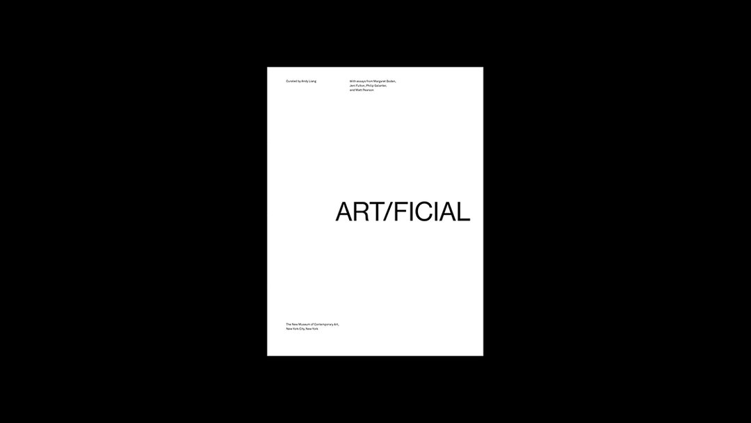
INT: You have a particular interest in merging culture with technology – can you tell us a bit more about that?
Of course. I was born during a time when the Internet was just starting to find its footing and throughout my childhood and adolescence, I practically grew up on the internet. It was through my interactions with technology such as the internet, and its profound impact on my life, that led me to want to explore the symbiotic relationship of how technology impacts our everyday lives and how technology is developed based off of how it affects us.
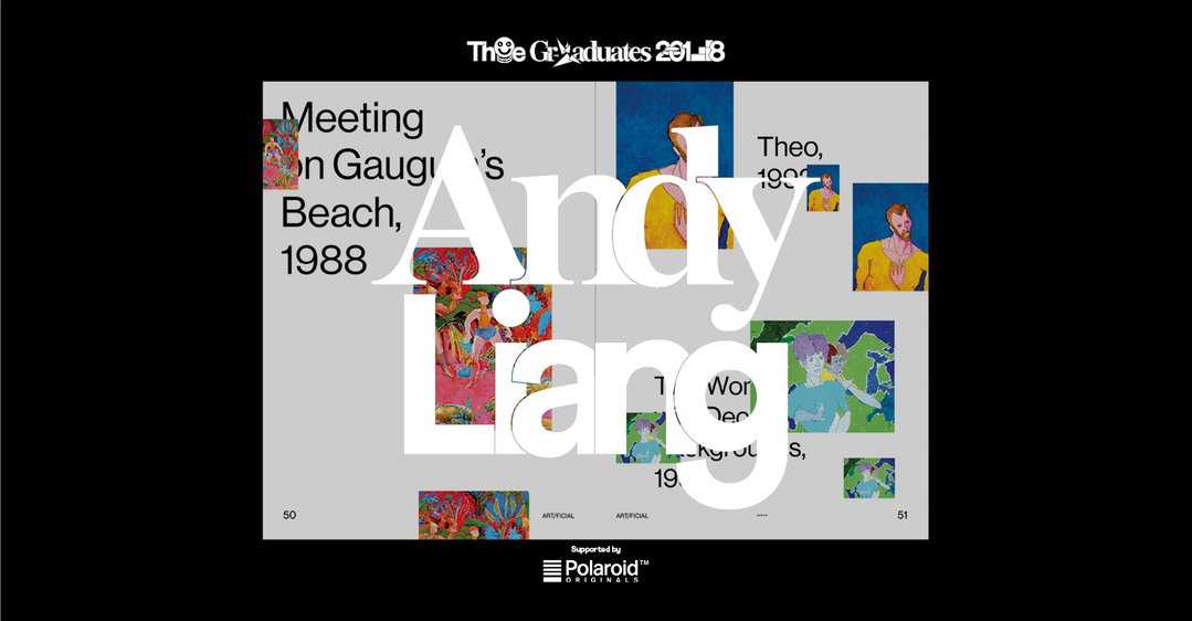
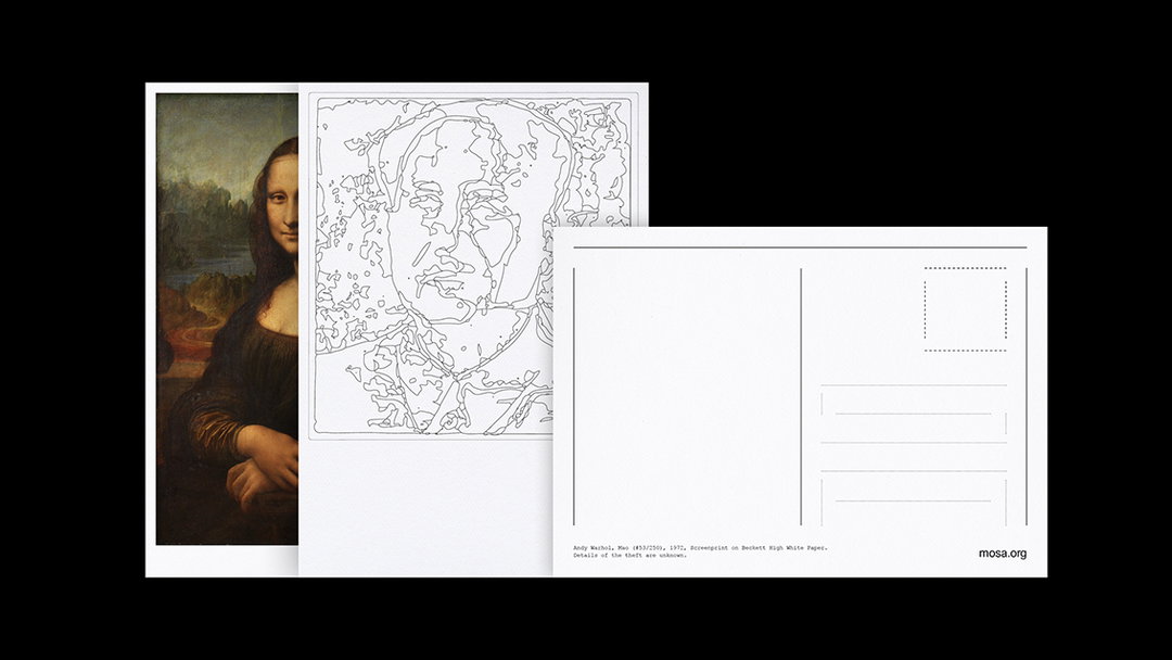
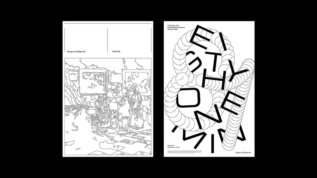
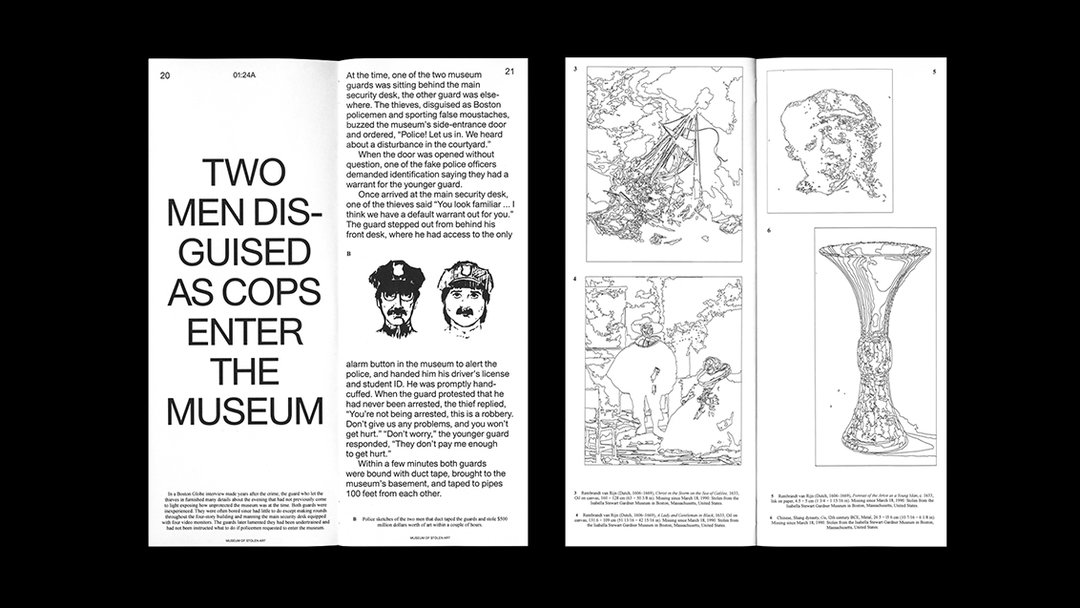
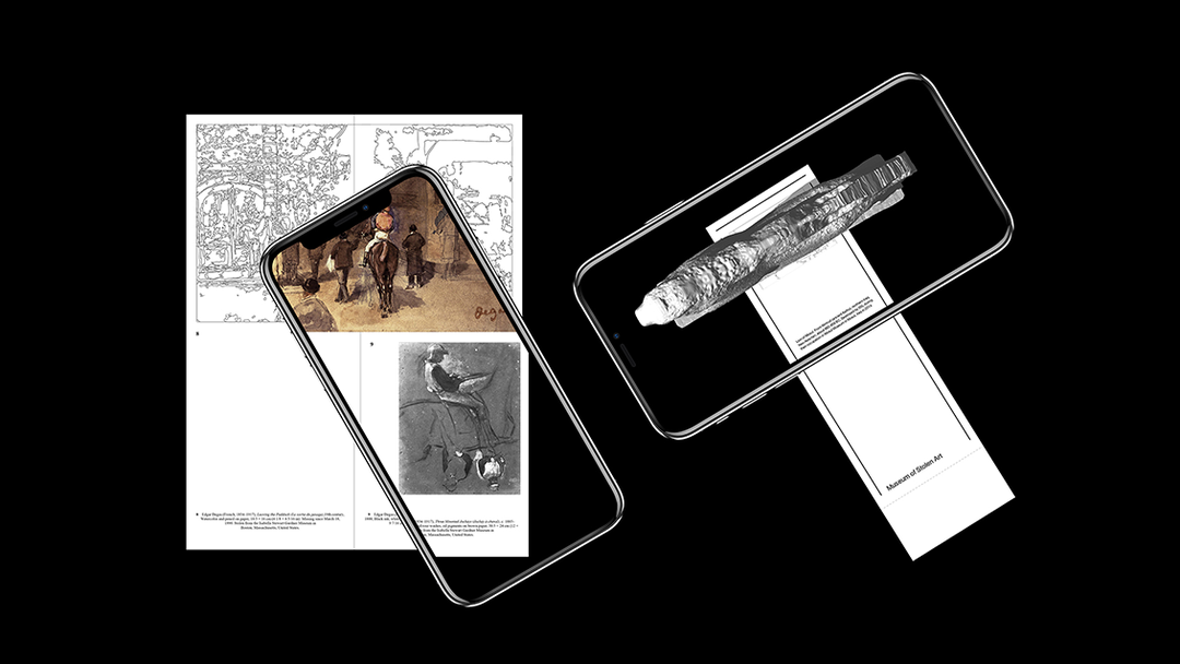
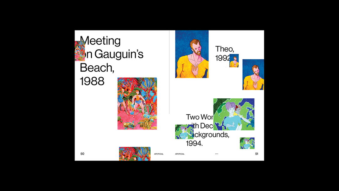
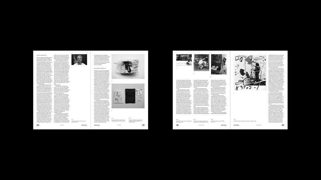
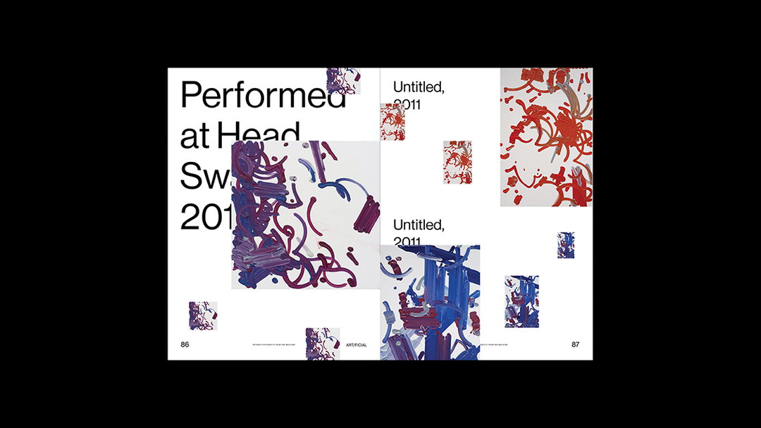
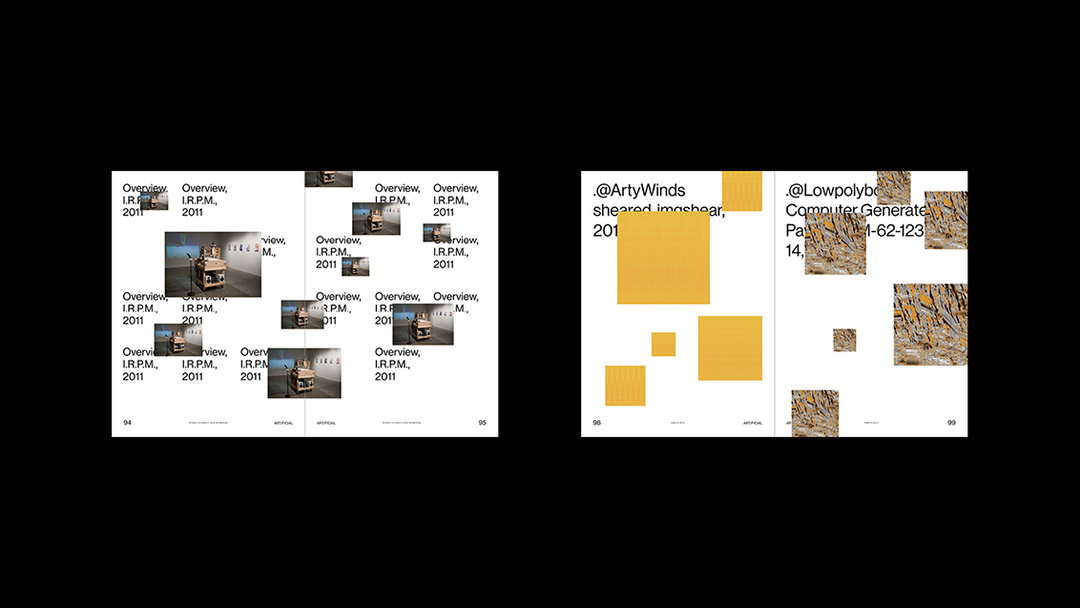
I think we are at a crucial stage of technology with the burgeoning development of artificial intelligence, augmented reality and virtual reality – technologies that I researched and looked into for my project ART/FICIAL and for the Museum of Stolen Art – so I think it will be exciting to see how it will impact future generations (like the internet did for me), and how we interact with each other and the world on an even larger scale.
INT: Can you describe a project you’re most proud of and why?
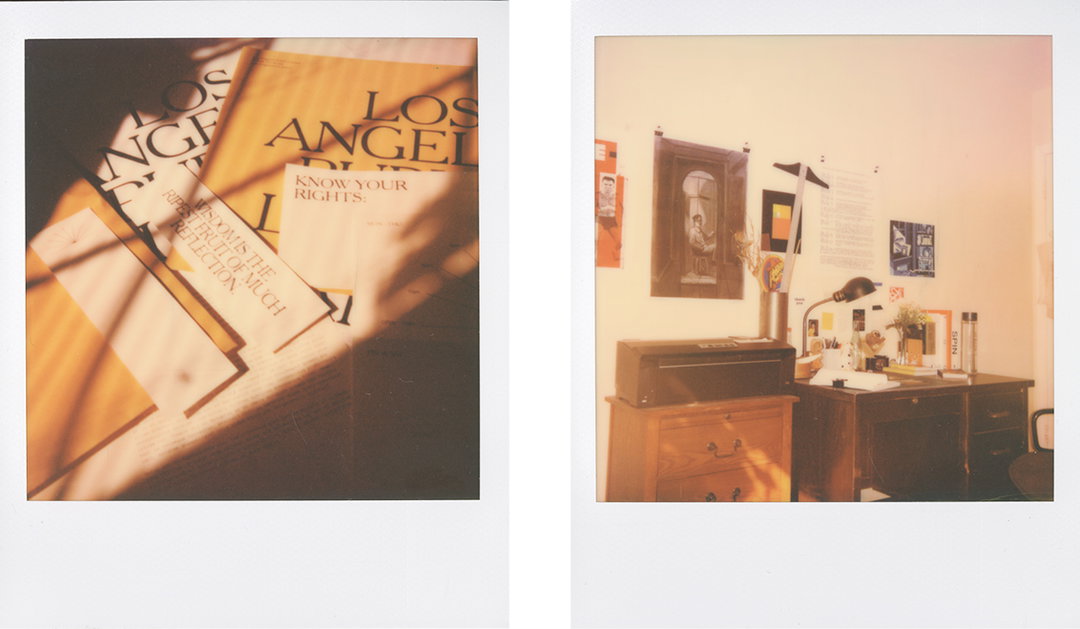
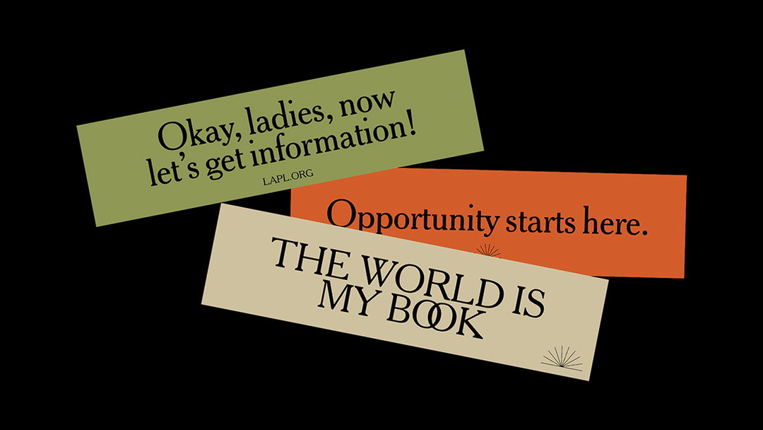
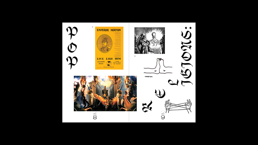
AL: The project that I’m most proud of is actually one I’m currently working on at the moment: a fictional identity for the Los Angeles Public Library. I chose to rebrand LAPL because it’s arguably the largest institution in Los Angeles, where people of all kinds (including those who are underprivileged and need it most) can visit and have free, open access to information and opportunities. Besides books, they also have an extensive photo archive which influenced a real project in the ‘90s called Shades of L.A. in which the library had scanned, documented, and archived thousands of family photographs from various communities of colour in Los Angeles.
So, for this redesign, I went into the Shades of L.A. archives, curated, and designed a book accompanying the original Shades of L.A. project since I think it’s important (especially with what is happening on in the world today) to let people of colour know that they matter, by placing value on their history. I remember the library being a place I frequented every week as a child so I think it was quite nice to work on an institution that was created for you and others like you.
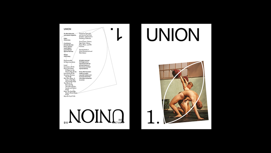
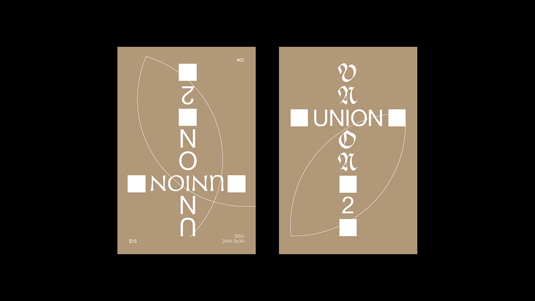
INT: Is there a particular person who has shaped your university experience or creative outlook?
AL: Stephen Serrato. He was my instructor for my first term at ArtCenter, my fourth term and my eighth and last term at the school, so it feels like a full circle moment to start and end my time at ArtCenter with him. I’ve admired his work and always appreciated his feedback so it was quite nice to have somebody who you aspire to be in the future witness your progression and growth as a designer.


Supported by Polaroid
Polaroid Originals is the new brand from Polaroid, dedicated to original format Polaroid analog instant photography. Find out more about their new and vintage cameras, plus film and accessories, on polaroidoriginals.com
The It’s Nice That Graduates 2018 is supported by Lecture in Progress and Polaroid Originals.
Share Article
Further Info
About the Author
—
Ellie joined It’s Nice That as managing editor from June to September 2018.