



Launch Recite Me assistive technology
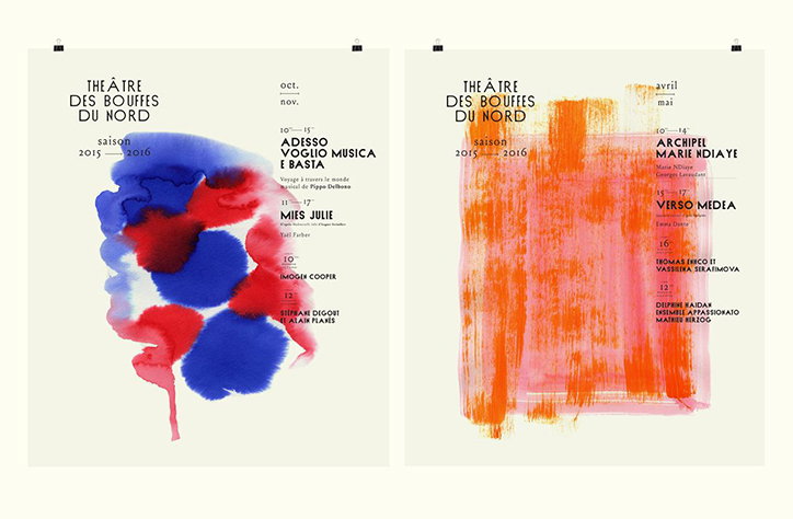
Two posters for the theatre “The Âtre des Bouffes du Nord” for the 2015–2016 season. The first features a blue and red watercolour blotch alongside a list of autumn performances. The second shows a textured orange rectangular wash with a list of spring performances.

Parisian studio turns out painterly, colour-themed identity for French theatre

—
Date
12 October 2015

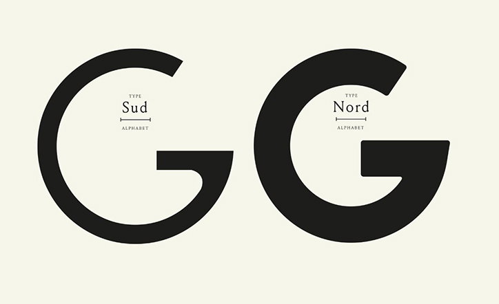
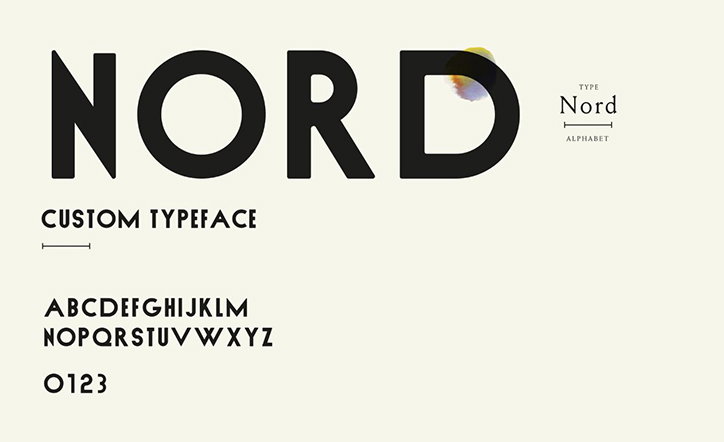
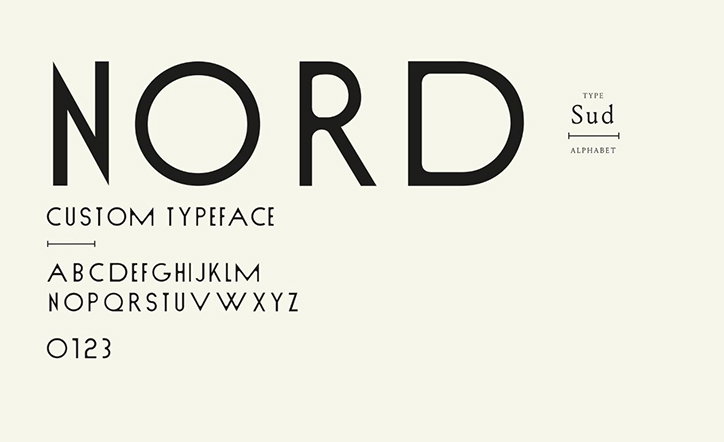
In its nearly 140-year run, Paris’ Le Théâtre des Bouffes du Nord has had a long and tempestuous history, counting 15 artistic directors in its first decade alone, one of whom notoriously absconded with the contents of the theatre safe after a failed production. After director Peter Brook helped the theatre finally find its feet in the 70s, it’s been smoother sailing and French studio Violaine et Jérémy was recently tasked with designing a bright new identity to accompany this season’s colour-themed programme. The identity sees fonts Nord and Sud – which have a thoroughly old Paris feel – sit against abstract splashes of ink and bleeding watercolour, subtly paying homage to the city’s reputation for first-class painting.
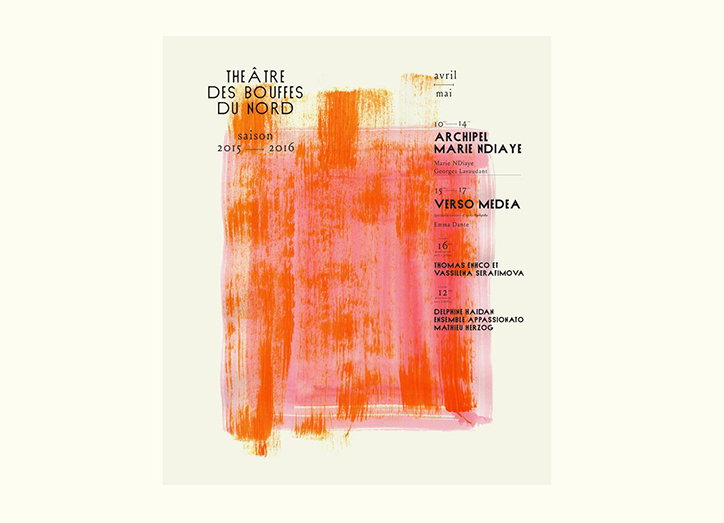
A poster for “The Âtre des Bouffées du Nord” for the 2015–2016 season. A large, textured orange brushstroke dominates the centre, partially obscuring a list of performances and dates.
Above

Violaine et Jérémy: Théâtre des Bouffes du Nord
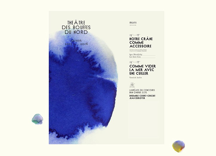
A poster for “The Âtre des Bouffes du Nord” for the 2015–2016 season. A large, bleeding wash of deep blue ink dominates the left side of the page.
Above

Violaine et Jérémy: Théâtre des Bouffes du Nord
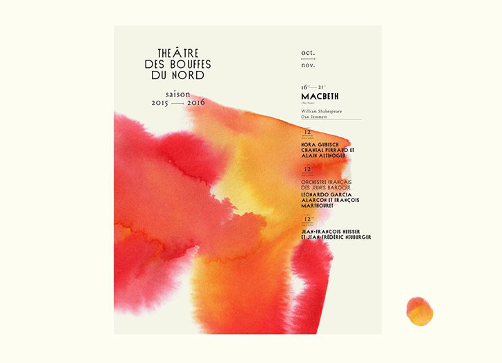
A poster for the “Théâtre des Bouffes du Nord” 2015–2016 season featuring a large, abstract wash of red and orange watercolour. Text on the right lists upcoming performances, including “Macbeth” by William Shakespeare.
Above

Violaine et Jérémy: Théâtre des Bouffes du Nord
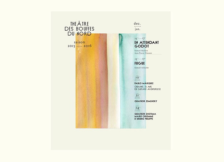
A poster for the theatre Des Bouffes du Nord for the 2015–2016 season. Three vertical watercolour washes in yellow, pale blue and green sit beside a list of performances, including “En attendant Godot” and “Fugue”.
Above

Violaine et Jérémy: Théâtre des Bouffes du Nord
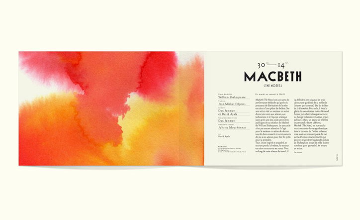
An open programme for a production of “Macbeth”. The left page features a bold, abstract wash of red and orange watercolour, while the right page contains the play's title and production credits.
Above

Violaine et Jérémy: Théâtre des Bouffes du Nord
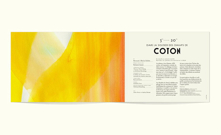
An open brochure featuring a bold, abstract painting in yellow and orange on the left page. The right page contains a layout of French text with the word “COTON” printed in a large, black serif typeface.
Above
Left

Violaine et Jérémy: Théâtre des Bouffes du Nord
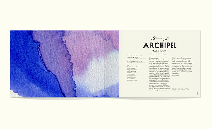
An open brochure featuring a blue and purple watercolour painting on the left page. The right page contains a typographic layout with the title “ARCHIPEL” and the name “MARIE NDIAYE”.
Two black capital letters “G” are shown side by side on a cream background. The first is a thin weight with the words “Type Sud Alphabet” inside it, while the second is a bold weight with the words “Type Nord Alphabet”.
Above

Violaine et Jérémy: Théâtre des Bouffes du Nord
A specimen for a custom typeface called “Nord”. The word “Nord” appears in large, bold black letters, followed by the phrase “Custom typeface” and a full uppercase alphabet and numbers.
Above

Violaine et Jérémy: Théâtre des Bouffes du Nord
A specimen of a custom typeface featuring the word “NORD” in large, black capital letters. Below, the text “CUSTOM TYPEFACE” is followed by the full alphabet and the numbers “0123”.
Above

Violaine et Jérémy: Théâtre des Bouffes du Nord
Share Article

About the Author

Alexander Hawkins

—

It's Nice That Newsletters

Fancy a bit of It's Nice That in your inbox? Sign up to our newsletters and we'll keep you in the loop with everything good going on in the creative world.



