




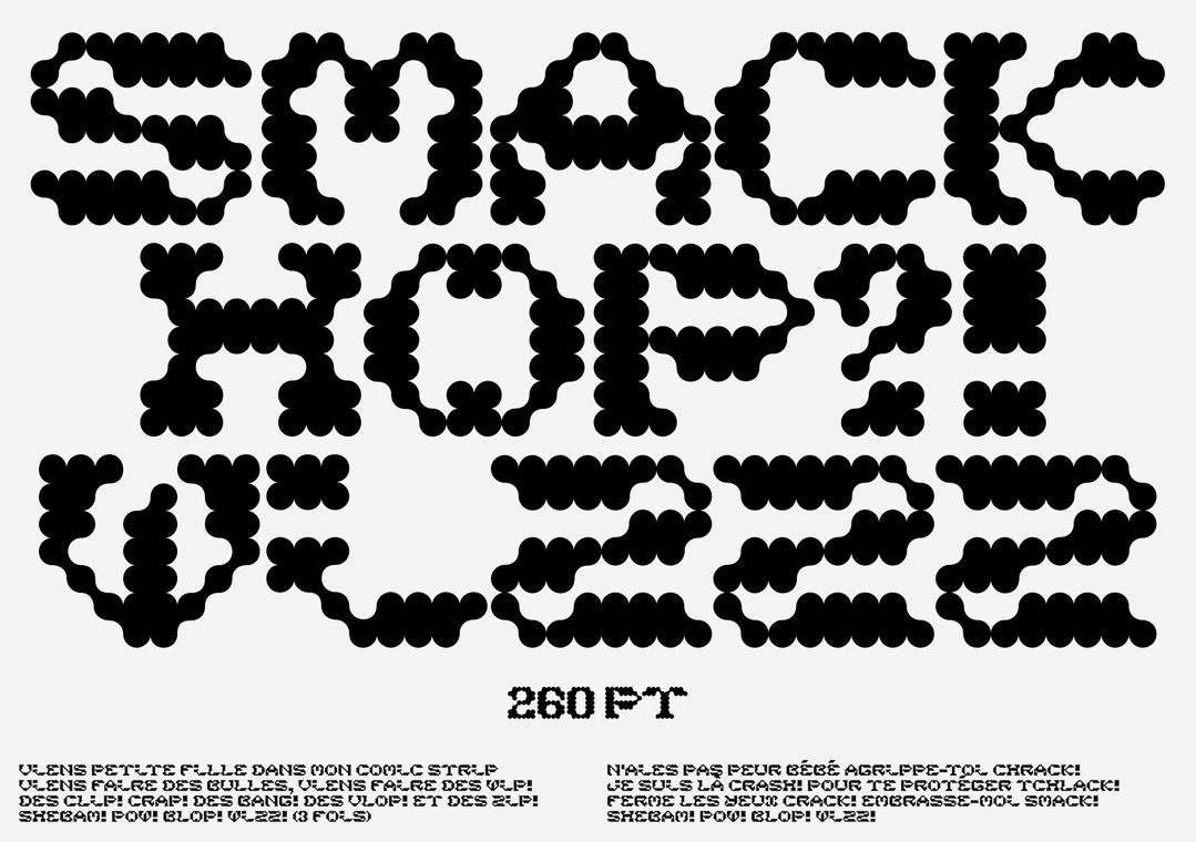
Meet Paul Bergès, a graphic designer who draws alphabets with the same freedom as he constructs images
The graphic designer refers to himself as a “bricoleur”, someone who can make objects using any material around them. Here, he explains more.
In his career to date, Paul Bergès has undergone a series of influential internships that have shaped his practice into the international style that it is today. In the enviable list of collaborators, Paul has worked with the likes of Joel Evey, Wax Studios, Vrints-Kolsteren and Studio Dumbar – a stellar set of designers that have helped form Paul’s burgeoning take on late modernism with a contemporary twist. Currently finishing up his second master’s degree in Nancy, supervised by Christophe Jacquet and Pierre Vanni, Paul has previously studied in Rennes – two locations not too far from his hometown of Biarritz in the Basque Country.
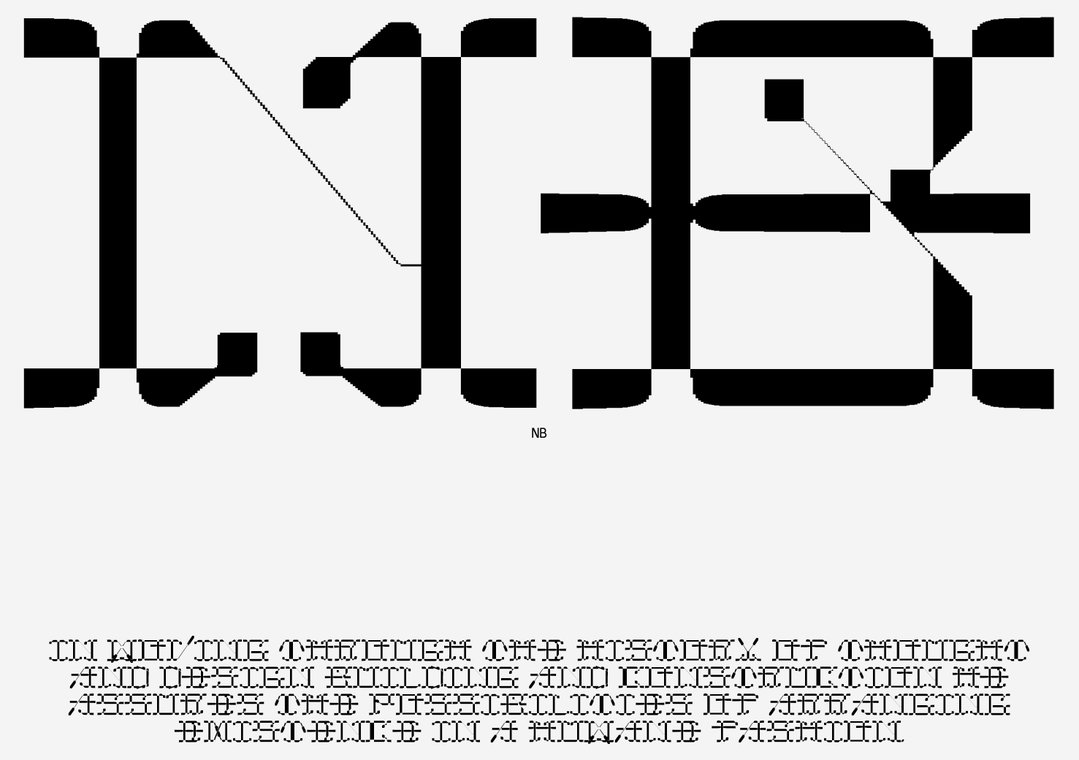
With bags of experience for someone so early on in their career, Paul also has a deep reverence for the late Wim Crouwel and his modular and functional typefaces. And though he himself has drawn quite a few alphabets, he tells It’s Nice That, “to be honest, I fully dissociate my work from other type designers.” Instead, he categorises himself as a “graphic designer who draws alphabets with the same freedom as I construct images.” During a recent internship with Vrints-Kolsteren in Antwerp, Paul developed an enthusiasm for drawing letters – sparked by a poster project for Beeldende Kunsten Mol and the Nacht van de Beeldende Kunst.
He thinks of himself as a kind of “bricoleur”, similar to the kind defined by Claude Lévi-Strauss in his seminal 1962 work The Savage Mind. It refers to someone who can make objects using any material around them, something Paul adapts within his own practice where he creatives compositions or type using almost anything. “That’s why my letters are so illustrative, fanciful and sometimes bizarre,” he explains. “They are my images.” On the other hand, he cannot help but be informed by the grid and the functionality that arises from such order. This harks back to his interest in Wim Crouwel’s modular systems, and Paul combines this obsession with repetitive systems with the more fluid, bricolage-like marks; a distinct approach which gives rise to the uniqueness of Paul’s practice.
GalleryPaul Bergès
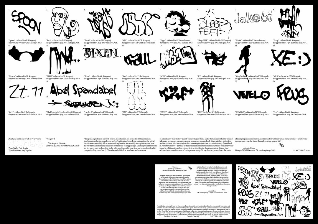
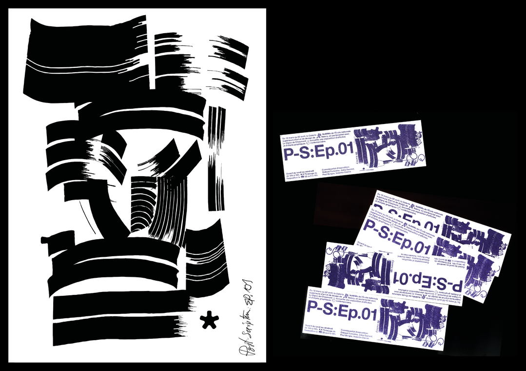
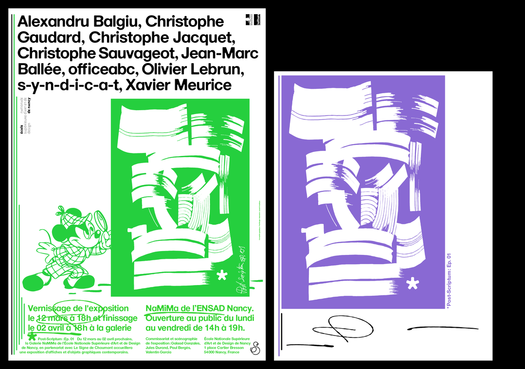
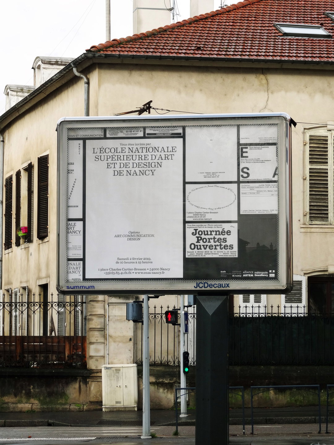
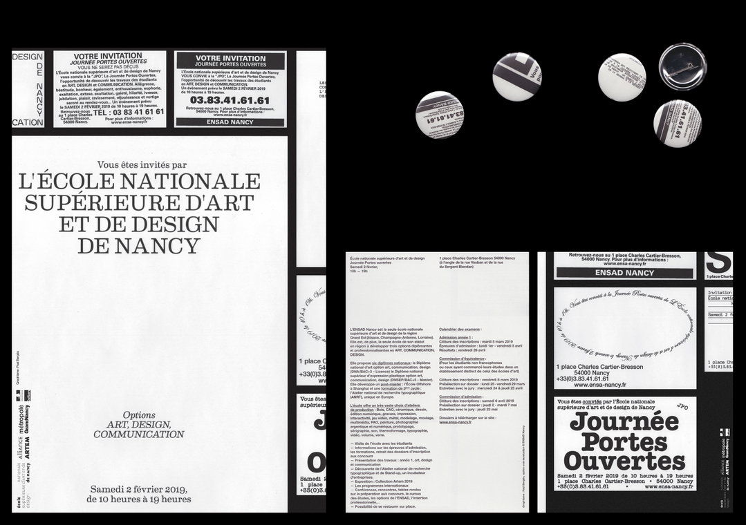
His typefaces ComicStrip and Alarm Dt embody this way of thinking. His work birds with ideas of “unlearning” and “de-writing”; principles which imbue his practice with an omnipresent freedom. “Mostly, my graphic influences lie in poor elements and anecdotal signs of vernacular and popular culture which surround me, and which I collect for both their formal and semantic aspects.” Once he’s established this, Paul goes on to explain, “then I digitally transform them in order to add to my projects.” In his visual identity for the Fine Arts School in Nancy for example, he collected all kinds of invitations to inform the background design of his compositions. Whereas in other work, Paul borrows Apple’s Mail motif as a place of discussion in the identity for the exhibition Post-Scriptum: Ep.01.
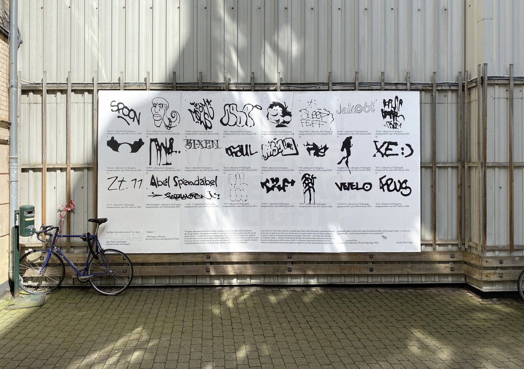
Utilising a symbol which is understood by masses as a means of direct communication to all, this kind of technique marks Paul’s use of “voluntary amateurism”, a concept he also explores through the software he chooses to use. He further explains, “the digital manipulations that I perform are a systematic succession of basic gestures borrowed sometimes from the Adobe suite, sometimes from 3D software, sometimes from typographic drawing software.” Elsewhere, for a billboard design for the Danish typographic foundry Playtype, Paul collected found typographic elements found on Google Maps in Copenhagen. He chose to highlight other peoples’ work rather than his own since since, as he said before, he doesn’t feel like a type designer. In turn, the work evokes memories of Copenhagan’s inhabitants, “glorifying the trivial typographical signs which are the first victims of time.”
Just about to graduate with a second master’s degree in the coming months, Paul hopes to continue his freelance practice on a full time basis, and hopefully it will be a smooth one. However, before he can establish his own name in the industry, he has plans to do one last internship. This time, in the hopes of deepening specific aspects of his practice which he can then use in his deeply thoughtful practice, and continue to wow us even more in both a conceptual and visual sense.
GalleryPaul Bergès
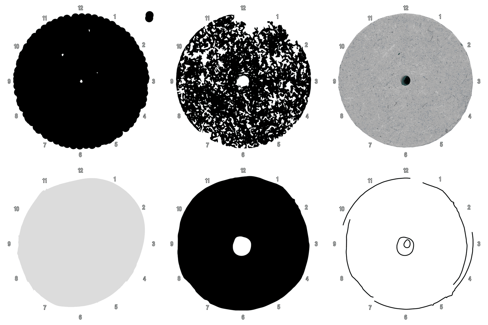
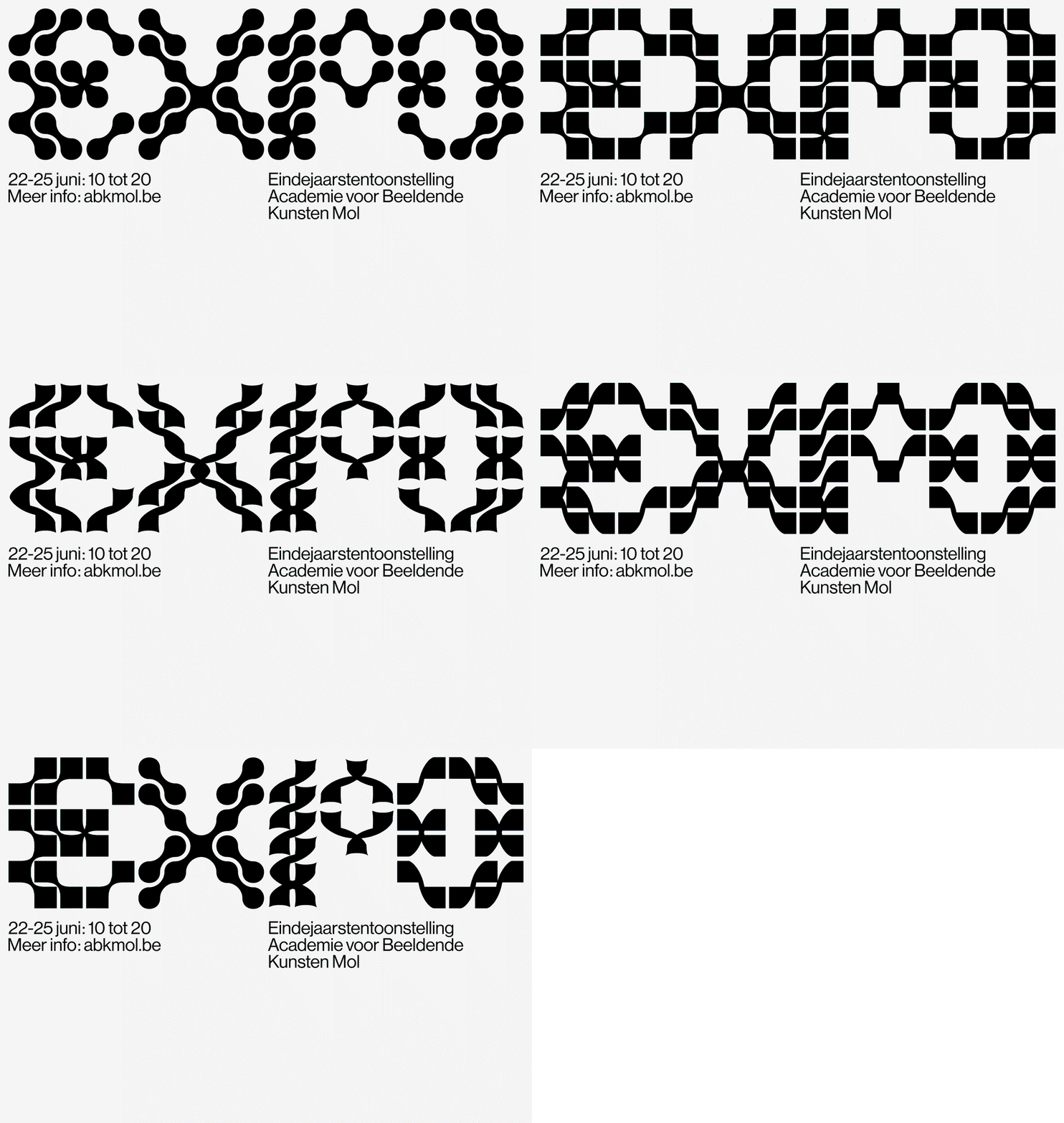
Made during an internship at Vrints-Kolsteren
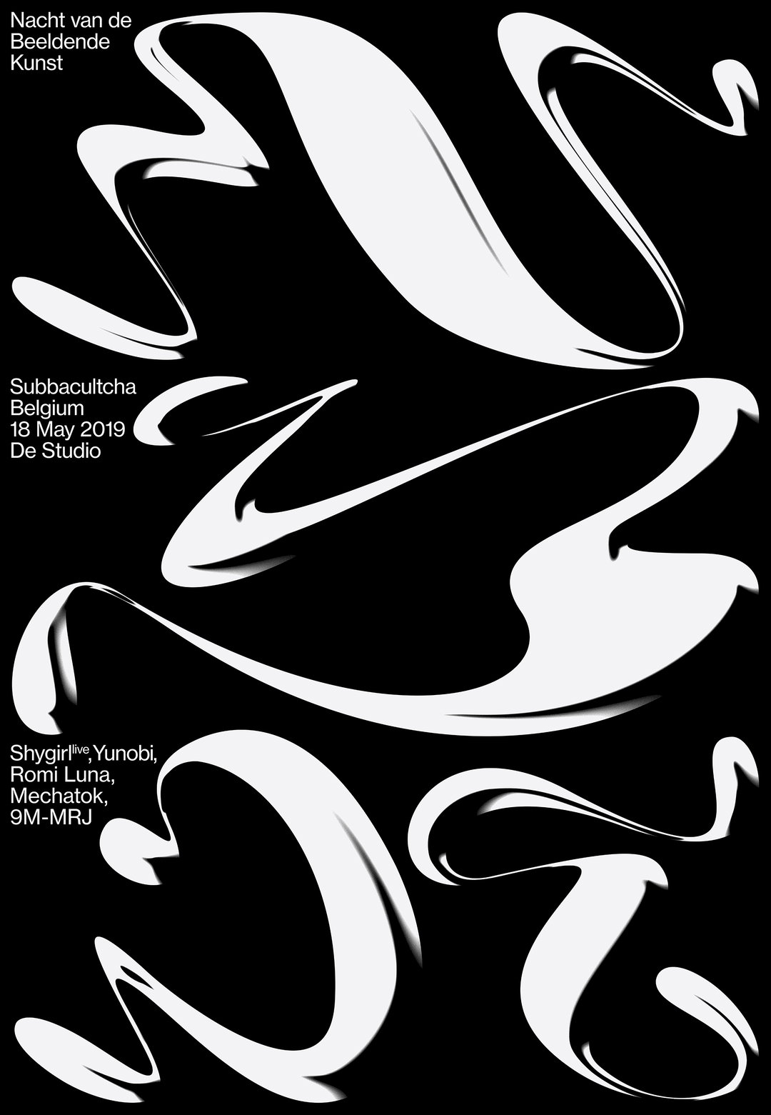
Made during an internship at Vrints-Kolsteren
Share Article
Further Info
About the Author
—
Jynann joined It’s Nice That as an editorial assistant in August 2018 after graduating from The Glasgow School of Art’s Communication Design degree. In March 2019 she became a staff writer and in June 2021, she was made associate editor. She went freelance in 2022.

