Meet Bon Elliot: the family-run, slow-crafted skincare label from Little Troop
With visuals injected with Kubrick’s meticulous symmetry and Irving Penn’s essentialist approach to still life, the studio’s minimalist identity pulls on nostalgic beauty imagery to bring a new model for skin health into the beauty space.
Share
New York-based design studio Little Troop has shaped bold visual identities with its curious and playful approach for a range of impressive clients over the years, including Moma, Nike, Organic Basics, Nik Bentel Studio and more. In a recent project for skincare brand Bon Elliot, however, co-founders of Little Troop Jeremy Elliot and Noemie Le Coz didn’t just get to shape the face of a new brand once again, they actually got to sit in the client’s seat for the first time too.
Founded by Jeremy’s sister-in-law Bonnie Fergie, a Sydney-based dermatologist, and her husband Jono Elliot, the emerging skincare label brought the pair on as the design team but also as co-founders of the brand from its very beginnings – one half of a family-run team. Bon Elliot is a culmination of years spent building both a formula and brand voice for what luxury skincare might look like in 2026. “Bon wanted to create the skincare brand she’d been searching for herself,” Noemie says. “A line of high performance, easy-to-wear products that her patients would look forward to wearing, and a brand that finally felt relevant, deeply considered and carefully crafted in every way.”
Shaping up the brand’s visual universe called for a slightly more pared-back approach than Little Troop might normally take into their colourful world of branding. Because of this, it presented a few new challenges. “In clinical skincare, there’s often an assumption that the more ‘designed’ something looks, the less serious it is,” Noemie explains. “Creating a brand that felt just as trustworthy as the clinical products it would be competing with, but that equally felt like a fresh, contemporary and covetable luxury brand, was definitely the biggest challenge, but it was also the biggest opportunity — that essentially became our white space,” she says.
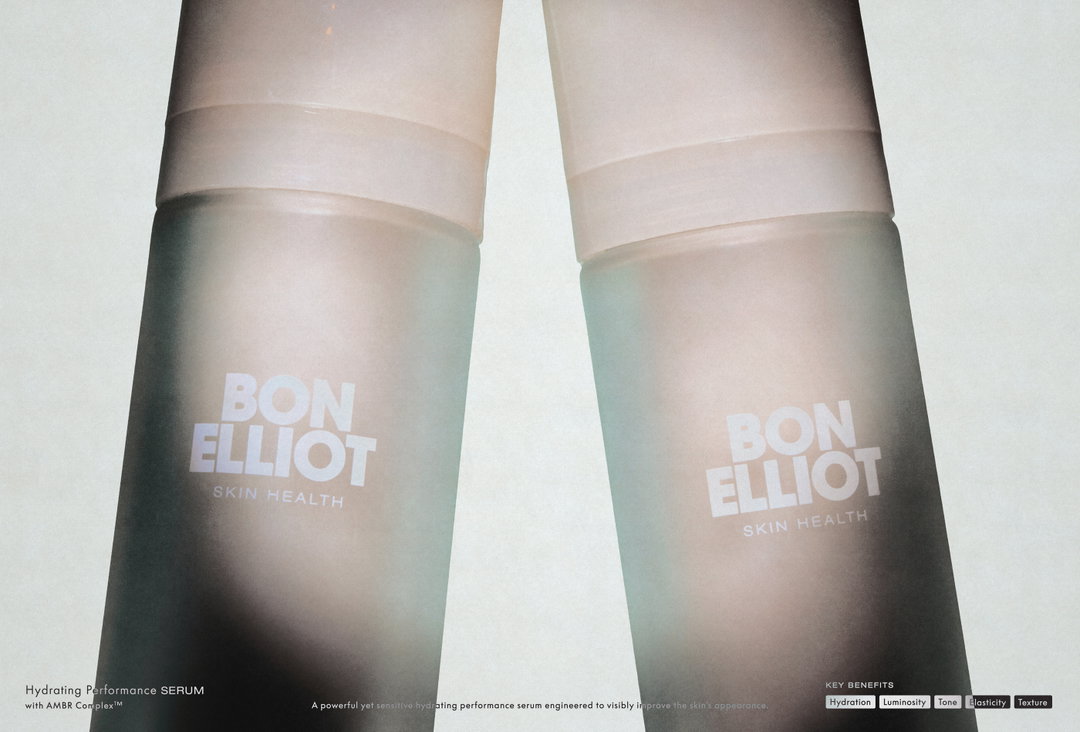
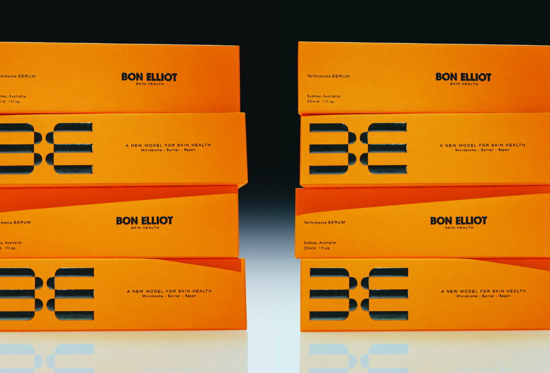
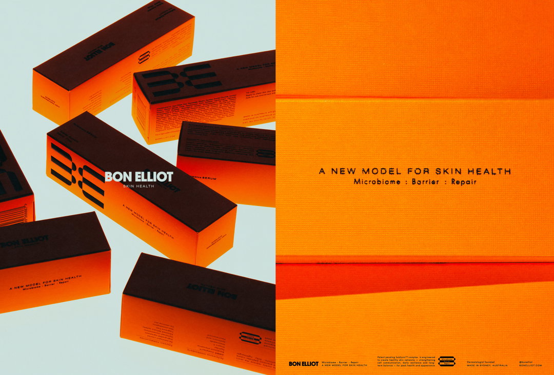
Aiming for a careful balance between science and beauty, the designers started with packaging – the product bottles took shape in minimal colour, “with a warm family of neutrals that played with light and transparencies”, to nod to the brand’s “essentialist approach to skincare”, Jeremy shares. Bon Elliot’s wordmark was an element that Noemie and Jeremy wanted to feel quite bold and timeless, with a touch of editorial flair, “but without veering too far into uncharted territory for the category”, says Noemie. Built from the typeface Avant Garde, the stacked, all-caps composition leaves a modern, functional but still luxury feeling mark on the product’s case – a fresh take on design and dermatology.
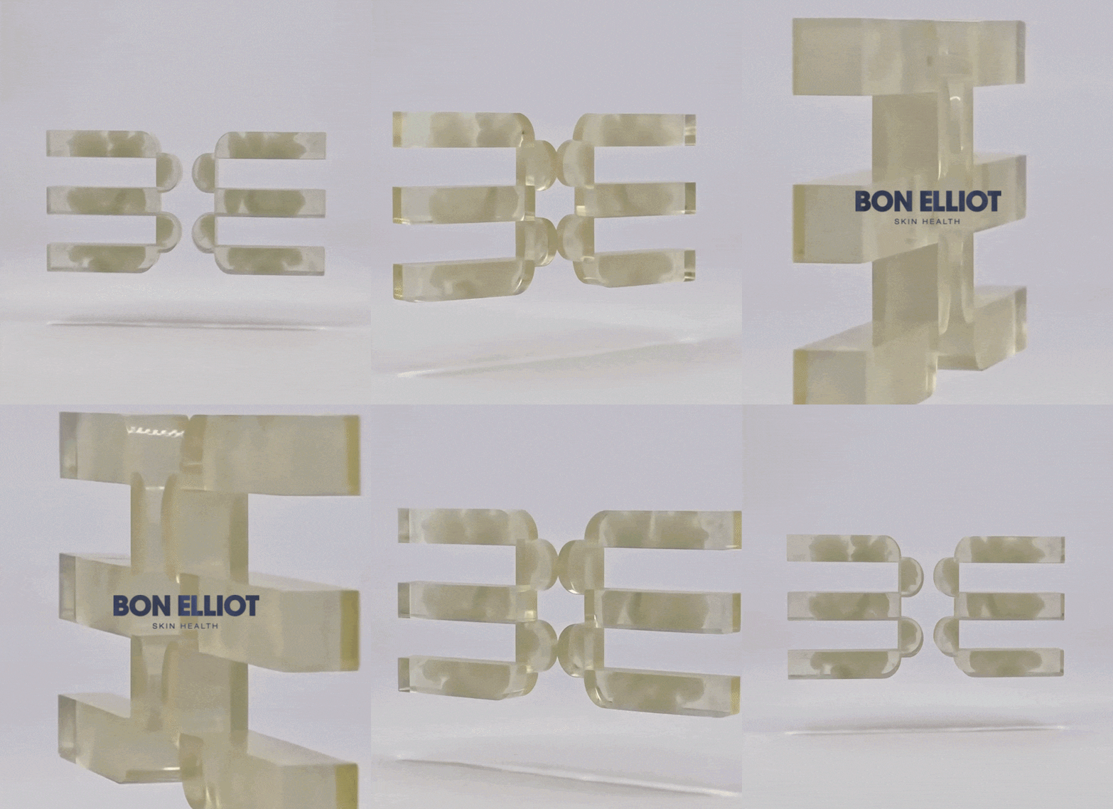
For the logo, the Little Troop team got pretty lucky and, after playing around with some letterforms, they noticed that the B and E initials of their brand name could converge into “perfectly symmetrical graphic elements and served as the perfect ownable mark for the brand”, Jeremy shares. The form neatly ties up into a diagram that mimics “the three layers of the skin”, he says, doubling up as a satisfying infographic on assets and packaging that stands apart or animates the letters to move between one another.
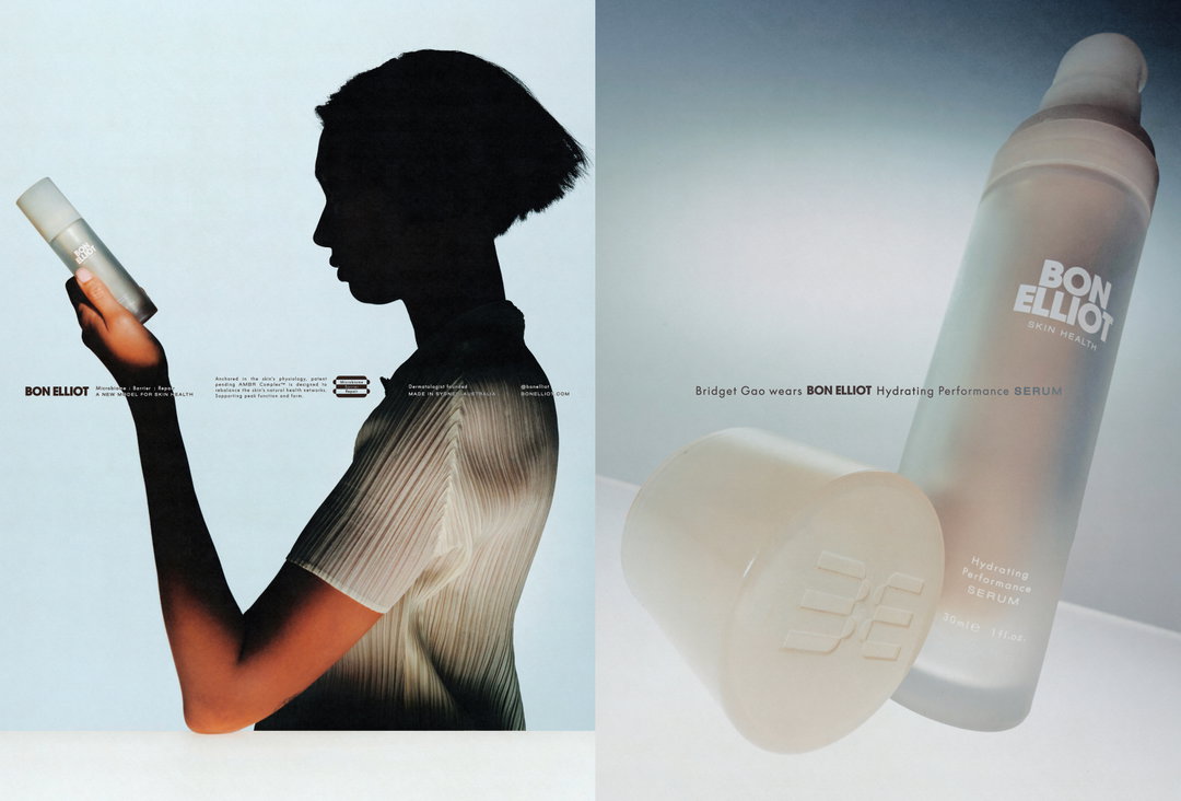
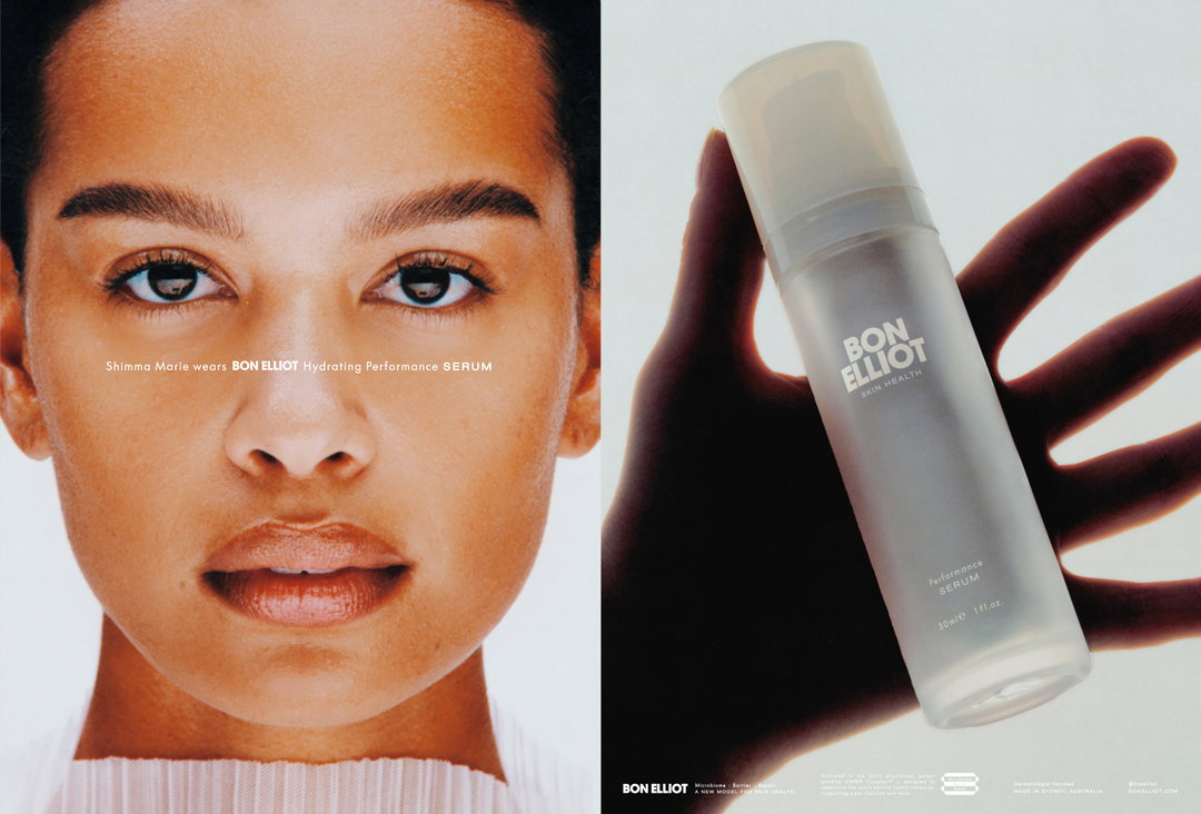
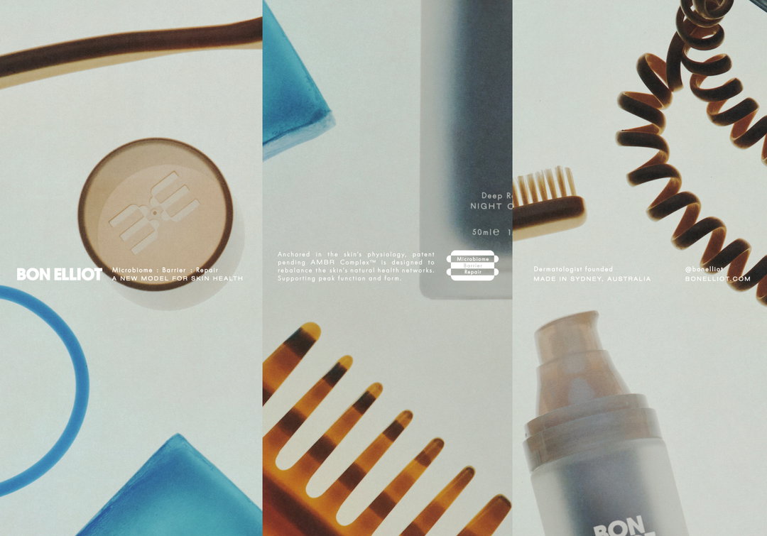
In true Little Troop fashion, the launch of Bon Elliot’s first product has come along with a shoot that takes tips from the past, selecting references like Irving Penn’s campaigns for Clinique back in the 80s – known for their still-life approach – and early-2000s beauty imagery for their playful lighting and character. The campaign’s key concept was “under the microscope – a visual thread that nodded to the brand’s scientific rigour and attention to detail,” Noemie says, “but through a visual world that already felt familiar.” This collaboration came to life with photographer Luca Venter, who the studio has worked with a number of times in the past and who effortlessly “understood the common threads throughout our references and could distill them to create something entirely new,” Noemie ends. “The final world we landed on together was this rather fun mash-up of Irving Penn meets Stanley Kubrick — executed with a level of restraint that aimed to feel timeless.”
GalleryLittle Troop / Luca Venter: Bon Elliot Launch Campaign (Copyright © Little Troop, 2026)
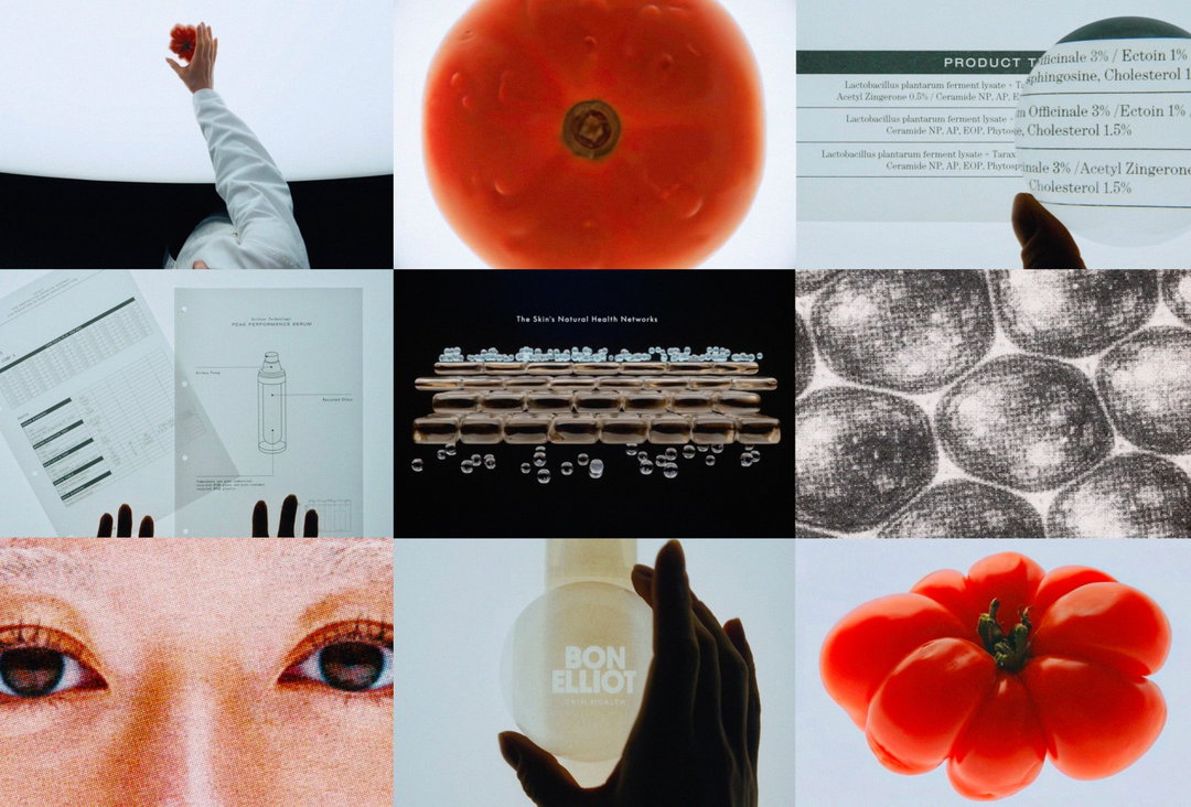
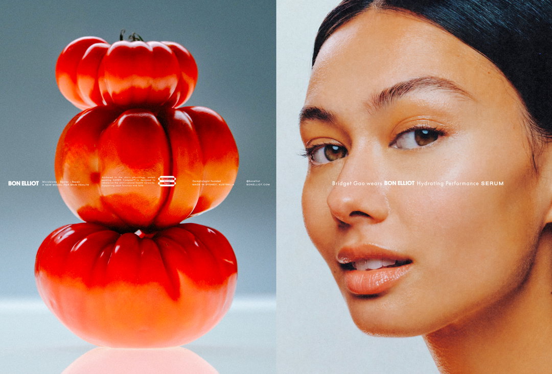
Hero Header
Little Troop / Luca Venter: Bon Elliot Launch Campaign (Copyright © Little Troop, 2026)
Share Article
About the Author
—
Ellis Tree (she/her) is a staff writer at It’s Nice That. She joined as a junior writer in April 2024 after graduating from Kingston School of Art with a degree in Graphic Design. Across her research, writing and visual work she has a particular interest in printmaking, self-publishing and expanded approaches to photography. ert@itsnicethat.com
To submit your work to be featured on the site, see our Submissions Guide.