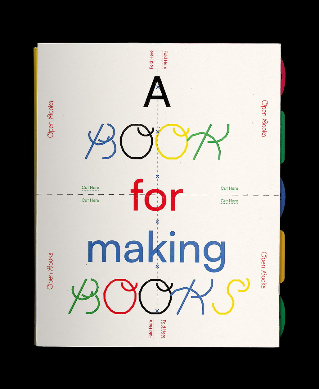
Joel Burden on realising his work is graphic, but he isn’t a graphic designer
Following university, this graphic design graduate felt lost as to where to head next, until he took some time out to realise that really, he was an illustrator all along.
After studying graphic design at Leeds College of Art, Joel Burden left feeling pretty disillusioned with the industry. “Which I think anyone else who, after dedicating three years of their life to something only to discover they’re not sure they actually want to do it, will understand is a real kick in the teeth,” he tells It’s Nice That.
A feeling we’re sure many readers can relate to (our own team sure does!), Joel’s approach to tackling this was to avoid the subject of design entirely. During a period of “toying with ideas of potentially changing career completely,” even exploring the idea of everything from food to maybe something humanitarian, he then headed to New Zealand. Following a road trip with no signal and barely any human contact either, it’s a process he now terms as “100 per cent recommended”, leading him to make an agreement with “myself to suck it up, move home and remove the residue from my portfolio.”
During this internal process, it didn’t take Joel long to realise “that the work I was making was graphic, but it wasn’t necessarily design,” he tells us. This allowed him to realise that, really, he was an illustrator all along, backed up by the fact that when he started sharing his work, positive feedback and commissions soon followed. “It became pretty clear that it was something I wanted to explore further,” even finding that his original graphic design training became relevant again; it was something he studied “because I have a graphic mind, and I find value in it,” he says.
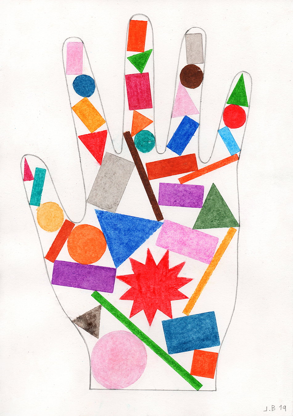
Joel Burden
Only relatively recently settling into illustration as his creative output, “the work I make is still evolving,” says Joel on the portfolio he’s created so far. When it comes to commercial work, it’s bold and bright, which he describes as “colourful, fun, irreverent perhaps,” that tends to catch a client’s eye. His personal practice, on the other hand, sits at the subtle end of the spectrum. This difference is one Joel alludes to reflecting his own personality, explaining how “maybe growing up as a shy kid, and then a shy teenager, means I find bold colour as a way to be extroverted in some way.”
Joel’s use of colour is the most instantly recognisable attribute of his portfolio, and one he applies in a natural way commenting how: “My practice is often most internally satisfying when I’m thinking of it in terms of colour.” His colour experimentation and research is extremely vast in this respect, noting everyone from Picasso to Kapoor, Hockney and Kusama as influences. In form however, more contemporary illustrators come to mind, with a brightness of line work that reminds us of Annu Kilpeläinen's, and other more structural forms like Peter Judson's.
It’s this approach that has also led to Joel working mainly in editorial, naming commissions from The Guardian as a client “I was extremely humbled to work with,” he tells us. Another commission where the illustrator’s use of colour really sings is his work for Leeds City Council. Creating an illustrated banner for North Street, to see his own work in a city he’s called home was a real experience for Joel. As a result it’s the piece of illustrative work he’s most proud of: “One because I’ve lived here for many years… and two because I found it engaging doing something in a public space, and something positive at a time of such uncertainty and worry.”
At the moment, between a few commissions, it seems that Joel has again taken this time to consider what he wants to pursue – in life, and creatively. “I’ve mainly been focused on myself and the people around me,” he says as our conversation draws to a close. “It’s actually given me some time to work on ideas I’ve had floating around in my head for months now but haven’t had a chance to grab them, and make them real.” Looking to the future, the illustrator is looking to explore the influence of abstraction and sculptural forms, while commercially it’s “working with good clients, in whatever form that comes in,” that excites him most. Maybe too, he might get to combine the two soon, working on something “more spatially aware and contextual.”
GalleryJoel Burden
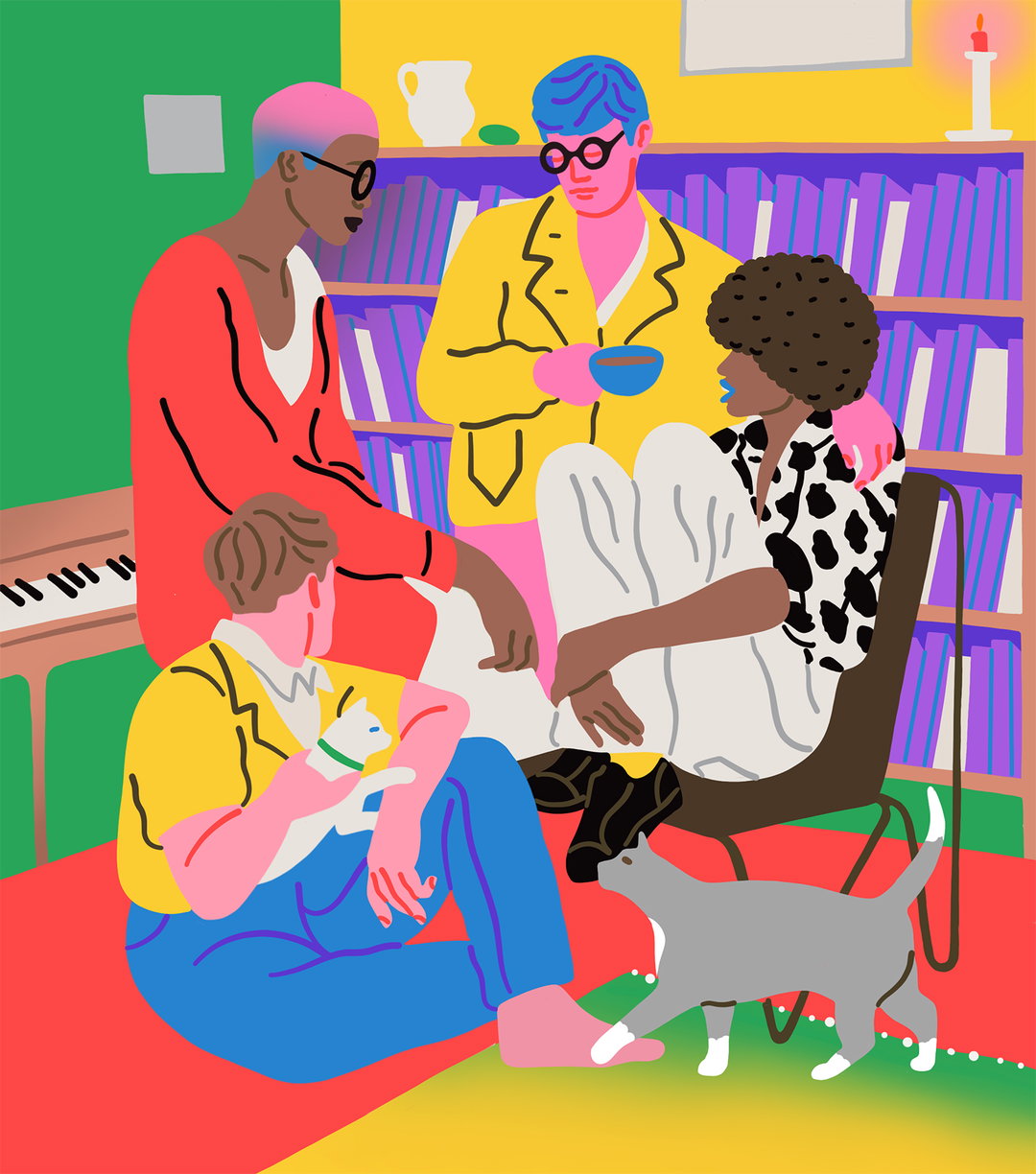
Talk
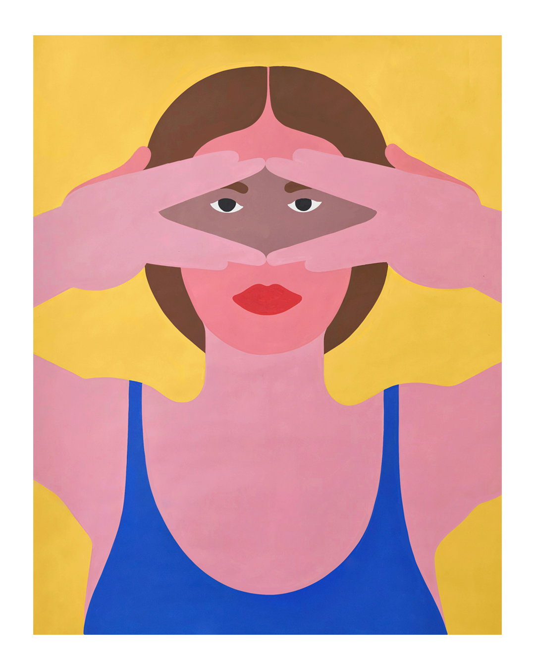
Peek-a-boo
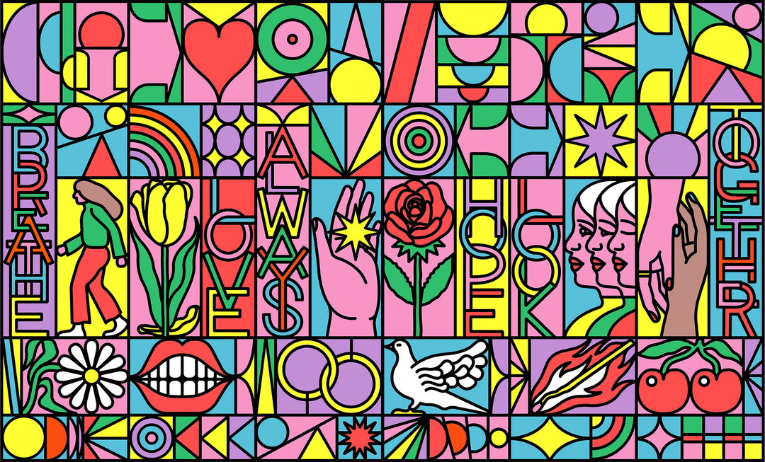
North Street
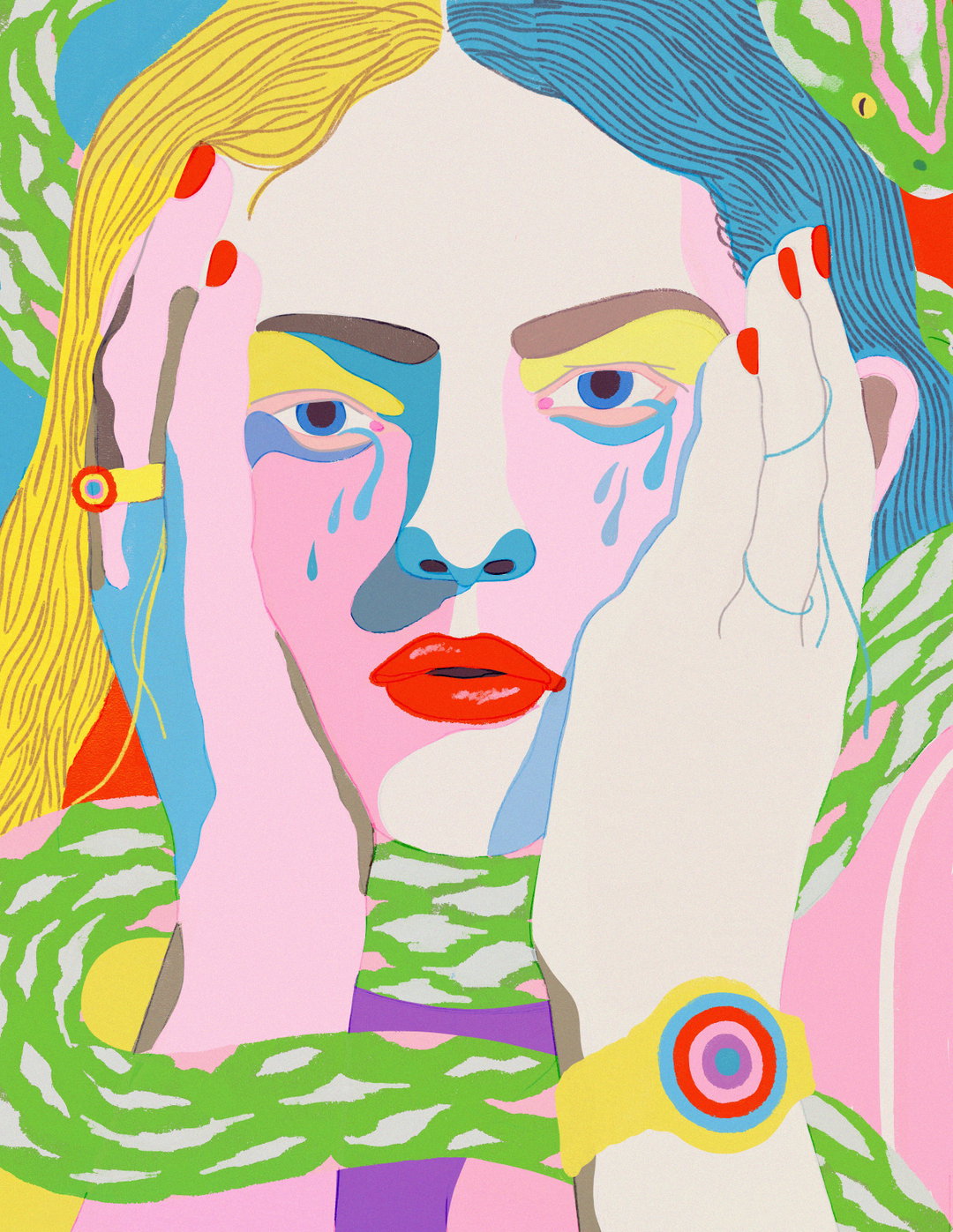
More Anxious Than Ever
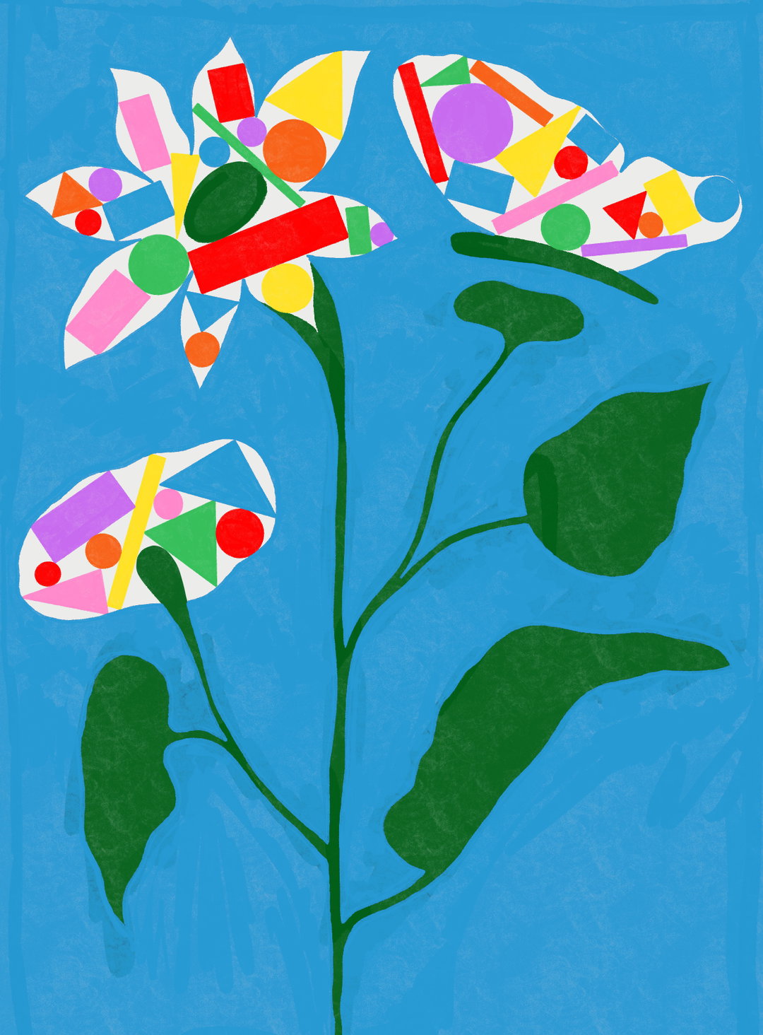
Life
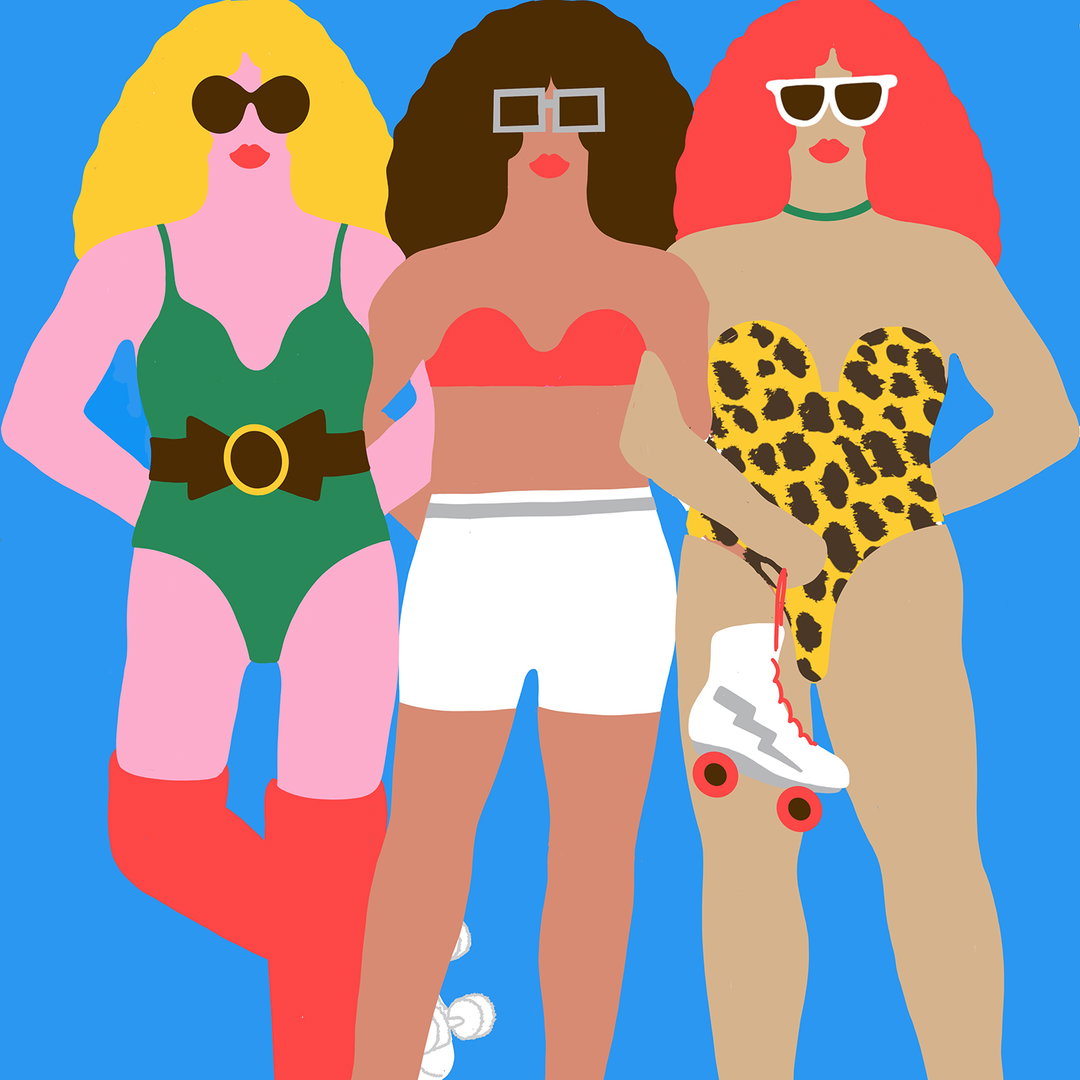
I Disco
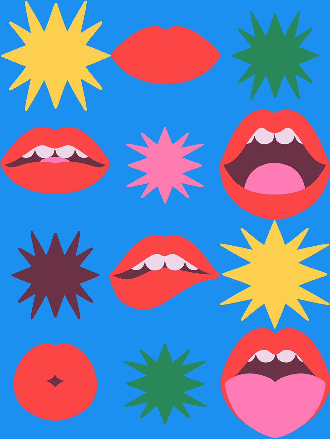
Drama
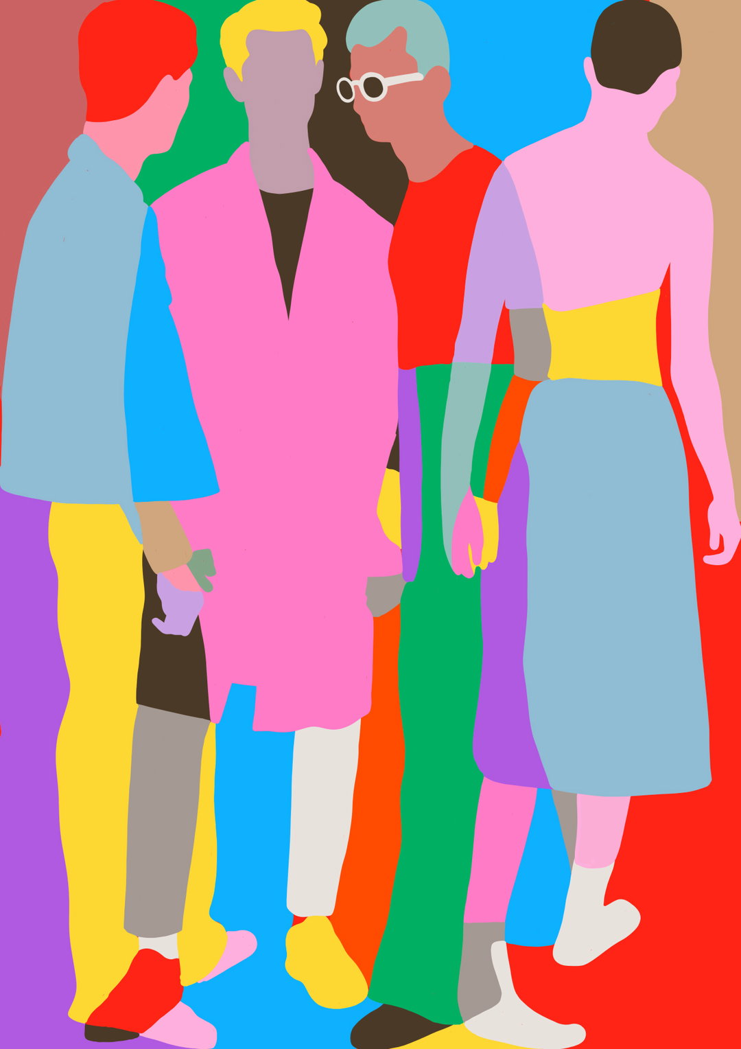
Connected Apart
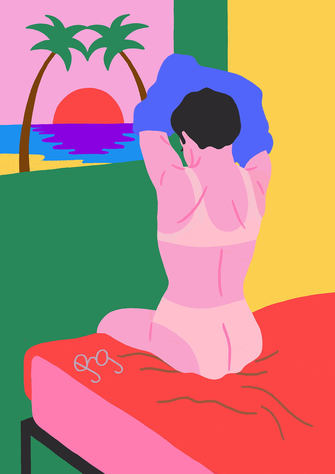
Changing
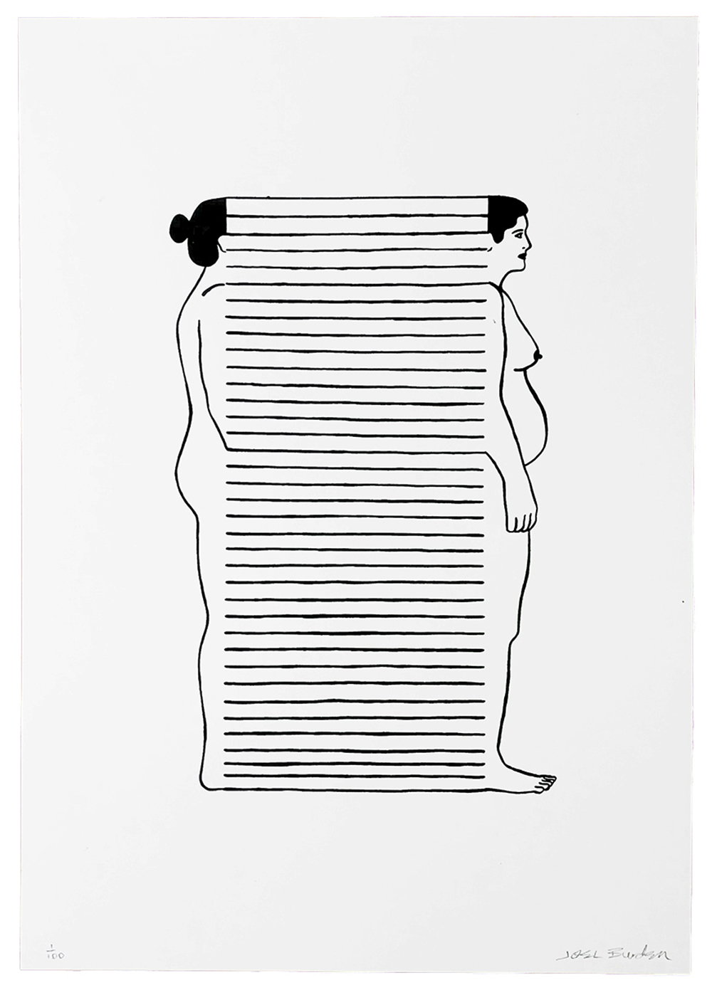
Mother
Hero Header
Joel Burden: Paris
Share Article
Further Info
About the Author
—
Lucy (she/her) was part of the It’s Nice That team from 2016–2025, first joining as a staff writer after graduating from Chelsea College of Art with a degree in Graphic Design Communication, eventually becoming a senior editor on our editorial team, and most recently at Insights, a research-driven department with It’s Nice That.