




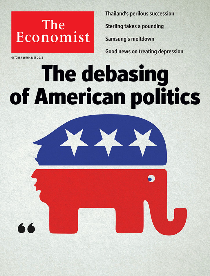
Hope to Nope: exploring the "pivotal" past decade of graphic design and politics
Contrary to its distinctly present-day focus, the Design Museum’s latest exhibition, Hope to Nope: Graphics and Politics 2008-18, started off as a historical retrospective. Curator Margaret Cubbage and designer of the show, GraphicDesign&’s Lucienne Roberts, discussed beginning in the 50s and 60s, but then Brexit happened. Then Trump. And what was immediately evident was the seismic creative response to global crises. “We suddenly felt there was an urgency to respond to this,” Margaret tells It’s Nice That. “How pivotal graphic design had become to political movements, and how diverse and rich and democratic it was.”
2008 was marked by Margaret and Lucienne as the first domino. It saw the financial crash, the year of revolutions and the Occupy movement, and the Obama campaign, during which Shepard Fairey’s poster become a symbol of the era. “That was a grassroots campaign, but it became so influential,” says Margaret. From 2008 onwards, she explains, it’s fascinating to examine the evolution of graphic design in the political context.
So the curatorial team set off with the intention to encompass as many people and issues as possible, which has been the most challenging aspect of putting together the show. To help anchor their decisions, the curator explains that it came back to one question: “How did this event manifest itself in a graphic form?” The work, therefore, ranges from slick commissioned government campaigns by renowned studios to raw and emotive personal responses from complete design amateurs. “The shift we’ve seen over the past ten years means technology has enabled anyone with a computer or smartphone to create and disseminate these images,” she says. “So the exhibition is a full spectrum, from the Hillary Clinton ‘H’ logo to placards at the women’s march or the Zuma protests in South Africa. Our decisions weren’t based on aesthetics; it’s about impact and influence.”
The show is split into three sections, Power, Protest and Personality. Within each, the work is presented from two polarised viewpoints. For example in Power, the display looks at how graphic design asserts and subverts power, exploring the design of propaganda, election campaigns, brands and borders. Within this is Matt Furie’s Pepe the Frog, showing its initial message of peace but also how its meaning was subverted when adopted by the alt-right as an image of hate. This brings up another challenge for the curators: how to curate a show in a cultural context that is perpetually shifting. “It’s on until August, so who knows what could happen during the exhibition. The interpretation and context could change over the course of the show, but that in itself is interesting,” says Margaret. The solution, she explains, is to present the designs in their original context, and let them speak for themselves.
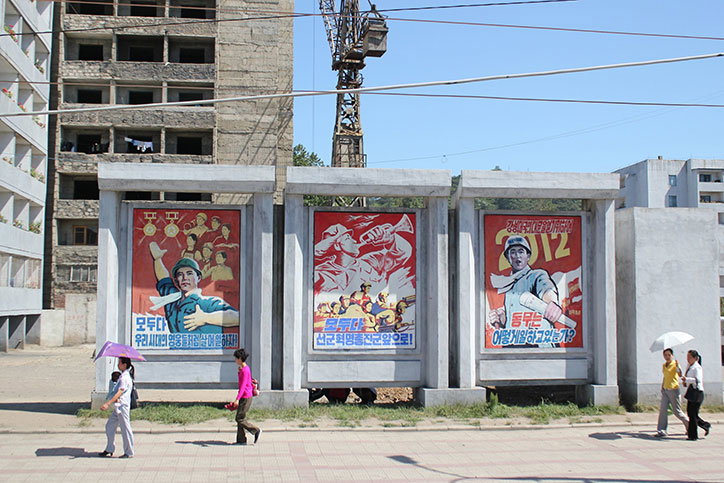
North Korean propaganda posters. Photo: Raymond Cunningham
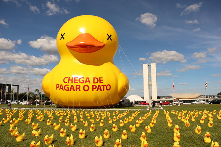
Brazil protests. Photo: Charles Albert Sholl
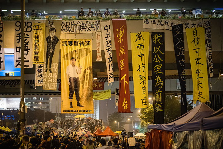
The Protest section is split into two “styles”, one being collective protest, where participants adopt a symbol, colour or slogan, and its impact is in the repetition on a mass scale. In contrast, the show also presents the eclectic visual language of protest, the many styles of placards, T-shirts, badges, and more, that show individual creative expression. “It appears more festival-like,” Margaret comments.
Lastly, in Personality, the show looks at how graphic design idolises and demonises political figures. “In the past decade there’s been this real sense of cult of personality,” Margaret says, “so this section looks at how political leaders present themselves as these nation-builders, held up to be worshipped.” The counterpart to this section explores satire, for example how Trump has become a graphic icon. “Graphic designers and illustrators have taken on these characteristics, the red hat and tie, the permatan, the hair, and used them in their work.” Personality also includes analysis of Anonymous as a cult, its origins and how it has been adopted as an identity for activism and dissent; and the support for Jeremy Corbyn. “Corbyn’s campaign had a grassroots visual language that usurped mainstream media – the Corbyn Nike T-shirt, the Jeremojis, the comic, which presented a personality that appealed to a younger demographic.”
Now the work is collated and installed ready for the exhibition opening tomorrow (28 March), I ask Margaret if, looking over the collection, she feels design is more valued in politics today. “Yes, in this decade I think there’s an awareness of the potential impact of graphic design,” she says, “partly because of technology. We live in an age where we receive and consume so much information, so it’s finding a way to attract and retain attention. It’s got to have impact, and reach a broad demographic. It’s not just about the billboard on the street, it’s about the photograph of the billboard that gets shared on social media. Visual material has a new currency in that respect.
“Within protest, it happens too. When people go out to protest, the visual material they bring isn’t just about the people around them; they’re aware there’s an audience out there on YouTube or Twitter or Instagram. Even in non-English speaking countries, protestors use English language on their placards, because they know their audience is global.”
Hope to Nope: Graphics and Politics 2008-18 opens at the Design Museum, London, from 28 March – 12 August 2018. The museum is also hosting two concurrent workshops during the exhibition: Print Matters, Creative Publishing for DIY Media and Typography Workshop with Fraser Muggeridge.
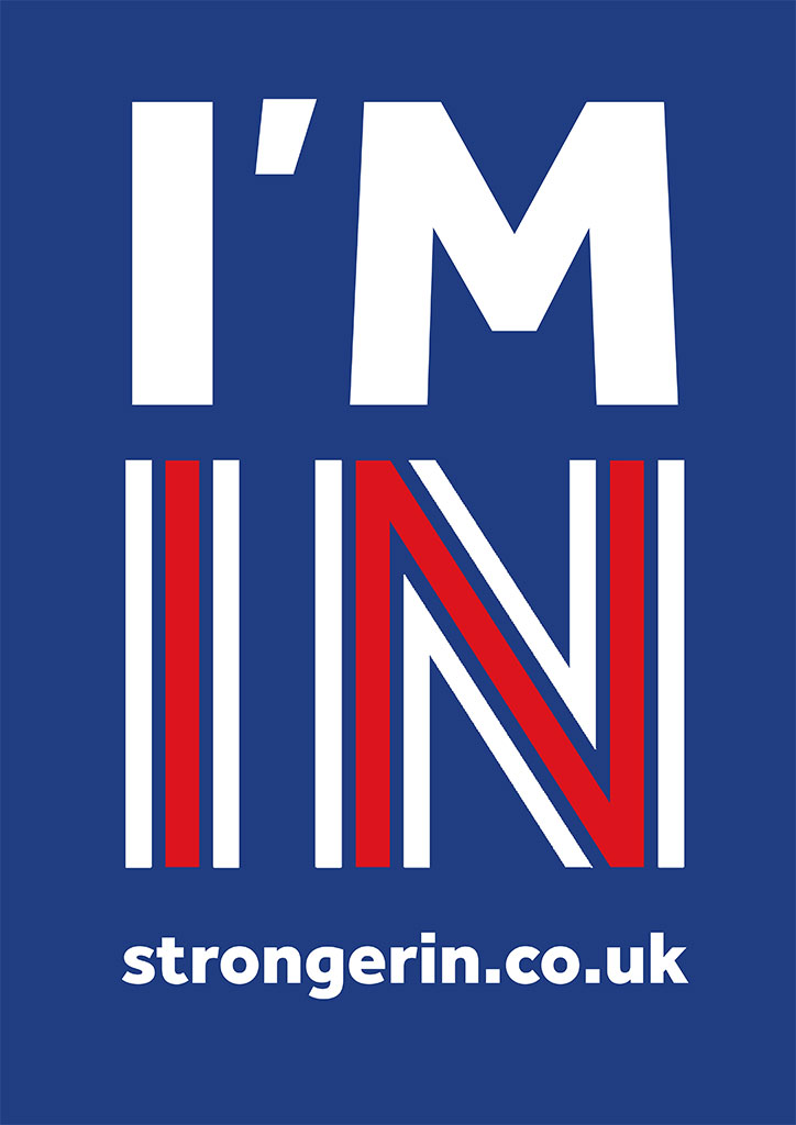
Britain Stronger in Europe: Remain campaign
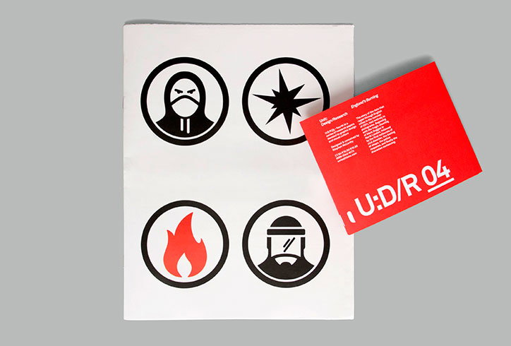
England’s Burning
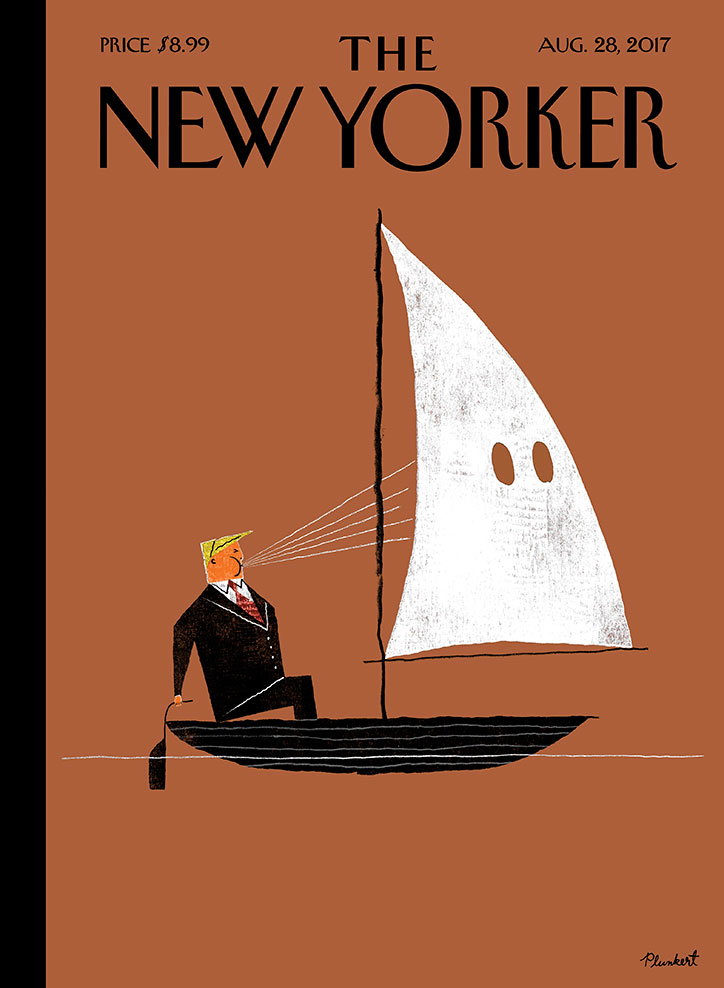
David Plunkert for The New Yorker
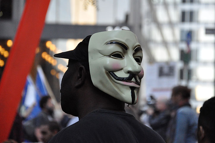
Photo: David E Cooley
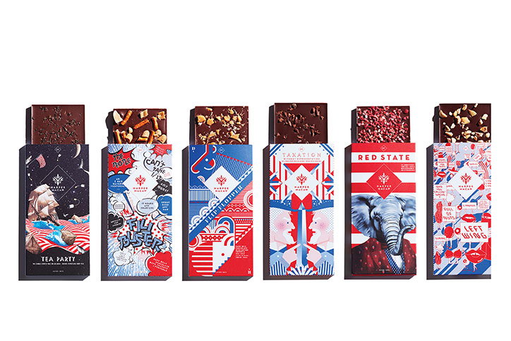
Harper Macaw
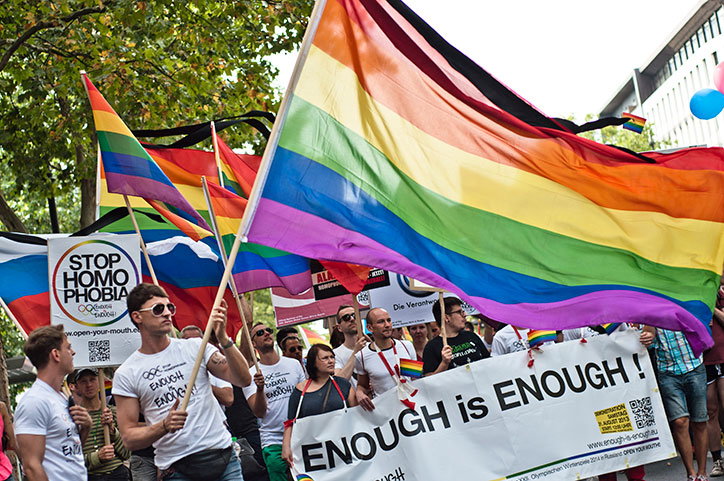
Enough is enough demonstration in Russia
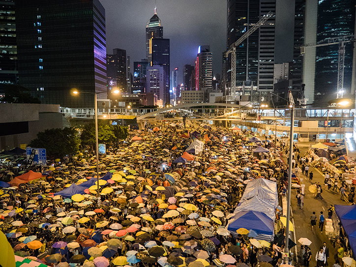
Photo: Pasu Au Yeung
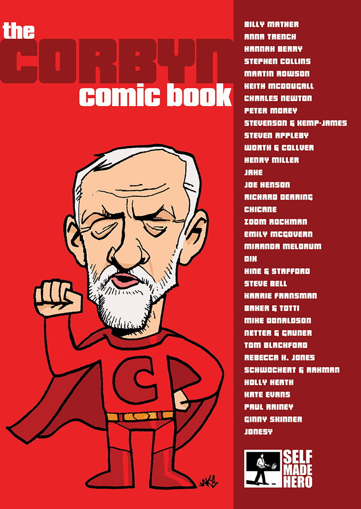
Corbyn comic book
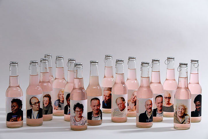
Sour Brexit
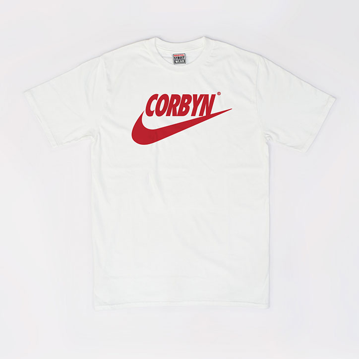
Corbyn Nike Swoosh T-Shirt
Share Article
Further Info
About the Author
—
This article was written by the It’s Nice That team. To find our editors and writers, please head over to our Contact page.


