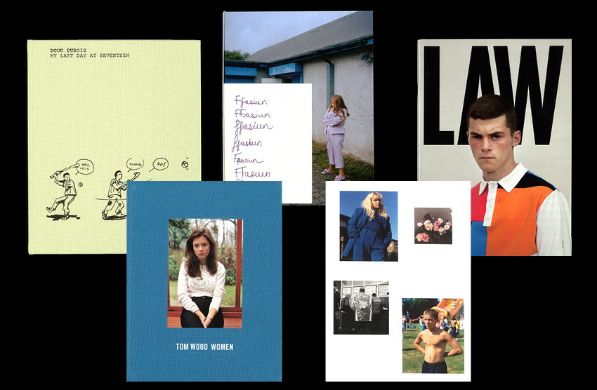
Photographer and Lecturer Dean Davies’ bookshelf features Tom Wood, Doug Dubois and LAW
The photographer is also director of an independent photobook publisher, and has picked these highlights from his extensive personal collection.
Share
Dean Davies’ series, Manchester Girls, went down a storm last year at It’s Nice That, and seemingly everywhere else for that matter. Alongside Vicky Olschak he managed to capture the aesthetic of the women that he grew up alongside in a beautiful project that became his first photobook.
His initial interest in photography stemmed from design and styling, something he is now teaching to others as a senior lecturer in fashion communication at UWE. It is clear to see the influences these choices have had on his personal work, with all having some relation to people and place, fashion as a means of identity and story-telling featuring communities – all things synonymous with Dean's photography.
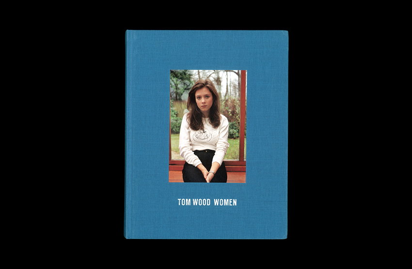
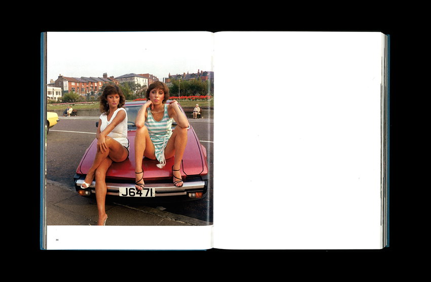
Tom Wood: Men | Women
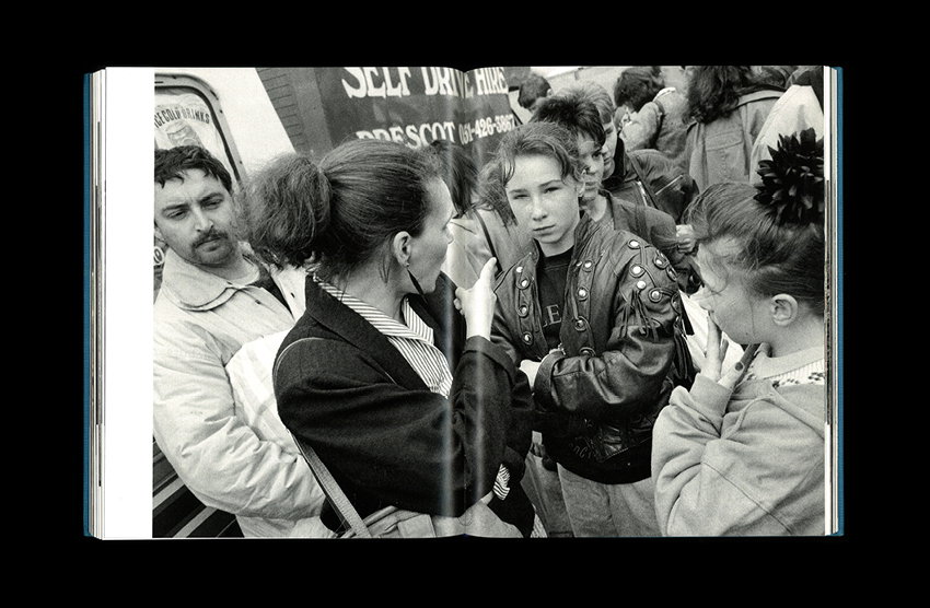
I discovered Tom Wood’s work just before graduating in 2013. I was creating pretty different work then. Seeing Tom’s photographs of Merseyside, of the streets I grew up on, was a pivotal moment. Until then, I’d never seen such a positive depiction of my hometown and its people, and I’d never truly appreciated my experiences of growing up in the area, let alone considered how I can put them at the forefront of my work.
This book, or books, presents Tom’s portraits of men and women in separate hardbacks. For me, his portraits of women have always resonated the most. He has a way of framing his subjects in the settings that he finds them in, so that people and place are positioned as equals. You can see Tom is a painter because of his incredible compositions and eye for colour. For me, there is no one better.
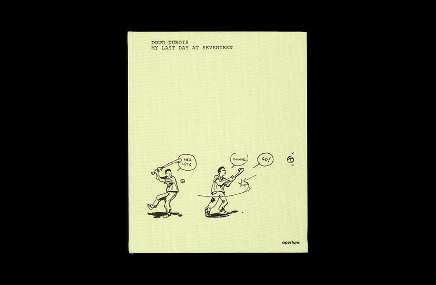
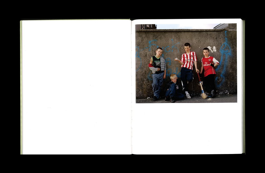
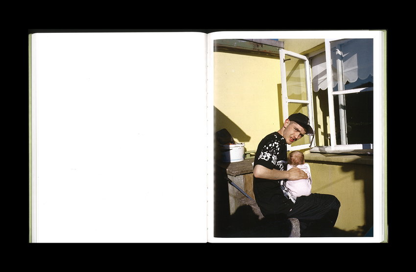
Doug Dubois: My Last Day at Seventeen
I’ve always been interested in, and explored the space between, documentary and fashion within my work, and I am constantly questioning what constitutes a fashion image. A large majority of the books on my shelf feature the works of “documentary” photographers, and one of those photographers is Doug Dubois. To me, Doug’s images – in My Last Day at Seventeen in particular – resonate with me as fashion images, because the clothes that adorn the young people within the photographs really speak to the time and place in which they were captured, and each image has its own unique narrative, which perfectly captures perspectives of youth coming-of-age in Ireland.
This is my second copy of this book. I loaned my original copy to a former student who never gave it back. I don’t blame them.
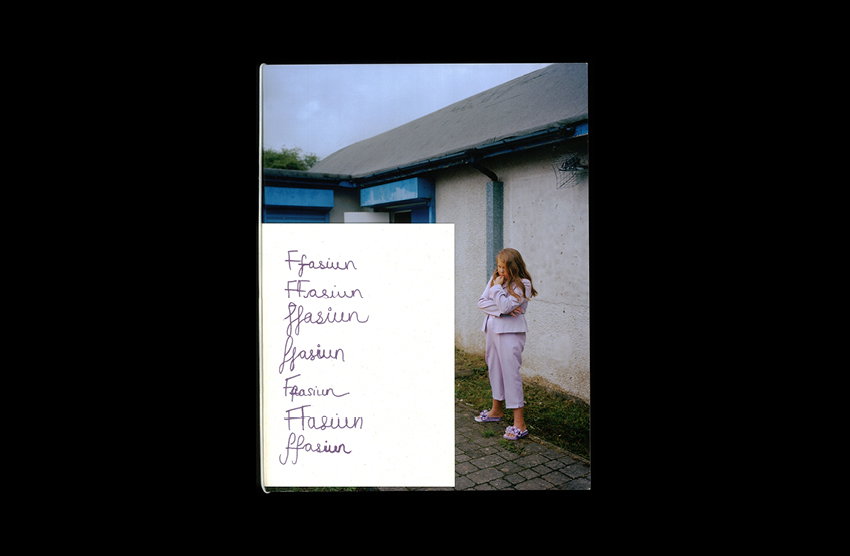
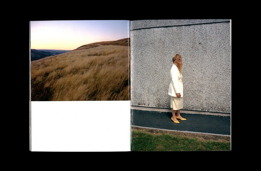
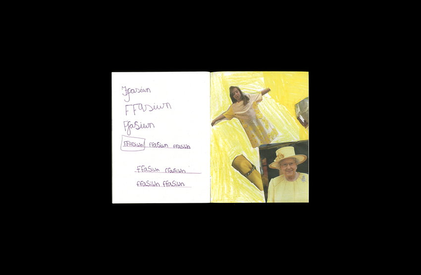
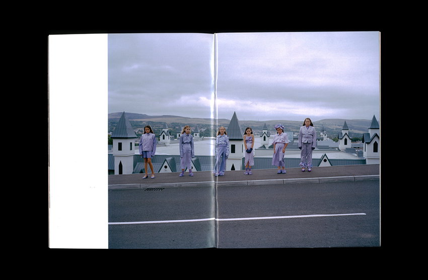
Charlotte James and Clementine Schneidermann: Ffasiwn Magazine
Charlotte James and Clementine Schneidermann’s Ffasiwn Magazine presents the results of a summer school they ran with two youth groups in the Welsh Valleys last summer, and is part of a much larger body of work called It’s Called Ffasiwn, which they’ve been working on over the past five years with the same and other youth groups from the area.
These workshops, ran by Charlotte, Clementine, youth group workers and various other collaborators, provide young people with insight into the creative industries. As the Tory government has obliterated funding for community and youth groups, this work, now more than ever, is so important for providing activities and opportunities for young people that may otherwise go without.
My favourite part of this magazine, besides the photography, is the zine accompaniment, which is made up of the young people’s sketchbook pages from their creative workshops. The inclusion of this within the magazine, for me, shows what this project is all about – youth, creativity, community.
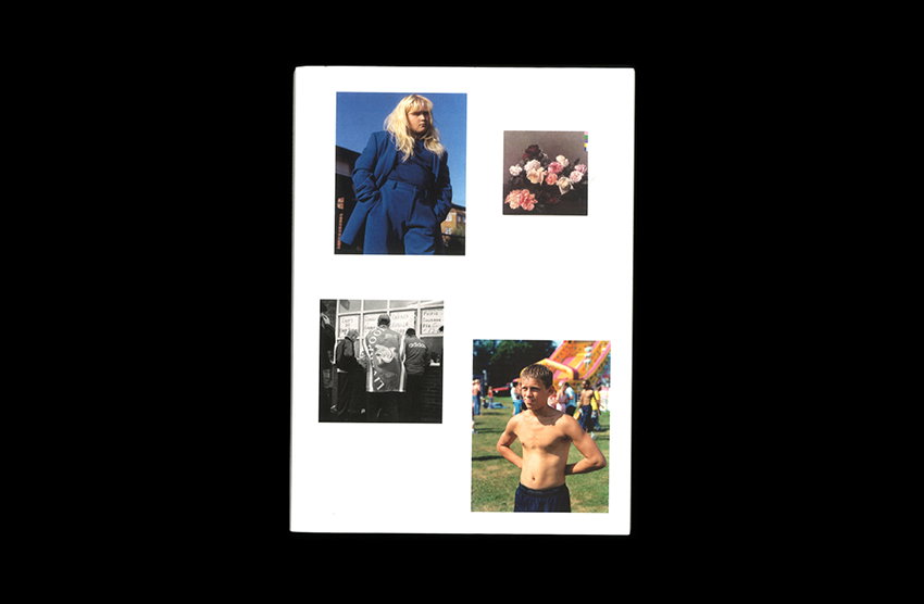
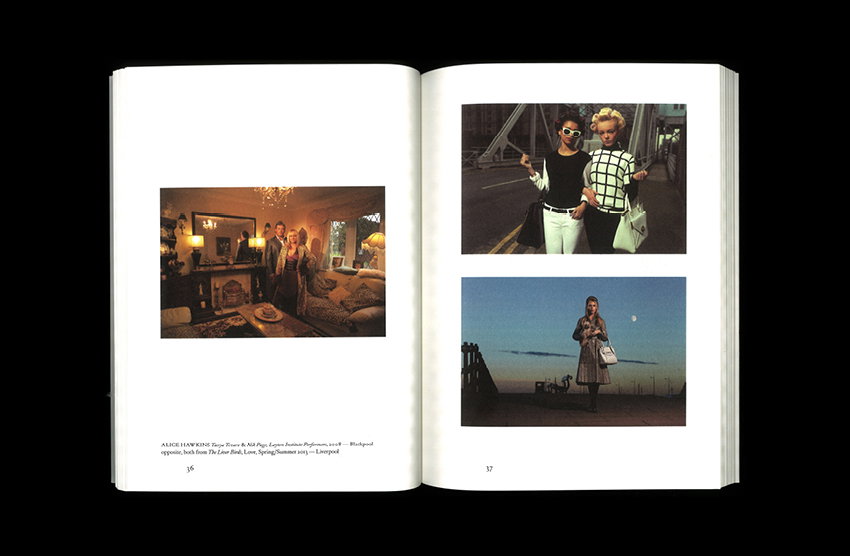
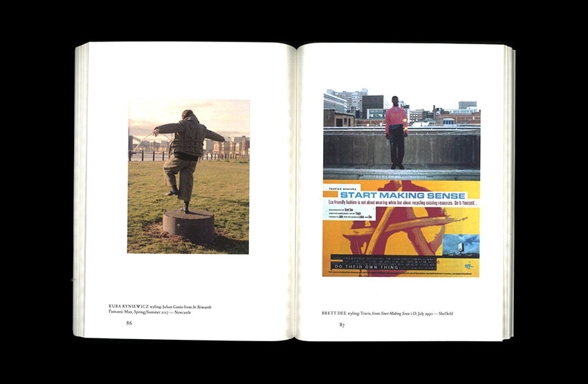
Lou Stoppard and Adam Murray: North
I am someone who works within fashion, but positioned from somewhere on the outskirts, and I think this is, in part, due to never truly identifying with the fashion depicted in the titles I read growing up, and not seeing stories that represented me or my upbringing within them (until discovering Tom Wood). Seeing the rising cultural interest in the North (and more specifically, Northern creatives) in the last couple of years has been great to witness, if not a long time coming.
North is a publication that was released alongside the Lou Stoppard and Adam Murray-curated exhibition of the same name, which debuted at Liverpool’s Open Eye Gallery, and then travelled to London’s Somerset House, and Barnsley’s The Civic.
There are some excellent essays and interviews presented within this book, which give insight into fashion obsessions with the north of England. A particular stand out for me was a piece by photographer Alasdair McLellan talking about his love of his hometown, and how in the work he creates today, he is still looking for those people and those places as they’re a part of his DNA. Hearing another image-maker talk about the impact of their upbringing on their work, and communicating that perspective and those stories, really reaffirmed the importance of what I’ve been doing for the last six years.
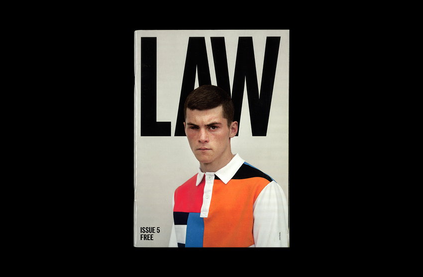
LAW Magazine
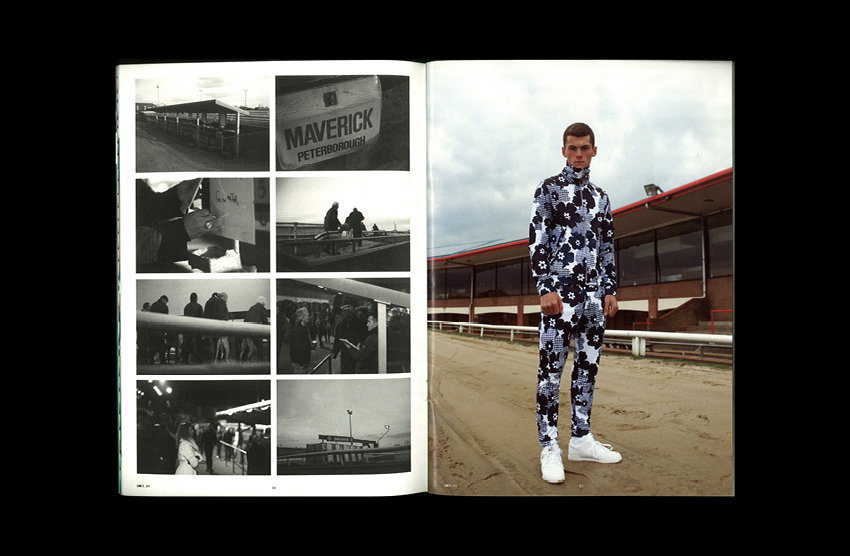
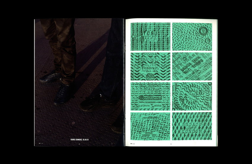
Described as an Argos catalogue full of things you never knew you needed, LAW, for me, is the best independent magazine of the last ten years.
What I love the most about LAW is its ability to re-frame the mundane, and its knack for spotlighting interesting characters and stories that would otherwise have been overlooked. As a lecturer, I reference LAW more than any other magazine. It’s a fine example of what can be achieved, and how inspiration can be sourced from whatever is around you, if you really look.
Issue five has to be my favourite for its cover story and star – cast whilst working at a race track and styled in Classics and a Christopher Shannon two-piece – as it is a great example of LAW’s ability to re-contextualise fashion into something relatable.
Share Article
Further Info
About the Author
—
Charlie joined It’s Nice That as an editorial assistant in December 2019. He has previously worked at Monocle 24, and The Times following an MA in International Journalism at City University. If you have any ideas for stories and work to be featured then get in touch.