Carolyn Rhee creates ethereal digital collages from nature, phone photos and Google Earth
Throughout her ongoing and multidisciplinary project, Flora, the artist gathers snippets while on her walks through Chicago.
Share
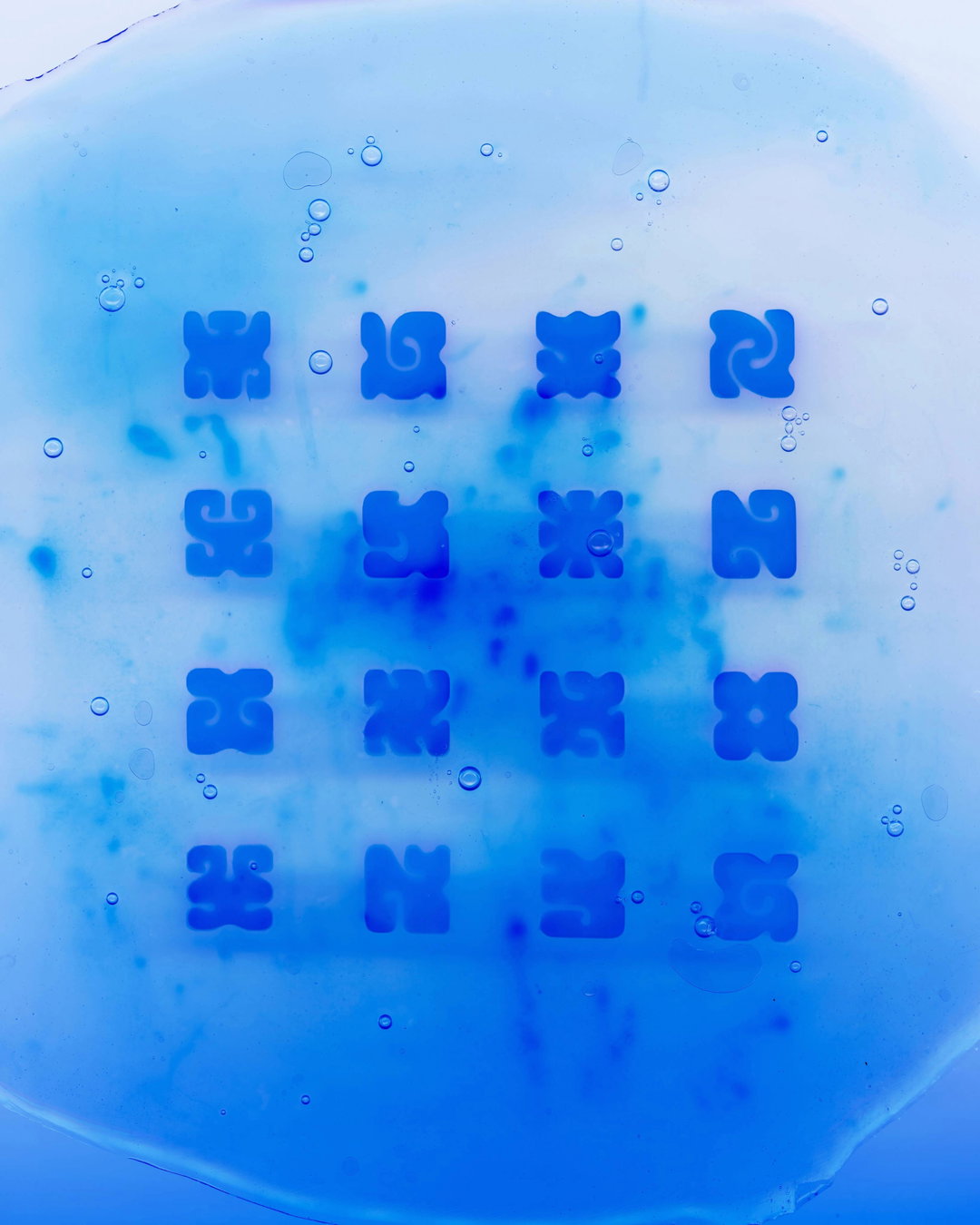
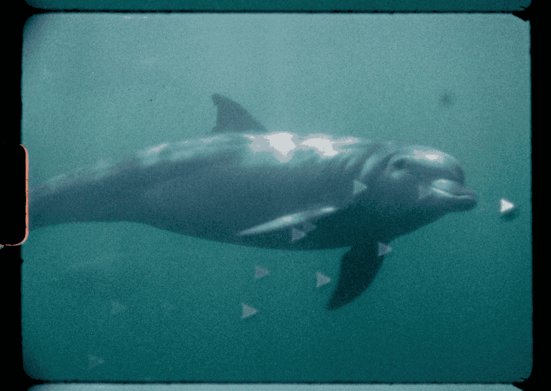
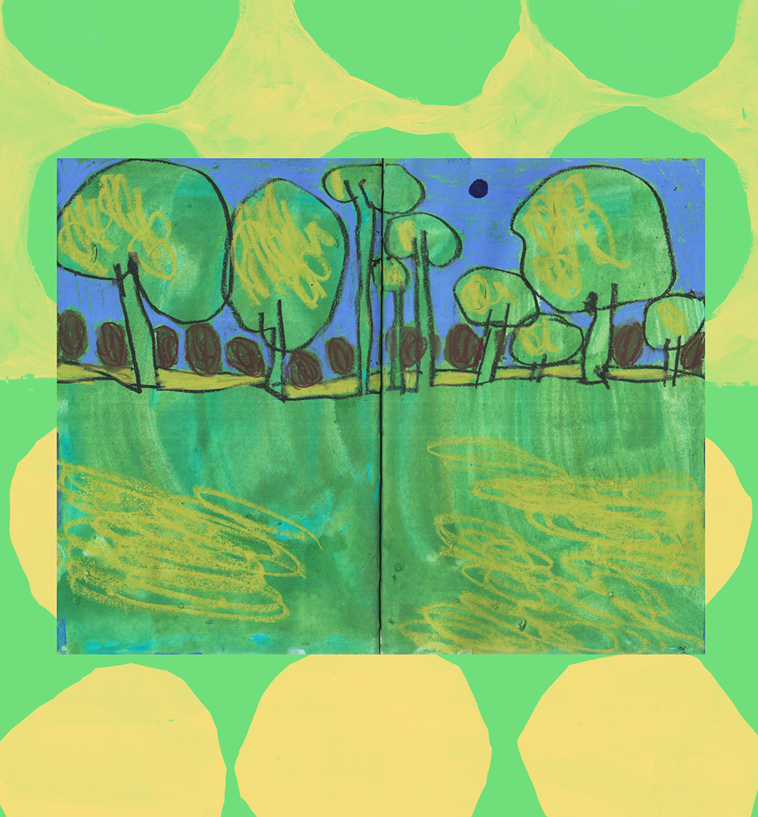
Based out in Chicago is Carolyn Rhee, an artist and designer whose work is “driven by the acts of observing, collecting and exploring.” Operating a multidisciplinary practice within this, Carolyn’s recent body of work, a series titled Flora, takes the idea of a floral environment and unfolds it into many executions, explorations, and illustrative outcomes.
Beginning from “a very organic process of observing and collecting from my daily environment,” when asking Carolyn how the project originated, she veers off the conversation to tell us about the city of Chicago. Describing one of her favourite factors of the city is simply how walkable it is, travelling by foot has become part of the artist’s daily routine. “On these walks, I would find very special moments in found objects,” she describes, “leaves bigger than my face, flower petals with the most beautiful colours and form, interesting spatial compositions within the bush of a tree, an intricate texture on stone.” Collecting what she could, and taking phone photos of anything she couldn’t: “By the end of each walk, I would have a little pile of findings,” Carolyn describes.
From there, the artist wanted to inspect these daily discoveries a little further, deciding to scan them and create an archive, “as a means to capture their inherent qualities,” she tells us. “It was a natural process, similar to how people surround themselves with objects that give them a sense of joy; it was once I had grown a little garden of scans and images that I started experimenting with them.”
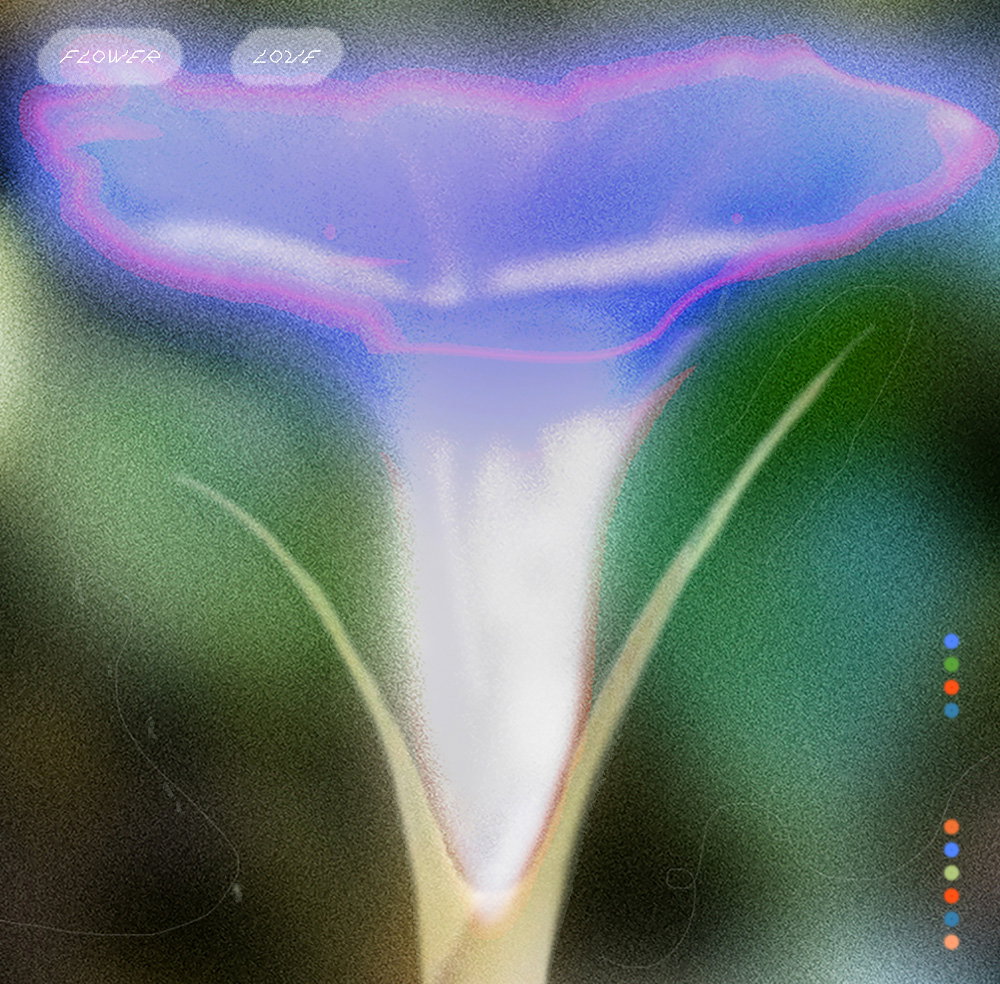
Carolyn Rhee: Flora, Flower Love
Utilising these images she’s collected, Carolyn also added images from Google Earth to create distinctive illustrations, consisting “purely of manipulated and collaged photos,” she describes. “Sometimes, I can’t collect something I find (out of respect to someone’s garden), so I take photos of them instead,” she explains. Sometimes, I will capture and observe flowers over a period of time to observe and take inspiration from their natural progression. When I have too much time, or when I long for a specific place, I will roam and take virtual walks via Google Earth.”
In being so natural in its beginnings – and it’ content too – throughout Flora’s evolution as a project, keeping it as “a space for play and exploration” has been key, with the artist “hoping to be free from the pressures of expectations that can come from more client-facing projects.” This has also allowed the project to take on unexpected routes and it was particularly important for the artist that “this project could survive as this amorphous thing and be able to be expanded upon, not limited to a certain form or definition.” As a result, Carolyn describes an openness to using “all available to me” whether it be “images, drawing, fabric dyeing, K-pop lyric references, and learning all as facets for play,” she says.
Parts of Carolyn’s work from the series have developed into their own routes for other projects, such as for posters or scarves or tote bags. But when asking the artist how this series may grow, she remains open to all possibilities, planning only to “continue to make without an idea of what it’ll grow into!”
GalleryCarolyn Rhee: Flora
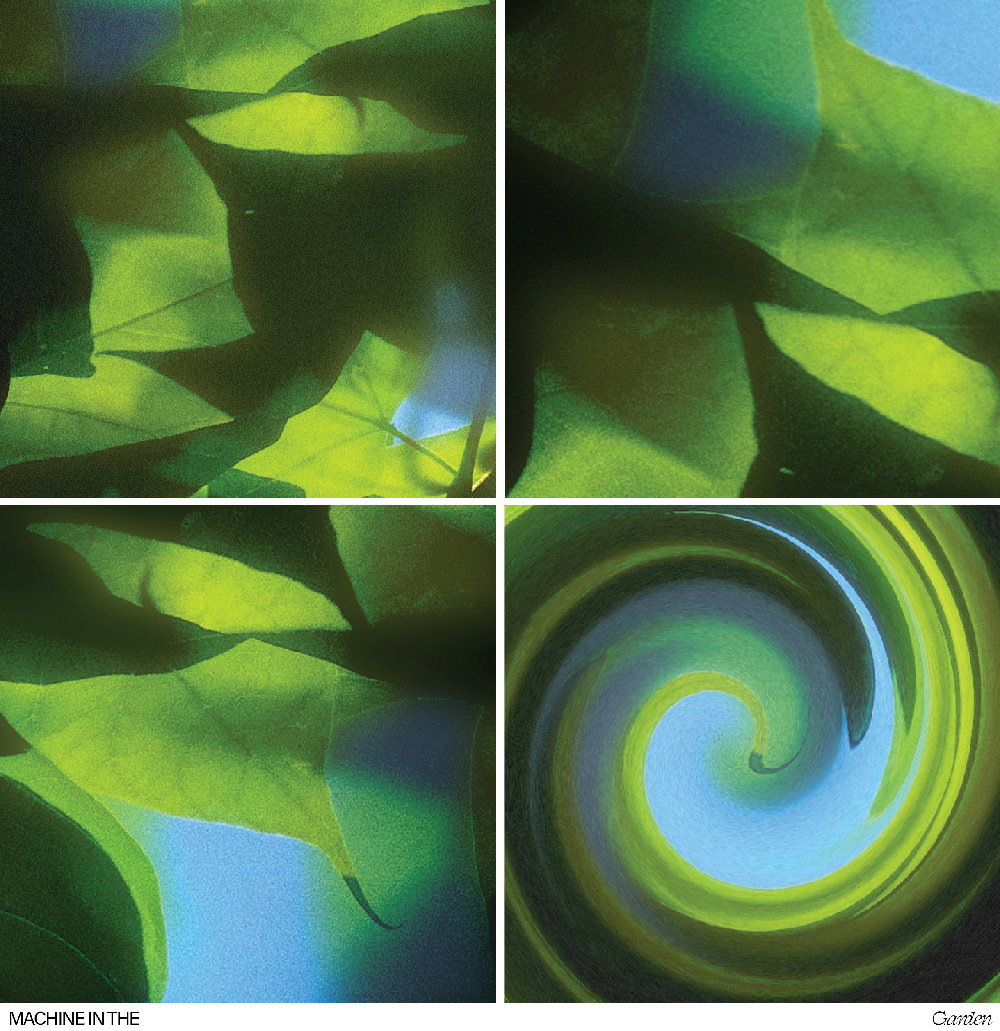
Machine in the Garden
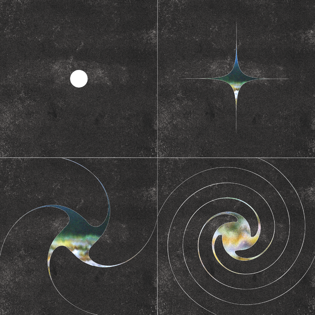
Flower Dreams
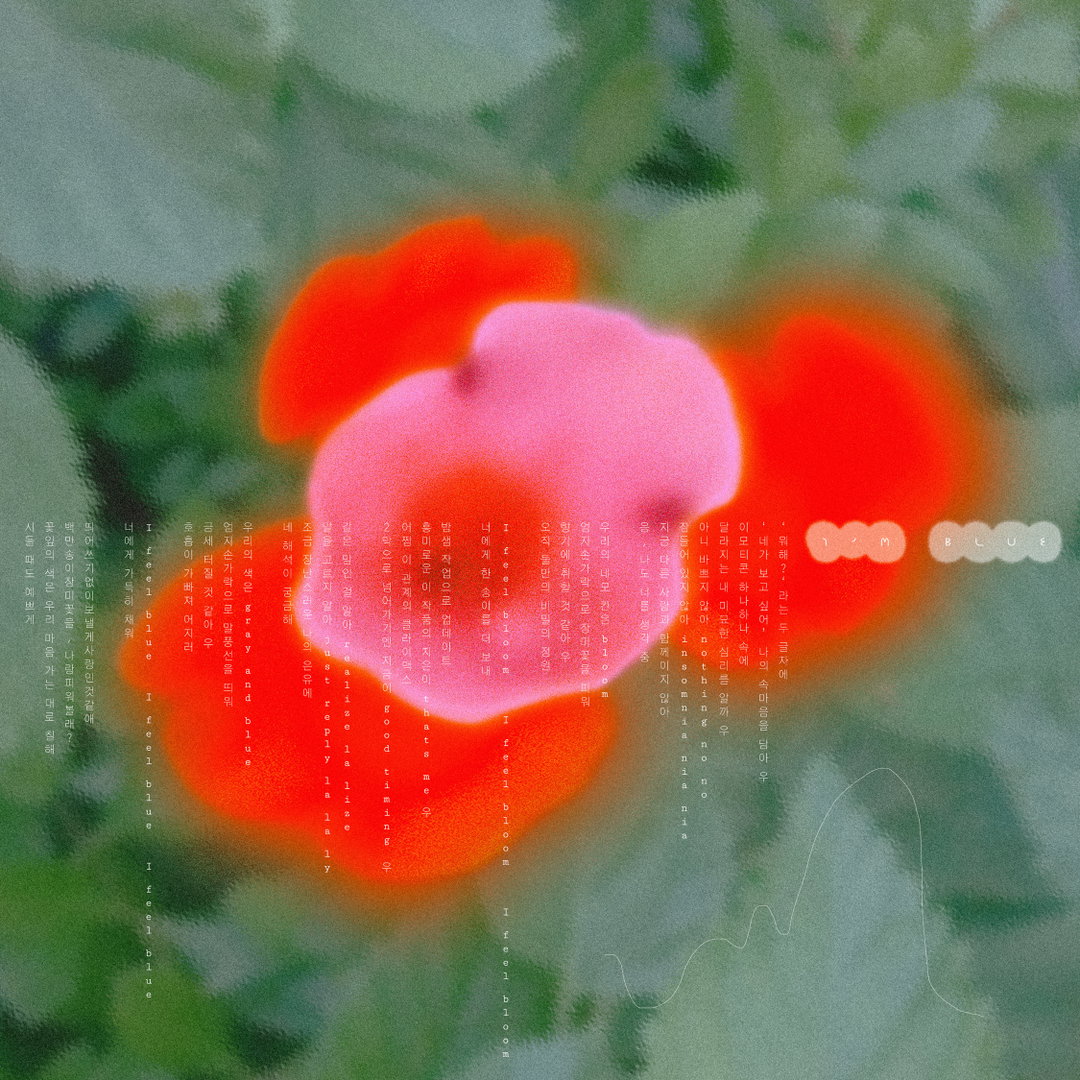
Blueming
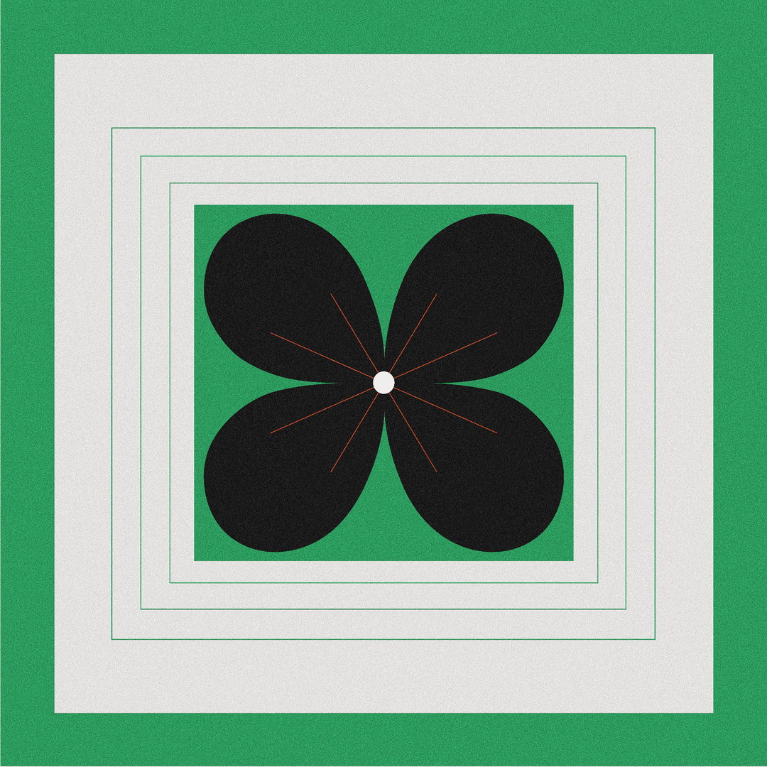
Flora Folding
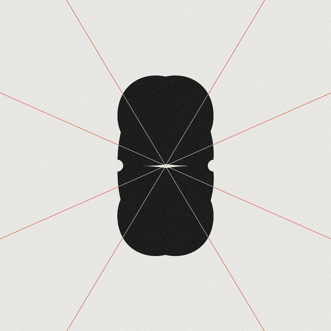
Flora Folding
Flora Folding
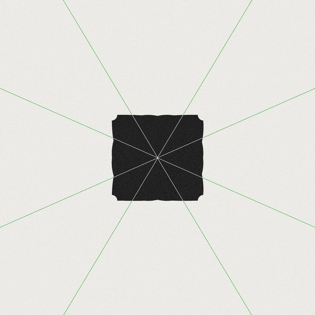
Flora Folding
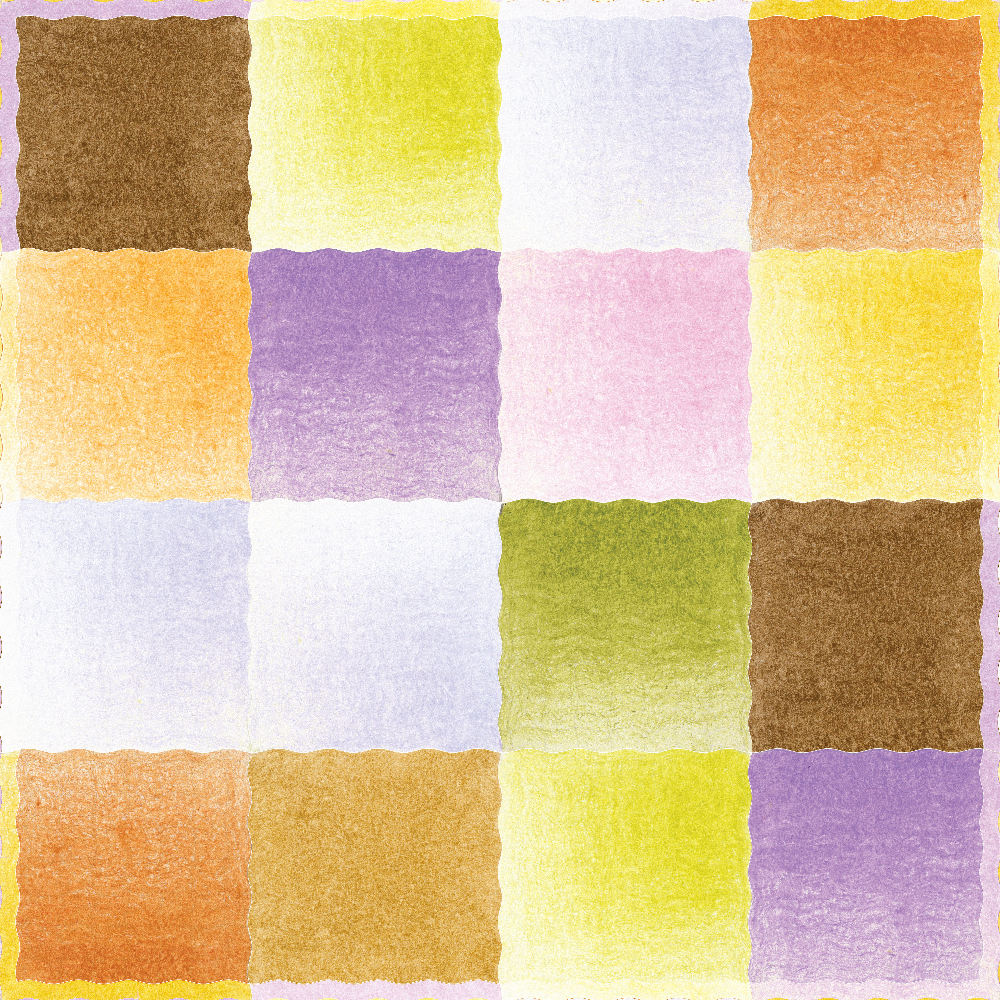
Ok Not To Be Ok
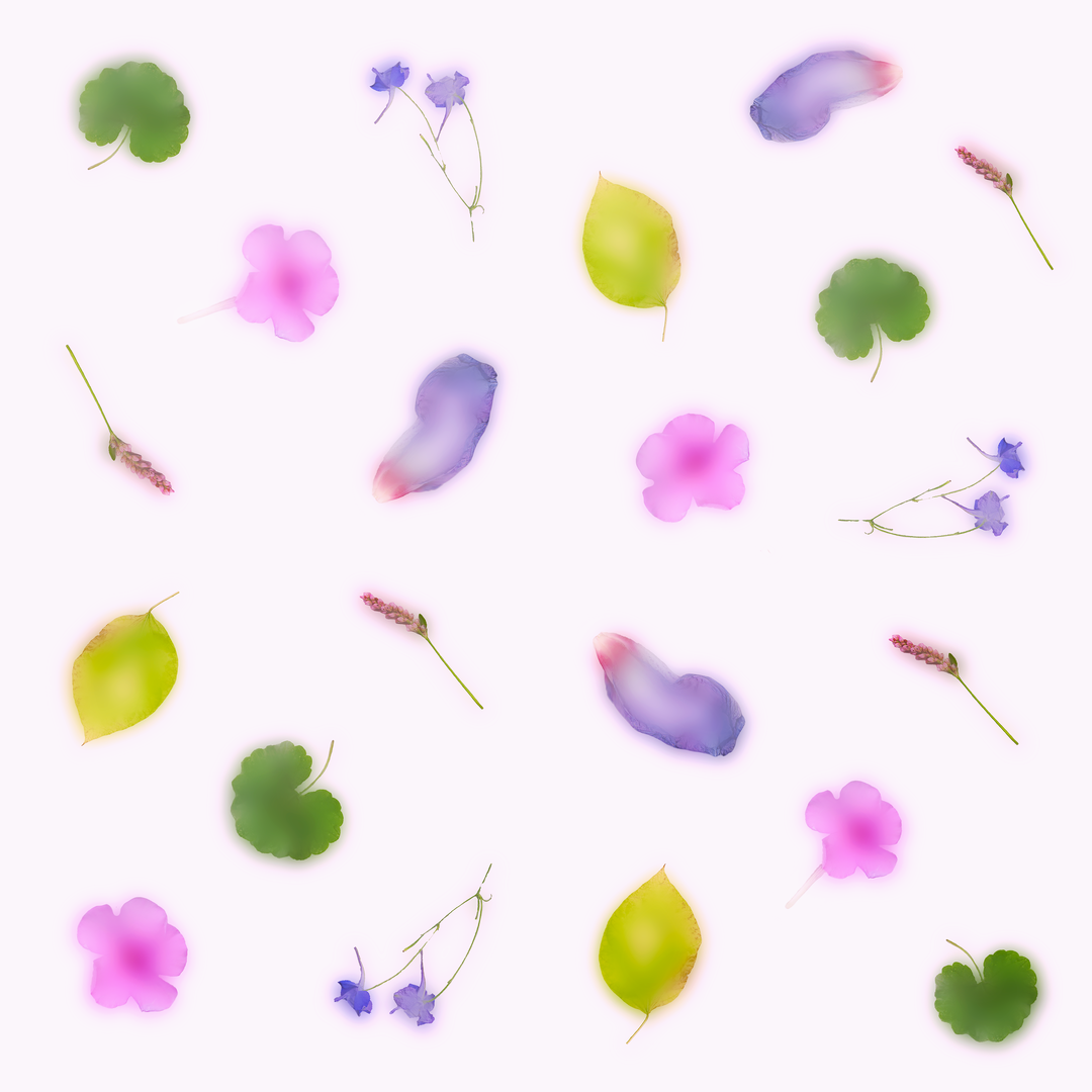
Flora Jelly Snack
Share Article
Further Info
About the Author
—
Lucy (she/her) was part of the It’s Nice That team from 2016–2025, first joining as a staff writer after graduating from Chelsea College of Art with a degree in Graphic Design Communication, eventually becoming a senior editor on our editorial team, and most recently at Insights, a research-driven department with It’s Nice That.