




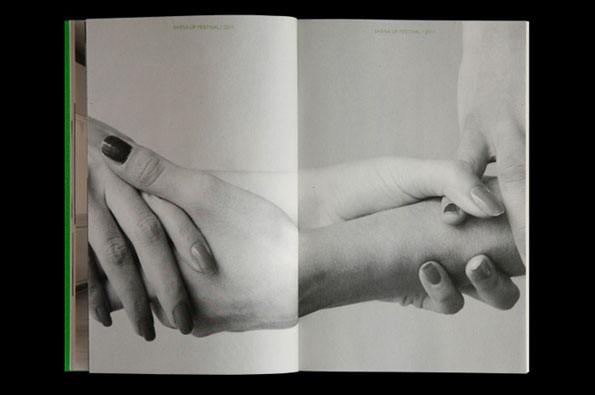
Graphic designer Bardhi Haliti on the design scene in Kosovo
“As far as the Kosovo graphic design scene goes,” Bardhi Haliti explains, “there isn’t really one. Certainly there are some individuals doing interesting things, but I wouldn’t dare call it a scene!” Kosovo born and bred, Haliti studied in the US (he lived in New York, Maryland and Utah), before returning to Prishtina in 2009, where he designs good-looking, highly functional printed matter for a wealth of arts and culture sector clients.
“When I decided to come back it was more of a temporary decision – I thought I’d go back to New York very quickly,” he explains. “But once I was here, I kept meeting people I was interested in, and who were interested in what I was doing.”
And it’s no wonder – Haliti’s work is interesting. Consistent in its typographic purity – he’s rigorous if nothing else – the Kosovan’s portfolio is a seamless blend of form and function. But he doesn’t just make things. Last year he and a few friends founded REDO, a one-day conference on the subject of graphic design – “We invited a few locals as speakers, this year we’ll invite international speakers as well” – and right now he’s part of a group in the process of registering an association of Kosovan graphic designers. But to what end?
“We’re aiming to improve the current state of design in the country,” Haliti announces. “Most of the design talent [here] is squandered on advertising. We need to shift the focus onto the creation of more essential things. For example, a friend of mine is designing typefaces, which is something new here and, since the practice hasn’t previously existed, is very important. It’s these little things I have hopes on.”
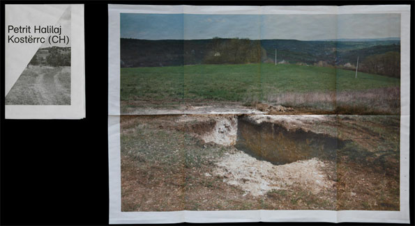
Brochure for the project “Kostërrc (CH)” by Petrit Halilaj. Photography Alexis Zavialoff (2011)
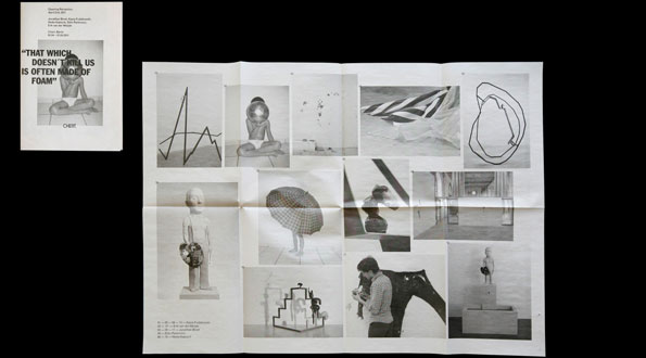
Brochure for the group show titled “That Which Doesn’t Kill Us Is Often Made Of Foam”. Published by Chert (2011)
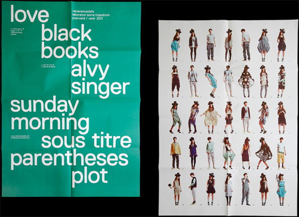
Catalogue/Poster, Venera Mustafa SS11. Photography Atdhe Mulla (2011)
Share Article
Further Info
About the Author
—
Alex originally joined It’s Nice That as a designer but moved into editorial and oversaw the It’s Nice That magazine from Issue Six (July 2011) to Issue Eight (March 2012) before moving on that summer.



